.NET MAUI DataGrid: Display Transaction Details, Account Summaries

Summarize with AI:
The Telerik UI for .NET MAUI DataGrid helps you build powerful, scalable grids with all the sort, filter, edit and on-demand load functionality you need.
In mobile applications—especially in the financial sector—the way we present data is key to delivering an efficient, organized and clear user experience. Whether we’re displaying bank transactions, expense records, income reports or monthly balances, the presentation should make information easy to read and interact with.
Imagine you’re reviewing your bank account transactions, and you have to click on each one individually to see the details. Sounds tedious, right? Now imagine those same transactions shown in a neatly organized table, with clear columns like date, amount, description and transaction type—you’d be able to scan all the information at a glance.
This is where the .NET MAUI DataGrid component from the Progress Telerik UI for .NET MAUI library comes in. It’s a powerful tool that allows you to display and manage large volumes of data in a smooth, organized and user-friendly way. With this component, you can visualize data, sort, filter, edit records directly within the grid and access many other powerful features, all in a simple and efficient manner.
🎯 In this article, I’ll show you how to implement the Telerik DataGrid in your .NET MAUI apps so you can easily integrate features like transaction viewing, in-place editing, filtering, field-based organization and much more. Let’s turn that data into a far more useful, dynamic and professional visual experience!
What Is the .NET MAUI DataGrid?
The Telerik UI for .NET MAUI DataGrid displays data organized in rows and columns (like a matrix), which you can also edit.
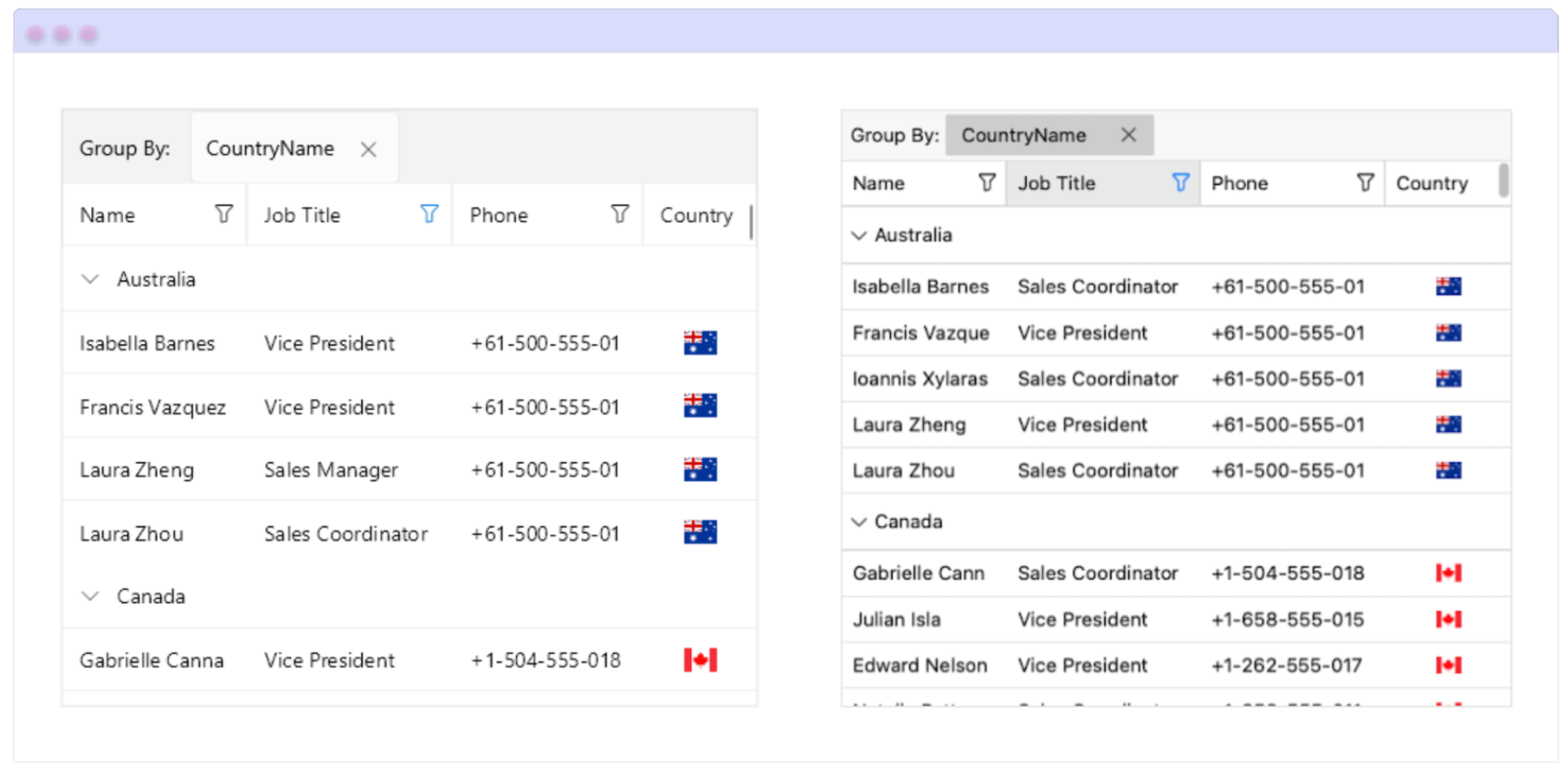
This control also lets you play with styles. For example, alternating row colors, which not only helps users quickly identify each row but also allows you to better match your app’s branding. The component supports powerful features like grouping, sorting, filtering and more.
Additionally, it uses row and cell virtualization, meaning it only creates the visual elements that are needed at that moment, avoiding unnecessary records that aren’t currently visible on screen. This greatly improves your app’s performance!
This control is part of the Telerik UI for .NET MAUI library, which offers more than 60 professionally designed UI components—ideal for building modern, cross-platform applications with a polished user experience.
Below is an example of how the DataGrid looks:

Initial Configuration
Let’s set up the basic configuration so you can use the control directly in your XAML file. For now, we’ll focus only on this initial setup. As we move forward, you’ll see how the other details are implemented step by step.
First of all, make sure you have the following prerequisites ready:
- Set up your .NET MAUI application.
- Download Telerik UI for .NET MAUI.
- Install Telerik UI for .NET MAUI.
Once all the prerequisites are set, you’re ready to start! 😎
Step 1: Add the Telerik namespace
Go to your XAML file, and add the following namespace:
xmlns:telerik="http://schemas.telerik.com/2022/xaml/maui"
Step 2: Register Telerik in MauiProgram.cs
Head over to your MauiProgram.cs file and inside the CreateMauiApp method, add .UseTelerik() to enable Telerik controls. Place it right above .UseMauiApp<App>(), like this:
using Telerik.Maui.Controls.Compatibility;

public static class MauiProgram
{
    public static MauiApp CreateMauiApp()
    {
    var builder = MauiApp.CreateBuilder();
	    builder
	    .UseTelerik()
	    .UseMauiApp<App>()
	    .ConfigureFonts(fonts =>
	    {
		    fonts.AddFont("OpenSans-Regular.ttf", "OpenSansRegular");
	    });

	    return builder.Build();
    }
}
Column Definitions
The Telerik DataGrid allows you to take the following three approaches to define your columns:
- Automatic: This is the default option. It automatically creates one column for each property in your data source. This behavior is enabled by setting the
AutoGenerateColumnsproperty to true. - Manual: This option allows you to manually define the columns that the DataGrid will display. To do this, you must add the columns to the Columns collection and set the
AutoGenerateColumnsproperty to false. - Mixed: This option lets you combine both manually defined and automatically generated columns. In other words, you can add specific columns to the Columns collection and keep
AutoGenerateColumnsset to true so the remaining columns are generated automatically.
Manual Generation
If you choose the manual generation option, you can define columns such as Text, Numeric, Boolean, Date, Time, ComboBox and other less common types like:
- Template Column: This type of column lets you fully customize the content of each cell using a DataTemplate. It’s ideal when you want to display more complex UI elements—such as images, buttons or formatted text—instead of plain values.
- ToggleRowDetails Column: This column adds a toggle button that allows users to expand or collapse additional details for a specific row. It’s perfect for displaying extra information without overcrowding the main grid view.
For columns with a specific type (Text, Numeric, Boolean, Date, Time and ComboBox), you can indicate which property of the data object will be displayed in the column in two ways:
- PropertyName: To directly specify the name of the property that will be shown in the column.
- DataMemberBinding: Defines the data binding for the content displayed in the cell. Using
DataMemberBindinggives you more control over how the information is formatted and presented in the DataGrid cells.
You can see how to use it here:
<telerik:RadDataGrid x:Name="grid"
    ItemsSource="{Binding Clubs}"
    AutoGenerateColumns="False">
    <telerik:RadDataGrid.BindingContext>
    <local:ViewModel />
    </telerik:RadDataGrid.BindingContext>
    <telerik:RadDataGrid.Columns>
    <telerik:DataGridTextColumn PropertyName="Name"
    HeaderText="Name">
	    <telerik:DataGridTextColumn.CellContentStyle>
	    <Style TargetType="telerik:DataGridTextCellAppearance">

	    <Setter Property="TextColor" Value="#018383" />
	    <Setter Property="SelectedTextColor" Value="#A55200" />
	    <Setter Property="FontSize" Value="15" />
	    </Style>
	    </telerik:DataGridTextColumn.CellContentStyle>
	    </telerik:DataGridTextColumn>
	    <telerik:DataGridNumericalColumn DataMemberBinding="{Binding StadiumCapacity, StringFormat='{0:N0}'}"
	    HeaderText="Stadium Capacity"/>
	    <telerik:DataGridBooleanColumn DataMemberBinding="{Binding IsChampion, Converter={StaticResource BoolToValueConverter}}"
	    HeaderText="Champion"/>
	    <telerik:DataGridDateColumn PropertyName="Established"
	    HeaderText="Date Established"/>
	    <telerik:DataGridComboBoxColumn PropertyName="Championship"
	    HeaderText="Championship"
	    ItemsSourcePath="Championships"/>
	    <telerik:DataGridTemplateColumn HeaderText="Location">
	    <telerik:DataGridTemplateColumn.CellContentTemplate>
	    <DataTemplate>
	    <Grid>
	    <VerticalStackLayout InputTransparent="True">
	    <Label Text="{Binding Country}"
	    TextColor="#009688"
	    Margin="0, 5, 0, 5"
	    HorizontalOptions="Center"
	    VerticalTextAlignment="Center"/>
	    <Label Text="{Binding City}"
	    TextColor="#80CBC4"
	    HorizontalOptions="Center"
	    VerticalTextAlignment="Center"
	    FontSize="12"/>
	    </VerticalStackLayout>
	    </Grid>
	    </DataTemplate> </telerik:DataGridTemplateColumn.CellContentTemplate>
	    </telerik:DataGridTemplateColumn>
	    <telerik:DataGridNumericalColumn DataMemberBinding="{Binding Path=Revenue, StringFormat='{0:C}', TargetNullValue='N/A'}"
	    HeaderText="Revenue (in millions)"/>
    </telerik:RadDataGrid.Columns>
</telerik:RadDataGrid>
As a general review, it’s important to know the features available in this component. You can work with column headers, define how the content is displayed and edited using templates, and even show extra information in the column footers. You can also adjust the column width manually or automatically.
One key point is that you can freeze columns—just like in Excel—which is super useful because even if you scroll through a lot of data, those columns stay visible.
🔄 Column Reordering

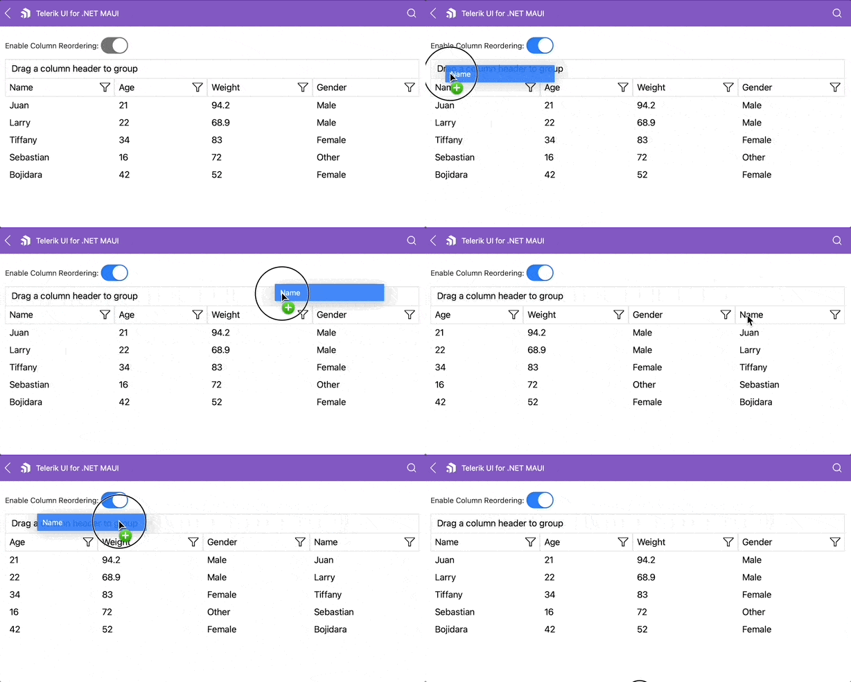
Yes! In addition to everything we’ve already covered, you also have the option to reorder your DataGrid columns in real time using drag-and-drop functionality. This greatly improves readability, offers a more user-friendly experience and makes integration with MVVM architectures much easier.
🛠️ Key Properties for Enabling Column Reordering
- CanUserReorderColumns: This property takes a boolean value and controls whether the user can rearrange columns. Its default value is true.
- ColumnReorderIndicatorTemplate: Lets you customize the visual indicator that appears between columns while dragging one. Think of it as a vertical line (for example, green) that shows where the column will land if you drop it.
- ColumnHeaderDragVisualTemplate: Defines how the column header looks while being dragged. You can customize its background color, text style, borders, etc. For example: a green box with blue text that appears as you drag the column.
Below is a simple example demonstrating the XAML implementation.
<Grid RowDefinitions="Auto, *">
    <Grid ColumnDefinitions="Auto, Auto" Margin="0, 0, 0, 10">
    <Label Text="Enable Column Reordering: " VerticalOptions="Center"/>
    <Switch Grid.Column="1"
    IsToggled="{Binding IsReorderingEnabled, Mode=TwoWay}"
    VerticalOptions="Center"
    HorizontalOptions="End"/>
    </Grid>
	    <telerik:RadDataGrid x:Name="dataGrid"
	    Grid.Row="1"
		    AutoGenerateColumns="False"
		    ItemsSource="{Binding Data}"
		    CanUserReorderColumns="{Binding IsReorderingEnabled}"
		    ColumnReorderStarting="OnColumnReorderStarting"
		    ColumnReordering="OnColumnReordering"
		    ColumnReorderCompleting="OnColumnReorderCompleting"
		    ColumnReordered="OnColumnReordered">
			    <telerik:RadDataGrid.Columns>
			    <telerik:DataGridTextColumn PropertyName="Name" IsFrozen="True" />
			    <telerik:DataGridNumericalColumn PropertyName="Age" />
			    <telerik:DataGridComboBoxColumn PropertyName="Gender" />
			    <telerik:DataGridNumericalColumn PropertyName="Weight" />
			    </telerik:RadDataGrid.Columns>
    </telerik:RadDataGrid>
</Grid>
🔽 Column Sorting
Another super important feature of the DataGrid is the ability to sort columns. And the best part? It’s as easy as clicking on a column header! Plus, if you prefer more control, you can also handle sorting by code.
Sorting behavior is controlled by the UserSortMode property, which determines how the DataGrid reacts when a column header is clicked. You can choose between:
- Auto (default): Standard behavior
- Single: Only one column can be sorted at a time
- Multiple: Allows multi-column sorting
- None: Disables UI-based sorting
You can also enable or disable sorting for a specific column using the CanUserSort property (type bool).
Sorting in Code
If you want full control, you can also sort columns programmatically. There are two main ways to do it:
🔹 Using PropertySortDescriptor: This allows you to sort based on a specific property in your data model, such as name and age.
<telerik:RadDataGrid.SortDescriptors>
    <telerik:PropertySortDescriptor PropertyName="Name" SortOrder="Ascending"/>
</telerik:RadDataGrid.SortDescriptors>
🔹 Using DelegateSortDescriptor: Ideal when you want to sort using a calculated value, like the length of a string.
public class CustomKeyLookup : IKeyLookup
{
    public object GetKey(object item) => (item as Person).Name.Length;
}

dataGrid.SortDescriptors.Add(new DelegateSortDescriptor
{
    KeyLookup = new CustomKeyLookup()
});
🔍 Exploring the Filtering

Filtering via the UI
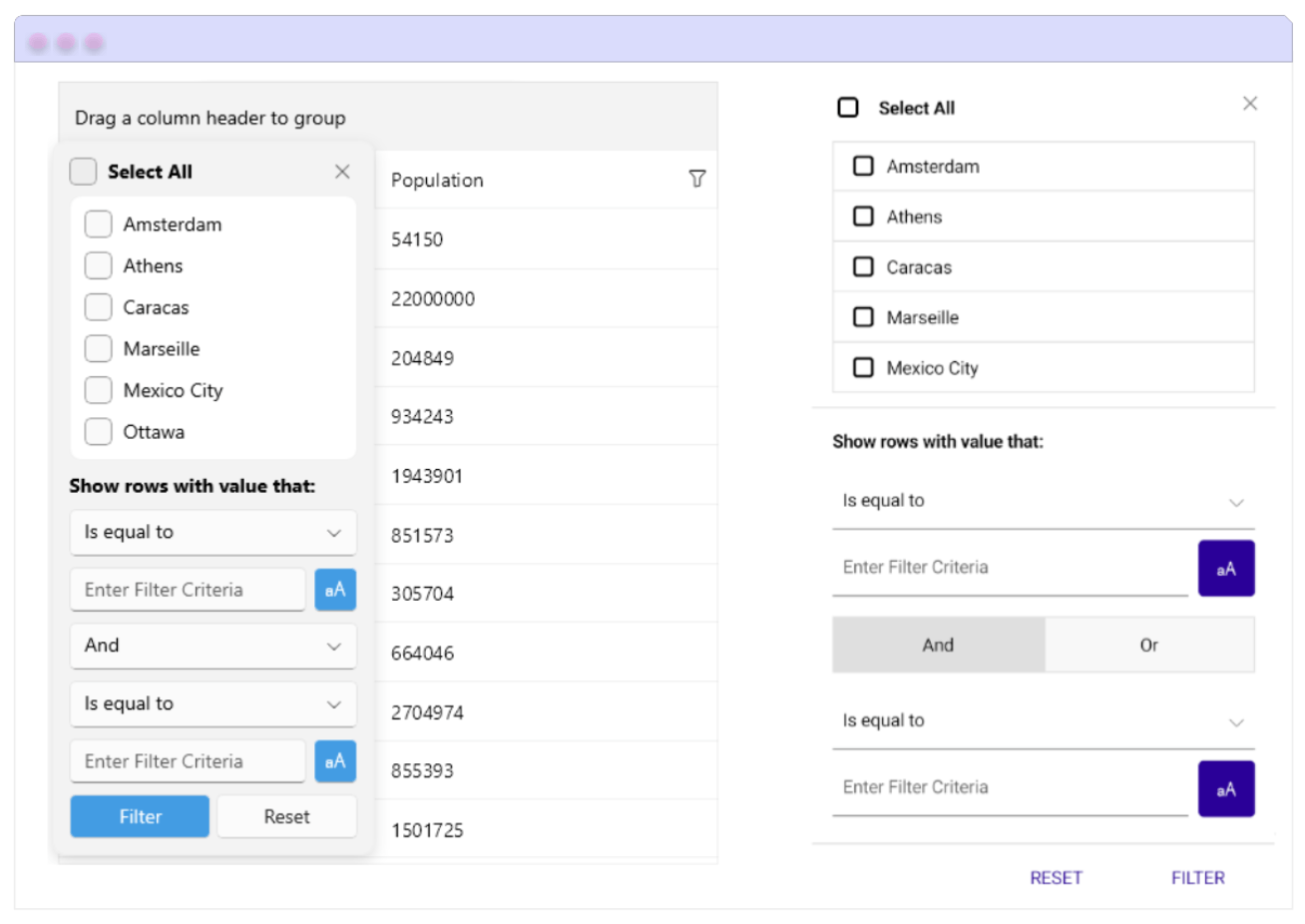
You also have the possibility to enable filtering directly in your DataGrid. Each column header includes a filter icon, and by clicking it you’ll see the available filter conditions you can apply.
✨ The coolest part is that you can fully customize the appearance of the filtering UI using the FilterControlTemplate property.
- FilterControlTemplate: Allows you to define a custom template for the column’s filter control. This template must include a control that inherits from DataGridFilterControlBase, giving you full control over how the filter panel looks.
Filtering Programmatically
- You can also apply filters directly through code by adding different types of filter descriptors to the FilterDescriptorscollection of the DataGrid.
This is perfect when you want to apply logic-based filtering, such as:
- Filtering by the current date
- Showing only active records or specific statuses
- Combining multiple filter conditions
How to Edit Cell Content in a DataGrid
You can easily edit cell content directly in the DataGrid. Editing is triggered by double-clicking (or tapping) on a cell, and the behavior is controlled by the UserEditMode property, which accepts the following values:
- None (default on mobile) – Disables editing
- Cell (default on desktop) – Enables cell-level editing
You can also disable editing for specific columns by setting the CanUserEdit property to false.
Want to Customize the Editing Experience?
If the default editors don’t fit your needs, you can define custom editors for each column using the CellEditTemplate property. This gives you full control over how data is edited.
And yes—you can also style your editors using the CellEditorStyle property on each column. For example, here’s a style applied to a TextColumn editor with bold text and centered alignment:
<telerik:DataGridTextColumn.CellEditorStyle>
    <Style TargetType="telerik:RadEntry">
	    <Setter Property="FontAttributes" Value="Bold" />
	    <Setter Property="HorizontalTextAlignment" Value="Center" />
	    <Setter Property="Margin" Value="2" />
    </Style>
</telerik:DataGridTextColumn.CellEditorStyle>
Load On Demand in the DataGrid
When working with large datasets, this component allows you to load data incrementally, which significantly improves performance and user experience.
Available Load Modes
This behavior is controlled by the LoadOnDemandMode property, which accepts the following values:
- Automatic: Automatically loads more data as the user scrolls near the end of the grid. You can fine-tune when this is triggered using the
LoadOnDemandBufferItemsCountproperty. - Manual: Displays a “Load More” button at the bottom of the grid. When clicked, it loads additional data based on your logic.
Ways to Implement Load On Demand
1. Using LoadOnDemandCollection
A special collection that works like an ObservableCollection, but supports loading items dynamically using a delegate function.
this.Items = new LoadOnDemandCollection<Person>((token) =>
{
    var list = new List<Person>();
    for (int i = 0; i < 10; i++)
	    list.Add(new Person { Name = $"LOD Person {i}", Age = i + 18 });
    return list;
});
2. Using the LoadOnDemand Event
You can handle this event and manually append new items to the grid’s ItemsSource.
private void dataGrid_LoadOnDemand(object sender, LoadOnDemandEventArgs e)
{
    var source = (sender as RadDataGrid).ItemsSource as ObservableCollection<Person>;
    for (int i = 0; i < 15; i++)
	    source.Add(new Person { Name = $"Person {i}", Age = i + 18 });
	    e.IsDataLoaded = true;
}
3. Using the LoadMoreData Command (Ideal for MVVM)
Create a custom command and add it to the DataGrid.Commands collection. This gives you full control from the ViewModel.
public class CustomLoadMoreDataCommand : DataGridCommand
{
public override void Execute(object parameter)
    {
	    var viewModel = this.Owner.BindingContext as MyViewModel;
	    for (int i = 0; i < 10; i++)
		    viewModel.Items.Add(new Person { Name = $"Person {i}", Age = i + 18 });
    }
}
Conclusion
That’s it! Now you’re fully equipped to take your .NET MAUI DataGrid to the next level. From sorting and filtering to editing and loading data on demand—you’ve got everything you need to build powerful, dynamic and scalable grids that deliver a smooth user experience across platforms. 💪📊
You can read more information on the .NET MAUI Grid control here.
Whether you’re letting users sort and filter with ease, customizing inline editors or handling massive datasets with incremental loading, the Telerik UI for .NET MAUI DataGrid has your back. Try it, plus the other 60+ UI components in the library free for 30 days:
If you have any questions, feel free to leave a comment or reach out—I’m happy to help!
See you in the next one! 🙋♀️💚
References

Leomaris Reyes
Leomaris Reyes is a software engineer from the Dominican Republic specializing in mobile development. She is a 7-time Microsoft MVP and actively builds mobile applications while sharing practical knowledge through technical articles and developer-focused content.
Through her work, she explains programming concepts, developer tools and real-world development practices to help developers grow in their careers.
You can follow her on Instagram and TikTok at @leomarisreyes.dev, read her articles on AskXammy, and connect with her on LinkedIn, where she shares tutorials, insights and resources for developers.

