Design Tokens—Fundamental Building Blocks of Design Systems

Summarize with AI:
Design tokens are the smallest pieces of a design system and they help to provide consistent visuals and experiences. Here’s how to use them strategically in your design system.
In the world of user interface (UI) development, consistency is king. Users often expect a product to feel cohesive and familiar, no matter which part they interact with. This is where design systems come in—collections of reusable components, guidelines and assets that help you provide a unified user experience across an entire product or product suite.
Design tokens are fundamental building blocks to design systems that offer a unified and consistent user experience across different parts of a product. In this article, we’ll delve into what design tokens are, why they are crucial and how they can be effectively implemented to uphold consistency throughout a product.
What Are Design Tokens?
Design tokens are essentially the smallest parts of a design system. They are named entities that store specific visual design attributes (like colors, typography, spacing and more) within a design system. These tokens act as a bridge between design and development, providing a single source of truth for these attributes. This means that instead of hard-coding values directly into our code, we reference design tokens, which can be updated centrally.
For example, a design system might define a set of color tokens:
// Colors
$kendo-color-primary: #ff6358;
$kendo-color-secondary: #666666;
$kendo-color-tertiary: #03a9f4;
$kendo-color-info: #0058e9;
$kendo-color-success: #37b400;
$kendo-color-warning: #ffc000;
In addition to colors, design tokens can also define other aspects of design, such as font sizes, font families, line heights, spacing and more.
// Font sizes
$kendo-font-size: 0.875rem;
$kendo-font-size-xxs: 0.5rem;
$kendo-font-size-xs: 0.625rem;
$kendo-font-size-sm: 0.75rem;
$kendo-font-size-md: $kendo-font-size;
$kendo-font-size-lg: 1rem;
$kendo-font-size-xl: 1.25rem;
In the above examples, we’re defining our design tokens as Sass variables assuming the Sass preprocessor is being used in the project. We could also use CSS custom properties, which offer similar benefits for maintainability and scalability within modern web projects.
/* CSS Variables */
:root {
  --kendo-color-primary: #ff6358;
  --kendo-color-secondary: #666666;
  --kendo-color-tertiary: #03a9f4;
  --kendo-color-info: #0058e9;
  --kendo-color-success: #37b400;
  --kendo-color-warning: #ffc000;

  --kendo-font-size: 0.875rem;
  --kendo-font-size-xxs: 0.5rem;
  --kendo-font-size-xs: 0.625rem;
  --kendo-font-size-sm: 0.75rem;
  --kendo-font-size-md: 0.875rem;
  --kendo-font-size-lg: 1rem;
  --kendo-font-size-xl: 1.25rem;
}
When it comes to using these tokens in a project, developers have different methods for referencing them in their code. One of the most common ways to access these design tokens in CSS is by using the var() function to retrieve custom properties. This method is especially beneficial for maintaining a consistent design across a large-scale application and makes it easier to make global changes.
For instance, in a CSS file, we can apply design tokens to elements like this:
.button {
  background-color: var(--kendo-color-primary);
  padding: var(--kendo-font-size-sm) var(--kendo-font-size-md);
  font-size: var(--kendo-font-size);
}

.header {
  color: var(--kendo-color-info);
  font-size: var(--kendo-font-size-lg);
}
Here, the var() function is used to insert the value of a custom properties where they’re referenced. This allows us to easily switch themes or adjust styles by simply changing the values of these tokens at the root level.
Different Types of Design Tokens
Design tokens can be expansive, encompassing a variety of types that cater to different aspects of a design system. The Progress Design System showcases a helpful structure of design tokens ranging from global values to very specific ones tailored for particular components.
Global Design Tokens
Global design tokens are foundational values that form the cornerstone of a design system. They represent tokens that are:
- Context-agnostic, meaning they don’t pertain to a specific component or context.
- Generic, allowing them to be reused across various parts of the design.
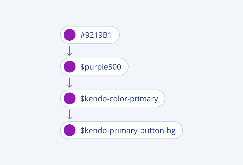
For instance, a color palette might include tokens like $purple-100, $purple-200, $purple-300, etc., establishing a scalable and reusable color system. Though these tokens can be used directly, they’re often used as building blocks and are referenced by other design tokens.

Alias Design Tokens
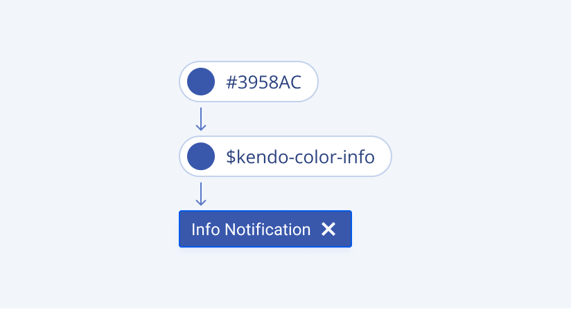
Alias design tokens are a step more specific than global tokens. They are named in a way that suggests their intended use, helping to apply consistent styling across different UI elements while maintaining clear and meaningful connections to their function within the design system.
For example, $kendo-color-info might be specifically used for informational messages or alerts, signaling its purpose through its name.

Component-Specific Design Tokens
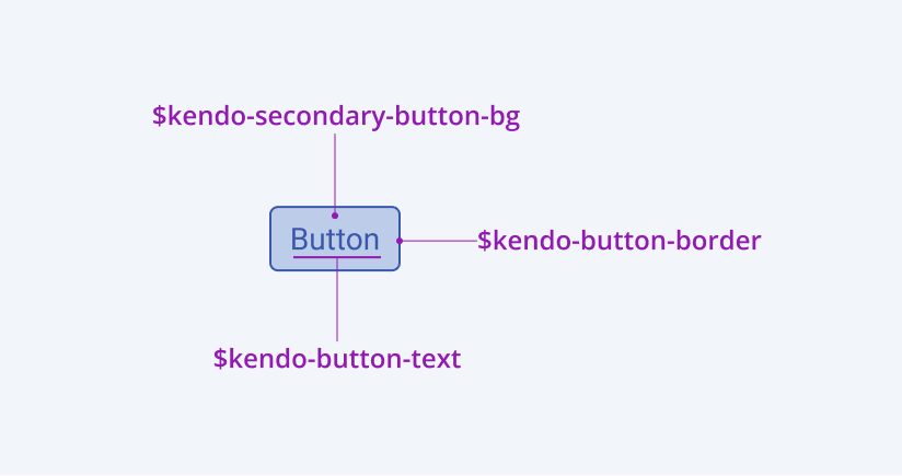
Component-specific design tokens take specificity even further. These tokens are directly tied to particular components within the design system, defining properties such as colors, borders and typography specific to that component.
For instance, the $kendo-button-border might define the border style for all buttons within a system. This level of detail helps each component to behave and appear as expected, no matter where it is used within the application.

Application-Specific Design Tokens
Application-specific design tokens are crafted to address the particular needs of individual projects or a series of related projects. They provide the flexibility needed to adapt the overarching design system to specific functional requirements, aesthetic preferences or brand guidelines. They often encompass several types of properties:
- Color design tokens: These are used to establish a color identity specific to an application, adjusting for various UI elements like backgrounds, text and borders for visual coherence and brand alignment.
- Typography design tokens: These tokens manage typographic details tailored to specific applications, balancing readability with style, including defining sizes, weights and spacing for text across different UI components.
- Space design tokens: While many design tools don’t yet support space tokens directly in their UI editors, they are crucial for defining the spacing rhythm within an application. These tokens help maintain consistent margins and paddings that align with the spatial and structural design principles.
- Effect design tokens: Used for adding depth and dynamics through visual effects like shadows, blurs and overlays, these tokens help enhance the aesthetic appeal and user focus on specific elements within the application.
Good Practices for Implementing Design Tokens
Implementing design tokens in certain ways can be helpful for maximizing their benefits and ensuring the consistency and scalability of a design system. Drawing from the guidelines provided by the Progress Design System, here are some practical do’s and don’ts to follow when working with design tokens.
Use Global Design Tokens Cautiously
Global design tokens serve as the foundation of a design language. They are versatile and can be applied across different parts of your project without being tied to specific UI components.
Do:
- Utilize global design tokens as foundational elements within your design system. They are ideal for establishing basic colors, typography and spacing that are common across multiple components.
- Consider the broad applicability of these tokens when integrating them into your designs. They should enhance consistency without restricting flexibility.
Don’t:
- Overuse global tokens for specific applications where component-specific tokens are more appropriate. Relying too heavily on global tokens can lead to a lack of specialization in your designs, which might not meet the nuanced needs of individual components.
Choose the Right Component-Specific Tokens
Component-specific design tokens are tailored for specific elements within the UI, such as buttons, input fields or navigation bars. They help give components a consistent appearance and behavior across different parts of your application.
Do:
- Use component-specific tokens to define properties that are unique to particular components. This could include button border thickness, hover state colors or specific typography for headings within a component.
- Select tokens based on their intended use, as their names often provide clear indications of their application.
Don’t:
- Substitute component-specific tokens with global tokens if the specific tokens provide a better fit. Misapplying tokens can lead to inconsistencies and unexpected behaviors in the UI.
- Use tokens intended for one component in another unless they are explicitly designed to be cross-component. This helps maintain the integrity and purpose of each design decision.
Strategically Implement Application-Specific Design Tokens
Application-specific design tokens are designed to meet the unique stylistic requirements of a particular project or suite of projects. These tokens allow for the customization of designs to align with specific branding guidelines and functional requirements.
Do:
- Create and utilize application-specific tokens to address unique design challenges and requirements of your project. These might include specific color schemes for branding purposes, custom typography settings or unique spacing that aligns with the overall layout of the application.
- Make sure that these tokens are clearly documented and understood by both the design and development teams. This clarity will facilitate easier updates and modifications as project requirements evolve.
Don’t:
- Ignore the broader design system guidelines when creating application-specific tokens. While it’s important to customize, it should not come at the expense of overarching design consistency and usability standards.
Wrap-up
In conclusion, design tokens are not just tools for maintaining visual consistency—they are strategic assets in a design system that enhance collaboration across teams, align detailed design elements with broader brand narratives and adapt gracefully to the ever-changing requirements of modern digital projects. As such, proper implementation and management of design tokens are essential for any organization that values design quality and coherence across its product suite.
For more details, explore the helpful guidelines provided by the Progress Design System and their documentation on Design Tokens.

Hassan Djirdeh
Hassan is a senior frontend engineer and has helped build large production applications at-scale at organizations like Doordash, Instacart and Shopify. Hassan is also a published author and course instructor where he’s helped thousands of students learn in-depth frontend engineering skills like React, Vue, TypeScript, and GraphQL.

