
How to Create a Design System with ThemeBuilder

Summarize with AI:
A good design system will help your team build consistent applications more efficiently. Get started on yours today with Progress ThemeBuilder.
Creating modern and visually cohesive user interfaces that look and behave consistently across various platforms and devices is a challenging task. This problem can be tackled by introducing a design system that can be used as a blueprint for how interfaces should work.
In this article, we will explore the importance of a good design system and its core components. Furthermore, we will cover how to build a design system with the powerful Progress ThemeBuilder.
What is a Design System and Why Do We Need One?
A design system is a detailed collection of guidelines, principles, patterns and assets. Developers, designers, product managers and other stakeholders can use it to create interfaces that are consistent visually and provide coherent behavior for all products and services across various platforms and devices.
It can have a significant impact on how users perceive products and the brand. What’s more, it can play an essential role in differentiating from competitors and establishing a recognizable identity for the brand and its offerings. A good design system can help users recognize the brand behind products and reinforce positive memories and experiences.
Besides consistency and recognizable UI and UX, a design system improves efficiency since it’s easier to avoid reinventing the wheel. The existing components can be used in new projects, so there is no need to spend time figuring out how things should look and work in a project.
Moreover, having a centralized design system helps with maintenance and reduces the risk of inconsistent UIs. In addition, it can aid the onboarding process of new team members since it can be referred to as documentation for the company’s design and development standards.
What are the Components of a Design System?
A design system can consist of several components depending on how thorough and complex it is. However, here are a few core components that design systems can comprise:
Style Guide
The style guide covers branding elements, such as typography, color palettes, spacing, grid layouts and more.
Component Library
A component library comprise the building blocks of a design system. It should contain reusable components, such as buttons, form fields, layouts or dialogs. These components should be built based on the design system’s style guide and design principles.
UI Patterns
UI patterns specify the solutions to common design challenges. For instance, what approach should be used to build and handle a navigation menu on mobile devices? Should an application use a top or bottom navigation bar or should the navigation links be hidden in a drawer instead? If a drawer, then how should the drawer be opened? A very common solution for this problem is the use of the “hamburger menu,” which comprises a button with multiple lines that look like a stacked hamburger. UI Patterns ensure that interfaces use a consistent approach to the same problems.
Design Principles
Design principles provide the basic ideas behind design choices. The principles ensure the design system has a consistent design style throughout. These might comprise focus on light, depth or size.
Documentation
Documentation is the instruction manual on how to understand and use the design system. The documentation should cover how different parts of the design system should be used individually or combined to create richer experiences. These could comprise implementation details and code examples.
Design Tools
Desgin tools are a collection of tools that is used to create and maintain the design system. For instance, a company might use an application such as Figma, Adobe XD or Sketch for creating designs and StoryBook or Zeplin to maintain the design system in an interactive manner.
In a nutshell, a design system covers visual look and functional behavior. It speeds up product iteration, makes the design and development process faster and ensures everything works in the same manner on different platforms and devices. In the next sections, we will have a look at how to take advantage of Kendo UI to build a design system.
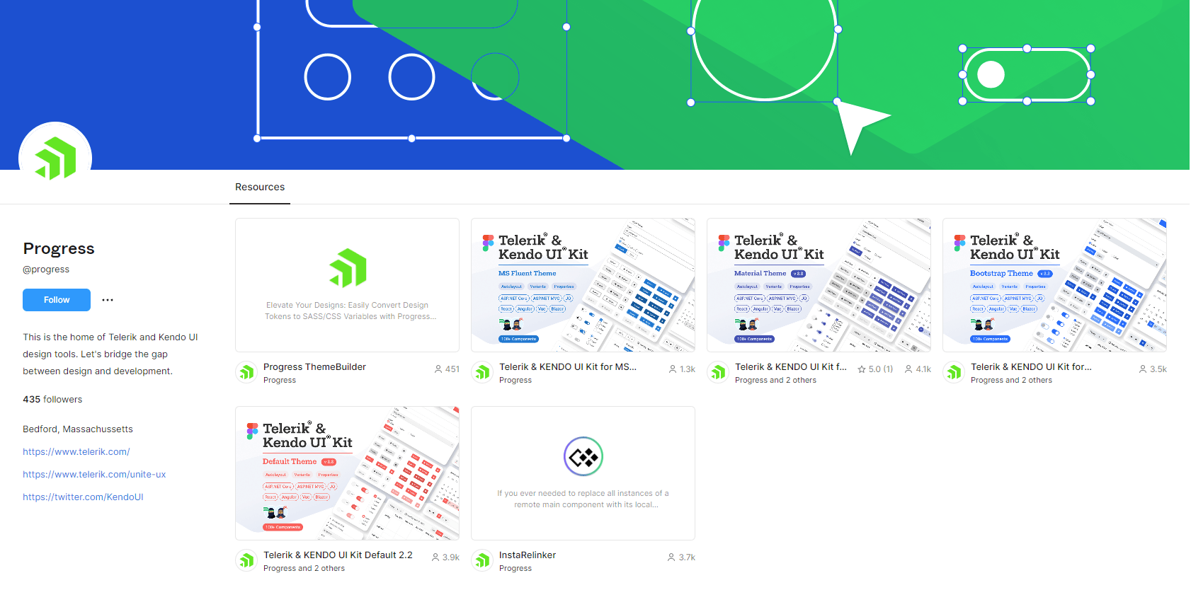
What is Kendo UI?
Kendo UI is a comprehensive bundle of UI components built by the Progress team for four major JavaScript UI libraries—React, Angular, Vue and jQuery.
Each version provides many feature-rich components with consistent API, visual styles and behavior. The components offered by Kendo UI can cover the needs of many applications, and they span various features, such as buttons, icons, grids, layouts, charts, form fields, dropdowns and much more.
The fact that Kendo UI supports multiple UI libraries means even teams that use micro-frontends and utilize different solutions can still develop user interfaces that match visually and behaviorally.
Kendo UI offers five beautifully crafted UI themes:
You can pick one and immediately start coding. Kendo UI even provides Figma UI Kits for each of the themes, which you can use to create your own styles and designs in Figma using the provided style primitives.
The default themes are excellent, but if you need more customized styles, Kendo UI has the ThemeBuilder to meet your needs.
ThemeBuilder—Creating a Design System with Kendo UI
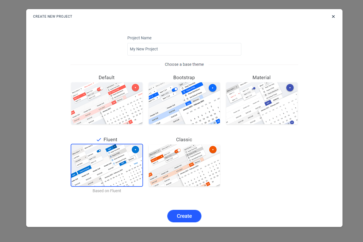
ThemeBuilder is a powerful Telerik and Kendo UI tool that can be used to create styles for UI components. To use it, we need to create a new project and choose the base theme we want to work with.
After creating a new project, we are redirected to the ThemeBuilder dashboard. We are immediately greeted by a helpful tour guide that can walk us through various features of the ThemeBuilder.
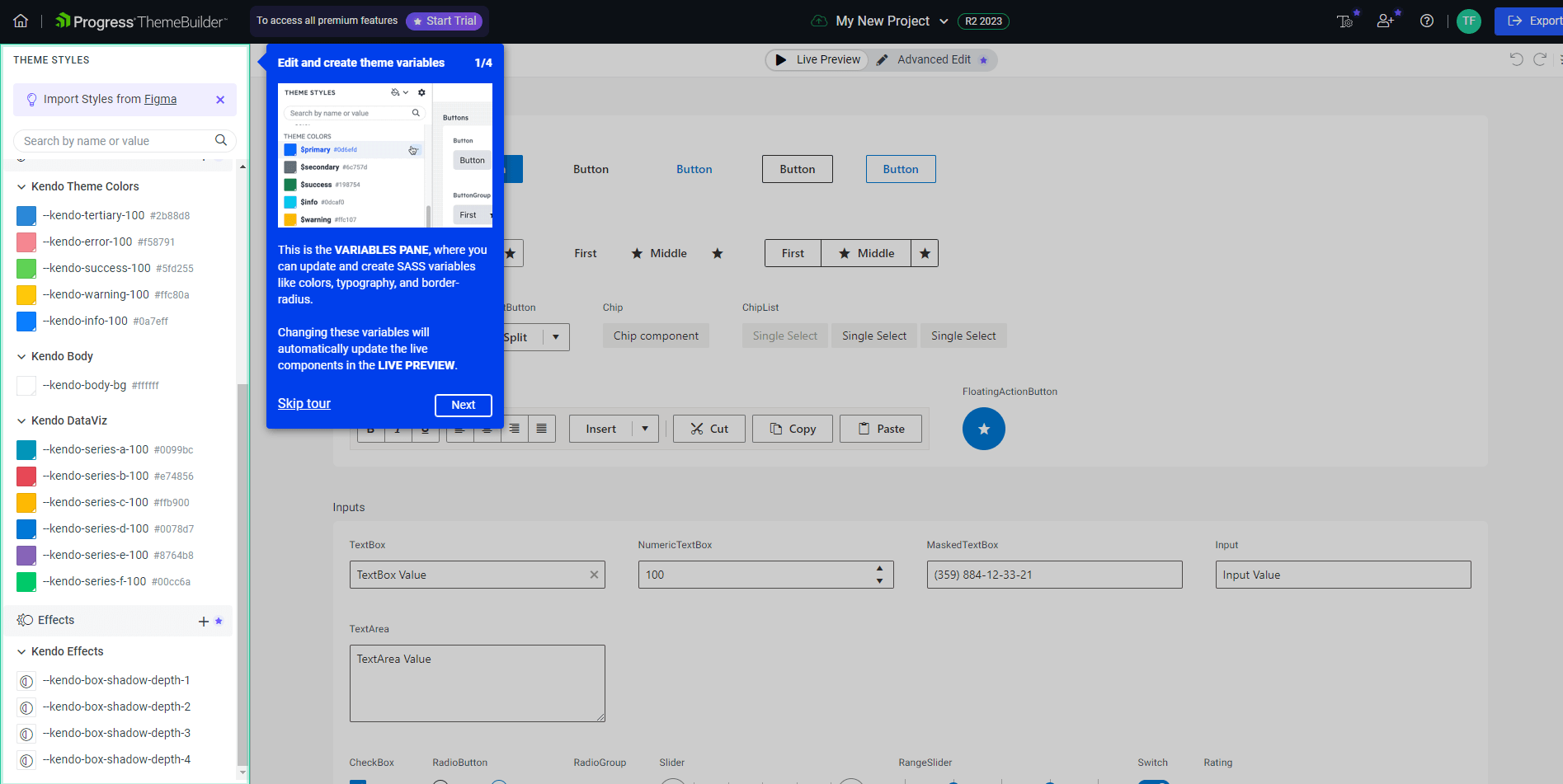
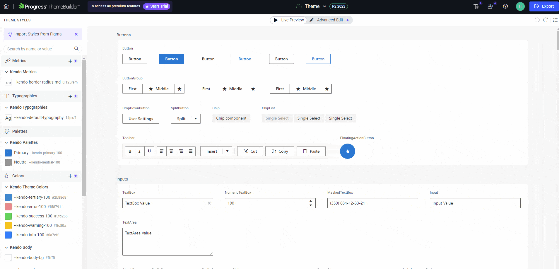
The main content showcases a live preview of all UI components present in the theme.
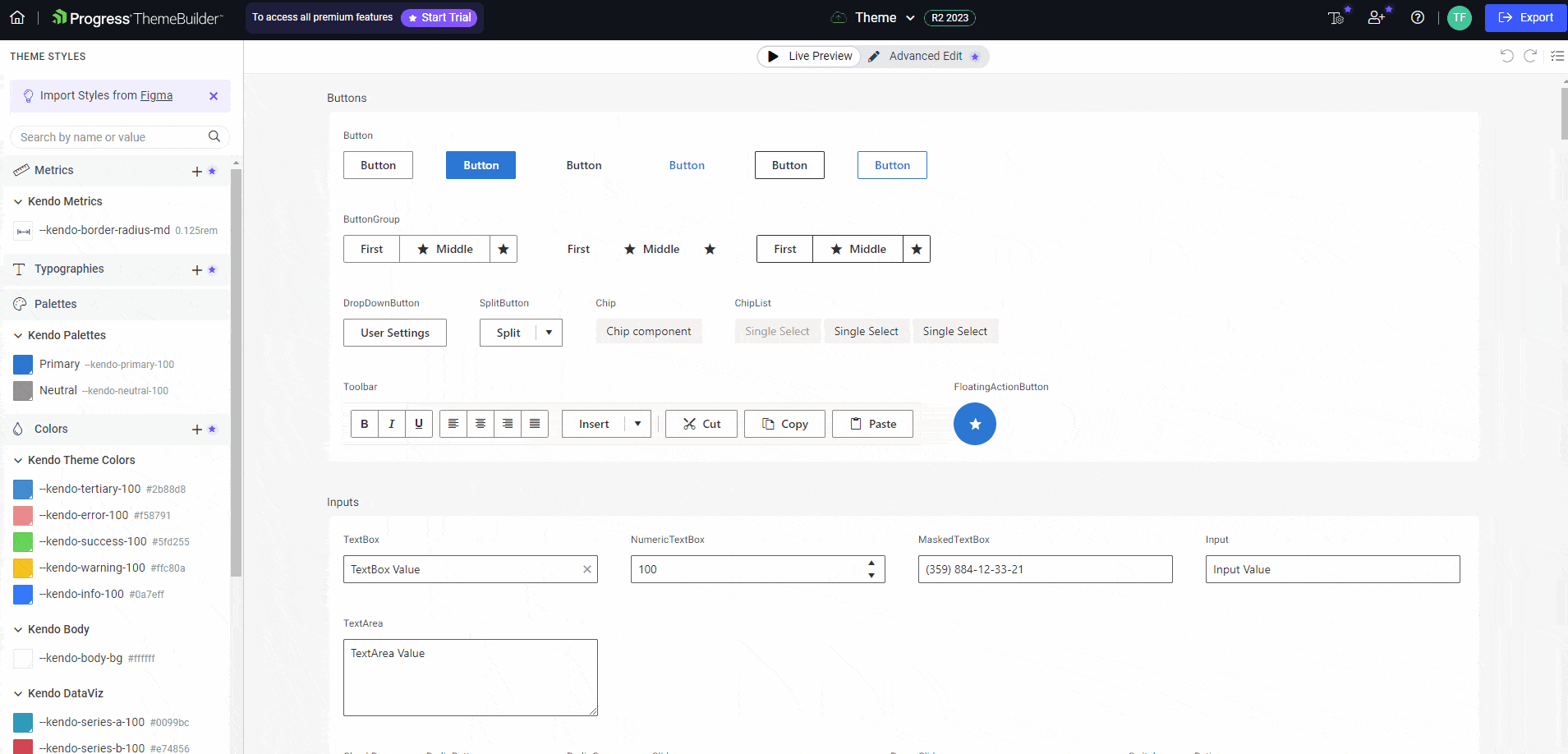
On the left side of the dashboard, we have a sidebar with theme styles, such as typography, color palettes and effects. In the theme selection process, I picked the Fluent Theme, so all components utilize the default Fluent styles.
Whenever any of the styles are changed, the ThemeBuilder refreshes the UI and renders all components with the latest styles. The GIF below shows how all components change colors when the primary style is modified.
Detailed Styling Customization
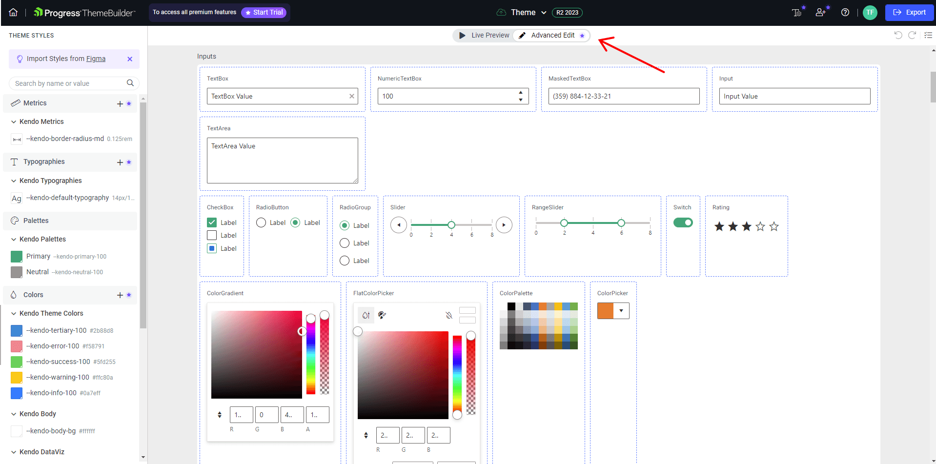
The main content, by default, shows the live preview, but we can also switch to the “Advanced Edit” mode, which will allow us to click on any of the components to get access to detailed styling customization for each component part and state.
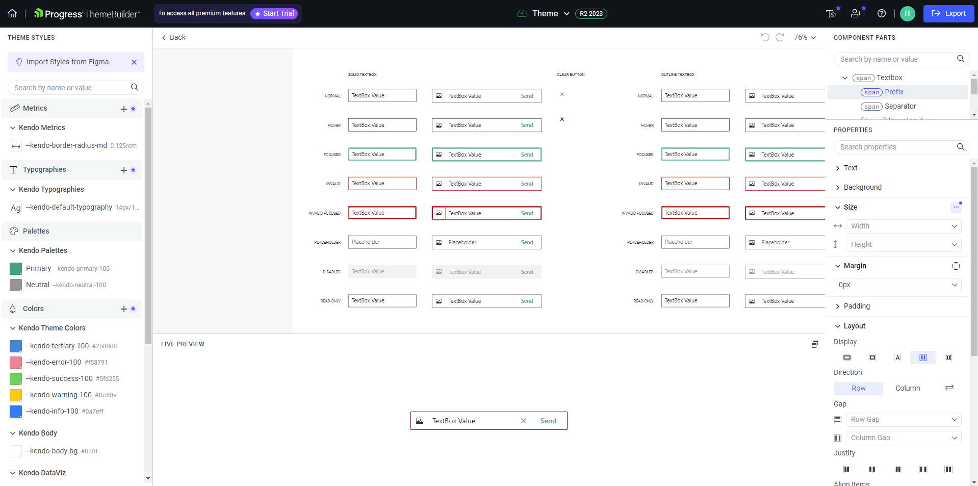
The Advanced Edit Component View consists of three main parts:
- The component states preview in the middle, which shows how a component looks like in a default state, when it’s hovered, focused and more
- The live preview section at the bottom, which renders an interactive component that can be interacted with
- The sidebar that can be used to configure the component’s text, background, spacing and more
ThemeBuilder Plans & Pricing
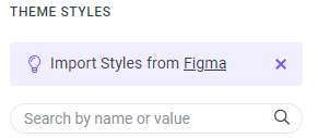
A lot of the features in the ThemeBuilder are free, but some of them require a paid plan subscription. For instance, the “Detailed Styling Customization” we just covered in the previous section requires the ThemeBuilder Pro plan. The ThemeBuilder also offers a very useful feature that allows importing styles and fonts from Figma. You might have spotted the “Import Styles from Figma” notification at the top of the left sidebar.
The Progress team built a Figma plugin that can be used to automate theme generation by exporting styles and fonts from Figma. The exported assets can then be easily imported into the ThemeBuilder and used to style components. This feature requires the ThemeBuilder Ultimate plan. Besides the free tier, there are three plans in total—Pro, Ultimate and Enterprise. You can find a detailed pricing plan comparison here.
Exporting a Theme in ThemeBuilder
When your theme is ready, you can click on the big blue Export button at the top right of the application. It will download a zipped file with the following structure.
.
├── theme/
│   ├── dist/
│   │   ├── css/
│   │   │   └── theme.css
│   │   └── scss/
│   │       ├── _overrides.scss
│   │       ├── _tokens.scss
│   │       └── index.scss
│   └── package.json
└── README.md
The README.md file describes how the theme should be added to a project. In the dist directory, we have css and scss folders. If you’re using Sass in your project, then you should import the dist/scss/index.scss file. Otherwise, you should import the theme.css file.
Note that since those files are generated, they should not be modified directly. Instead, they should be treated as read-only files. Any further modifications should be done in the ThemeBuilder, and the theme should be exported again.
Summary
In this article, we have covered the importance and building blocks of design systems, including style guides, component libraries, UI patterns, design principles, documentation and design tools. Further, we delved into Kendo UI and its unique features, such as themes, Figma UI Kits and Progress ThemeBuilder.
ThemeBuilder, equipped with advanced customization options and a live preview, enables us to create themes that perfectly align with our requirements. Moreover, we covered practical aspects, including the pricing structure of ThemeBuilder plans and how to export a theme to integrate it in a project. Equipped with the new tools, we can enhance our design workflows and create more cohesive and efficient user experiences.

Thomas Findlay
Thomas Findlay is a 5-star rated mentor, full-stack developer, consultant, technical writer and the author of “React - The Road To Enterprise” and “Vue - The Road To Enterprise.” He works with many different technologies such as JavaScript, Vue, React, React Native, Node.js, Python, PHP and more. Thomas has worked with developers and teams from beginner to advanced and helped them build and scale their applications and products. Check out his Codementor page, and you can also find him on Twitter.
Related Posts
Comments
All articles
Topics
Web MobileMobile
Desktop
Design
Productivity
People
