
Customizing the KendoReact Data Grid Styling and Theming Options

Summarize with AI:
See some of the many styling and theming options available to customize your React Data Grid.
The KendoReact Data Grid is a powerful component that enables developers to display and manage large datasets efficiently. While its out-of-the-box appearance is professional and clean, there are numerous ways to customize its look and feel to match an application’s design requirements. In this article, we’ll explore various styling and theming options available when using this React Data Grid.
KendoReact Data Grid
The KendoReact Data Grid component comes with built-in support for various features, such as sorting, filtering, grouping and paging. Each of these features can be styled to create a cohesive look that matches an application’s design system.
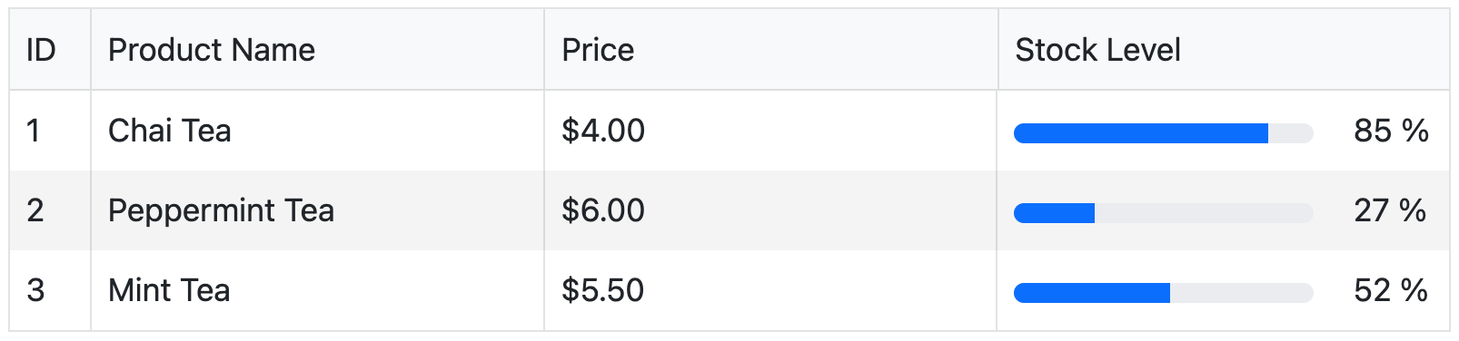
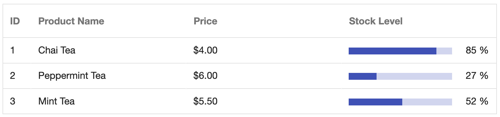
Let’s start with a basic example of a KendoReact Data Grid:
import * as React from "react";
import { Grid, GridColumn } from "@progress/kendo-react-grid";
import { ProgressBar } from "@progress/kendo-react-progressbars";

const ProgressCell = (props) => {
  const progress = props.dataItem[props.field];

  if (props.rowType === "groupHeader") {
    return;
  }

  return (
    <td {...props.tdProps}>
      <ProgressBar
        style={{
          width: "150px",
          height: "10px",
          marginRight: "20px",
        }}
        value={progress}
        labelVisible={false}
      />
      {progress} %<span> </span>
    </td>
  );
};

const App = () => {
  const data = [
    {
      ProductID: 1,
      ProductName: "Chai Tea",
      UnitPrice: 4.0,
      UnitsInStock: 85,
    },
    {
      ProductID: 2,
      ProductName: "Peppermint Tea",
      UnitPrice: 6.0,
      UnitsInStock: 27,
    },
    {
      ProductID: 3,
      ProductName: "Mint Tea",
      UnitPrice: 5.5,
      UnitsInStock: 52,
    },
  ];

  return (
    <Grid data={data}>
      <GridColumn field="ProductID" title="ID" width="40px" />
      <GridColumn field="ProductName" title="Product Name" />
      <GridColumn field="UnitPrice" title="Price" format="{0:c2}" />
      <GridColumn
        field="UnitsInStock"
        title="Stock Level"
        cell={ProgressCell}
      />
    </Grid>
  );
};
export default App;
In the above code example, we’ve created a basic table with custom cell rendering for the stock level column using a progress bar component to visually represent the data.
Theme Customization
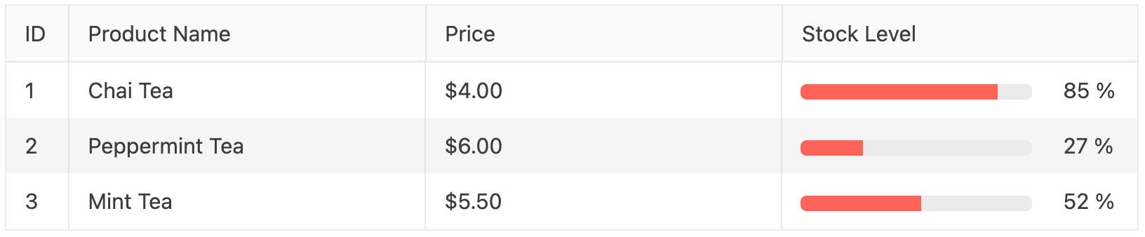
One of the most straightforward ways to customize the grid’s appearance is by using the KendoReact built-in themes. The Data Grid supports these main themes out of the box:
We can switch between themes by simply changing the imported stylesheet in our application. For example, the Bootstrap theme was used in the above example. If we wanted to instead use the Default theme, we would replace the Bootstrap theme CSS import in the index.html file of our app with:
<link
  rel="stylesheet"
  href=" https://kendo.cdn.telerik.com/themes/10.0.1/default/default-ocean-blue.css"
/>
This would give the grid a more neutral, classic appearance with the KendoReact Default styling.
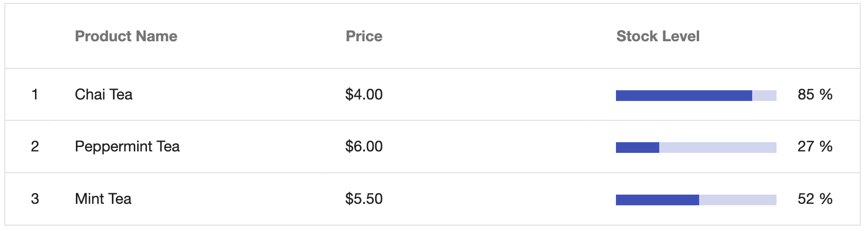
Alternatively, if we wanted to use the Material theme, we would use:
<link
  rel="stylesheet"
  href="https://kendo.cdn.telerik.com/themes/10.0.1/material/material-main.css"
/>
This would give the grid a Material Design appearance, with characteristic flat surfaces and sharp edges.
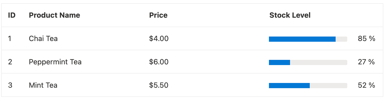
And, if we were to instead use the Fluent theme, we would replace the CSS import with:
<link
  rel="stylesheet"
  href="https://kendo.cdn.telerik.com/themes/ 10.0.1/fluent/fluent-main.css"
/>
With this, we’ll be presented with a modern, Fluent UI–inspired design, characterized by subtle shadows, rounded corners and consistent spacing, aligning closely with Microsoft’s design language.
Additional Styling Options
Beyond theme selection, the React Data Grid provides some other ways to customize its appearance through size adjustments, custom cells, custom headers and row-level styling.
Grid Size
The KendoReact Grid allows us to adjust its density to optimize visibility across different screen sizes and use cases. By using the size prop, we can control the density and overall compactness of the grid. This is particularly useful when we need to display large datasets in limited space or adjust the grid’s appearance for different devices.
Here’s an example of setting the size of our grid to small:
const App = () => {
  const data = [
    // ...
  ];

  return (
    <Grid data={data} size="small">
      {/* ... */}
    </Grid>
  );
};
This will have our grid display in a more compact format with reduced padding and spacing, making it more suitable for dense data presentation or smaller screen sizes.
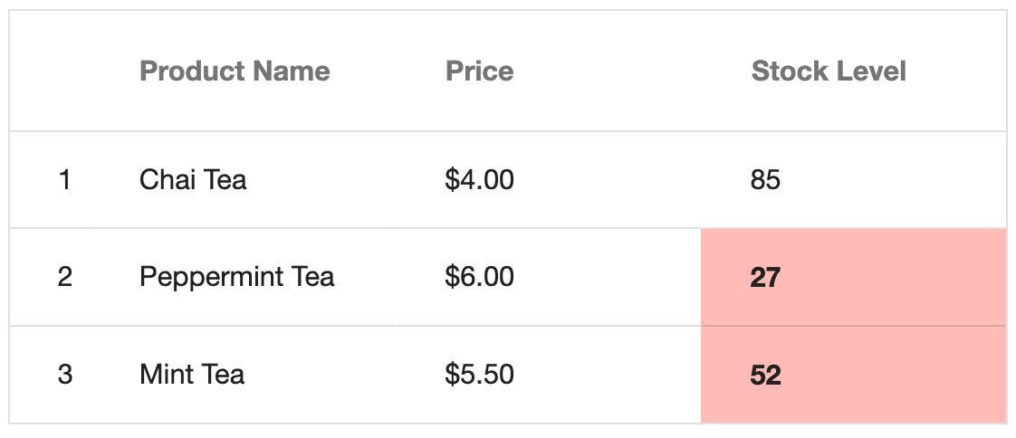
Custom Cells
Custom cells allow us to completely control the appearance and content of individual cells. This is particularly useful when we need to add conditional formatting or include additional elements within cells.
Here’s an example of implementing conditional formatting for stock levels, where cells are highlighted in red when stock is low:
import * as React from "react";
import { Grid, GridColumn } from "@progress/kendo-react-grid";

const CustomCell = (props) => {
  const value = props.dataItem[props.field];
  const isLowStock = value < 60;
  return (
    <td
      style={{
        backgroundColor: isLowStock ? "rgba(243, 23, 0, 0.32)" : "inherit",
        fontWeight: isLowStock ? "bold" : "normal",
      }}
    >
      {value}
    </td>
  );
};

const App = () => {
  const data = [
    // ...
  ];

  return (
    <Grid data={data} size="small">
      {/* ... */}
      <GridColumn field="UnitsInStock" title="Stock Level" cell={CustomCell} />
    </Grid>
  );
};

export default App;
With this change, any product with stock levels below 60 units will be highlighted in red.
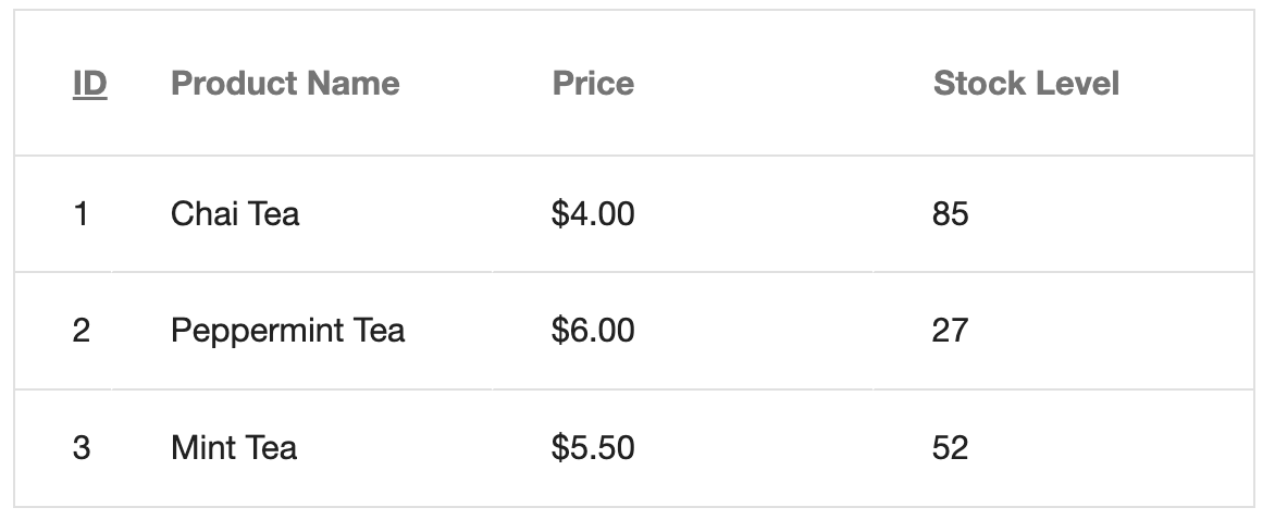
Custom Header Cells
Header cells can also be customized to include additional functionality or styling. Here’s an example of creating a custom header cell that’s used only for the ID header:
import * as React from "react";
import { Grid, GridColumn } from "@progress/kendo-react-grid";

const CustomHeaderCell = (props) => {
  return (
    <a onClick={props.onClick}>
      <span style={{ textDecoration: "underline", color: "53d2fa" }}>
        {props.title}
      </span>
      {props.children}
    </a>
  );
};

const App = () => {
  const data = [
    // ...
  ];

  return (
    <Grid data={data}>
      <GridColumn
        field="ProductID"
        headerCell={CustomHeaderCell}
        title="ID"
        width="40px"
      />
      {/* ... */}
    </Grid>
  );
};

export default App;
With the changes made in the above code example, the ID header cell displays as a clickable underlined link allowing users to interact with the table header as if it were a hyperlink.
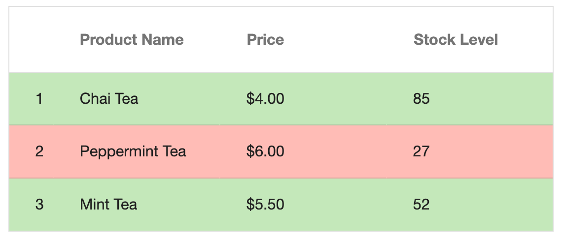
Row-level Customization
The rowRender prop allows us to customize entire rows based on data conditions. Here’s an example of applying conditional row styles based on the product’s availability status.
import * as React from "react";
import { Grid, GridColumn } from "@progress/kendo-react-grid";

const rowRender = (trElement, props) => {
  const isDiscontinued = props.dataItem.Discontinued;
  const style = {
    backgroundColor: isDiscontinued
      ? "rgb(243, 23, 0, 0.32)"
      : "rgb(55, 180, 0, 0.32)",
  };

  return React.cloneElement(
    trElement,
    { ...trElement.props, style },
    trElement.props.children
  );
};

const App = () => {
  return (
    <Grid data={data} rowRender={rowRender}>
      {/* Grid columns */}
    </Grid>
  );
};

export default App;
With this change and assuming the second row’s product is discontinued, the rows will be color-coded with discontinued products showing in red and active products showing in green, providing an immediate visual indication of product status.
Wrap-up
The KendoReact Data Grid offers some helpful customization options to help us create the exact look and feel our application may need. From simple theme changes to complex conditional formatting, we can achieve sophisticated styling while maintaining the grid’s powerful functionality.
For more details on the React Data Grid and the additional styling capabilities it provides, be sure to check out the following official documentation:
And don’t forget: KendoReact comes with a free 30-day trial, so give it a try today!

Hassan Djirdeh
Hassan is a senior frontend engineer and has helped build large production applications at-scale at organizations like Doordash, Instacart and Shopify. Hassan is also a published author and course instructor where he’s helped thousands of students learn in-depth frontend engineering skills like React, Vue, TypeScript, and GraphQL.
Related Posts
Comments
All articles
Topics
Web MobileMobile
Desktop
Design
Productivity
People
