
KendoReact Charts Case Study: The Designer-Developer Collaboration Survey Report

Summarize with AI:
If you want a quick and easy way to start integrating beautiful, responsive and fully accessible charts into your React apps, look no further than KendoReact.
Any developer will tell you that one of the most painful things in the world to code from scratch are charts. Complicated, difficult to make responsive and all around finicky, I can think of about a thousand things I’d rather do instead of building charts from scratch—and most of those things aren’t very fun, either.
Which is why, when sitting down to create the State of Designer-Developer Collaboration Survey Results page, I was immensely grateful to be able to reach for our Progress KendoReact Charts. As I sat down with the team to start planning the page, I realized I was going to need to build 47 charts in total! All of those charts needed to be:
- Fully responsive, out of the box. I absolutely didn’t have time to tinker with individual breakpoints for 47 charts, and I don’t even want to imagine what that CSS would look like.
- Easy to customize to fit our brand color scheme—ideally all at once (because again … 47 charts).
- Accessible so that all our users could understand/interact with the content in all 47 charts.
- Quick to create, since—by the way—did I mention that I needed to make 47 of these???
Okay, so … maybe I was a little intimidated by the scope and scale of this task. The deadline was coming up quick, and I needed to get to work. Read on to see how the KendoReact charts held up in my assessment, based on those four main priorities. Spoiler alert: I was pretty happy with them.
Responsiveness
In 2024, responsiveness is one of those things that’s truly non-optional. Everyone is accessing the web from their phone, tablet, car, screen on the front of their refrigerator—you name it. And yet, charts and data visualizations are one of the few things that seem to have slipped through the cracks on responsive performance; there are still a truly surprising number of charts on the web that aren’t readable or usable if you’re not on a full-sized screen.
Even setting aside the mobile device (and other small screen) users, we had some questions that were related. Since those charts needed to enable folks to compare the results, they needed to be presented side-by-side. That meant that even on a full screen, the individual charts would still (in many cases) be “half” size. Responsiveness was truly non-negotiable here.
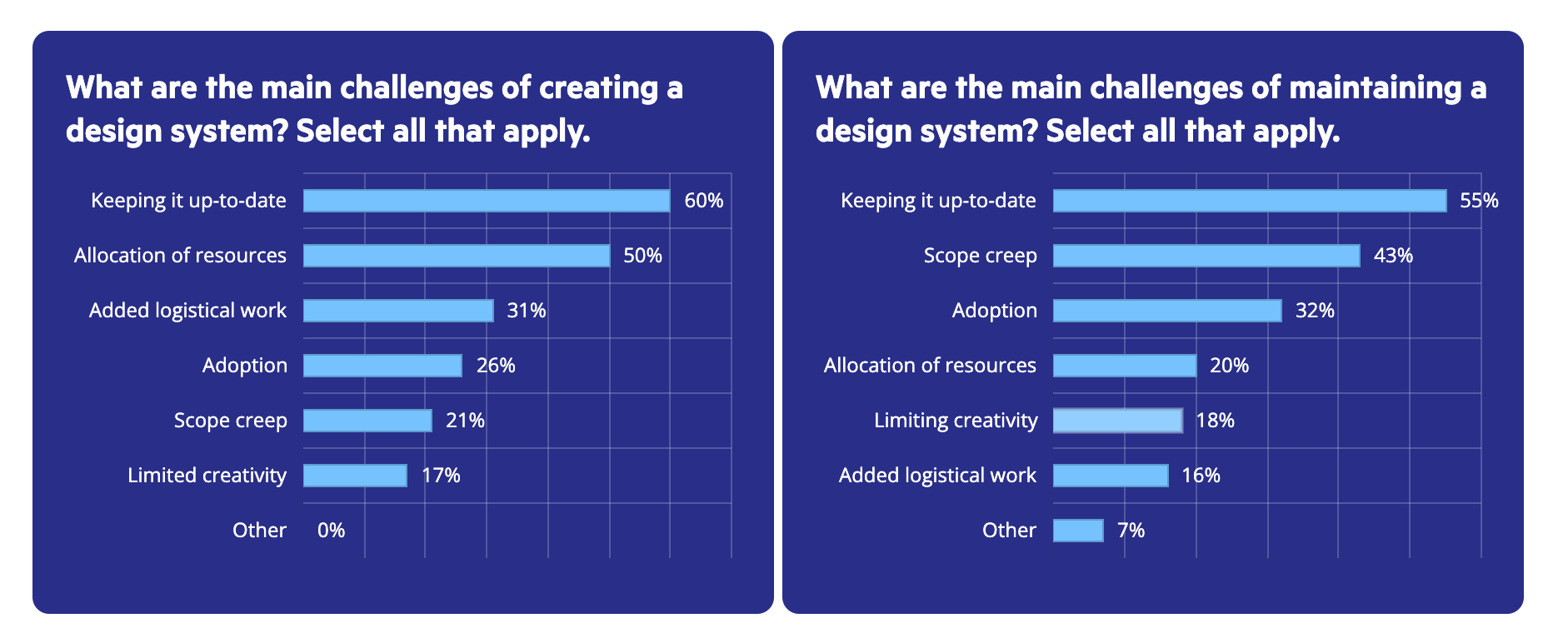
Thankfully, that’s also a non-issue with the KendoReact Charts. As soon as you drop them in, they’re automatically responsive, no further adjustments needed. In many cases, I did specify a height on the bar charts, to make sure there was enough space between the bars—but that was primarily a visual preference (the charts did not require that in order to be responsive). It also wasn’t too hard, only requiring adding a height to the Chart parent element:
<Chart style={{height: 200}}>
Customization
As you can see from a quick visit to the report site, there was a pretty strong brand identity that we needed to match with the visual design of these charts. Progress, like most other companies, has a very specific style guide. Anything we wanted to put on this page needed to look cohesive with the design of other pages on the site/the nav menu/etc. Practically, this meant that I needed to be able to customize the fonts and colors of all the charts.
Since I needed to handle the visual design of the entire page (not just the charts), I chose to define my styles in Progress ThemeBuilder and just export the Sass. This saved me a ton of time, as compared to writing the Sass by hand—and honestly, I’m pretty handy with CSS, so that’s saying something.
By defining all my colors and styles in ThemeBuilder, I could live preview how my charts and other components would look.
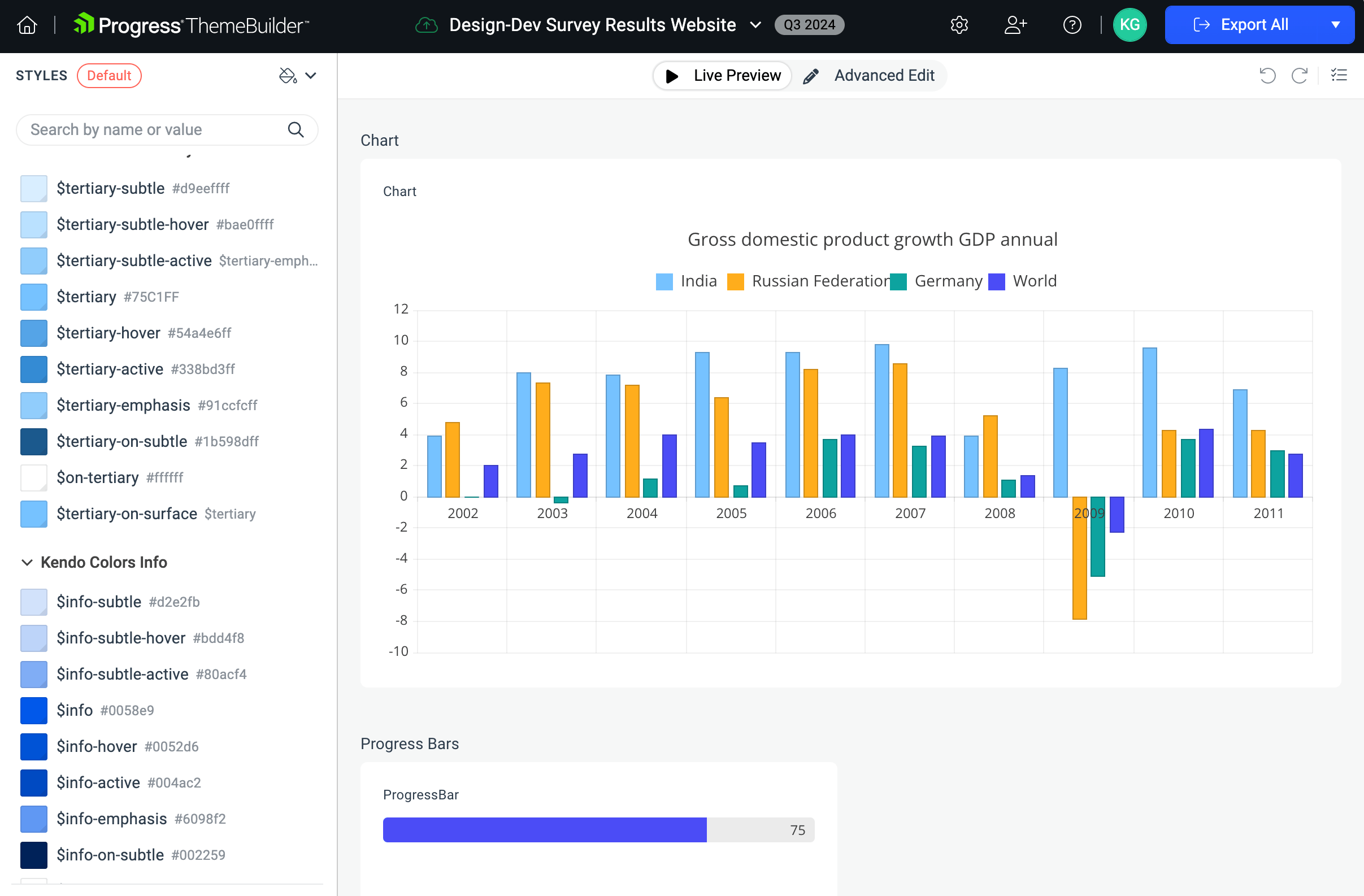
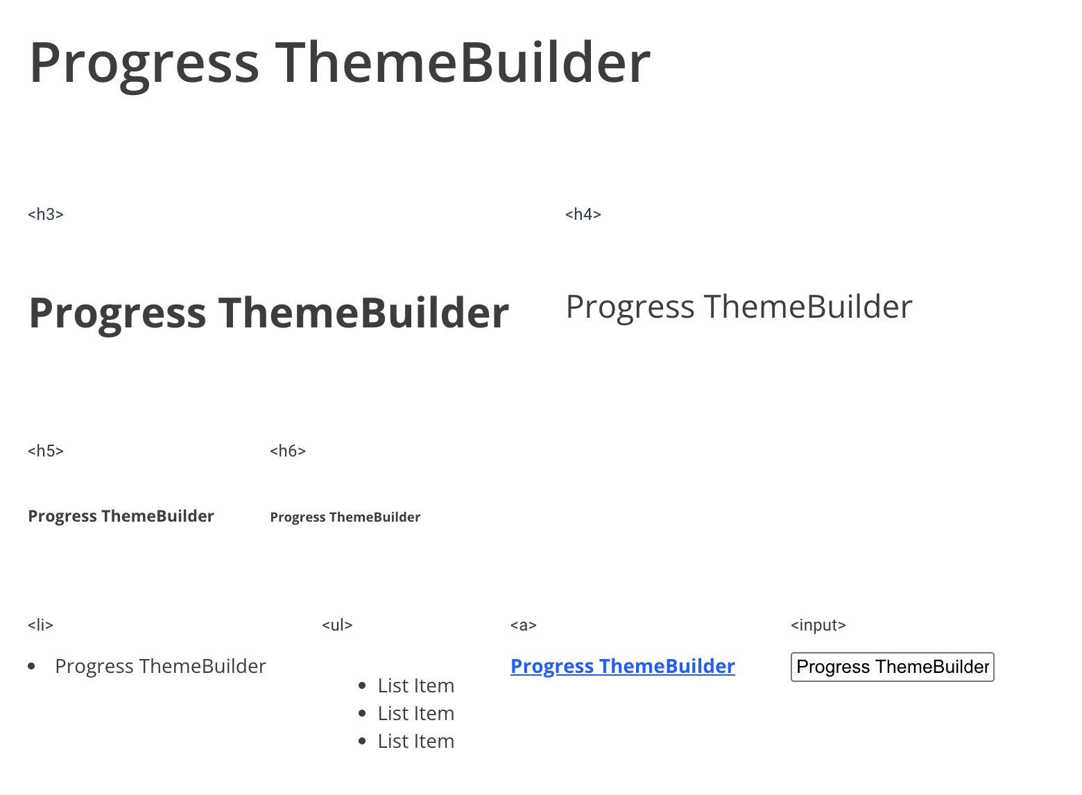
In addition to the KendoReact components, I also handled all the basic HTML element styling through ThemeBuilder as well: headers, links, bulleted lists, paragraphs, etc. That was a huge help—since (by nature) a report means a lot of text, those basic elements were used around every chart. Being able to style them in the same place as the components and keep all my CSS managed in one place was a huge benefit.
Accessibility
Because the descriptive sections of the report were mostly plain text, there was very little to worry about from an accessibility standpoint—after all, regular old header and paragraph tags are just about as accessible as it gets.
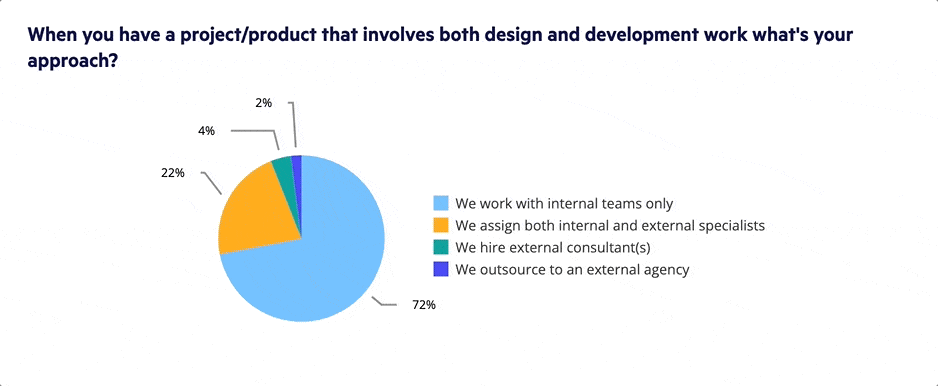
However, charts (as we all know) are a different story. Often, charts on the web are flat images, which means they have to rely entirely on alt text to be understandable to our visually impaired users. If a chart isn’t just an image, it’s often because it has some interactive elements (such as clicking to highlight / isolate specific elements) … but those tend to be difficult—or even impossible—to use if you’re navigating with a keyboard or other alternative input device.
The KendoReact charts, on the other hand, don’t have those issues. They’re entirely keyboard-navigable, which means that you can do all the cool interactive stuff with them—no matter what you’re using as an input device. Here’s an example of toggling on and off sections of the pie chart using only the keyboard:
On top of that, the charts also play nice with screen readers! Obviously that’s a little harder to capture in a format that can be included in a blog … but I did my best. Here’s a clip of VoiceOver on OS X narrating the point values of a bar chart (also using only keyboard navigation):
Often, our users who rely on accessibility features get left behind when it comes to charts and other forms of data visualization. While we can help mitigate inaccessible charts by providing summaries and descriptions, it’s infinitely better if our users can interpret the data themselves—and with KendoReact charts, they can.
Speed
All those other things are well and good—but only of limited value if it takes hours to create a single chart. If you’re creating them from scratch, it will take ages. Sometimes, even if you’re using a library, the amount of customization and manual adjustment it takes to get what you want means that you’re still not actually saving that much time. The KendoReact charts, however, are quick and easy to implement.
If you’re using the ThemeBuilder (as I was) then the high-level styles (fonts and colors) will already be applied as soon as you add the new chart to the page. There was a small upfront investment of time for setting the chart configurations the way I wanted them for this project: customizing the unit types to percentages, removing the x-axis labels on the bar charts and setting the labels to appear to the right of each bar, adjusting where the legend appears in the pie charts, etc. Once that had been done once, though, it was easy enough to duplicate the chart and update the data.
Data binding is flexible, and can be handled via arrays or objects, so whatever form you have the data in already, you probably won’t have to change it. Even with the customizations I made, each chart had fewer than 50 lines of code—and that’s including imports and other boilerplate! It’s pretty much plug-and-play; what’s not to love about that?
Try Them Yourself!
The Kendo UI component libraries combine form and function, offering over 100 intuitive and feature-rich components that are all highly customizable and made with the developer—and end user—experience in mind. If you want a quick and easy way to start integrating beautiful, responsive and fully accessible charts into your React apps, look no further. Check out the KendoReact UI component library, and give it a shot—completely free for 30 days!
Of course, make sure you check out our survey results webpage to see all those charts in action—and while you’re there, you’ll certainly want to download the full report to get all the extra data analysis and interesting cross-sections. We think there’s a lot to learn, and it’s packed with helpful tips for improving the collaborative process at your workplace.

Kathryn Grayson Nanz
Kathryn Grayson Nanz is a developer advocate at Progress with a passion for React, UI and design and sharing with the community. She started her career as a graphic designer and was told by her Creative Director to never let anyone find out she could code because she’d be stuck doing it forever. She ignored his warning and has never been happier. You can find her writing, blogging, streaming and tweeting about React, design, UI and more. You can find her at @kathryngrayson on Twitter.
Related Posts
Comments
All articles
Topics
Web MobileMobile
Desktop
Design
Productivity
People
