
Crypto Financial Charts in .NET MAUI Apps

Summarize with AI:
In a volatile market like cryptocurrency, users need easy-to-read, real-time data visualization. The .NET MAUI Financial Chart can help!
For me, technology is like “a snowball that never stops growing,” especially in recent years—and this is extremely good for us! Every step forward is designed so that, as developers, we can make users’ lives easier through our apps, particularly in a world that is constantly moving and where new needs always arise.
One clear example of this is applications that work with crypto. It’s a space where users make many important decisions, since money is involved. So, what matters the most here?
- That it’s a reliable app.
- And a transparent one.
Therefore, user experience is key to the growth of this type of app.
And speaking of transparency, the cryptocurrency market is extremely volatile. That’s why users need to visualize in real time how trends are changing and, based on what they see, analyze and decide whether to buy or not.
Now, imagine this information being very heavy to read … just a raw table of unprocessed data, where users would still have to do extra calculations before making clear decisions. This could lead to them being unable to quickly interpret market behavior—and therefore unable to make agile decisions, which is definitely not good.
That’s why a financial chart fits perfectly in this kind of app, because it:
- Makes the information more attractive and understandable for decision-making.
- Allows interactivity with the data presented.
- Keeps your app cleaner and more elegant, since you don’t need to display an overload of raw data.
That’s why today you’ll dive deeper into a super interesting option: the .NET MAUI Financial Chart. Let’s explore it together!
What Is the Telerik Financial Chart for .NET MAUI?
The .NET MAUI Financial Chart is a component that delivers financial visualizations in a way that is both digestible and intuitive for users. It is primarily used to track stock prices and analyze patterns of price changes over time.
Here’s an example of how this component looks:
✍️ This control is part of the Progress Telerik UI for .NET MAUI component library, which offers more than 60 professionally designed UI components—ideal for building modern, cross-platform applications with a polished user experience.
Types of Financial Charts and Indicators
While the Financial Chart provides the foundation for visualizing market data, financial indicators also come into play.
- Charts focus on displaying raw price movements.
- While indicators apply formulas to those prices to reveal trends, momentum or volatility.
The combination of both turns raw data into actionable information, giving the user a more complete view of the market. Let’s take a closer look at them.
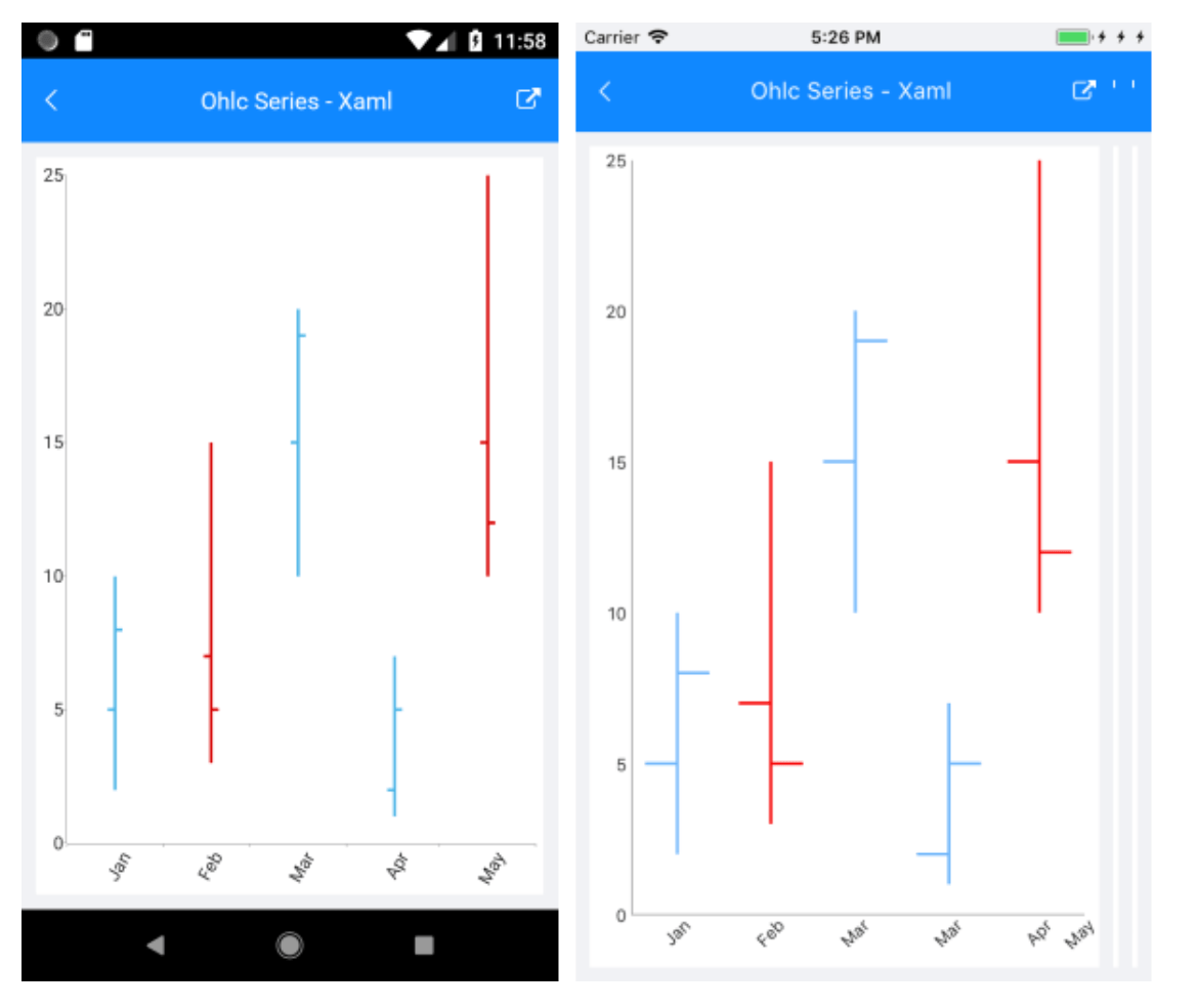
.NET MAUI Chart OHLC Series
OHLC comes from the initials Open, High, Low, Close. It condenses all the key information about an asset’s behavior within a period of time into a single element. It’s one of the most widely used formats in market analysis.
To better understand it visually, each data point in an OHLC chart is displayed with a combination of lines and marks:
- A vertical line that goes from the lowest price reached to the highest during the period.
- A horizontal mark on the left side of the line indicating the opening price.
- A horizontal mark on the right side of the line indicating the closing price.
This allows a single figure to show the full price range (high and low) and the exact price at which the period started and ended.
In summary, these calculations allow you to:
- Know whether the price closed above or below the opening
- See how much an asset varied between the maximum and minimum (volatility)
- Identify behavior patterns
The .NET MAUI Chart OHLC Series is implemented within a RadCartesianChart. This control expects the four values (open, high, low, close) as parameters, and, based on them, it draws the figure!
An example of its main implementation code would be the following:
<telerik:RadCartesianChart PaletteName="Light"
SelectionPaletteName="LightSelected"
BackgroundColor="White" >
    <telerik:RadCartesianChart.BindingContext>
	    <local:SeriesOhlcViewModel />
	    </telerik:RadCartesianChart.BindingContext>
		    <telerik:RadCartesianChart.HorizontalAxis>
		    <telerik:DateTimeContinuousAxis LineColor="#A9A9A9"
		    LabelFitMode="Rotate"
		    LabelFormat="MMM"
		    PlotMode="BetweenTicks"
		    MajorStepUnit="Month"/>
		    </telerik:RadCartesianChart.HorizontalAxis>
		    <telerik:RadCartesianChart.VerticalAxis>
		    <telerik:NumericalAxis LineColor="#A9A9A9"
	    MajorTickBackgroundColor="#A9A9A9" />
    </telerik:RadCartesianChart.VerticalAxis>
    <telerik:RadCartesianChart.Series>
	    <telerik:OhlcSeries CategoryBinding="Category"
	    OpenBinding="Open"
	    HighBinding="High"
	    LowBinding="Low"
	    CloseBinding="Close"
	    ItemsSource="{Binding SeriesData}" />
    </telerik:RadCartesianChart.Series>
</telerik:RadCartesianChart>
⚠️ In this example, I only added the implementation in XAML. Remember that you must also create your models.
And visually, it would look as follows:
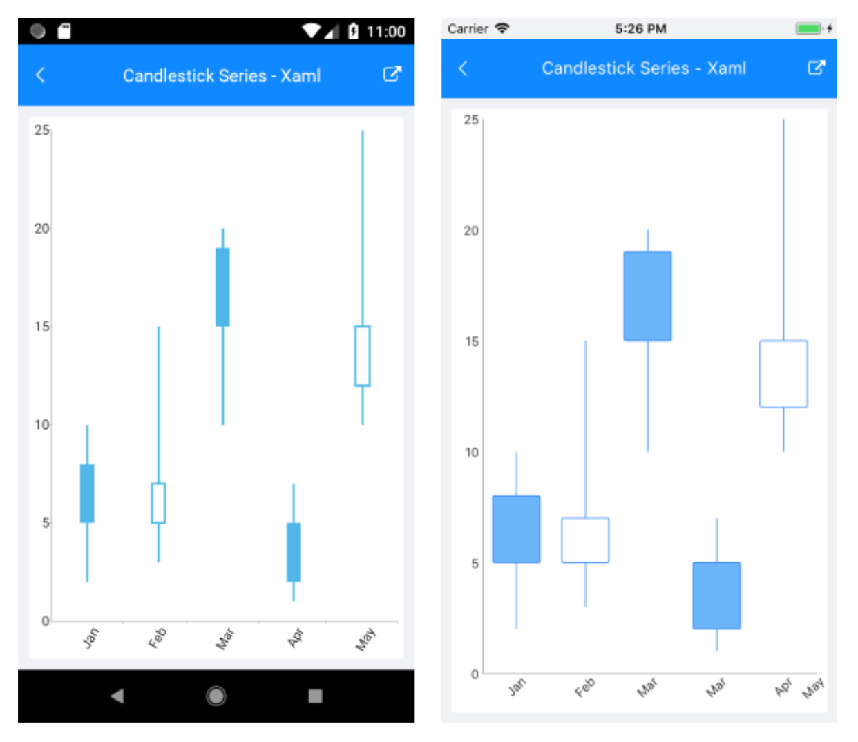
.NET MAUI Chart Candlestick Series
This is another very popular way of representing the financial data of an asset. It’s one of the most commonly used methods by traders and technical analysts, as it allows them to quickly understand market ups and downs, identify trends and detect classic chart patterns. As a fun fact, its name comes from its visual resemblance to a candle.
Just like the OHLC Series, a candlestick uses four fundamental market values: Open, High, Low and Close.
With these values, the chart represents:
- The body of the candle (rectangle): Shows the difference between opening and closing
- The wicks (thin lines above and below): Show the highest and lowest prices reached during the period
You can interpret that chart as follows:
- If the closing price is higher than the opening → the candle is usually shown in green (or hollow), indicating the price went up.
- If the closing price is lower than the opening → the candle is usually shown in red (or filled), indicating the price went down.
Just like OHLC, this is also implemented within a RadCartesianChart. In code, its implementation in XAML would look something like this:
<telerik:RadCartesianChart PaletteName="Light"
    SelectionPaletteName="LightSelected"
    BackgroundColor="White" >
	    <telerik:RadCartesianChart.BindingContext>
		    <local:SeriesOhlcViewModel />
		    </telerik:RadCartesianChart.BindingContext>
		    <telerik:RadCartesianChart.HorizontalAxis>
		    <telerik:DateTimeContinuousAxis LineColor="#A9A9A9"
		    LabelFitMode="Rotate"
		    LabelFormat="MMM"
		    PlotMode="BetweenTicks"
		    MajorStepUnit="Month"/>
		    </telerik:RadCartesianChart.HorizontalAxis>
		    <telerik:RadCartesianChart.VerticalAxis>
		    <telerik:NumericalAxis LineColor="#A9A9A9"
		    MajorTickBackgroundColor="#A9A9A9" />
		    </telerik:RadCartesianChart.VerticalAxis>
	    <telerik:RadCartesianChart.Series>
		    <telerik:CandlestickSeries CategoryBinding="Category"
		    OpenBinding="Open"
		    HighBinding="High"
		    LowBinding="Low"
		    CloseBinding="Close"
		    ItemsSource="{Binding SeriesData}" />
    </telerik:RadCartesianChart.Series>
</telerik:RadCartesianChart>
⚠️ In this example, I only added your implementation in XAML. Remember that you must also create your models.
And visually, it would look as follows:
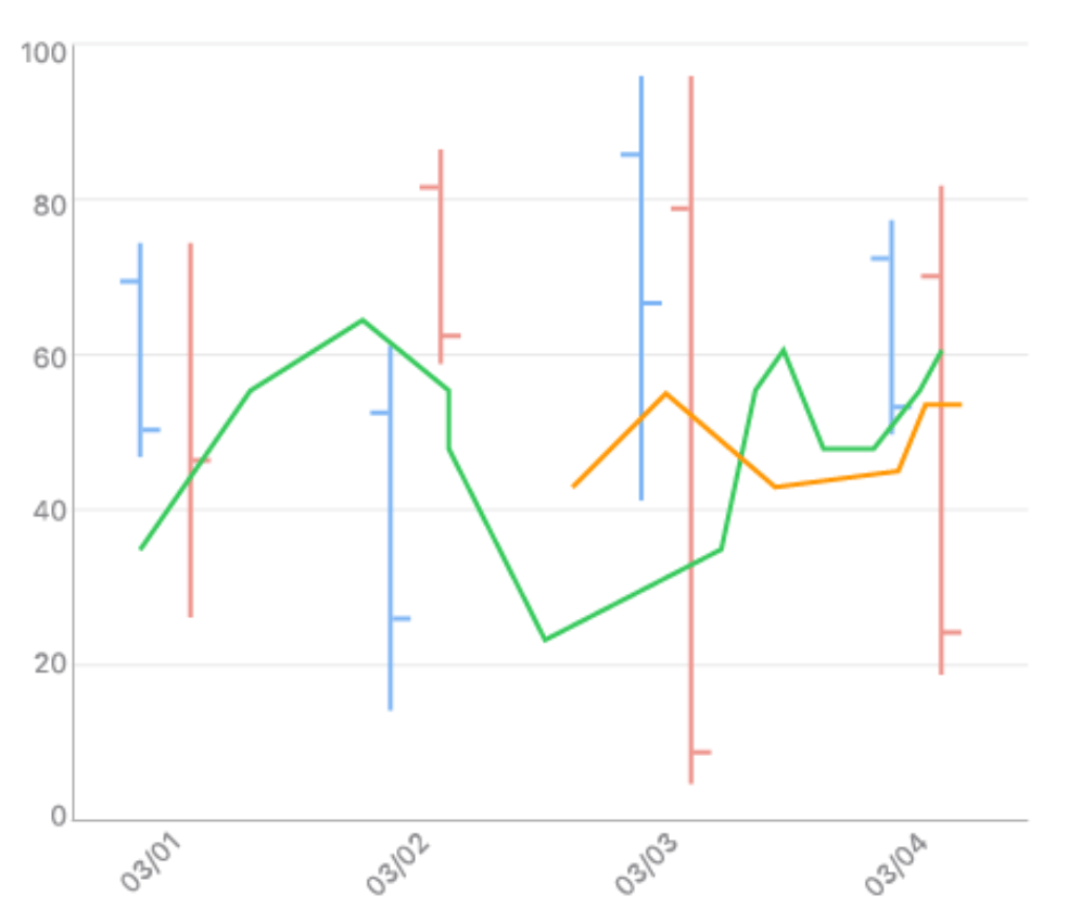
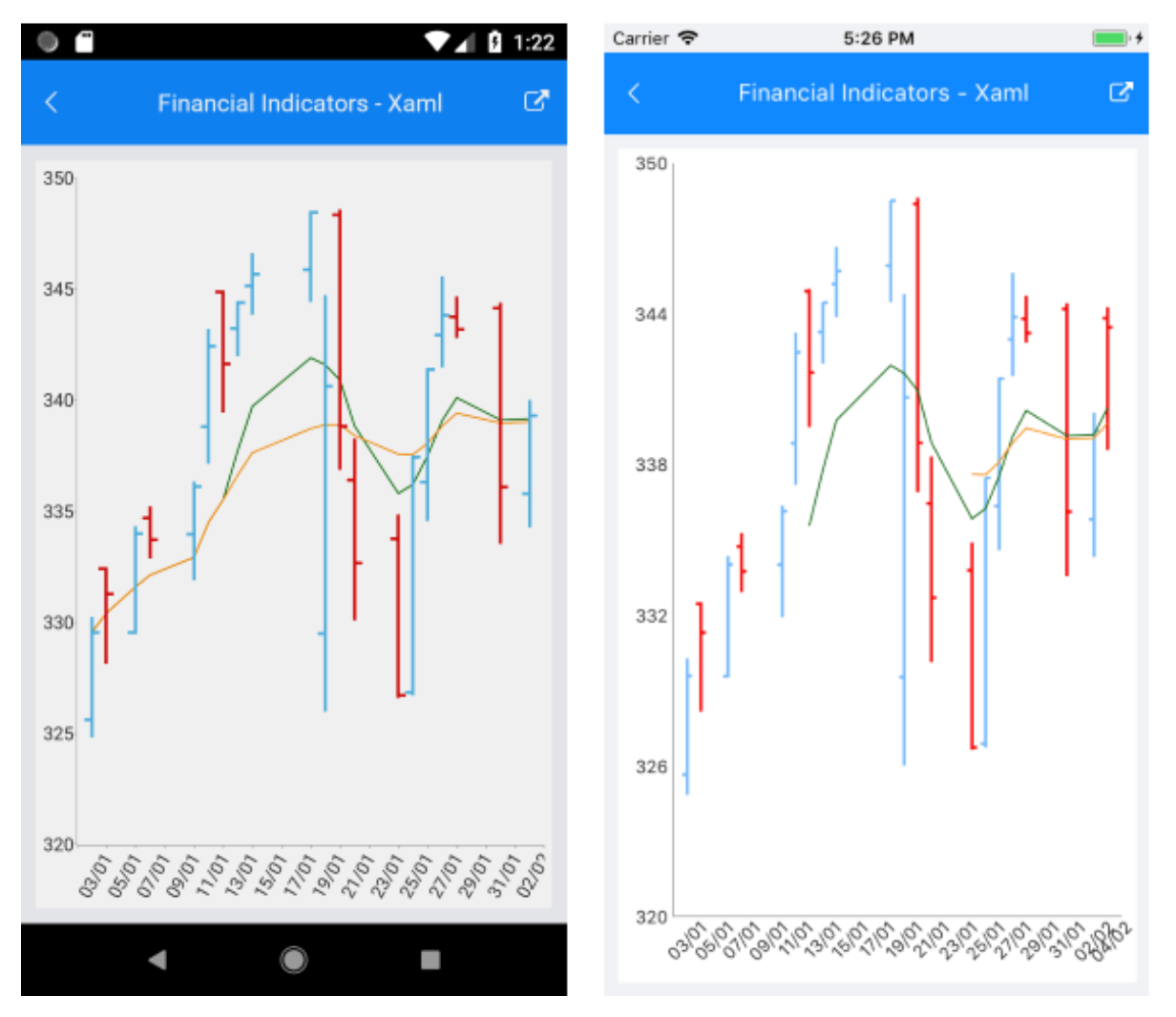
.NET MAUI Chart Financial Indicators
These are used to track stock prices and patterns of price changes over time. The financial indicators also use the RadCartesianChart, so you must add them in the same way you add any other Cartesian series.
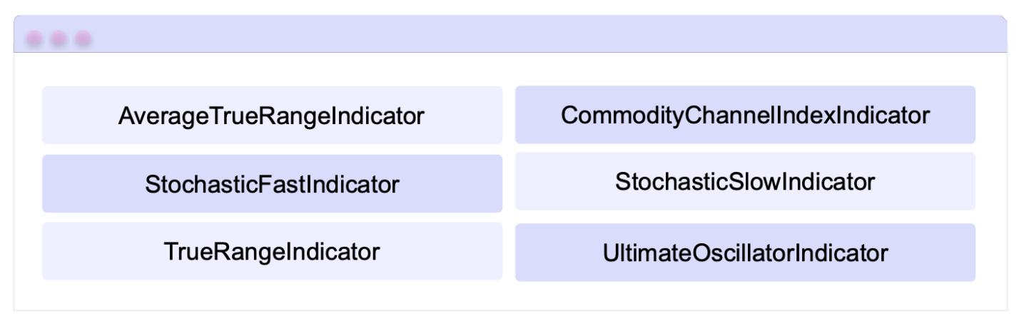
When configuring financial indicators in a RadCartesianChart, there are two main groups:
- Indicators based on category + a single value (usually Close) and one or more periods: These allow you to measure trends, momentum and volatility from the closing price and defined periods, and they are the following:
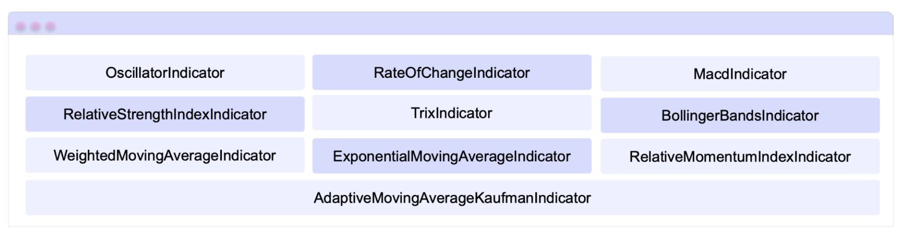
- Indicators based on category + High/Low/Close values and none, one or more periods: These focus on volatility and oscillators that compare closing prices against price ranges, and they are the following:
In code, its implementation in XAML would look something like this:
<telerik:RadCartesianChart PaletteName="Light"
    SelectionPaletteName="LightSelected"
    BackgroundColor="White" >
	    <telerik:RadCartesianChart.BindingContext>
	    <local:ViewModel />
		    </telerik:RadCartesianChart.BindingContext>
		    <telerik:RadCartesianChart.HorizontalAxis>
		    <telerik:DateTimeContinuousAxis LineColor="#A9A9A9"
		    LabelFitMode="Rotate"
		    LabelFormat="dd/MM"
		    PlotMode="BetweenTicks"
		    MajorStep="2"
		    MajorStepUnit="Day"/>
		    </telerik:RadCartesianChart.HorizontalAxis>
		    <telerik:RadCartesianChart.VerticalAxis>
	    <telerik:NumericalAxis LineColor="#A9A9A9"
	    Minimum="320"
	    Maximum="350"
	    MajorTickBackgroundColor="#A9A9A9" />
		    </telerik:RadCartesianChart.VerticalAxis>
		    <telerik:RadCartesianChart.Series>
		    <telerik:OhlcSeries CategoryBinding="Category"
		    DisplayName="AppleStocks-OHLC"
		    OpenBinding="Open"
		    HighBinding="High"
		    LowBinding="Low"
		    CloseBinding="Close"
		    ItemsSource="{Binding SeriesData}"/>
		    <telerik:ExponentialMovingAverageIndicator CategoryBinding="Category"
		    DisplayName="EMA 7days"
			    ValueBinding="Close"
			    Period="7"
			    StrokeThickness="1"
			    Stroke="DarkGreen"
		    ItemsSource="{Binding SeriesData}"/>
		    <telerik:ExponentialMovingAverageIndicator CategoryBinding="Category"
		    DisplayName="EMA 14days"
			    ValueBinding="Close"
			    Period="14"
			    StrokeThickness="1"
			    Stroke="DarkOrange"
		    ItemsSource="{Binding SeriesData}"/>
    </telerik:RadCartesianChart.Series>
</telerik:RadCartesianChart>
And visually, it would look as follows:
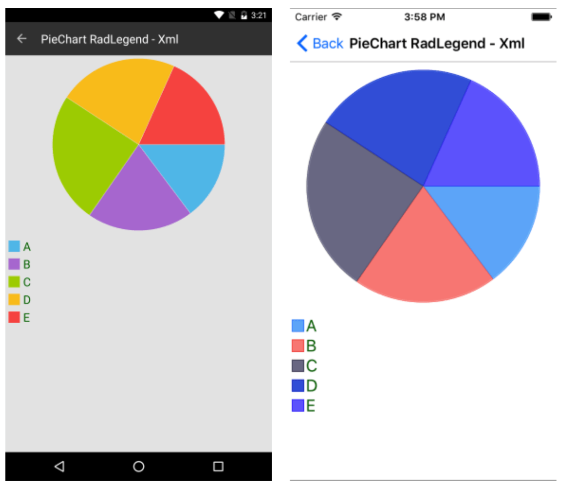
Legend Support
The Financial Chart also makes it easy to add descriptions for the series visualized within the control. This is especially useful when you have multiple series in the same chart, allowing users to quickly identify what each line or figure represents, making the chart clearer and easier to interpret.
How to Use It
Let’s look at an example using a PieChart:
- Initialize a
RadLegendobject and link it to a chart type (PieChartin our example). This is done through theLegendProviderproperty.
<telerik:RadPieChart x:Name="pieChart" HeightRequest="300">
  <telerik:RadCartesianChart.BindingContext>
   <local:ViewModel />
  </telerik:RadCartesianChart.BindingContext>
  <telerik:RadPieChart.Series>
    <telerik:PieSeries DisplayName="Value" LegendTitleBinding="Category" ItemsSource="{Binding Data1}" ValueBinding="Value"/>
  </telerik:RadPieChart.Series>
 </telerik:RadPieChart>
 <telerik:RadLegend HeightRequest="200"
 LegendItemFontColor="DarkGreen"
 LegendItemFontSize="20"
LegendProvider="{x:Reference Name=pieChart}"/>
- Define a
ViewModelwith categorical data collections that feed the chart series.
public class ViewModel
  {
    public ViewModel()
    {
	   this.Data1 = GetCategoricalData();
	   this.Data2 = GetCategoricalData2();
	   this.Data3 = GetCategoricalData3();
    }

    public ObservableCollection<CategoricalData> Data1 { get; set; }
    public ObservableCollection<CategoricalData> Data2 { get; set; }
    public ObservableCollection<CategoricalData> Data3 { get; set; }

    private static ObservableCollection<CategoricalData> GetCategoricalData()
    {
      var data = new ObservableCollection<CategoricalData> {
	      new CategoricalData { Category = "A", Value = 0.63 },
	      new CategoricalData { Category = "B", Value = 0.85 },
	      new CategoricalData { Category = "C", Value = 1.05 },
	      new CategoricalData { Category = "D", Value = 0.96 },
	      new CategoricalData { Category = "E", Value = 0.78 },
      };
      return data;
    }

    private static ObservableCollection<CategoricalData> GetCategoricalData2()
    {
      var data = new ObservableCollection<CategoricalData> {
	      new CategoricalData { Category = "A", Value = 0.13 },
	      new CategoricalData { Category = "B", Value = 0.35 },
	      new CategoricalData { Category = "C", Value = 0.55 },
	      new CategoricalData { Category = "D", Value = 0.46 },
	      new CategoricalData { Category = "E", Value = 0.28 },
      };
      return data;
    }

    private static ObservableCollection<CategoricalData> GetCategoricalData3()
    {
      var data = new ObservableCollection<CategoricalData> {
        new CategoricalData { Category = "A", Value = 1.63 },
        new CategoricalData { Category = "B", Value = 1.85 },
        new CategoricalData { Category = "C", Value = 2.05 },
        new CategoricalData { Category = "D", Value = 1.96 },
        new CategoricalData { Category = "E", Value = 1.78 },
      };
      return data;
    }
 }
Each series can have a DisplayName or a LegendTitleBinding, which will appear as items in the legend.
And you will have a result like the following:
Annotations
Annotations are very useful when you need to draw the user’s attention to a specific data point or area within a chart (for example, marking an unusual peak), and you can also use them in this control! 😎
The Chart supports the following types of annotations:
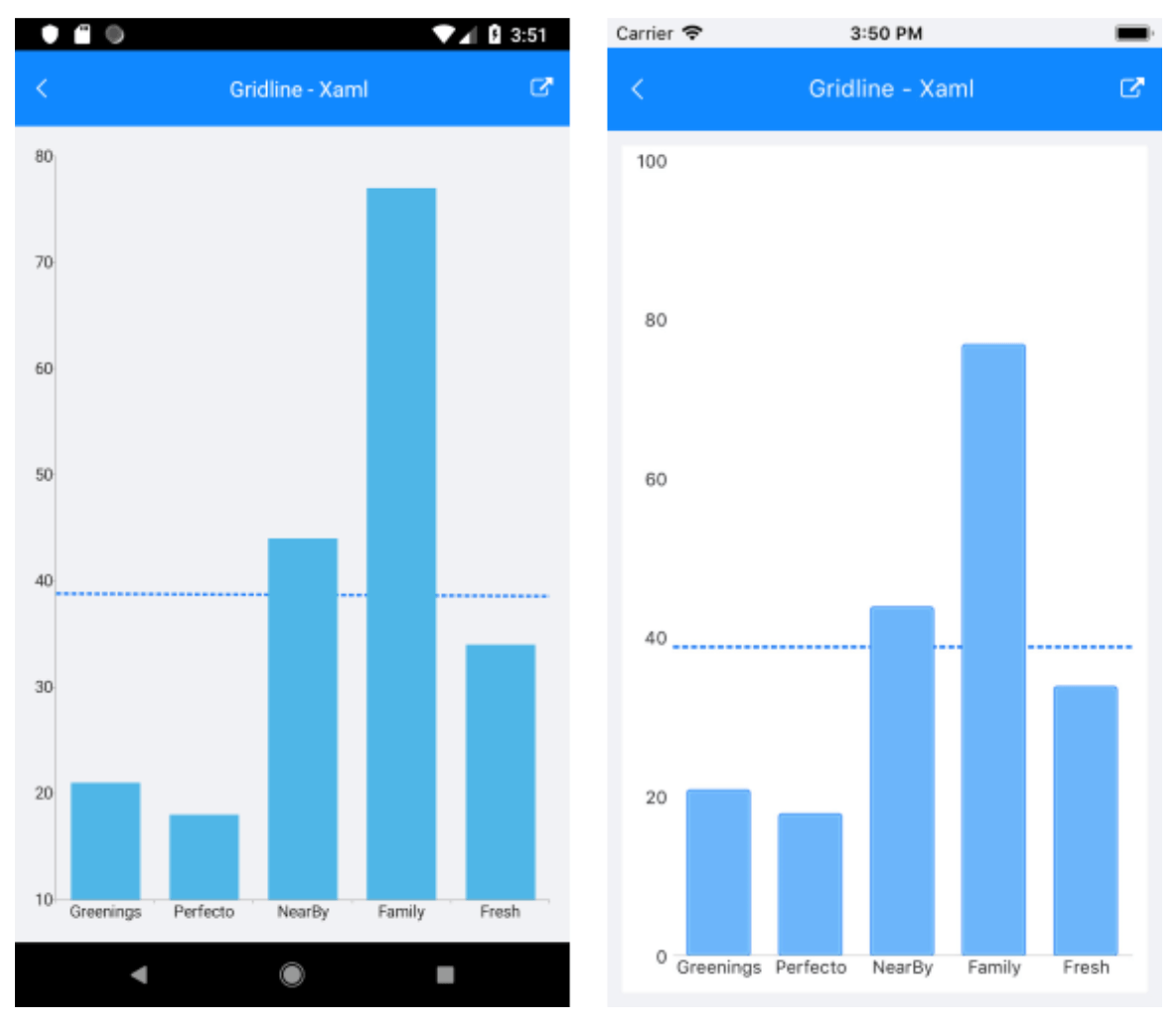
➖ CartesianGridLineAnnotation
This is an annotation that draws a straight line (vertical or horizontal) across the entire chart to mark a specific value on the Cartesian axis.
It provides the following features:
- Axis: Must be explicitly associated with a horizontal or vertical Cartesian axis
- Value: Specifies the exact point on the associated axis where the line is drawn
Let’s see a code example. First, let’s see an example of a ViewModel:
public class ViewModel
{
    public ObservableCollection<CategoricalData> Data { get; set; }
    public double Threshold { get; set; }

public ViewModel()
{
    this.Data = GetCategoricalData();
    this.Threshold = this.Data.Average(data => data.Value);
}

private static ObservableCollection<CategoricalData> GetCategoricalData()
{
    var data = new ObservableCollection<CategoricalData>
    {
    new CategoricalData { Category = "Greenings", Value = 21 },
    new CategoricalData { Category = "Perfecto", Value = 18 },
    new CategoricalData { Category = "NearBy", Value = 44 },
    new CategoricalData { Category = "Family", Value = 77 },
    new CategoricalData { Category = "Fresh", Value = 34 },
};
return data;
}
}
And then the RadChart in XAML:
<telerik:RadCartesianChart>
	    <telerik:RadCartesianChart.BindingContext>
    <local:ViewModel />
	    </telerik:RadCartesianChart.BindingContext>
	    <telerik:RadCartesianChart.HorizontalAxis>
	    <telerik:CategoricalAxis LabelFitMode="MultiLine" />
	    </telerik:RadCartesianChart.HorizontalAxis>
	    <telerik:RadCartesianChart.VerticalAxis>
	    <telerik:NumericalAxis x:Name="verticalAxis" />
	    </telerik:RadCartesianChart.VerticalAxis>
	    <telerik:RadCartesianChart.Series>
	    <telerik:BarSeries ValueBinding="Value"
	    CategoryBinding="Category"
	    ItemsSource="{Binding Data}" />
	    </telerik:RadCartesianChart.Series>
	    <telerik:RadCartesianChart.Annotations>
	    <telerik:CartesianGridLineAnnotation Stroke="#0E72F6"
	    StrokeThickness="2"
	    Axis="{x:Reference verticalAxis}"
	    Value="{Binding Threshold}">
	    <telerik:CartesianGridLineAnnotation.DashArray>
		    <x:Array Type="{x:Type x:Double}">
		    <x:Double>4.0</x:Double>
		    <x:Double>2.0</x:Double>
	    </x:Array>
	    </telerik:CartesianGridLineAnnotation.DashArray>
	    </telerik:CartesianGridLineAnnotation>
    </telerik:RadCartesianChart.Annotations>
</telerik:RadCartesianChart>
And you will have a result like the following:
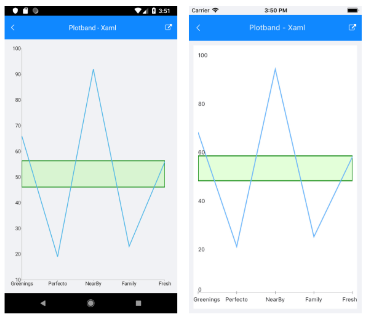
➖ CartesianPlotBandAnnotation
This is an annotation that draws a horizontal or vertical band across the chart to highlight a specific range on the Cartesian axis.
It provides the following features:
- Axis: Must be explicitly associated with a horizontal or vertical Cartesian axis
- From: The starting value of the plot band
- To: The ending value of the plot band
- Fill: Defines the fill color of the band
Let’s see a code example, first of a ViewModel:
public class ViewModel
{
public ObservableCollection<CategoricalData> Data { get; set; }
public double StartThreshold { get; private set; }
public double EndThreshold { get; private set; }

public ViewModel()
{
    this.Data = GetCategoricalData();
    var threshold = this.Data.Average(data => data.Value);
    this.StartThreshold = threshold * 0.9;
    this.EndThreshold = threshold * 1.1;
}

private static ObservableCollection<CategoricalData> GetCategoricalData()
{
var data = new ObservableCollection<CategoricalData>
{
    new CategoricalData { Category = "Greenings", Value = 66 },
    new CategoricalData { Category = "Perfecto", Value = 19 },
    new CategoricalData { Category = "NearBy", Value = 92 },
    new CategoricalData { Category = "Family", Value = 23 },
    new CategoricalData { Category = "Fresh", Value = 56 },
};
return data;
}
}
And then the RadChart in XAML:
<telerik:RadCartesianChart>
    <telerik:RadCartesianChart.BindingContext>
    <local:ViewModel />
    </telerik:RadCartesianChart.BindingContext>
    <telerik:RadCartesianChart.HorizontalAxis>
    <telerik:CategoricalAxis LabelFitMode="MultiLine"
    PlotMode="OnTicks" />
    </telerik:RadCartesianChart.HorizontalAxis>
    <telerik:RadCartesianChart.VerticalAxis>
    <telerik:NumericalAxis x:Name="verticalAxis" />
    </telerik:RadCartesianChart.VerticalAxis>
    <telerik:RadCartesianChart.Series>
    <telerik:LineSeries ValueBinding="Value"
    CategoryBinding="Category"
    ItemsSource="{Binding Data}" />
    </telerik:RadCartesianChart.Series>
    <telerik:RadCartesianChart.Annotations>
    <telerik:CartesianPlotBandAnnotation StrokeThickness="2"
    Stroke="Green"
    Fill="#2F66FF33"
    Axis="{x:Reference verticalAxis}"
    From="{Binding StartThreshold}"
    To="{Binding EndThreshold}" />
    </telerik:RadCartesianChart.Annotations>
</telerik:RadCartesianChart>
And you will have a result like the following:
Conclusion
✨ That’s it! In just a few minutes, you’ve learned valuable insights about the Telerik UI for .NET MAUI Financial Chart component. It’s super useful and saves you time by performing complex trend calculations for you.
🚀 This way, if you implement it in your applications, your users will appreciate it since it provides great value for their decision-making.
To see a full crypto app, check out the .NET MAUI Crypto Tracker App demo. It’s one of the example .NET MAUI apps Progress offers, so you can access the code for the crypto sample app.
If you have any questions, feel free to leave a comment or reach out—I’m happy to help!
See you in the next one! 🙋♀️💚
References
The code explanations have been taken from the official documentation.
- https://www.telerik.com/maui-ui/financial-chart
- https://docs.telerik.com/devtools/maui/controls/chart/series/financial/ohlc-series
- https://docs.telerik.com/devtools/maui/controls/chart/series/financial/candlestick-series
- https://docs.telerik.com/devtools/maui/controls/chart/series/financial/financial-indicators
- https://docs.telerik.com/devtools/maui/controls/chart/legend
- https://docs.telerik.com/devtools/maui/controls/chart/annotations

Leomaris Reyes
Leomaris Reyes is a software engineer from the Dominican Republic specializing in mobile development. She is a 7-time Microsoft MVP and actively builds mobile applications while sharing practical knowledge through technical articles and developer-focused content.
Through her work, she explains programming concepts, developer tools and real-world development practices to help developers grow in their careers.
You can follow her on Instagram and TikTok at @leomarisreyes.dev, read her articles on AskXammy, and connect with her on LinkedIn, where she shares tutorials, insights and resources for developers.
Related Posts
Comments
All articles
Topics
Web MobileMobile
Desktop
Design
Productivity
People
