All About the Telerik WPF DataGrid

Summarize with AI:
In this article we will take a deep dive into the Telerik WPF DataGrid and its key features, as well as how to load data into the component, optimize for performance, and style and customize it for a more modern and personal look and feel.

Ever heard of DataGrids, GridViews or simply Grids? Well, if you are an application developer, the chances you have are quite high, as they can be found in just about any application that provides data management to its users - and for good reason.
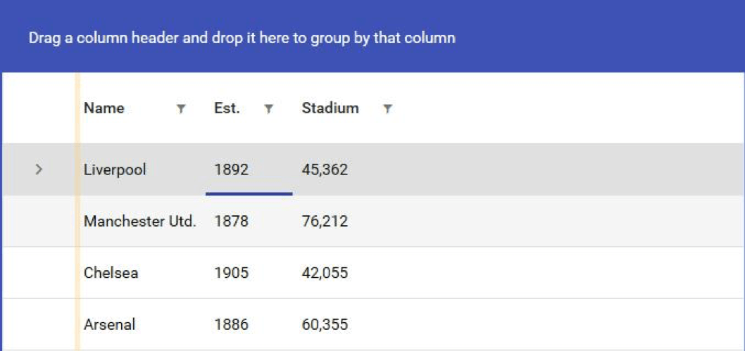
If you are new to the topic, a DataGrid is an application control that displays data in a customizable - you guessed it - grid. Data grids provide you with a powerful and flexible way to display data to your application’s users in a tabular format, where the data can be either read-only or editable by the user depending on the use case.
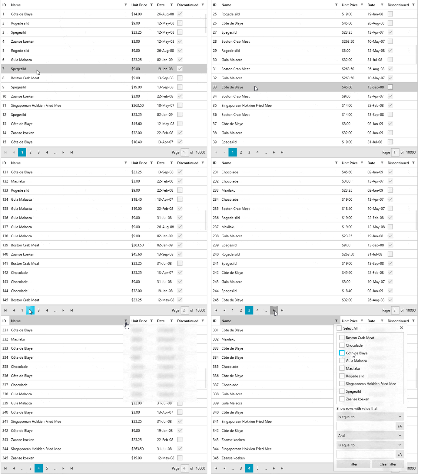
Data displayed in a table with rows and columns is both easy to manipulate and represent, thanks to a variety of features, such as filtering, sorting and grouping. In this “big data”-driven world we live in today, people often work with huge data sets on a daily basis, across manufacturing, finance, banking, healthcare, retail, automotive and other industries. Data needs to be available, manageable and actionable throughout the organization and data grids are the key ingredient for making that happen.
Due to the mass adoption of data grids (think of Microsoft Excel), people are so used to working with Excel-like spreadsheets that they intuitively expect to find the same set of functionalities in anything that even slightly resembles one - be it the airport terminal kiosk, the sales dashboards at work, the internal asset management software, medical records or email clients.
As a consequence of the growing demand, the responsibility to replicate that experience in every single scenario falls on the shoulders of the developer. However, there is a lot to be done to meet the ever growing functionality needs of the user amid frequently changing design paradigms. Developers are left to figure out the best way to proceed.
Anyone who has created an application data grid from scratch can back me up in saying that it can turn out to be a daunting task. This is especially true when trying to provide all the conventional functionalities (grouping, sorting, paging, filtering), while maintaining a great user experience. Trust me - I’ve been there and that’s precisely why I wanted to take the time and dig deeper into the most commonly requested and most frequently used data grid features, and how we’ve tackled them in our Telerik UI for WPF suite.
There are a variety of articles across the web that can help you create a conventional Microsoft default WPF Grid, most of which you've probably already read. So I want to take a different angle here and share insights from my perspective as both a creator and customer of the Telerik WPF DataGrid.

Table of Contents:
(easily navigate to a specific section by clicking on it)
- DataGrids and the Developer Challenge
- Telerik WPF DataGrid Key Features
- Loading the Telerik WPF DataGrid with Data
- DataGrid Performance Tips and Tricks
- How to Style and Customize Your WPF DataGrid

1. DataGrids and the Developer Challenge
Let’s consider the following scenario, as a basis for the topic: You are tasked with building a desktop application for the finance or healthcare industry. Together with your team, you’ve worked for countless hours and created the perfect architecture for your WPF app. You are using DI, MVVM, IoC and are getting the data from a web service, from the cloud or from a database (local or remote), and process it all in a testable and maintainable way. That’s what developers are good at and have done many times. Okay, I agree, that’s more than single scenario, but in any case, you do end up in the same situation:
You must now present that data to the user in a easy to manage way, while also providing a great UI and user experience. This can be challenging and even the best can struggle. In the end, the end users of your application honestly don’t care what architecture you have used, as long as the app can get the job done. So if you are in a similar situation, and don’t want to spend countless hours in development, you might consider checking out the Telerik UI for WPF suite. This suite will be used as the basis of the topics in the following sections and the provided practical examples.
Below is an example of an Outlook-inspired application, which utilizes a few of the most commonly used controls and functionalities in WPF projects.
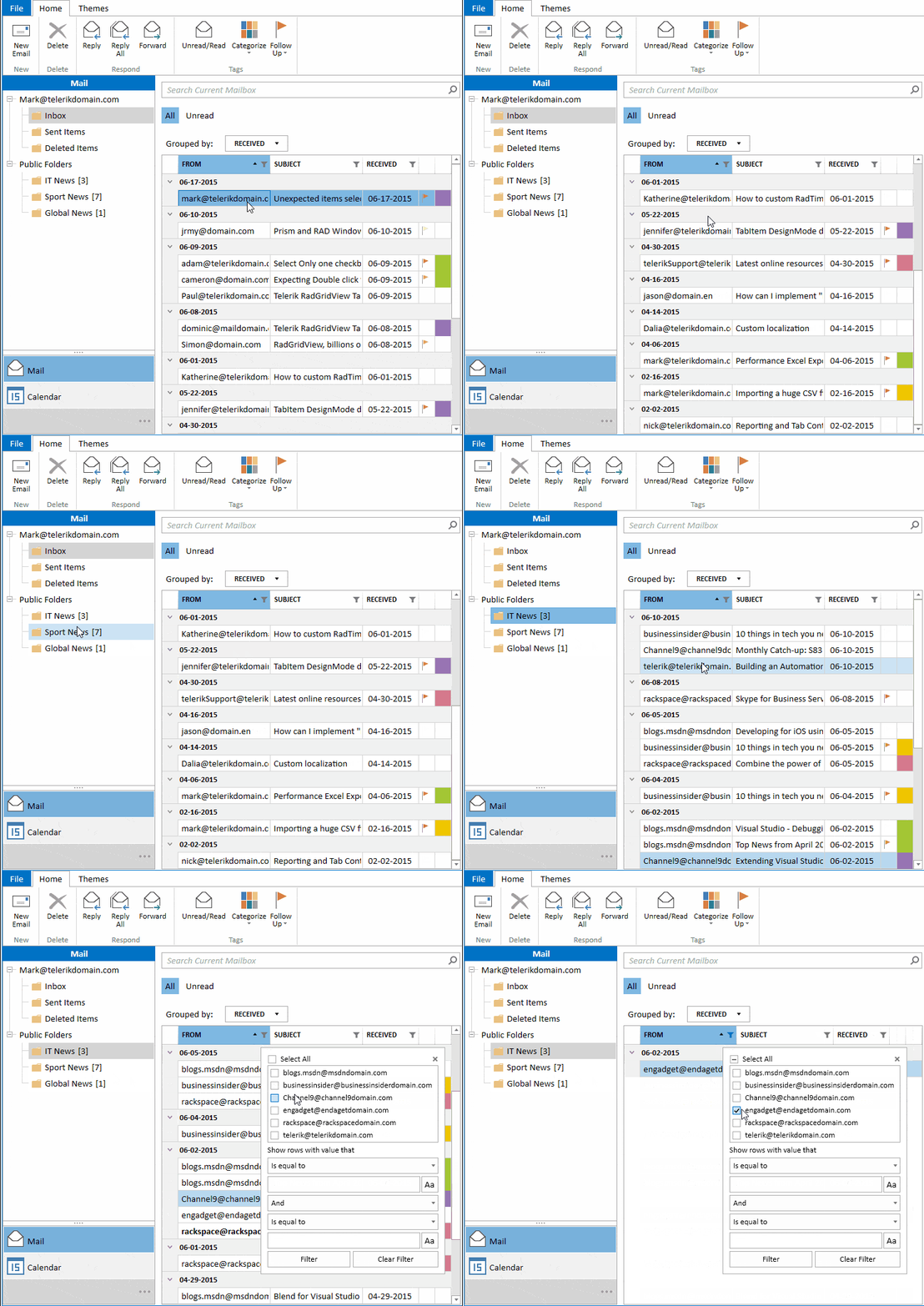
In the sections to follow, we will cover the versatility and features of the toolkit, as well as some of the most commonly used and requested grid functionalities. These include populating and loading data into the grid, improving its performance and, last but not least, how to style and customize it and provide the application’s end users with an outstanding UX. In addition, you can check out the GitHub repository I will be referring to throughout the post.

2. Telerik WPF DataGrid Key Features

The Telerik WPF DataGrid is a powerful and easy-to-use component for desktop applications, which offers a variety of built-in features to cover a the vast majority of scenarios for line-of-business apps.
We're going to cover a lot of ground in this post - feel free to read from the top or to skim to the feature that captures your interest.
- Creating Columns
- Grouping Your Data
- Let’s Not Forget Sorting
- The All-Mighty Filtering
- Paging for Larger Datasets
- Row Details
- Exporting to Various Formats
- Hierarchical Grid
- Managing Data
- Theming
Creating Columns
For the basis of a WPF datagrid we need rows and columns. Rows are obvious - they represent the objects in your data source. Columns on the other hand represent the properties of those objects. Most datagrids support automatic column generation. This feature allows you to show your data with minimal to no configuration. It is great for simple scenarios, or for situations in which the shape of data that will be presented is determined at runtime. Controlling the generated columns can be done using either the familiar Display attribute or the DataGrid AutoGeneratingColumn event. The latter gives you complete control over the generated columns and the generation process itself.
public class Employee
{
    [Display(AutoGenerateField = false)]
    public string FirstName { get; set; }

    [Display(AutoGenerateField = false)]
    public string LastName { get; set; }

    [Display(AutoGenerateField = false)]
    public decimal Salary { get; set; }

    [Display(Order = 2)]
    public string Department { get; set; }

    [Display(Name = "Name", Order = 1)]
    public string FullName => $"{FirstName} {LastName}";

    [Display(Name = "Salary", Order = 3)]
    public string FormattedSalary => this.Salary.ToString("C");
}
If you need more control over what and how columns get presented, you can define them manually. With the Telerik WPF DataGrid solution you have several different kinds of columns at your disposal: data, expression, checkbox, combobox, image, masked input, hyperlink. You can do quite a lot using those. And if you need something more, you can always define your own cell template. You have control over the column header and footer as well, so you can put things like images in the column header or add some text to the column footer. One feature that is very useful is column aggregates. With that feature you can add aggregate functions like min, max, sum, avg to the contents of your column and display the results in the column footer.
<telerik:RadGridView ItemsSource="{x:Static local:SampleData.Employees}"

                     AutoGenerateColumns="False" ShowColumnFooters="True">

    <telerik:RadGridView.Columns>

        <telerik:GridViewDataColumn DataMemberBinding="{Binding FullName}" Header="Name" />

        <telerik:GridViewDataColumn DataMemberBinding="{Binding Department}" />

        <telerik:GridViewDataColumn DataMemberBinding="{Binding Salary, StringFormat={}{0:C}}">

            <telerik:GridViewDataColumn.AggregateFunctions>

                <telerik:MinFunction Caption="Min: " ResultFormatString="{}{0:C0}" />

                <telerik:AverageFunction Caption="Avg: " ResultFormatString="{}{0:C0}" />

                <telerik:MaxFunction Caption="Max: " ResultFormatString="{}{0:C0}" />

            </telerik:GridViewDataColumn.AggregateFunctions>

        </telerik:GridViewDataColumn>

    </telerik:RadGridView.Columns>

</telerik:RadGridView>
And here is the result: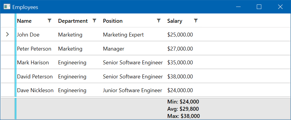
Grouping Your Data
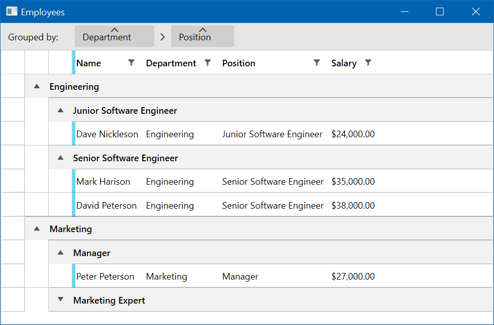
Grouping your data is a very powerful and useful feature. Making it easy and user-friendly is one of the key features of the Telerik WPF DataGrid. Your users can easily group the data by simply dragging the desired column to the group panel. Multiple grouping is supported as well.
Remember column aggregates? Well, when the data gets grouped, the aggregate functions work as well, giving you aggregate information about each group. This is built-in behavior and all you need to do to enable it is add aggregate functions to your columns and group your data.
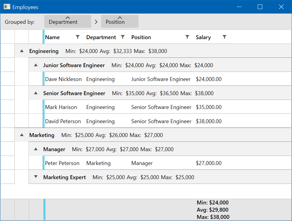
One more thing. Because of the complexity, grouping a large data set on more than one level can lead to some performance issues. The Telerik DataGrid is prepared for such cases and employs a special kind of rendering. It is called flat group rendering mode and it is controlled by the GroupRenderMode property. It simply renders rows one below the other instead of nesting them on many levels.
Let’s Not Forget Sorting
This is pretty intuitive for any scenario. Customers are used to clicking on the column header and expect to find the familiar sort direction arrow, and they take it for granted that every datagrid should do it, whether for web, desktop or mobile. Of course, Telerik grids support column sorting and it works in the usual way. But there is more.
When your data is grouped you can change the sort direction of each group individually, and in addition, you can sort the data in each group by another column. This is indicated by the arrows shown in the group buttons appearing in the group panel and in the column headers, as can be seen in the screenshots I have added above. Sorting by more than one column is supported as well, so you can get that much more insight into your data.
The All-Mighty Filtering
One of my favorite built-in features is the column filtering (even though, I must admit, I am a bit biased 😊). The user can filter the presented data by their own criteria, which is especially useful in large and complex data sets. By default, all data bound columns have filtering enabled on them. You can opt-out of this behavior by disabling it if you feel that filtering on this column is not necessary. The filter window itself closely resembles what can be found in pretty much any spreadsheet processing tool.
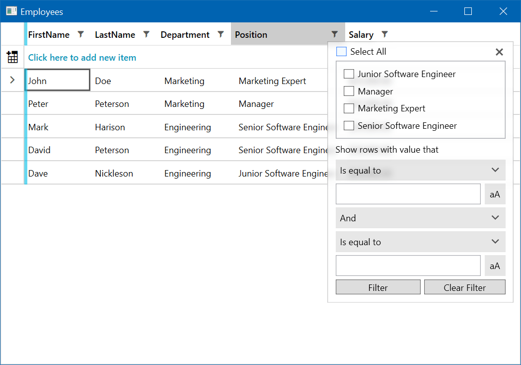
The filter for a given column picks up all the distinct values that are present in your data set for that particular column. The user can filter by simply selecting a specific value or values using the checkboxes. Advanced filter expressions are also supported. You can do filter expressions that check if the values in your columns start with a specific string value, or is greater, equal, lesser than or between given values. The possibilities are endless here and it is all done automatically for you and out of the box. The consumer of your data, when it is presented in a Telerik DataGrid, has all the filtering power they need.
Paging for Larger Datasets
Sometimes you just have too much data for the user to grasp at once. One popular solution is to use paging. Telerik UI for WPF has you covered with a special component made specifically for this purpose - the RadDataPager. It works in close cooperation with the DataGrid and it is a breeze to setup and configure, as you can see in the following code snippet:
<telerik:RadDataPager Grid.Row="1" Source="{Binding Items, ElementName=grid}" PageSize="5" DisplayMode="Next,Previous,Numeric,Text" />Resulting in: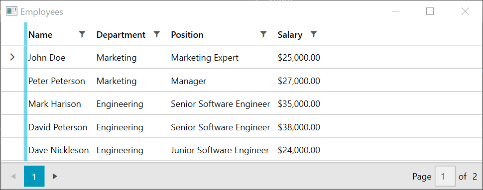
Controlling the appearance and paging options starts with the DisplayMode property. It is of type PagerDisplayModes flag enumeration, and its members control what is displayed by the pager. You can also control the size of the page, which is the number of items displayed at once on the screen.
One nice thing about separating the component that does the paging from the DataGrid is that you can use the data pager with other components, like ListView, ComboBox or even charts. This can be helpful when building a dashboard, for example.
Row Details
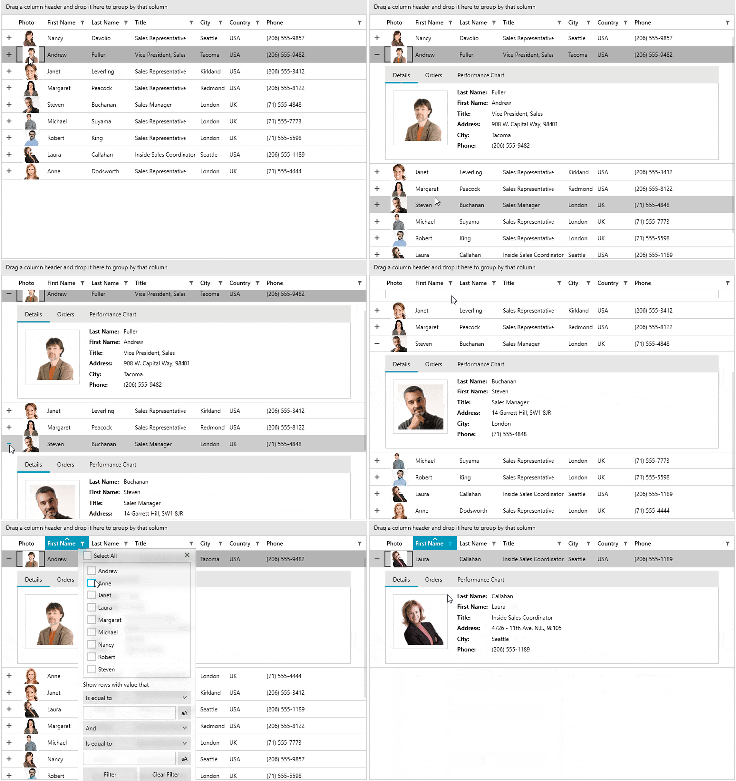
When you have a lot of information and you can’t display it all using just columns, maybe you can show that information in a row detail. Each WPF DataGrid row is capable of presenting additional information if the form of a row detail. The advantage of this approach is that it can be configured to be displayed only when the row gets selected. This can reduce the number of columns and give your data grid a neater and more compact layout, while still providing all the information the user needs. You can also show the row details at all times, regardless of whether the row is selected or not, if you prefer.
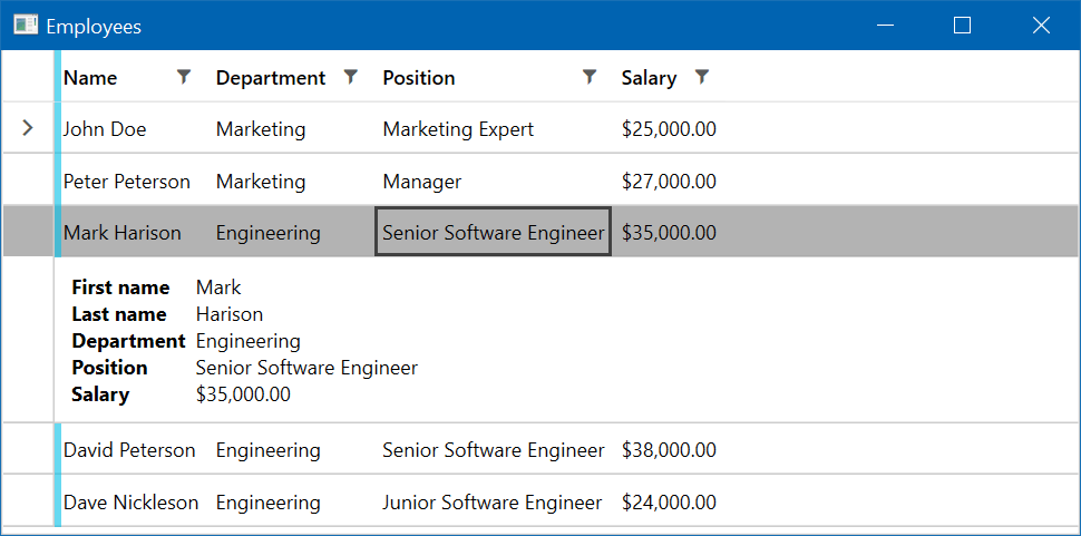
Configuring the row detail is done through the row details template. You have complete freedom with regard to what you put in there. You can display text, put in charts or even other DataGrids. The possibilities are endless.
Exporting to Various Formats
One of the benefits of using the Telerik UI for WPF toolkit is that you are stepping on the shoulders of giants. There is already an excellent document processing library that has been developed for Telerik tools, and of course it is well integrated into the Telerik WPF DataGrid. The data that is presented by the grid can be exported to many different formats for different applications, including Microsoft Excel (both xlsx and xls format are supported), and exporting to PDF and HTML is also possible. It all comes straight out of the box. You can customize it too.
One other way of exporting data is using the clipboard. The DataGrid supports both copying and pasting data from and to the clipboard and is very flexible in doing so. You have the option to copy the cells with or without the headers, footers, empty rows and columns.
Hierarchical Grid
Sometimes your data can be hierarchical with a parent - child relationship. Extending our current sample data, we can display the employees our managers are managing. The DataGrid can display such data using a nested DataGrid.
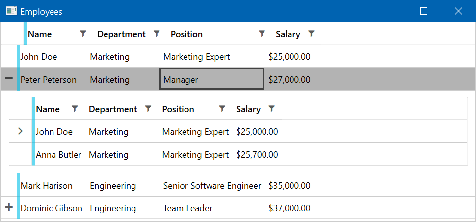
Note that the nested grid is a full blown DataGrid. The hierarchical support for the DataGrid handles self-referencing data sets as well. So, if your data has a ParentID relationship for example, your data is good to go. If not all of your data is forming a hierarchy you can hide or show the row expander icons by binding it directly to your data.
This feature can be useful in situations in which your data is truly hierarchical in nature and drilling down makes sense. This can also reduce the cluttering and data overflow in large data sets. When combined with lazy loading it can lead to performance improvements as well, because you will be fetching only the data you are actually showing on the screen.
Managing Data
Displaying data is great, but the Telerik DataGrid also allows you to modify the data it is presenting. You can perform insert, update and delete operations with validation and everything. In order to enable it you need to flip a few switches and you are good to go. Make sure to be sure your collection is not read-only and that the type of objects in your data set have a public default constructor.
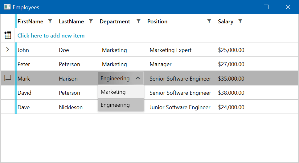
This feature can be useful in some scenarios when your data set is not too complex. Another use case can be when you want to allow the user to edit values of particular cells without the hustle of opening up other views and filling up lengthy forms.
Theming
Last but definitely not least, your data is just a bunch of numbers without a beautiful and modern looking UI. There are plenty of readily available themes you can apply to the DataGrid and any Telerik component for that matter. Two of my favorite themes are the Material and Fluent themes. In the screenshots above you can see the Windows 8 theme, another great one.
Material Theme
Fluent Theme
Applying a theme to your DataGrid is a breeze. Just reference the theme that you desire and merge its resources in your App.xaml file. Why the merge? Because Telerik NoXaml assemblies, which are the recommended ones, have no Xaml files inside of them. In order to give your WPF DataGrid the right appearance, you have to reference a theme and merge the resources in your application. This separation allows for the packing of theme dependent resources in different assemblies and reduces the overall size of dependencies and your application, because you are only referencing what you actually need.
<Application>
    <Application.Resources>
        <ResourceDictionary>
            <ResourceDictionary.MergedDictionaries>
                <ResourceDictionary Source="/Telerik.Windows.Themes.Windows8;component/Themes/Telerik.Windows.Controls.xaml" />
                <ResourceDictionary Source="/Telerik.Windows.Themes.Windows8;component/Themes/Telerik.Windows.Controls.Data.xaml" />
                <ResourceDictionary Source="/Telerik.Windows.Themes.Windows8;component/Themes/Telerik.Windows.Controls.GridView.xaml" />
                <ResourceDictionary Source="/Telerik.Windows.Themes.Windows8;component/Themes/Telerik.Windows.Controls.Input.xaml" />
            </ResourceDictionary.MergedDictionaries>
        </ResourceDictionary>
    </Application.Resources>
</Application>
Another benefit of the NoXaml assemblies is that you can customize the built-in themes very easily. You can change absolutely anything, starting from a color to completely retemplating the whole component. When you just need to give a specific component some style you will be pleased to know that there are many different APIs for doing that. Keep reading to learn more.

3. Loading the Telerik WPF DataGrid with Data

Data. It comes in all shapes and sizes and it's in the core of all applications. Of all the types of visualizations, the data grid is the most widely used and ubiquitous.
Today, we are going to discuss how to load your Telerik GridView with different flavors of data in an MVVM-friendly way. Why? Because MVVM allows us to separate the code that prepares the data for display and is responsible for handling user input from the code that manages the view. Also, MVVM is purposely built for WPF.
If you are new to MVVM or need a refresher, take a moment to read an introduction to the MVVM pattern. In this post, I will assume you have a basic understanding of how MVVM works. If you don't need MVVM and just want to visualize your data in a code-behind, don’t worry—you will still find some nuggets of wisdom here.
Basic Data Binding
Let's start with the basics. Data grids display data in rows and columns and in order to display your data, you need a collection of objects. For each item in your collection, a new row is added to the grid. The columns are constructed from the public properties of your objects. You can either use automatic column mapping or take manual control and define the columns yourself. In either case, there is no good or bad way, but an automatic and a manual one.
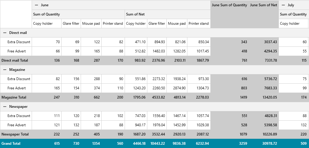
On many occasions people consider using a grid when in fact they need a pivot. If your data is more like measures and dimensions with multiple layers of nesting, rows and column totals like in the image above, then take a look at the RadPivot. It is a purpose-built component for displaying data in a pivot that enables users to add or remove measures and dimensions on the fly.
Let's see how we can databind our grid. (Check out the official documentation here.)
We start by defining a model—I’ll use a simple Employee model. Next, we need a view model with a public property that will expose our collection of employees. Let's first start with simple in-memory data.
public class MainViewModel : ViewModelBase
{
    private ObservableCollection<Employee> _data;

    public ObservableCollection<Employee> Data
    {
        get => _data;
        set
        {
            if (_data == value)
                return;

            _data = value;
            this.RaisePropertyChanged();
        }
    }
}
Let’s use this model and bind the ItemsSource property of the RadGridView. It is of type IEnumerable, as you would expect, and indeed it can accept any enumerable. This behavior is very similar to what we have in the standard WPF toolbox. However, the grid checks the inbound collection and there are some special types that influence the grid behavior. This is where the Telerik DataGrid has some hidden treasures.
One special collection is the ObservableCollection, which implements the INotifyCollectionChange. Like other WPF components, changing the contents of that collection in your view model will inform the DataGrid of the change and it will update accordingly. New rows will be added or old ones removed—nice!
Grouping, Sorting, Filtering
There is another special collection that ships the Telerik assemblies and this is the QueryableCollectionView or QCV. It ends in view because it intends to serve as a facade over your collection. It allows you to manipulate your data from your ViewModel trough the QCV API. In order to use it, you wrap your data inside of it and pass it to the GridView. For example, if you want to filter the data, you can do it in the following way:
public MainViewModel()
{
    _data = new ObservableCollection<Employee>(SampleData.Employees);
    _dataView = new QueryableCollectionView(_data); // Wrap data in a collection view
}

public QueryableCollectionView Data => _dataView;

private void OnFilterData(object obj)
{
    var descriptor = new FilterDescriptor(nameof(Employee.LastName), FilterOperator.StartsWith, "P");
    _dataView.FilterDescriptors.Add(descriptor);
}
Sorting is similar, just tap the SortDescriptors property. You can group in a similar way—adding GroupDescriptors will group your grid. The DataGrid understands the QCV and will update its UI to indicate the data manipulation. Notice the plural in the descriptors property. You can add multiple descriptors to do multiple groups, sorts and filters. One more thing—if you have multiple data operations on the QCV, then you can defer its refresh to speed it up like this:
private void OnSortData(object obj)
{
    var descriptor = new SortDescriptor() { Member = nameof(Employee.LastName), SortDirection = ListSortDirection.Descending };
    _dataView.SortDescriptors.Add(descriptor);
}
As a testimonial to the DataGrid understanding of the QueryableCollectionView, when the user applies grouping in the UI, the collection of group descriptors gets updated. You can observe the changes to this collection and perform some logic when the user groups the grid. This can be tremendously useful on many occasions when you need to be informed about a user performing an action on the data. You can obviously subscribe to the events of the GridView, but this is not very convenient for MVVM. That's the exact reason why Microsoft has created a number of special interfaces like the ICollectionView, which we saw today in the form of QueryableCollectionView.
Dynamic Data
In most cases, you already know the schema of the data prior to the application launch. But sometimes this information is obtained only after the app starts. An example I can give you straight away is CSV file visualization. The schema of the CSV file can change from file to file and it is known after the user selects the file. In cases like that, the plain old System.Data.DataTable and DataView can be your friend. Just create a DataTable, populate it with the rows and columns of the CSV file and data bind to the grid view. The Telerik DataGrid understands this classical type and will display its structure as you expect.
private void RefreshData(object obj)
{
    this.Data = this.GenerateRandomData();
}

static DataView GetSampleView()
{
    DataTable table = new DataTable();
    table.Columns.Add("Weight", typeof(int));
    table.Columns.Add("Name", typeof(string));
    table.Rows.Add(57, "Koko", "Shar Pei", DateTime.Now);
    table.Rows.Add(130, "Fido", "Bullmastiff", DateTime.Now);

    return table.DefaultView;
}
A word of warning here. As cool as the DataTable API is, you should restrain yourself from using it except for cases of dynamic data as described above or when you are migrating an existing code base to WPF. Querying databases and displaying their data can be done using other, more modern techniques. There are number of good reasons for this.
Getting Data from a Database
Long gone are the days that you have to write your SQL statements in code with string concatenation and commands. ADO.NET is still here with us and there may be some situations in which you can rely on old faithful, but ORM frameworks like EntityFramework have rescued us from writing boring boilerplate code. Using an ORM framework has many advantages, including:
- Saving a lot of time
- Minimizing boilerplate code
- Executing data operations on the server blazingly fast using IQueryable
- The ability to replace one database server with another with minimal effort
- Database versioning and automatic migrations
- Automatically creating database from your models
There are many ORM frameworks out there and WPF developers are spoiled with choice. Microsoft offers EntityFramework and the open-source version, called EntityFrameworkCore. EntityFrameworkCore is getting a lot of attention lately and it is becoming more mature with each subsequent version. In WPF, it has one distinct advantage over EF and this is built-in support for client-side SQLite databases. Having a small-in-size, fast relational database source can be tremendously useful for any WPF app. For example, I have used SQLite to store indexing information of some huge local directories. This way, the search experience can be improved significantly because your file search can be reduced to a simple search in a relational table. Other examples include the caching of remote data for faster application startup and retrieval.

4. DataGrid Performance Tips and Tricks

Good performance is vital for a good application user experience, which makes it a key priority for all applications. As you know, users hate slow and laggy applications and that's why performance is one of the highest concerns for developers and managers alike.
The Telerik WPF DataGrid is optimized for dealing with huge datasets, however, there are some things that should be kept in mind when dealing with large data sets. Fortunately, there are lots of tweaks that you can apply to the WPF DataGrid in order to get top performance, which traditionally fall into one of two categories: reducing the UI complexity or reducing the amount of data being processed.
Reducing UI Complexity
Application performance begins to slow down when there is too much going on in the UI thread. In WPF applications one of the reasons could be the complexity and size of the visual tree. Simply put, when there are lots of visual objects that need to be measured, arranged and painted, the time needed for those operations can increase beyond what is considered reasonable.
The DataGrid is a complex control with lots of features and because of that, the number of UI elements created on the screen is huge. That's a common problem among many WPF components, as the more complex the UI component, the more UI elements get created. If we examine the visual tree created for a simple GridView with 10 rows and 5 columns, you will find that it has spawned 1,339 visual elements (using the Windows 8 theme). It must be noted here that the Telerik DataGrid utilizes advanced techniques like UI element virtualization, so it only creates as many visual elements as can be displayed on your screen. But still, the complexity of these elements is the problem.
The creators of the Telerik WPF DataGrid have recognized this problem and have provided an intuitive solution: light templates that significantly reduce the number of UI components created. In order to use them, you have to use no-XAML binaries and you also have to opt-in.
<ResourceDictionary>
    <ResourceDictionary.MergedDictionaries>
       <ResourceDictionary Source="/Telerik.Windows.Themes.Windows8;component/Themes/System.Windows.xaml"/>
       <ResourceDictionary Source="/Telerik.Windows.Themes.Windows8;component/Themes/Telerik.Windows.Controls.xaml"/>
       <ResourceDictionary Source="/Telerik.Windows.Themes.Windows8;component/Themes/Telerik.Windows.Controls.Input.xaml"/>
       <ResourceDictionary Source="/Telerik.Windows.Themes.Windows8;component/Themes/Telerik.Windows.Controls.GridView.xaml"/>
    </ResourceDictionary.MergedDictionaries>

    <Style TargetType="telerik:GridViewRow" BasedOn="{StaticResource GridViewRowCoreValidationStyle}"/>
    <Style TargetType="telerik:GridViewCell" BasedOn="{StaticResource GridViewCellCoreValidationStyle}"/>
</ResourceDictionary>
The code snippet above is everything needed to opt-in for the lightweight templates, but for it to work, you must use the no-XAML binaries and implicit themes, as already mentioned.
You may ask “why did I have to opt-in for something that improves performance? Why isn’t it enabled out of the box?” Well, here's the gist - these templates disable some of the DataGrid features like row details and hierarchical grid. Basic effects like hover and selection as well as grouping are still enabled, so make sure you check your grid before enabling those light templates.
So far, we haven't talked numbers, so let's do that. Let’s enable the light templates in our simple 10-by-5 grid and check the number of visual elements spawned. Now the number is 919, a 31% reduction. That means faster loading, scrolling and performance overall. There is a good in-depth analysis in this blog post dedicated to light templates with more numbers and statistics. Be sure to check it out.
Another neat trick to reduce UI complexity is to use fixed width for your columns. Configuring all of your columns to use a specific size will help your GridView in measuring and arranging your columns, which in turn will increase both horizontal and vertical scrolling performance.
Reducing the Amount of Data
DataGrids are components that are data-centric. Because of their nature, they are usually filled with a lot of data. It is not uncommon to see a grid with tens of thousands of rows because grids are so easy to read and understand.
But loading a collection with millions of objects requires a lot of memory. Data operations on those objects can also be slow if not done properly. You can, of course, implement some partial loading as well as fast sorting and filtering that operate on huge datasets, but there is an easier way. There are some techniques you can utilize to reduce the number of objects loaded in memory at once and utilize the underlying database or remote service more efficiently.
Enter IQueryable. IQueryable, compared to IEnumerable (which is the contract used by most ItemsControls in WPF), allows some data-savvy components to not only get the items needed for display, but also create queries that can potentially be executed on a remote computer. Take, for example, sorting. If you have a million rows of data and you want to sort them, this can be time consuming if not done properly. However, a database can sort a dataset much faster if an index exists on the subject column.
Paging or filtering are other data manipulations that can see a huge boost if executed on the server. Not only that, but when you want to filter, sort and then read the data only a few records at a time, then the task at hand becomes very difficult if you don't use IQueryable. When using IQueryable, you can request only a single page from your data source at a time—and I am not talking about paging an in-memory data using some UI, but actually loading only a bunch of objects into memory from the underlying datasource. This can be much more efficient in terms of memory and transport.
Imagine loading 1 million rows from a remote service, then parsing them from JSON to POCO, only to display 20 objects. That's hugely inefficient. IQueryable allows you to request only the objects that you need from the comfort of dotNet. What the Telerik WPF grid offers is a special descendant of QueryableCollectionView that utilizes the power of IQueryable on your behalf—meet the VirtualQueryableCollectionView. If you want to obtain the items from your database 20 rows at a time, you can expose your data as IQueryable and wrap it in a VirtualQueryableCollectionView with LoadSize set to 20. Then, just pass this virtual collection to the Data Grid and voila—the GridView will now create queries for obtaining the data.
public class MainViewModel : ViewModelBase
{
    public MainViewModel(IEmployeeService employeeService)
    {
        IQueryable query = _employeeService.GetEmployees();
        this.Employees = new Telerik.Windows.Data.VirtualQueryableCollectionView(query) { LoadSize = 20 };
    }

    public Telerik.Windows.Data.VirtualQueryableCollectionView Employees { get; }
}
Just this simple code change is all that is required to start using the power of IQueryable in your code. You will immediately notice the faster loading of your grid. Sorting and filtering will also be done using queries, written for you by the DataGrid engine, and will execute much faster. Not only that, distinct column values, used by the filtering window, will be acquired faster. This means that the window itself will display faster. So, all in all, the DataGrid will display faster and be more responsive.
The Mighty VirtualGrid
Sometimes all you need is to display your data in just rows and columns and you don't need the advanced features of the DataGrid. Telerik engineers have created a component from the ground up for speed and performance and it is called the Virtual Grid (a.k.a. RadVirtualGrid). In the gif below, you can see an example of scrolling through more than a trillion cells (yes, that's a trillion!)
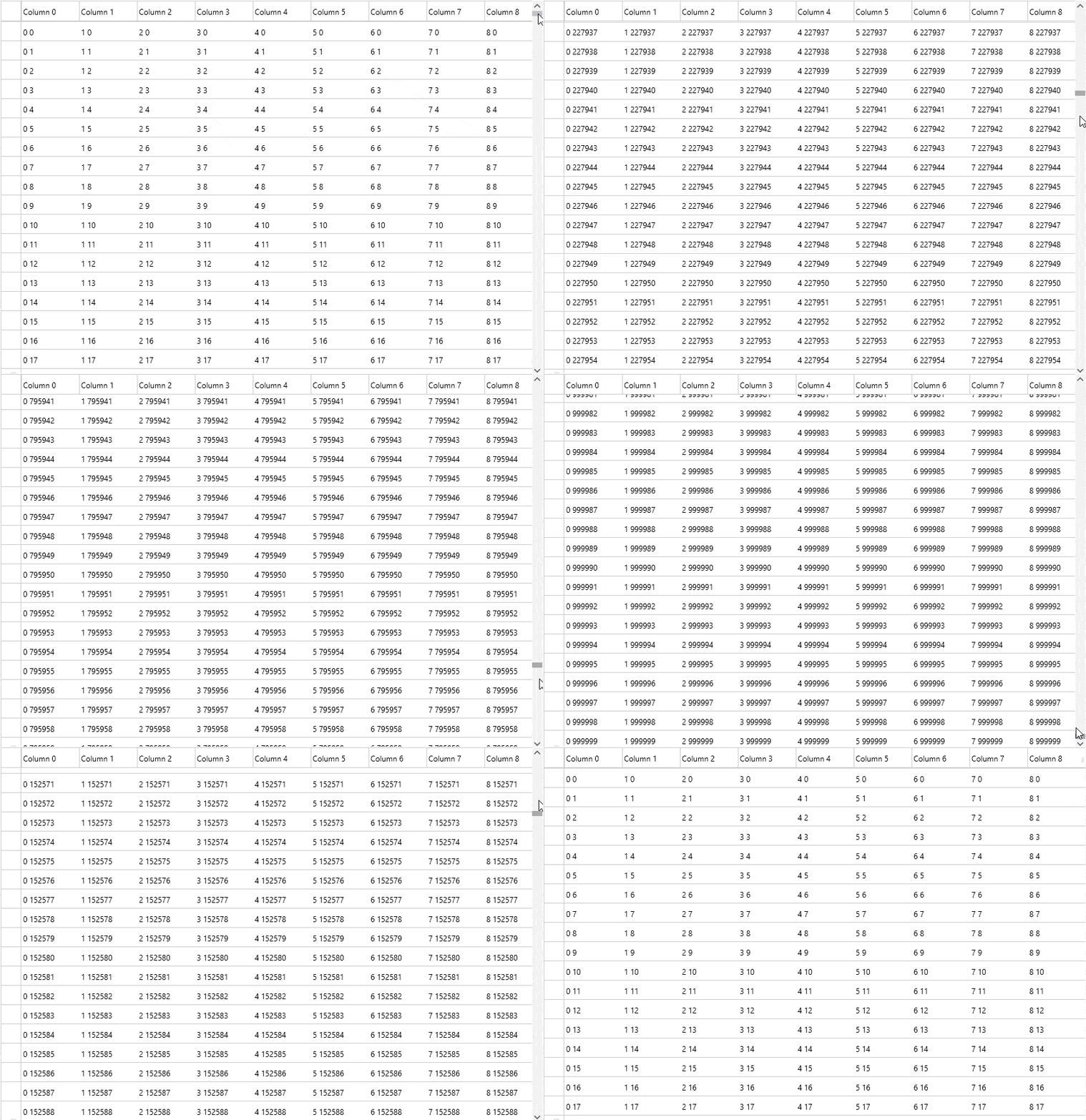
It lacks some of the more advanced features that DataGrid has like hierarchical grids, but it makes up for those missing features with speed. If you are serious about performance and responsiveness, and you want to display thousands and millions of rows of data, then you should definitely consider using this component. We talked about UI complexity and I have shown you some numbers for the DataGrid using light and regular templates. Well, the number of UI elements spawned to display the Virtual Grid is... 55. That's right, 55!
|
Feature |
DataGrid |
VirtualGrid |
|
Scrolling |
✔ |
✔ |
|
Filtering |
✔ |
✔ |
|
Grouping |
✔ |
✘ |
|
Sorting |
✔ |
✔ |
|
Selection |
✔ |
✔ |
|
Alternation |
✔ |
✔ |
|
Paging |
✔ |
✘ |
|
Row and column resizing |
✔ |
✔ |
|
Managing data (add, edit, delete rows) |
✔ |
✔ |
|
Mouse support |
✔ |
✔ |
|
Keyboard support |
✔ |
Limited |
|
Touch support |
✔ |
Limited |
|
Merged cells |
✔ |
✘ |
|
Pinned rows |
✔ |
✔ |
|
Custom columns |
✔ |
✘ |
|
Hierarchical grid |
✔ |
✘ |
|
Row details |
✔ |
✘ |
Knowing when to use Virtual Grid or regular DataGrid is the name of the game. From my experience, the Virtual Grid is more than enough feature-wise so you can usually swap your DataGrid with Virtual Grids safely.
If some of the missing features are a must, you can combine the two components together. You can display the entire dataset using virtual grids and when the user wants to view a particular portion of the data in more detail, you can display this data in a DataGrid. Utilizing the QueryableCollectionView we talked about above is very neat in scenarios like this, because it gets populated with the proper FilterDescriptors whenever your users apply filters to your virtual grid. You can use this as an opportunity to populate your DataGrids and perhaps some graphs to create a dashboard. Users love that.

5. How to Style and Customize Your WPF DataGrid

The Telerik WPF DataGrid is highly customizable component. Long gone are the days when the theme we got from the distributor was set in stone and couldn't be modified. With the power and flexibility of WPF, you can customize every part of the Telerik DataGrid—and any component for that matter.
One of the coolest WPF features is the styling and template mechanism. Styles allow you to set the properties of a component in a tidy way and create a configuration that can be shared among many instances. Templates allow you to take control over the appearance of a component using ControlTemplate or the appearance of data using DataTemplate. What the creators of the DataGrid have done is take advantage of this mechanism and allowed you, the developer, to modify the appearance of the GridView (and any component for that matter) very granularly.
All Telerik components have their styling and appearance declared as implicit styles and bundled together as themes. Out of the box, the Telerik DataGrid comes with a bunch of themes defined in separate assemblies. There are dark and light themes, a Material and touch-friendly theme. There are themes influenced by Microsoft Office. The list gets updated constantly with new releases.
The good thing about this vast array of themes is that you can find at least one that suits your needs. And even better, updating the appearance can be done in several ways as I am going to show you today. So, if you want to change the background of a row, you have several approaches that you can follow. The Telerik team has identified the most common styling needs and handled them gracefully so that you don't need to re-template anything unless you really need to.
DataGrid exposes a number of properties that can be used to easily customize it without the need to modify its template. You can show or hide specific DataGrid components, like the group panel that sits at the top, the column headers and footers, the row indicator and many more. Being WPF, you can either set these properties directly on the DataGrid as in this code snippet:
<telerik:RadGridView ShowGroupPanel="False" GridLinesVisibility="Vertical"
                     ShowColumnHeaders="False" ColumnBackground="Bisque"
                     RowIndicatorVisibility="Collapsed"/>
Alternatively, you can also define them in a style. Your style can either be implicit as in this code snippet or be a regular style with a key. Just remember to inherit from the theme style. Why is that? Well, remember that the Telerik team has defined everything style-related in the theme assemblies. Every component has two sets of styles for it: a named style, named like: <componenet_name> Style. So, in our code snippet we need to inherit from RadGridViewStyle. That gives us the control template and all other settings. Now you can use your style anywhere in our app. Easy, right?
<Grid>
    <Grid.Resources>
        <Style TargetType="{x:Type telerik:RadGridView}" BasedOn="{StaticResource RadGridViewStyle}">
            <Setter Property="ShowGroupPanel" Value="False" />
            <Setter Property="GridLinesVisibility" Value="Vertical" />
            <Setter Property="ShowColumnHeaders" Value="False" />
            <Setter Property="ColumnBackground" Value="Bisque" />
            <Setter Property="RowIndicatorVisibility" Value="Collapsed" />
        </Style>
    </Grid.Resources>
    <telerik:RadGridView />
</Grid>
And here is how that will affect the grid styling:

There are a bunch of properties for you to tweak, which fall into several categories. First, you have properties that show or hide grid components:
- ShowColumnFooters
- ShowColumnHeaders
- ShowColumnSortIndexes
- ShowGroupFooters
- ShowGroupPanel
- ShowScrollPositionIndicator
- ShowSearchPanel
- GridLinesVisibility
- RowIndicatorVisibility
- RowDetailsVisibilityMode
You can use those to remove a grid component that you don't need like we have done in the code snippet above. Then you have a group of properties that can control the size of the rows and columns:
- ColumnWidth
- MaxColumnWidth
- MinColumnWidth
- RowHeight
- VisibleRowsHeight
In the last group are properties, which define styles, style selectors and templates for various grid components:
- RowStyle & RowStyleSelector
- AlternateRowStyle & AlternateRowStyleSelector
- GroupFooterRowStyle & GroupFooterRowStyleSelector
- GroupHeaderTemplate
- GroupPanelItemStyle & GroupPanelStyle
- GroupRowStyle & GroupRowStyleSelector
- HeaderRowStyle
- NewRowStyle
- RowDetailsStyle & RowDetailsStyleSelector
- RowDetailsTemplate & RowDetailsTemplateSelector
- MergedCellsStyle & MergedCellsStyleSelector
- HierarchyChildTemplate & HierarchyChildTemplateSelector
Some of these properties have corresponding components that can be styled using implicit style. Take, for example, a row. You can style all rows using a single style, either set to the RowStyle property or an implicit style that targets GridViewRow. Both of those approaches will work and can be shared among all your data grid instances, so choose the one that suits you. You can also use style selectors to apply some custom logic depending on your concrete objects and choose a specific style for specific rows.
<Grid>
    <Grid.Resources>
        <Style x:Key="MyGridRowStyle" TargetType="{x:Type telerik:GridViewRow}" BasedOn="{StaticResource GridViewRowStyle}">
            <Style.Triggers>
                <Trigger Property="IsSelected" Value="True">
                    <Setter Property="Foreground" Value="Red" />
                </Trigger>
            </Style.Triggers>
        </Style>
        <Style TargetType="{x:Type telerik:GridViewRow}" BasedOn="{StaticResource MyGridRowStyle}">
            <Setter Property="Background" Value="SeaGreen"/>
        </Style>
        <Style TargetType="{x:Type telerik:GridViewHeaderRow}" BasedOn="{StaticResource GridViewHeaderRowStyle}">
            <Setter Property="Background" Value="MidnightBlue"/>
        </Style>
    </Grid.Resources>
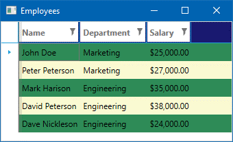
    <telerik:RadGridView ItemsSource="{x:Static local:SampleData.Employees}" AlternationCount="2">
        <telerik:RadGridView.AlternateRowStyle>
            <Style TargetType="{x:Type telerik:GridViewRow}" BasedOn="{StaticResource MyGridRowStyle}">
                <Setter Property="Background" Value="LightGoldenrodYellow" />
            </Style>
        </telerik:RadGridView.AlternateRowStyle>
    </telerik:RadGridView>
</Grid>
Resulting in the following:
But wait a minute! Where are the style properties for cells? You have two options: Either style all cells in your grid at once using an implicit style that targets GridViewCell or style columns individually. To do that, you need to define your columns manually and then you have access to the properties that control the cell appearance. The GridView data column have properties for:
- CellStyle
- CellStyleSelector
- CellTemplate
- CellTemplateSelector
- CellEditTemplate
- CellEditTemplateSelector
- FooterCellStyle
- HeaderCellStyle
- GroupHeaderTemplate
- GroupHeaderTemplateSelector
As you can see, you can easily control every aspect of your cells in a very granular fashion without the need to redefine the complete cell template. And because this is WPF, you have style and template selectors, which you can use to apply some custom logic when selecting a template or a style for your cells. Also, you can use triggers and data triggers in your styles for runtime precision customization.
<Grid>

    <Grid.Resources>

        <Style TargetType="{x:Type telerik:GridViewCell}" BasedOn="{StaticResource GridViewCellStyle}">

            <Setter Property="Background" Value="#ffcc00"/>

        </Style>

        <Style TargetType="{x:Type telerik:GridViewHeaderCell}" BasedOn="{StaticResource GridViewHeaderCellStyle}">

            <Setter Property="Background" Value="LimeGreen"/>

            <Setter Property="Foreground" Value="Cyan"/>

        </Style>

    </Grid.Resources>

    <telerik:RadGridView ItemsSource="{x:Static local:SampleData.Employees}" AutoGenerateColumns="False">

        <telerik:RadGridView.Columns>

            <telerik:GridViewDataColumn Header="Name" DataMemberBinding="{Binding FullName}" />

            <telerik:GridViewDataColumn Header="Department" DataMemberBinding="{Binding Department}" />

            <telerik:GridViewDataColumn Header="Salary" DataMemberBinding="{Binding Salary}" DataFormatString="{}{0:C0}">

                <telerik:GridViewDataColumn.CellStyle>

                    <Style TargetType="{x:Type telerik:GridViewCell}" BasedOn="{StaticResource GridViewCellStyle}">

                        <Setter Property="Background" Value="Green"/>

                        <Style.Triggers>

                            <Trigger Property="IsSelected" Value="True">

                                <Setter Property="Background" Value="Red"/>

                            </Trigger>

                        </Style.Triggers>

                    </Style>

                </telerik:GridViewDataColumn.CellStyle>

            </telerik:GridViewDataColumn>

        </telerik:RadGridView.Columns>

    </telerik:RadGridView>

</Grid>
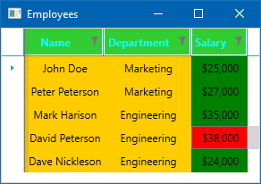
The outcome is the following: (yes, it's not a very practical example and it's a bit of an eye-sore, but you get the idea :) )

Summary
Well that's all folks! I hope you found this article helpful to get yourself better acquainted with the DataGrid control in the Telerik UI for WPF suite. We went in-depth through all of the key features of the control, as well as how to bind data to the grid, theme, style and customize it, and last, but definitely not least got to explore a few performance optimization tips and tricks.
One thing is for sure - DataGrids are widely popular and are often an integral part of a project's requirements for most line-of-business apps. Should you find yourself in need of one, consider the Telerik WPF DataGrid, as you will be able to save months of development time by getting the fully-featured control straight into your app. For what's it's worth, I have personally tested it extensively and used it to create quite a few client applications myself and can assure you that it is a very powerful and versatile component for visualizing data in a table-like fashion. Unarguably, It is a great tool for displaying your data and making decisions based on it.
If you decide to give it a try for yourself, go ahead and tap on the link below, where you can get a free 30 day trial of the complete Telerik UI for WPF suite, which also includes over 130 additional controls and a variety of themes.
Download Telerik UI for WPF Free Trial
In case you are still up for some additional reading, here are two extra blogs on the WPF DataGrid:

Yavor Ivanov
Yavor is a Senior Software Developer on the Telerik UI for Xamarin team. His 10+ years of XAML and WPF experience were gained in the Telerik UI for WPF and Silverlight suite as well as many LoB applications. His workday is a mixed bag of Xamarin, WPF and Angular development. Finding the right solution for the job is his main goal. You can find him on GitHub.


