
Telerik UI for WPF
What's New R3 2020
What's New HistoryAutoSuggestBox Control
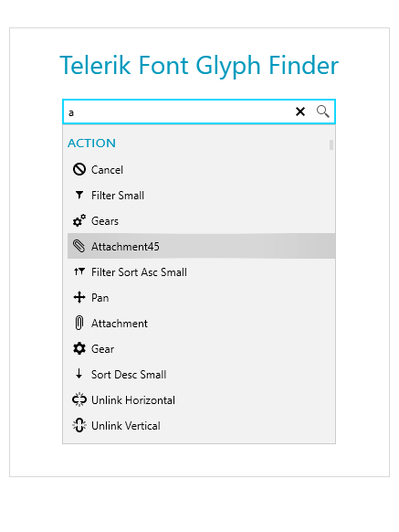
The Telerik UI for WPF AutoSuggestBox control is a text control that will automatically load suggestions, similarly to the Google search user experience. When users input text into the search textbox, an event will trigger the loading of suggestions into the dropdown menu of the control.
The WPF AutoSuggestBox control is equipped with the following features:
- Keyboard Navigation: A built-in support for several keyboard keys
- Commands Support: The search and clear actions of the control are implemented via commands that can be customized or replaced
- Grouping: A feature that enables grouping in the control
- Customizable Appearance: The ability to customize the appearance of the text box, buttons and dropdown
- Watermark Support: A watermark is displayed when no text is entered in the text box of the control
- Built-in Themes: Choose from a rich set of built-in themes to customize the appearance of your AutoSuggestBox control
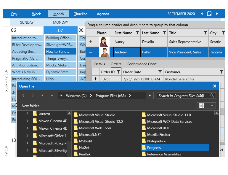
Office 2019 Theme
A brand-new Office 2019 theme is now available in all three color variations—Light, Dark and Gray.
Multiple Thumbs Support for Slider
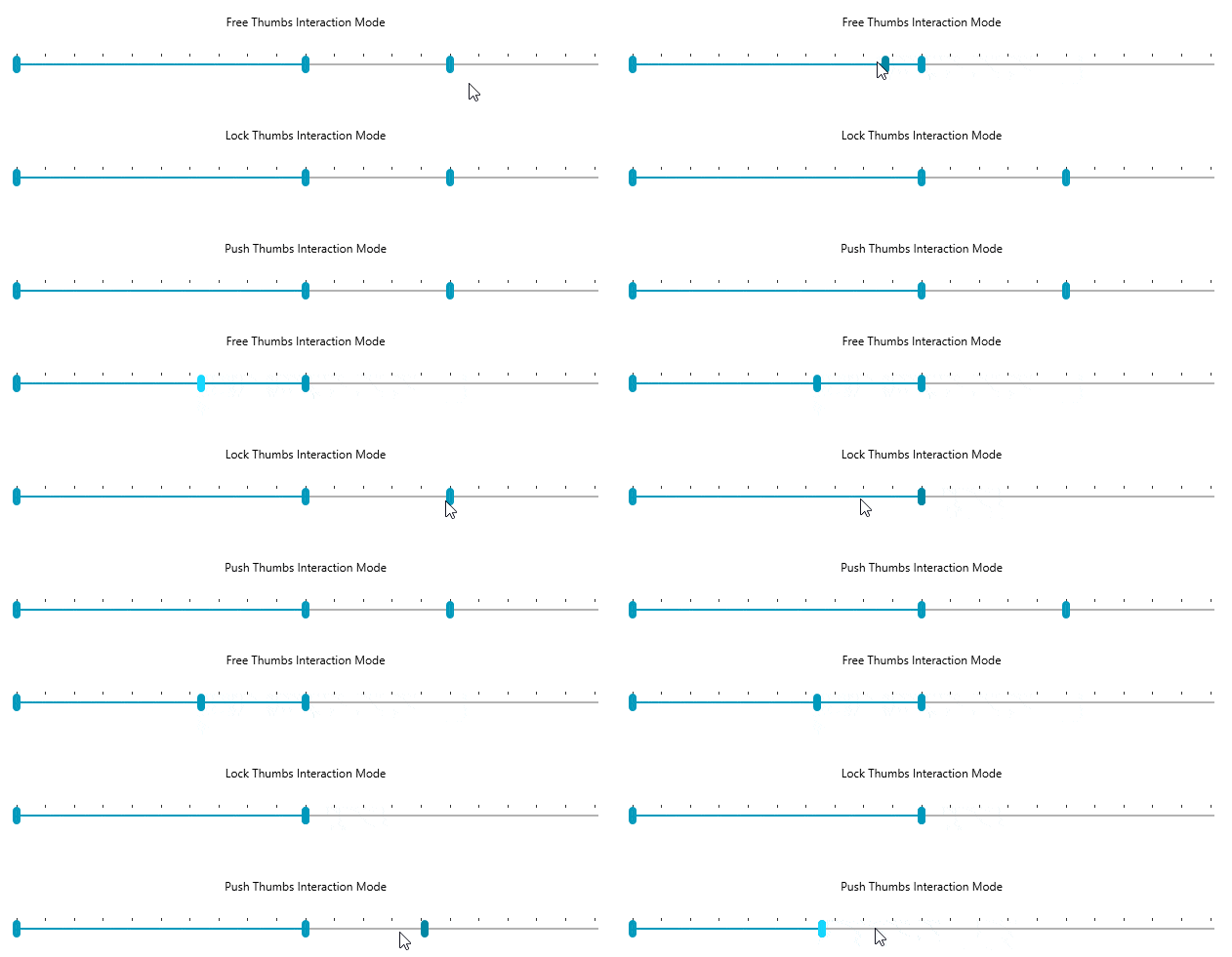
A new feature for the Telerik UI for WPF Slider control will allow you to configure the Slider to support multiple thumbs, thus enabling users to control the values and ranges of their selection. The feature is packed with classes and properties that allow maximum flexibility when defining a value.
Classes and properties of the multiple thumbs feature for Telerik UI for WPF Slider control:
- SliderThumb class: Represents a single thumb, which can be dragged by the user and exposes a single Value property of type double.
- RangeSliderThumb class: Represents a control with two draggable thumbs, as well as an extra thumb in between to drag the whole range. The class exposes properties, such as the smallest and largest value of a specified range, minimum and maximum value distance, and more.
- InteractionMode property: Controls the action of the individual thumbs when they come in contact with another thumb. There are three different interaction modes: free (the active thumb interacts with the thumb in free mode), lock (when the active thumb interacts with a locked thumb), push (when the active thumb interacts with the other thumb in a push mode).
- ThumbStyle property: Gives you the ability to apply a specific style only to a certain thumb.
Navigation commands for Dock control
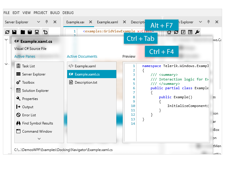
The WPF Dock control is now equipped with a DockingNavigator UI that significantly simplifies the navigation between all non-hidden panes. With the keyboard shortcuts CTRL+ Tab and ALT+F7 users are now able to navigate through the panes and preview their content.
EntityFrameworkCore DataSource
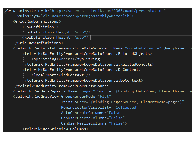
The Telerik UI for WPF EntityFrameworkCore DataSource is a WPF data control that provides seamless integration between a user interface and data coming from Entity Framework Core. With this new data control, you will be able to codelessly integrate the RadGridView, RadDataPager and RadDataFilter controls from the Telerik UI for WPF suite to perform paging, filtering, sorting and grouping directly on the database server.
Text Input to Set TimeSpan for TimeSpanPicker
The new functionality for the Telerik UI for WPF TimeSpanPicker will allow you to edit the value of the TimeSpan by directly entering the value in the input text box. This functionality is enabled through the EditMode and StringFormat properties and the TimeSpanText is formatted differently, depending on the defined values:
- None: The user won't be able to edit the value of the control
- TextOnly: Ability to edit the value through the text inside the control
- DropDown: Edit the value through the TimeSpanComponents inside the dropdown
- TextAndDropDown: Directly edit through the TextBox and the TimeSpanComponents inside the DropDownButton
- ValueEditing event: Allows to easily configure the editing behavior of the control.
- SpinMode: Spin only the current section (e.g.,hours, minutes, etc.) with up/down keyboard keys, spin the whole value (when minutes reach 60, hours are changed as well) or none.
- Tab navigation: Navigate through the sections with tab. Once, cycle or none.

NotifyIcon for WPF: Official Version
With R3 2020, we are shipping the official version of our Telerik UI for WPF NotifyIcon control! The new features include custom tooltip, high DPI support and a focus for the pop-up.
Built-In Sound for DesktopAlert
The DesktopAlert control for WPF is now equipped with a built-in sound functionality that enables you to play a sound when an alert is shown.
XLS format support for SpreadProcessing
Create and modify XLS documents in code-behind with the new XlsFormatProvider. The new class enables you to import and export documents of the Excel 97 - Excel 2003 Binary file format.
New model for PdfViewer
The RadPdfViewer control is now officially migrated to use the RadPdfProcessing library as its model. You can now create PDF documents and directly show them. Check the Showing a File topic and ensure your projects are using the latest functionality of the control.
XLS format support for RadSpreadsheet
With R3 2020, RadSpreadsheet enables you to work with documents of the Excel 97 - Excel 2003 Binary file format – XLS. Make sure to check how you can use that functionality in our documentation topics.
PdfViewer and PdfProcessing: CMap Tables support
The CMap Tables in the PDF documents define mappings between character codes and character selectors. As of R3 2020, can seamlessly import documents containing the predefined in the PDF format CMap Tables and ensure even the custom ones are imported as expected.
.Net 5 RC1 Support
This week Microsoft announced the availability of the first Release Candidate version of .NET5 and we are now supporting it with R3 2020! If you are already planning or currently building your first .Net 5 WPF app you easily use Telerik UI for WPF suite, which is now using the latest version of our .Net 5 WPF controls.
Telerik UI for WPF - R3 2020
- AutoSuggestBox Control
- Office 2019 Theme
- Multiple Thumbs Support for Slider
- Navigation commands for Dock control
- EntityFrameworkCore DataSource
- Text Input to Set TimeSpan for TimeSpanPicker
- NotifyIcon for WPF: Official Version
- Built-In Sound for DesktopAlert
- XLS format support for SpreadProcessing
- New model for PdfViewer
- XLS format support for RadSpreadsheet
- PdfViewer and PdfProcessing: CMap Tables support
- .Net 5 RC1 Support
New features & Roadmap
Have a feature request?
Post your feedback via the WPF Feedback Portal.
What's new across all Telerik products?

Next Steps
See Telerik UI for WPF in action.
Purchase individual products or any of the bundles.
With dedicated technical support.


