
Telerik UI for WPF
What's New R2 2022
What's New HistoryNew Component: Virtual Keyboard
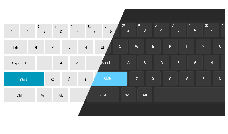
The Virtual Keyboard for WPF is a visual component that is rendered on the screen and mimics a physical keyboard. The users can interact with the Virtual Keyboard via the mouse or a touch device. For a richer user experience, you can enable the default click sound or add a custom sound effect.
- Layout – the component provides a configurable layout that can be changed by choosing an existing set or a custom layout with a specific format. Whether you need QWERTY (compact or extended), NumPad, Colemak or a completely custom layout, it is all customizable and under your control.
- Display options – the keyboard can be shown inline or in a dedicated window that can be moved
- Customization – the visualization of each button can easily be changed
- Multilingual support – work with a language that shares the Roman alphabet or any other script you may need
- System synchronization – tracks system language changes and updates the relevant keys automatically
- Culture support – the component supports assigning a specific culture that will be applied to the letter keys
New Theme: Windows 11
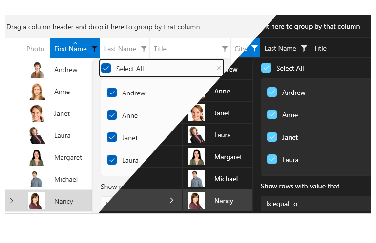
The newest member of the Telerik UI for WPF themes family is here! It is inspired by Windows 11 and you can enjoy the smooth round shapes in a Light or Dark variation, as well as the famous Mica backdrop effect on Windows 11.
The theme offers additional System variation that automatically switches to Dark or Light depending on the system settings and the ability to use the system accent color.
Compatibility with Preview 3 of .NET 7
We are delighted to announce that the Telerik UI for WPF suite is fully compatible with .NET 7 Preview 3, and you can use the WPF controls with the latest framework.

ARM64 Support
With .NET 6, Microsoft shipped native support for ARM64 on machines that run Windows on ARM devices like Surface Pro X, Samsung Galaxy Book and more. We are happy to confirm that all Telerik UI for WPF controls are compatible with ARM64 and can be utilized for applications targeting it.
VirtualGrid Enhancement: Support for Placing Custom UI Elements in Grid Cells
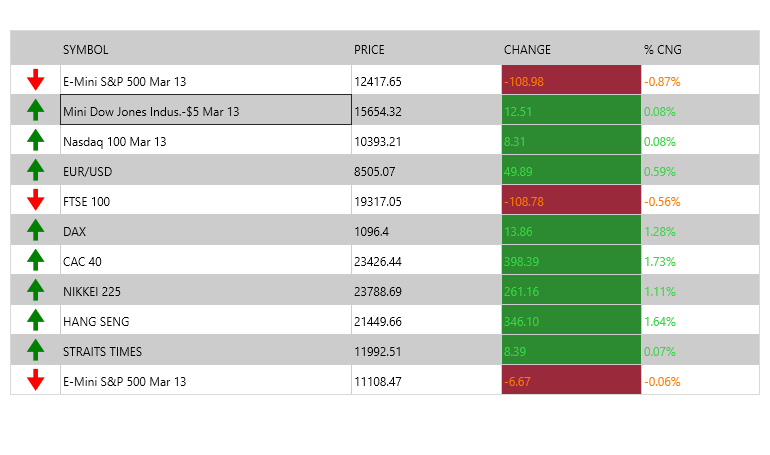
The Telerik UI for WPF Virtual Grid control can now have custom UI elements placed in the Virtual Grid cells. For example, you can set custom controls, symbols or images, change the color of the cells’ text, background or foreground, etc.
ChartView Improvements
Minor Ticks Support
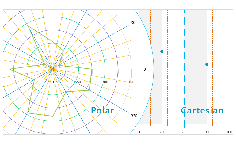
If you need to provide a more punctual view of the ticks in an axis, you can utilize the minor ticks support of RadChartView. With it, you can define the number of minor ticks to be displayed between the major ticks.
Minor ticks can be almost completely customized with the available API to define the number of minor ticks between the major ones, the tick length, offset from the major tick, the tick template, style and more.
Stripes Grid Support
Stripes are the visual representation of the minor ticks in the chart area and can be used to display where the minor ticks are, for the user to easily spot the value of a certain tick and compare it to a data point on the chart.
Stripes support defining the stripe visibility, style, dash array and more.
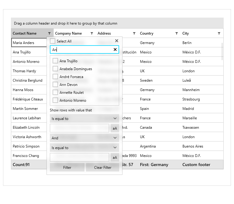
GridView: Filtering Textbox for Distinct Values in the FilteringControl
This functionality will ease the filtering process by introducing a search option to the Filtering control. Users will no longer have to scroll down the distinct filtering values and can quickly type in a desired value to find it.
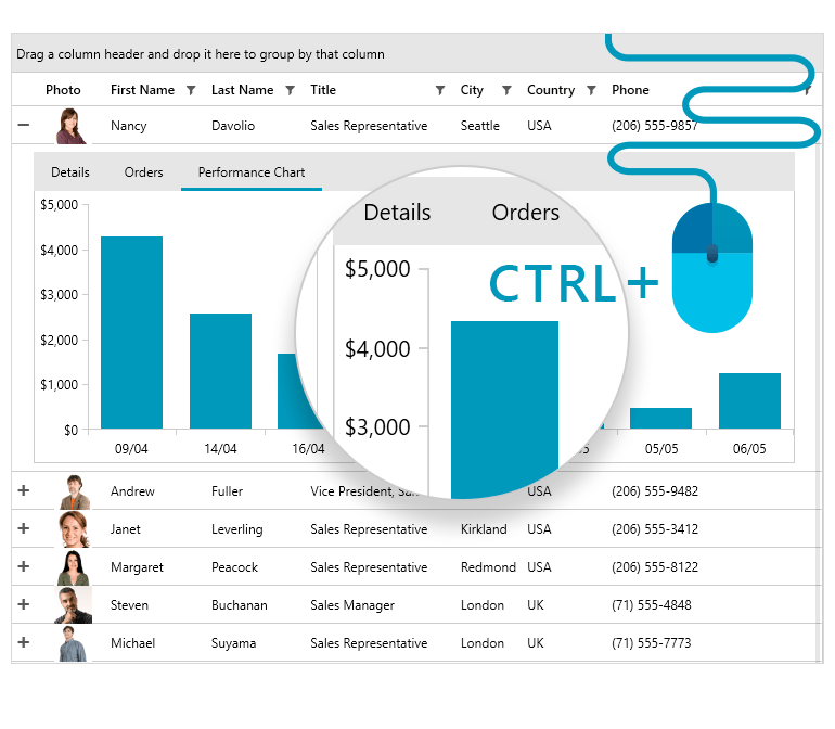
GridView: CTRL-Mouse Wheel (Excel-Like) Zooming Support
The GridView control for WPF comes with a new handy feature—support for Excel-like zooming. This allows users to zoom in and out in the context of the GridView via the CTRL + mouse wheel combination.
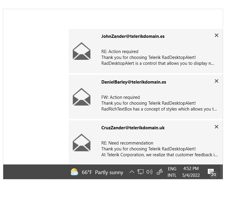
Desktop Alert: Show Alert on Current Display
Multiple displays may be beneficial for your users’ daily activities, but they also come with their own set of twists. With the new enhancement in the RadDesktopAlert, you will be able to display it on the current display instead of the main one to easily capture the user’s attention.
New Series Provider for ChartView3D – ChartSeriesProvider3D
RadCartesianChart3D can automatically create a dynamic number of series based on the provided data source. You can take advantage of this feature by creating a ChartSeriesProvider3D object. This object receives the data and holds the ChartSeriesDescriptor3D objects that define the specific properties of the dynamically generated series.
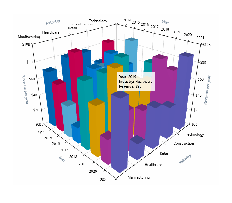
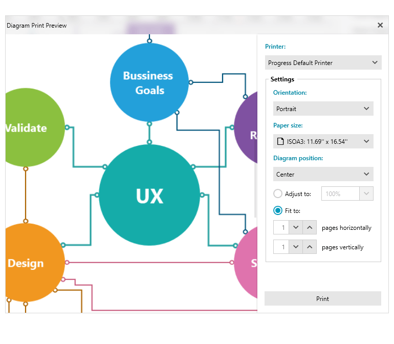
Diagram: Fit to Page Support When Printing
The Telerik UI for WPF Diagram control now supports a Fit to page option in the Print Preview dialog. If you want to fit the control to multiple pages vertically, horizontally or both ways, you will have control over the orientation with the Fit to page support.
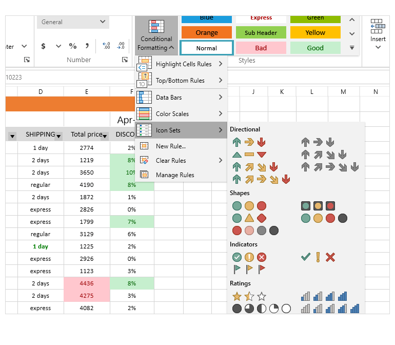
Spreadsheet: Conditional Formatting
The full visualizing power of conditional formatting is now accessible with a few clicks, thanks to the newly introduced UI. It allows users to set conditions based on which to format the cells in the spreadsheet, making it easier to analyze the data.
The feature comes with a wide range of predefined conditions, formatting options and also supports utilizing a formula to define a condition.
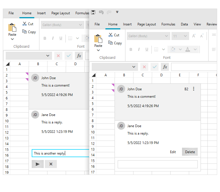
Spreadsheet: Insert/Delete Comments
This functionality of the Telerik UI for WPF Spreadsheet enables users to add, delete or reply to a comment in cells. Additionally, a comment (thread) can be marked as resolved, deleted or reopened at a later stage.
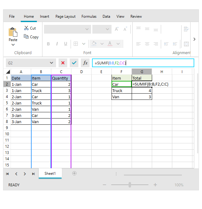
Spreadsheet: Support for Cell References
Cell references make it easy for RadSpreadsheet users to craft formulas that apply to a range of cells. All three types of references are supported—Absolute, Relative and Mixed.
SpreadProcessing: Insert and Delete Comments
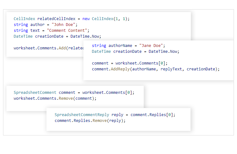
The latest addition to the SpreadProcessing library is the ability to insert and delete comments in excel files. This functionality allows you to add information about a cell, reply to a comment or delete one. Information such as the creation date, author and whether the comment is resolved is also readily available.
SpreadProcessing: Cell References
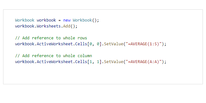
SpreadProcessing now supports Absolute, Relative and Mixed cell references to entire columns and rows, e.g., $1:$2 and A:D. These come in handy when you need to work with a range of cells.
PdfProcessing: Support for Type 3 Fonts
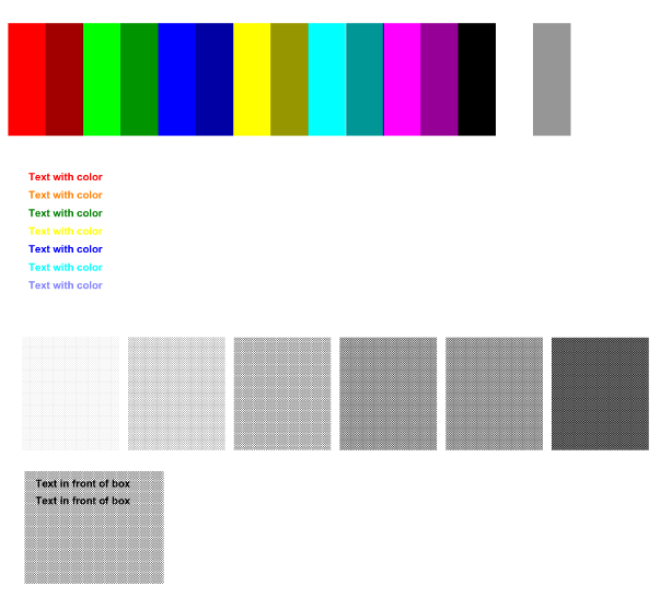
According to the PDF standard, Type 3 fonts can contain lines, areas, shares of gray, images, graduated fills or variable stroke width. This makes them quite useful for displaying logos or barcodes. Should you need to embed Type 3 fonts into a PDF file or to manipulate a file that uses such font types, with the RadPdfProcessing library for WinForms you can do it all.
Telerik UI for WPF - R2 2022
- New Component: Virtual Keyboard
- New Theme: Windows 11
- Compatibility with Preview 3 of .NET 7
- ARM64 Support
- VirtualGrid Enhancement: Support for Placing Custom UI Elements in Grid Cells
- ChartView Improvements
- GridView: Filtering Textbox for Distinct Values in the FilteringControl
- GridView: CTRL-Mouse Wheel (Excel-Like) Zooming Support
- Desktop Alert: Show Alert on Current Display
- New Series Provider for ChartView3D – ChartSeriesProvider3D
- Diagram: Fit to Page Support When Printing
- Spreadsheet: Conditional Formatting
- Spreadsheet: Insert/Delete Comments
- Spreadsheet: Support for Cell References
- SpreadProcessing: Insert and Delete Comments
- SpreadProcessing: Cell References
- PdfProcessing: Support for Type 3 Fonts
New features & Roadmap
Have a feature request?
Post your feedback via the WPF Feedback Portal.
What's new across all Telerik products?

Next Steps
See Telerik UI for WPF in action.
Purchase individual products or any of the bundles.
With dedicated technical support.


