
Telerik UI for WPF
What's New R1 2022
What's New HistoryNew Component: StepProgressBar
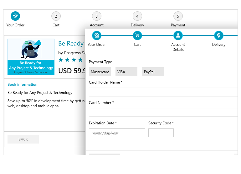
This new control allows you to visualize a complex and lengthy process in your WPF application. The StepProgressBar control for WPF enables you to set up a visual element that displays a multi-step process via a number of different steps and a progress track bar between each step. Selecting a step will animate a progress movement from the previously selected step to the new one.
This UI control is ideal for scenarios where you want to guide the users through a complex process by making it easy and intuitive for them to complete. The control covers many use cases, from orders and multistep forms to onboarding.
The Telerik UI for WPF StepProgressBar comes with various features, including:
- Flexible customizations: Easily customize the track bar and its various steps.
- Data binding support: Allows you to provide a collection of any objects that can store information for each step.
- Horizontal and vertical orientations: The out-of-the-box orientation of the control is horizontal, but it can be customized to appear vertically.
- Selection: The steps in the progress bar can be selected in code or via a click in the UI.
- Additional content: Each step can display content on top and bottom of its visual element.
.NET 6 & Visual Studio 2022 Support
We are happy to remind you that in the last months of 2021, we ensured that the Telerik UI for WPF suite is fully compatible with both .NET 6 and Visual Studio 2022!

Support for Rounded Corners for Windows controls
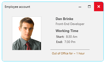
With Windows 11 being out for a few months now, we decided to implement their new design aesthetic of rounded corners across all our WPF Window controls, including: Window, TabbedWindow, RibbonWindow and the Docking ToolWindow. With R1 2022, all these controls now support a CornerRadius property out-of-the-box.
All WPF Sample Applications Now Available in .NET 6
There are several WPF sample applications that are built exclusively with the Telerik UI controls, and we are happy to announce that with R1 2022 all of these applications are fully migrated to and available for .NET 6!
You can check them out and play around with them by simply installing the click once from the corresponding page:
WatermarkTextBox: Added Support for an Embedded Label
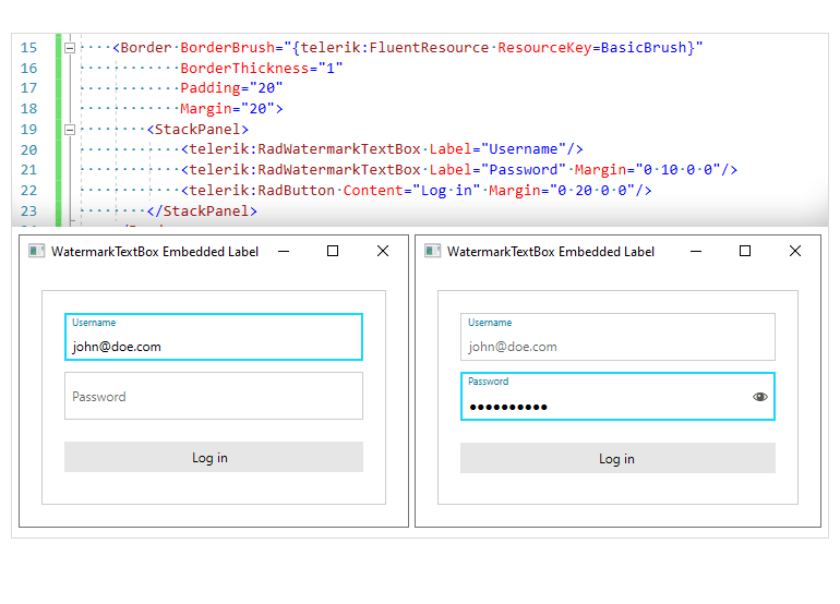
The Telerik UI for WPF WatermarkTextBox is now equipped with an embedded label. The label plays the role of a placeholder and displays as a watermark content when the TextBox control is unfocused and there is no text input in the field. Once the control gets focused and the text is entered, the label is positioned on top of the input area.
Map Enhancement: Support for Smooth Zooming
The Map control for WPF comes with a new handy feature—smooth zooming. The control allows users to zoom in and out of the context of the map via the mouse wheel or through the zoom option of the Commands Bar panel.

New Feature for PanelBar Control: Allow Resizing of PanelBarItems
While the PanelBar items cannot be resized through the control’s UI, with this release we have enabled a property that can allow you to easily resize the items to your desired dimensions.

New Feature for Diagram Control: Support for Exporting Large Diagrams
The Telerik UI for WPF Diagram control now supports exporting large diagrams.
New Feature for PivotGrid: Filtering Textbox for Distinct
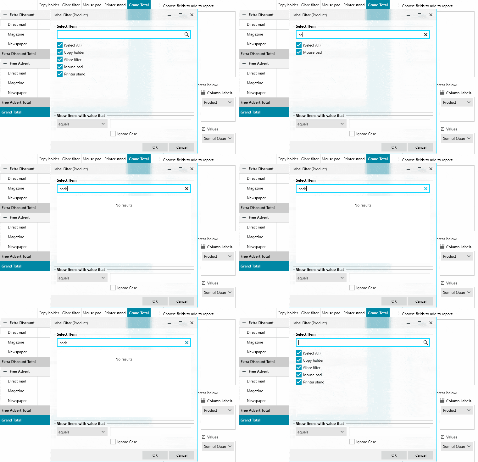
The textbox of the WPF PivotGrid now supports filtering for distinct, predefined values.
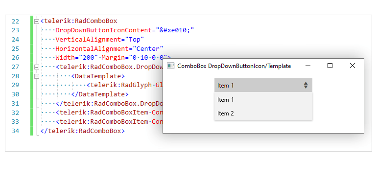
New Feature for ComboBox: Option to Change the Dropdown Icon
The styling and appearance customization capabilities of the WPF ComboBox control keep on expanding. With this release, you will be able to easily change the dropdown icon of the control.
Conditional formatting for SpreadProcessing
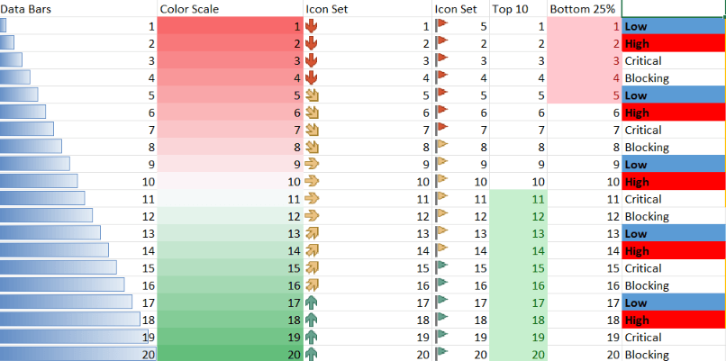
The Telerik SpreadProcessing library comes with a brand-new feature which allows you to format the cells depending on their value. The feature supports multiple formatting rules - from simple ones such as changing fill and font to more complex formatting rules for data bars, color scales, and icon sets.
Spreadsheet and SpreadProcessing: Notes Support
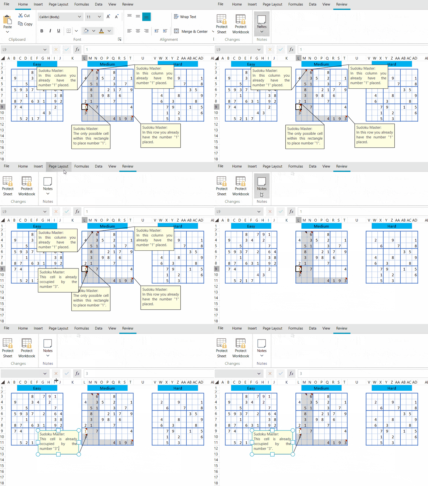
The Notes functionality of the Telerik Spreadsheet and SpreadProcessing libraries is used for making annotations about the data of a specific cell. This new feature allows you to easily work with notes via the UI - quickly and easily add, remove, edit, resize, show or hide the cell annotations through a button in the review tab, or directly from the context menu.
WordsProcessing: Nested Mail Merge
This new functionality of the Telerik WordsProcessing document library enables you to perform mail merge with complex business objects. In cases when your business objects contain a list of other objects, this neat functionality allows you to use the underlying objects when performing mail merge.
Telerik UI for WPF - R1 2022
- New Component: StepProgressBar
- .NET 6 & Visual Studio 2022 Support
- Support for Rounded Corners for Windows controls
- All WPF Sample Applications Now Available in .NET 6
- WatermarkTextBox: Added Support for an Embedded Label
- Map Enhancement: Support for Smooth Zooming
- New Feature for PanelBar Control: Allow Resizing of PanelBarItems
- New Feature for Diagram Control: Support for Exporting Large Diagrams
- New Feature for PivotGrid: Filtering Textbox for Distinct
- New Feature for ComboBox: Option to Change the Dropdown Icon
- Conditional formatting for SpreadProcessing
- Spreadsheet and SpreadProcessing: Notes Support
- WordsProcessing: Nested Mail Merge
New features & Roadmap
Have a feature request?
Post your feedback via the WPF Feedback Portal.
What's new across all Telerik products?

Next Steps
See Telerik UI for WPF in action.
Purchase individual products or any of the bundles.
With dedicated technical support.


