Telerik UI for WPF
What's New R1 2021
What's New HistoryCardView Control
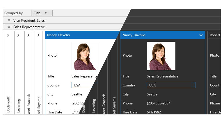
The WPF CardView is a powerful, feature-packed data visualization control that displays data in a card-like format. The control enables a wide variety of features, including but not limited to:
- Editing: The cards contain sets of data fields that can be edited while the corresponding card is selected.
- Selection: The control provides built-in selection support.
- Grouping: Users can interactively organize their data in a way that best suits their needs with a single drag and drop action. Data can be grouped according to several criteria, effectively creating a tree of groups with the leaf nodes holding the actual data records.
- Different card layouts: The layout of the cards and groups can be altered between row and column-based ordering.
- Sorting: You can sort the cards via a drop-down menu, listing the data fields.
- Filtering: The control has built-in filtering support.
- Customizable elements: Cards can be easily customized using the control's API.
- Localization support: The text used in the settings areas of the controls is localized.

Horizontal Layout in TileList Control
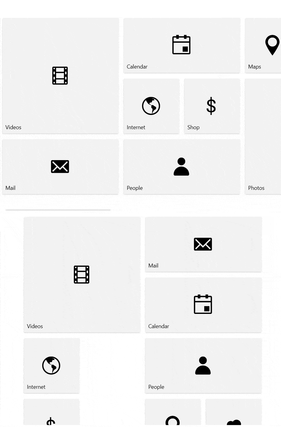
We’ve added a horizontal orientation option alongside the vertical layout of tiles to our WPF TileList control.

Accessibility Improvements Across the Entire Suite
Following a series of robust testing we performed during the last release, we have now implemented a best-in-class accessibility enhancement for the entire Telerik UI for WPF suite. All WPF controls have passed the tests of the Accessibility Insights tool from Microsoft. No issues were found.
RadialMenu: Fill Empty Spaces with Items
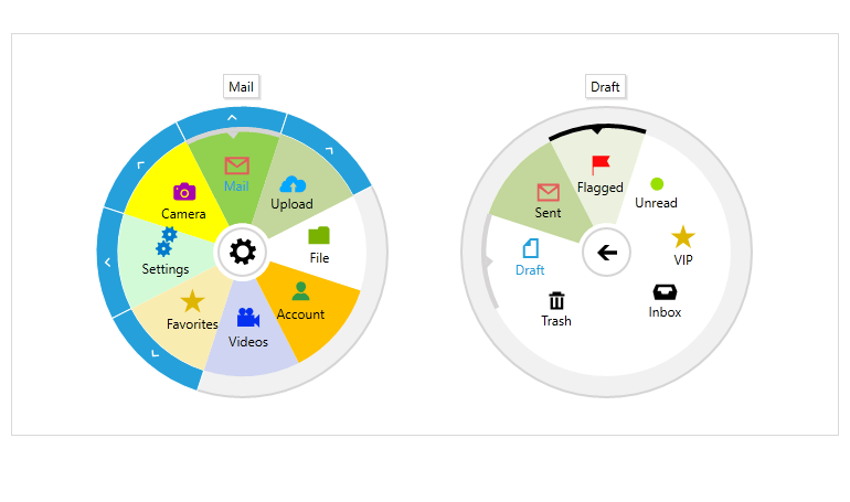
A new feature of the Telerik UI for WPF RadialMenu control makes it possible for RadialMenuItems to fill the available spaces of the control (when they are less than eight).

ColorThemeGenerator and CRM demo apps for WPF support .NET 5
The Telerik UI for WPF demo applications, ColorThemeGenerator and CRM are now successfully migrated to .NET 5 and available for download in your customer accounts. Grab the .ZIP with the source code and begin exploring our demo apps in .NET 5! Additionally, the CRM Prism dependency is upgraded to the latest version.
PdfViewer Support for Importing Documents with Type 3 Fonts
The PdfViewer now fully supports importing documents in Type 3 fonts.
WordsProcessing: Support for Content Controls
Structured Document Tags (SDT) or content controls enable users to add specific semantics to the document: restricting input, modifying editing behavior, etc. Usually, this functionality is used to create separate fields that should be filled and the user interaction is improved by providing specific UI controls like checkboxes, calendars, combo boxes, and others. The currently supported content controls by WordsProcessing include CheckBox, ComboBox, Date, DropDownList, Image, and others. You can the full list and more details in our documentation: Content Controls for WordsProcessing.
Docking: Set the MinWidth of the auto-hide area flyout element
Allow setting the MinWidth of the auto-hide area flyout element via a new FlyoutMinLength property.
Telerik UI for WPF - R1 2021
- CardView Control
- Horizontal Layout in TileList Control
- Accessibility Improvements Across the Entire Suite
- RadialMenu: Fill Empty Spaces with Items
- ColorThemeGenerator and CRM demo apps for WPF support .NET 5
- PdfViewer Support for Importing Documents with Type 3 Fonts
- WordsProcessing: Support for Content Controls
- Docking: Set the MinWidth of the auto-hide area flyout element
New features & Roadmap
Have a feature request?
Post your feedback via the WPF Feedback Portal.
What's new across all Telerik products?

Next Steps
See Telerik UI for WPF in action.
Purchase individual products or any of the bundles.
With dedicated technical support.


