Kendo UI for Angular
What's New August 2026
What's New HistoryBuild Richer Agentic Experiences with the New Kendo UI for Angular LLM Kit
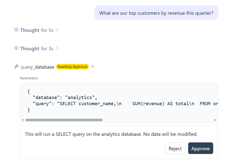
The new Kendo UI for Angular LLM Kit provides ready-to-use components for presenting AI agent activity inside chat and agentic applications. Use dedicated components to display reasoning, multi-step thought chains, tool calls and results, conversation checkpoints and inline citations instead of building these interaction patterns from scratch. The components work together alongside conversational interfaces, helping developers turn structured LLM and agent output into clear, consistent UI experiences.
See the Kendo UI for Angular LLM Kit demo
Kendo UI for Angular AI Skills for Licensing and Version Upgrades
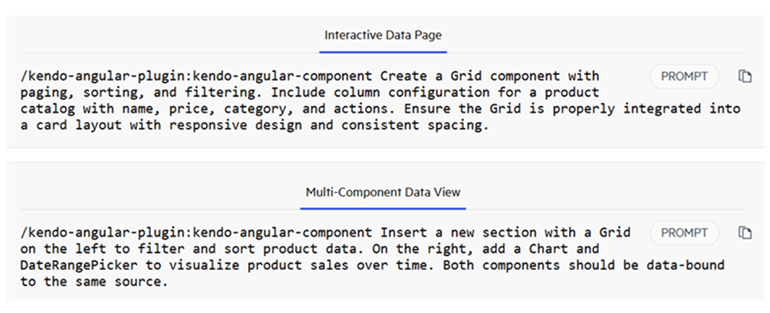
Kendo UI for Angular introduces two AI Skills that give coding agents product-specific guidance for common development workflows. The Licensing Skill helps agents guide developers through licensing setup and common licensing issues, while the Version Upgrade Skill provides guidance for upgrading projects between Kendo UI for Angular versions. Available through the Kendo UI for Angular AI Plugin, the Skills bring framework-specific knowledge directly into supported agents without requiring manual MCP configuration.
See the Kendo UI for Angular AI Plugin docs
Customize Default Icons Across Kendo UI for Angular Components
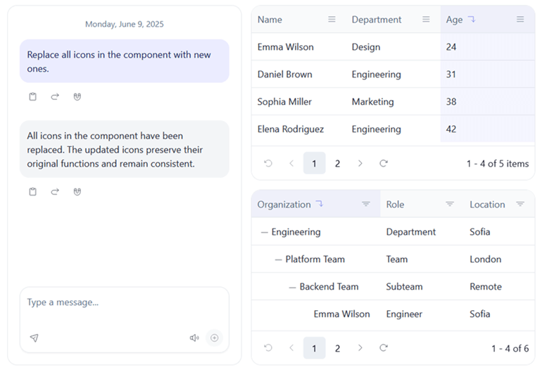
Kendo UI for Angular introduces a unified mechanism for overriding the default icons used across the component library, making it easier to align component visuals with your design system, brand or existing icon set. Developers can replace icons application-wide, customize them for a specific component type or override individual icons in a component instance. The mechanism supports both SVG and font icons, providing flexible control over icon customization without having to configure each component separately.
See the Kendo UI for Angular default icon customization demo
Kendo UI for Angular Data Grid: New Grouping Display Modes
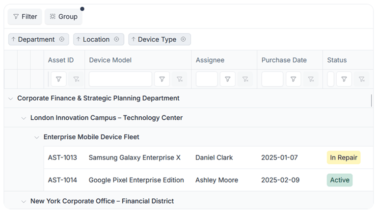
The Kendo UI for Angular Data Grid expands its grouping capabilities with new display modes that give developers more control over how grouped data is presented. Choose between Default, Compact, Single Column and Multiple Columns modes to make better use of available space across traditional, data-dense and responsive layouts. Developers can also customize generated group columns and hide the original grouped columns when needed, providing greater flexibility for complex grouping scenarios.
See the Kendo UI for Angular Data Grid grouping display modes demo