Kendo UI for Angular
What's New 2026 Q2
What's New HistoryWhat's New 2026 Q2
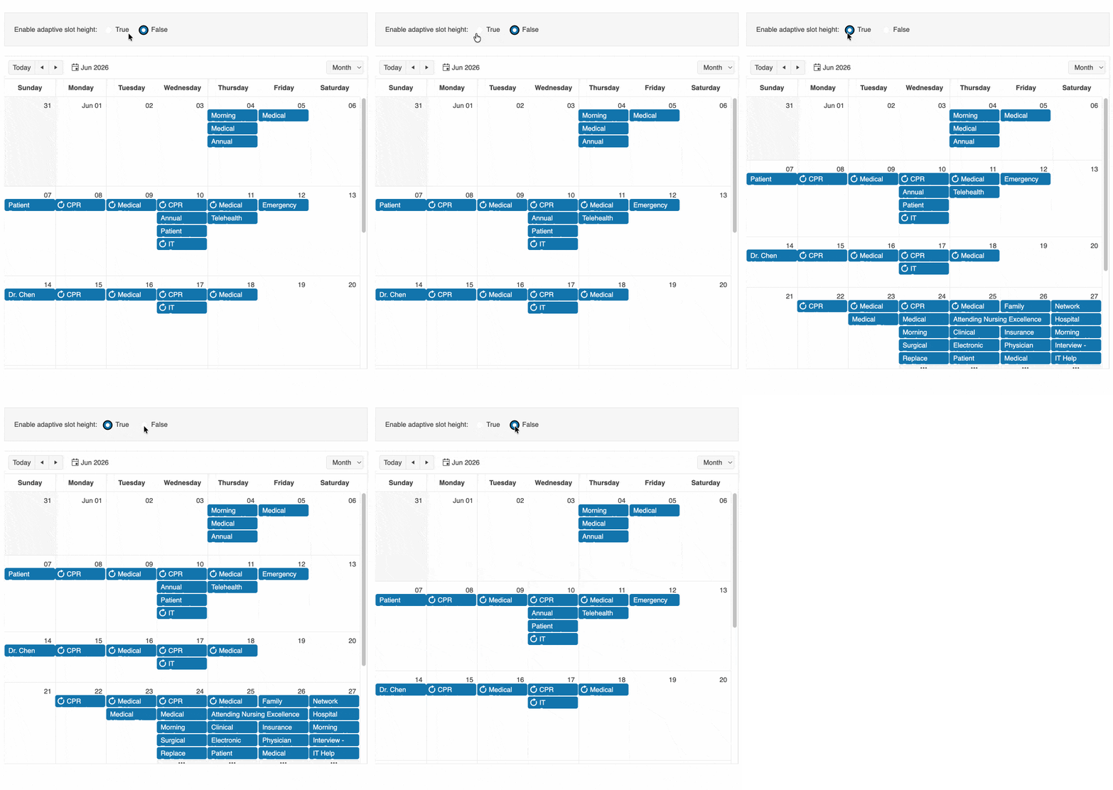
WebMCP in Preview: Let AI Interact with Your Kendo UI for Angular UI
The Kendo UI for Angular library now includes WebMCP integration, enabling your applications to work directly with AI agents in the browser.
WebMCP is an emerging browser standard that allows components to expose their functionality as structured tools. Instead of relying on DOM scraping or simulated clicks, AI agents can interact with your Kendo UI for Angular components by calling these tools directly, triggering actions like filtering data, navigating views, or updating values through natural language.
This addition brings AI closer to your application logic, turning your UI into a set of actionable capabilities that intelligent agents can understand and use.
See the Kendo UI for Angular WebMCP tools documentation
Get Started in Mere Minutes with the New Kendo UI for Angular CLI Setup
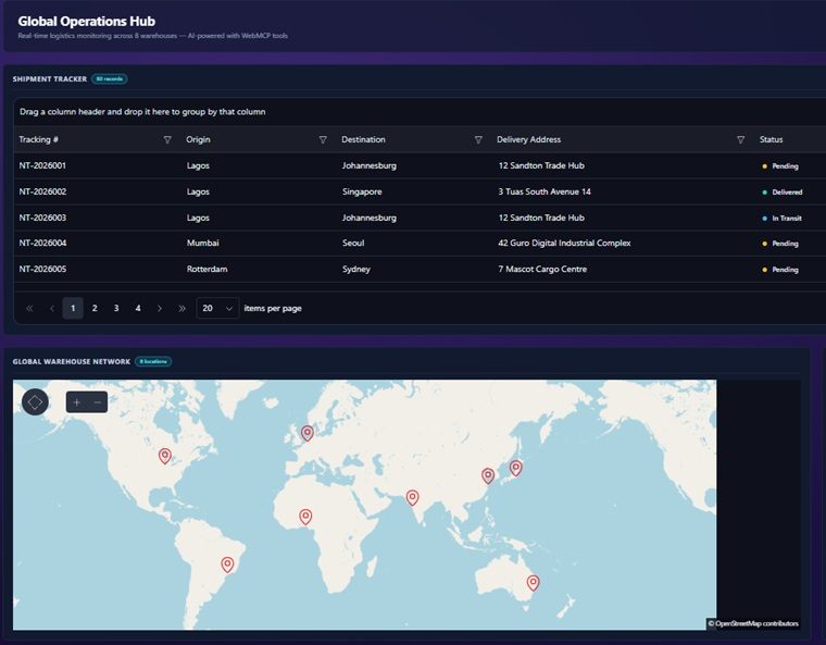
A new CLI-based setup experience streamlines how you install and configure Kendo UI for Angular, so you can go from zero to a fully working environment with less manual effort. With a single guided workflow, the setup handles key steps such as adding packages, configuring your project, setting up the license key file, and enabling MCP servers. This reduces the need for manual configuration and helps ensure everything is set up correctly from the start.
Upgrade Kendo UI for Angular Versions Faster with AI-Assisted Migration
Kendo UI for Angular now offers AI-assisted migration through the Upgrade Assistant, helping you move between major versions with less effort.
Built into the Kendo UI for Angular MCP server, the tool combines deterministic codemods with AI-powered code analysis to deliver a more complete and reliable upgrade process. It not only applies known transformations automatically but also analyzes your codebase to identify and guide more complex changes.
See the Kendo UI for Angular AI-assisted migration documentation
Switch Faster with the New Kendo UI for Angular SegmentedControl
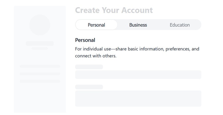
The new Kendo UI for Angular SegmentedControl enables you to present a small set of mutually exclusive options. It renders a group of buttons where only one item can be selected at a time, with a sliding indicator that clearly shows the current selection. This UI component makes it a good alternative to radio buttons or dropdowns when space is limited and quick switching is important.
See the Kendo UI for Angular SegmentedControl demo
Sticky Groups and Row Pinning in Kendo UI for Angular Grid
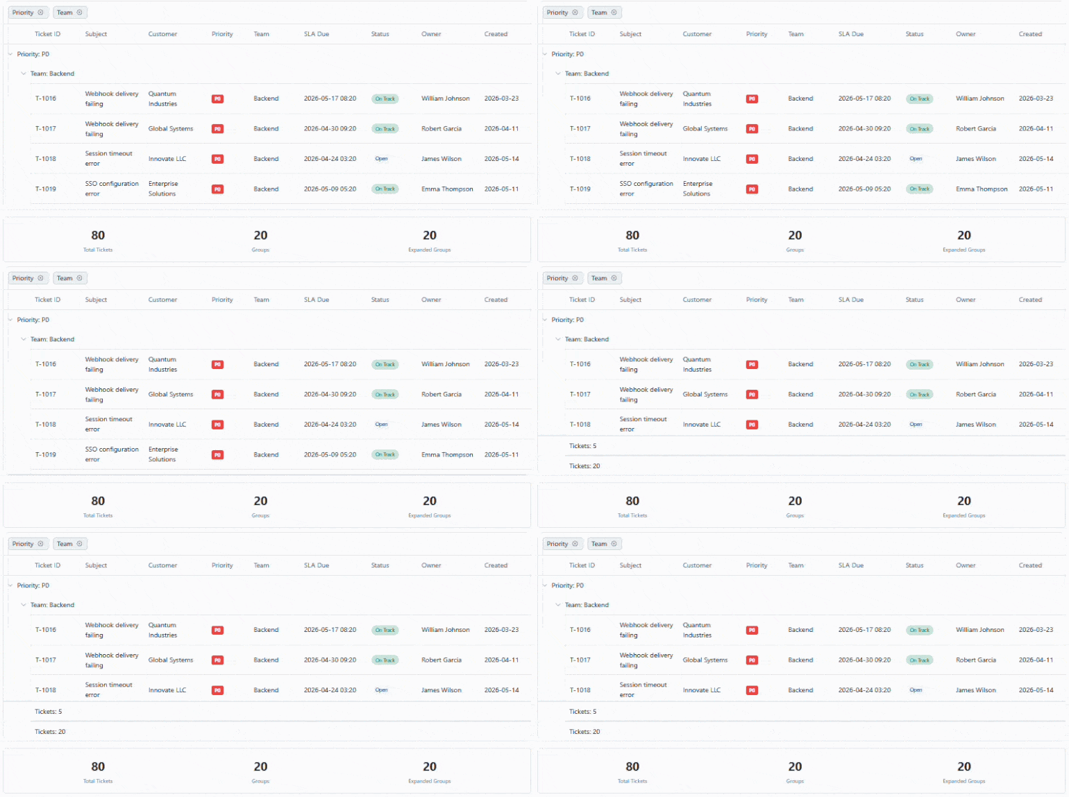
This release adds two new capabilities to the Grid, giving you more control over how data stays visible and accessible during interaction:
- Sticky Group Headers and Footers: Grouped data is now easier to navigate. As users scroll, group headers remain visible at the top, providing constant context about the data currently in view. Group footers can also stay in place, ensuring key summary information is always accessible.
- Row Pinning: You can now pin rows to the top or bottom of the Angular Grid, keeping important records in view regardless of sorting, filtering, or scrolling.
Scroll Modes in Kendo UI for Angular Chat
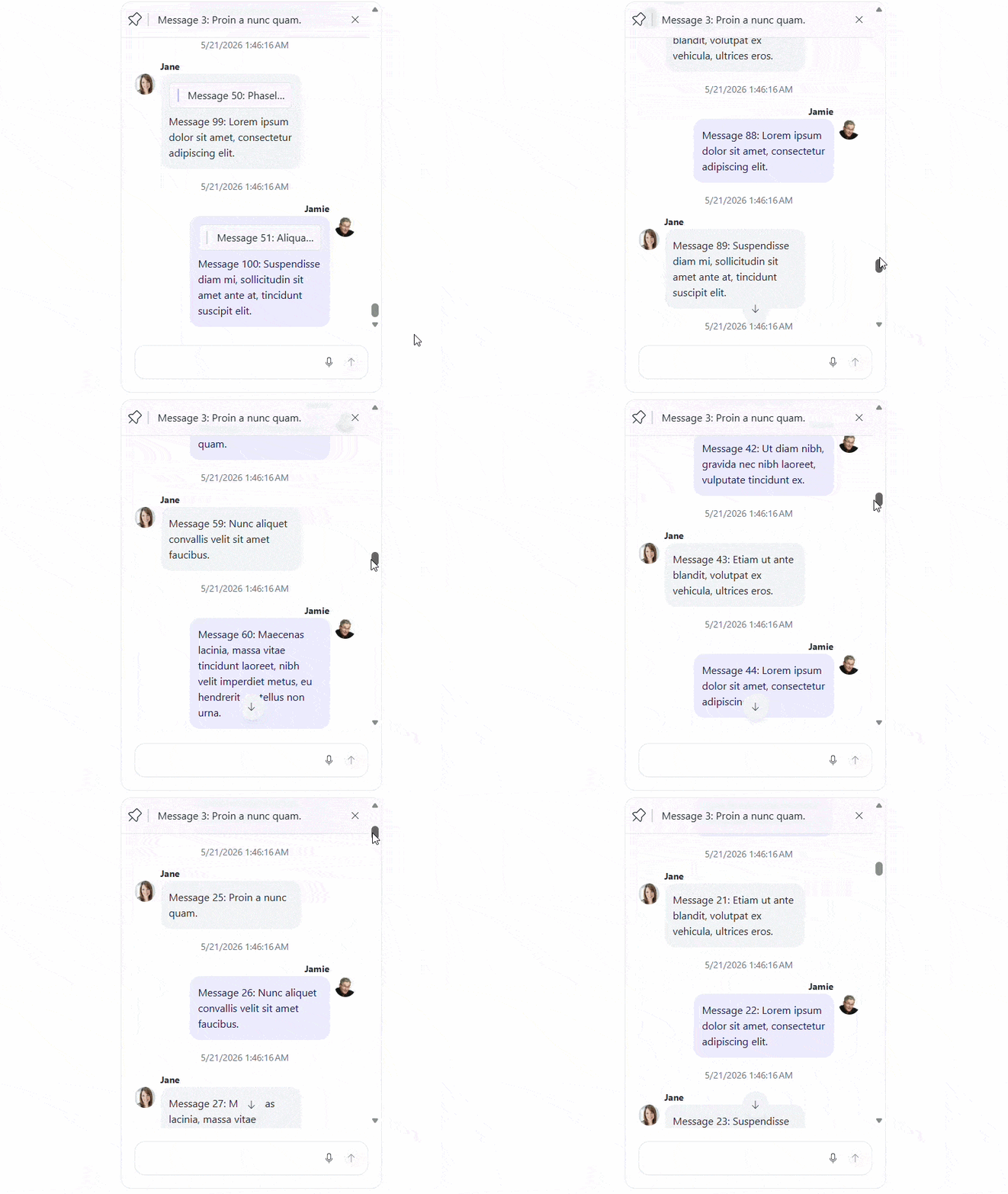
The Kendo UI for Angular Chat now introduces configurable scroll modes, giving you greater control over how conversations behave as new messages appear. With scroll modes, you can define whether the chat automatically scrolls to the latest message or preserves the user’s current position. This helps you tailor the experience based on the context of your application and user expectations.
See the Kendo UI for Angular Chat scroll modes demo
Rich Text Editing Comes to Kendo UI for Angular Diagram
You can now enhance your Kendo UI for Angular Diagram with rich text content, giving you more expressive and informative visuals directly within your applications. With rich text support, diagram elements are no longer limited to plain text. You can format content, emphasize key details, and structure information more clearly, making diagrams easier to read and more effective for communication.
More Control and Collaboration in Kendo UI for Angular Spreadsheet
The Spreadsheet component introduces several new features that give you finer control over editing, improve collaboration, and streamline common workflows:
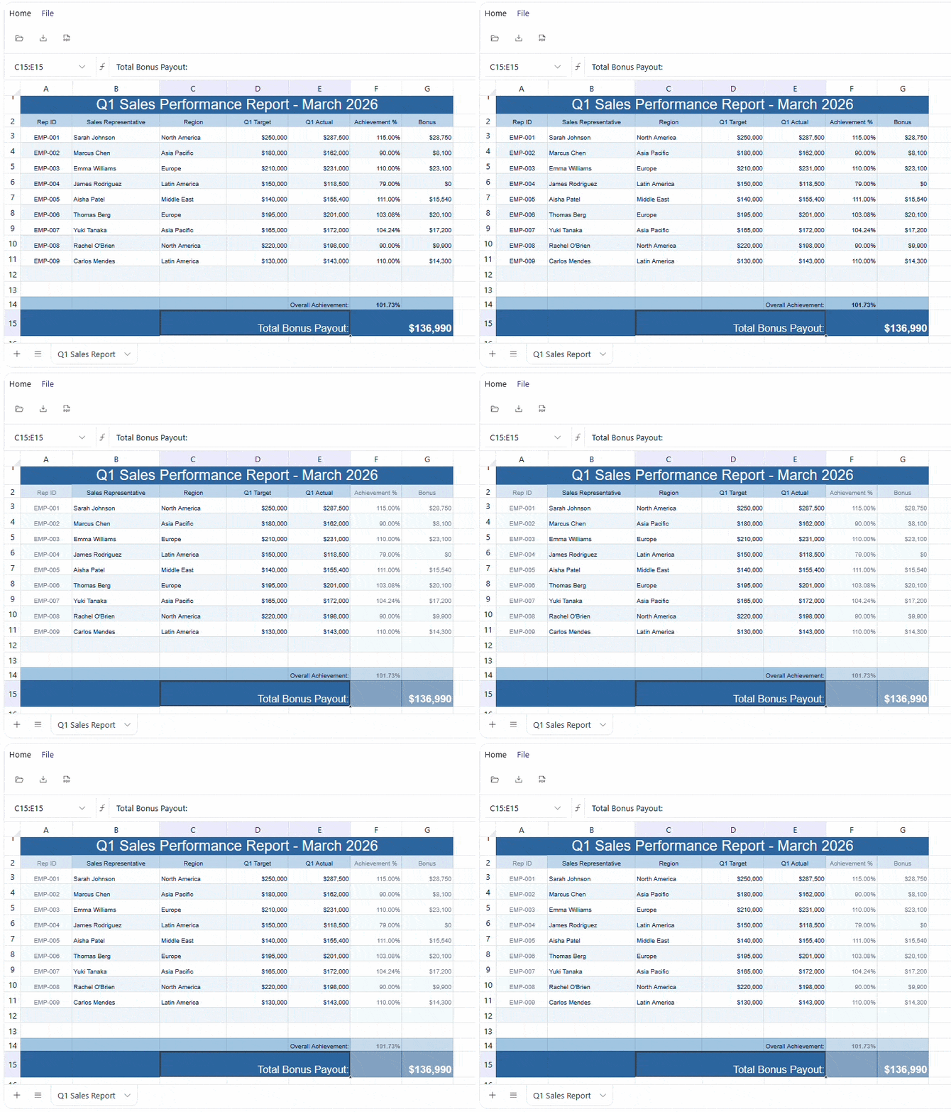
- Disabled Cells: You can now prevent editing specific cells by marking them as disabled. These cells remain visible but are non-interactive, helping protect important data from accidental changes.
- Cell Comments: Add contextual notes directly to cells with cell comments. This makes it easier to provide explanations, instructions, or feedback without altering the data itself.
- Cell and Sheet Operations: New APIs for cell and sheet operations give you more programmatic control over the Angular Spreadsheet behavior. You can update cell values, modify structure, and manage sheets more efficiently through code.
Integrated AI Chat in Telerik and Kendo UI Documentation
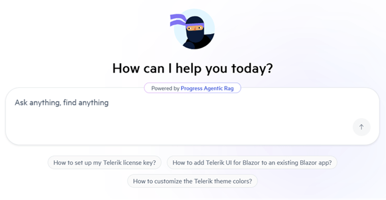
Telerik and Kendo UI documentation pages now support an integrated AI Chat, allowing you to easily ask questions and receive instant, context-aware answers directly within the page. The assistant helps you quickly locate relevant information, understand features, and explore related topics without interrupting your workflow. By combining search and conversational guidance, it streamlines navigation and improves productivity when working with components and APIs.
New Healthcare Sample App with Built-In AI Assistant
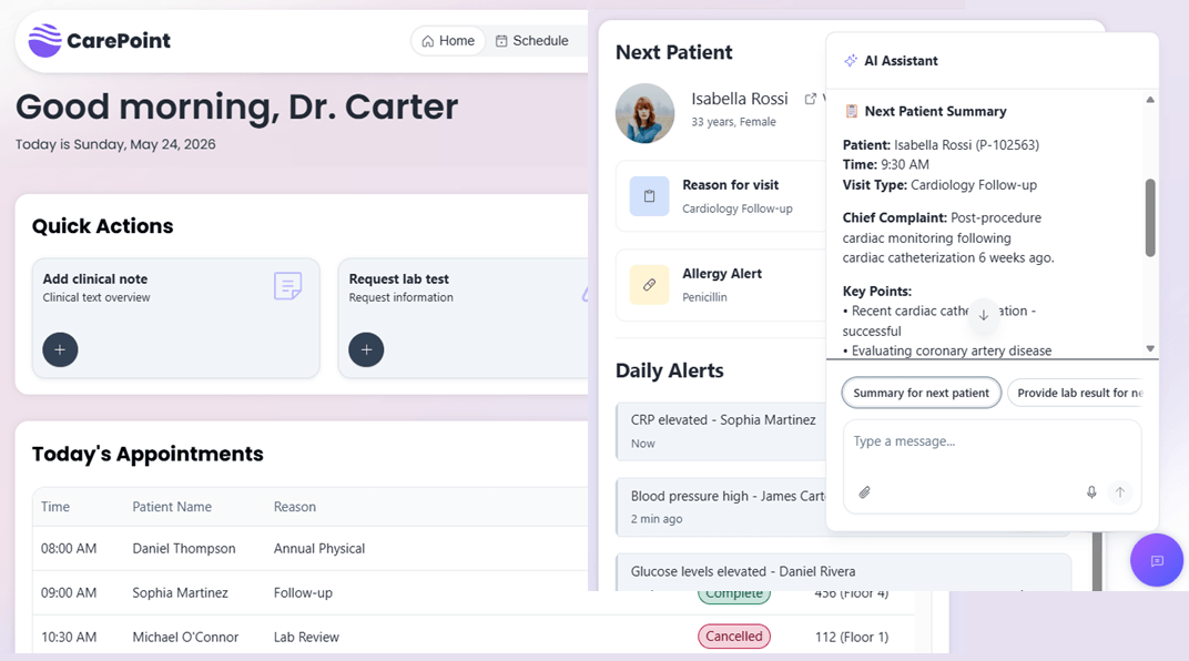
A new Healthcare Management sample application is now available, showcasing how to build a complete, real-world Angular app with Kendo UI components, enhanced with an integrated AI chat assistant. The app brings together dashboards, scheduling, patient data, and real-time alerts in a cohesive interface, while also demonstrating how AI can assist users directly.
See the Kendo UI for Angular healthcare sample app
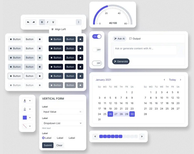
Kendo UI for Angular: Build Modern UI with a New Meridian Theme and Updated Icons
https://www.telerik.com/design-system/docs/themes/kendo-themes/meridian/
This release brings a refreshed visual foundation by combining the new Meridian theme with an updated and streamlined Kendo UI icons set, helping you create cleaner, more consistent, and modern user interfaces. The Meridian theme introduces a refined design language with improved colors, spacing, and visual hierarchy, while the updated icons complement it with a more cohesive and flexible set of visuals.
What's New 2026 Q1
PromptBox Component
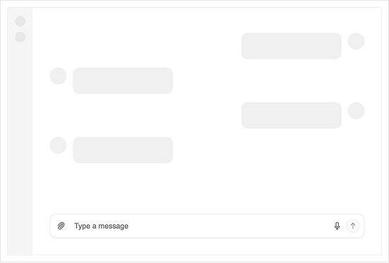
PromptBox is a dedicated Angular component for collecting prompts, attachments and actions in conversational and AI-assisted workflows. Choose from supported PromptBox modes to match compact, multiline or chat-style experiences, then add quick actions through configurable PromptBox tools for send, cancel or custom commands. Built-in support for adornments, file selection and keyboard navigation helps you ship consistent prompt entry across forms, chat screens and assistant panels. Explore all capabilities in the PromptBox documentation.
Key Features:
- Optimized for AI prompt input
- Clean, modern interface design
- Easy integration with AI services
- Customizable appearance and behavior
SmartPasteButton component turns clipboard text into form-ready data
SmartPasteButton is an AI-powered Angular Button component that extracts structured values from clipboard content and automatically fills form fields. With SmartPasteButton configuration, you can point the component to your AI service endpoint and describe the fields, mappings and allowed values you want returned. Use the SmartPasteButton events to manage the request lifecycle for loading states, cancellations and error handling, then plug results into reactive forms or template-driven forms. Get started with the SmartPasteButton documentation.
Key Features:- Intelligent clipboard data parsing
- Automatic data format detection
- Seamless form integration
- Reduces manual data entry errors
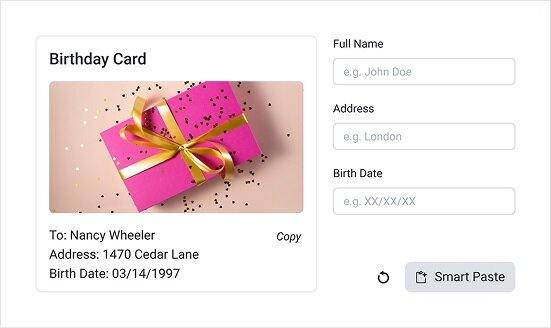
Diagram Tooltips add instant context to shapes and connections
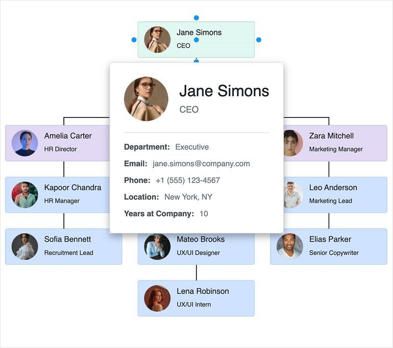
Diagram Tooltips bring inline context to complex visualizations by showing helpful details when users hover over diagram elements. Set tooltip content with tooltipText and control visibility globally through shapeDefaults and connectionDefaults, or per item when you need targeted guidance. For richer experiences, you can render custom templates for both shapes and connections to surface data from each element’s dataItem.
Learn more in the Diagram Tooltips documentation.
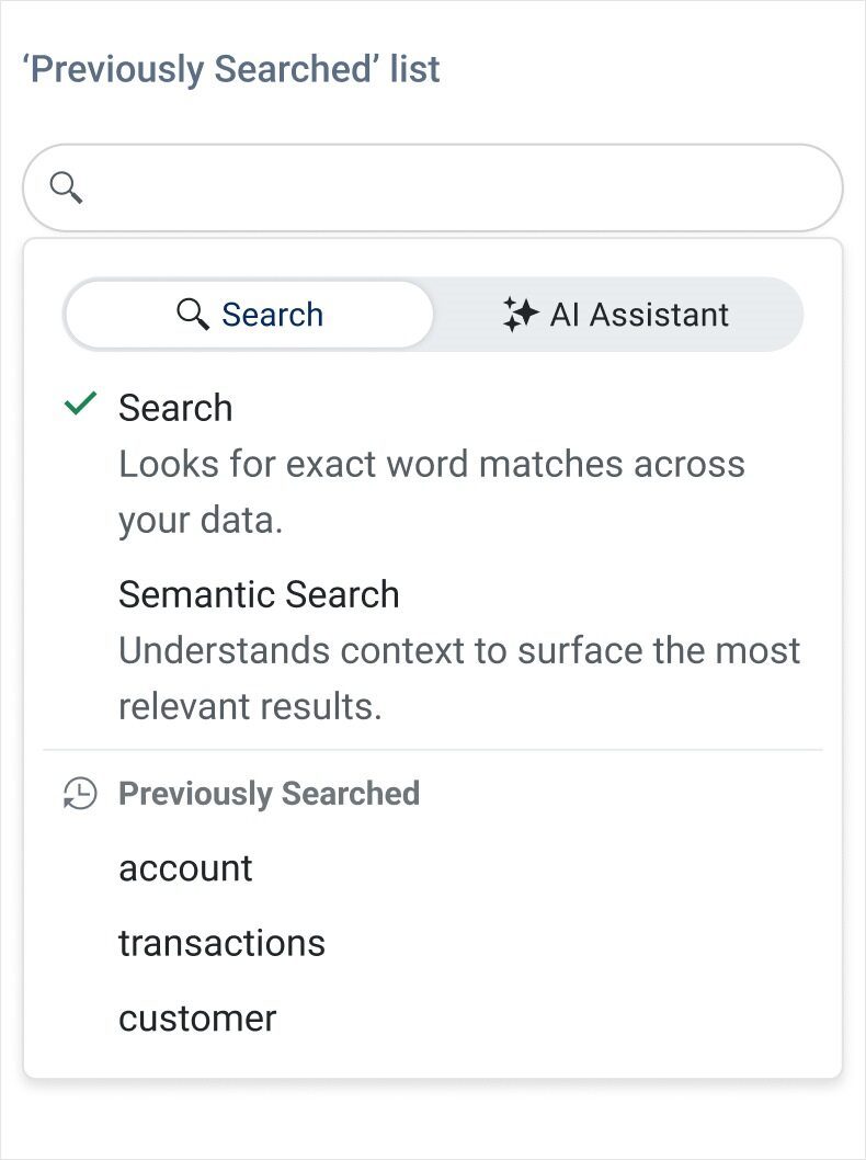
Smart Grid Semantic Search lets users filter with natural language
Smart Grid now supports Semantic Search mode in the AI Smart Box, so users can filter data with natural language instead of guessing exact column values. Add the AI Smart Box tool to your Grid toolbar and handle the semanticSearch event in your app to translate intent into filter criteria using the approach that fits your data (the demo uses a third-party service for illustration). Tune the experience with GridSmartBoxSemanticSearchSettings options like typing delay, placeholder text and query history.
See the full walkthrough in the Angular Data Grid Semantic Search documentation.
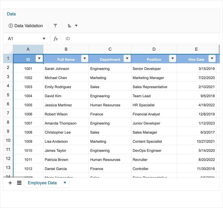
Spreadsheet Filtering and Sorting adds Excel-style data control
Spreadsheet users can now filter and sort ranges with familiar Excel-style interactions directly from the Data menu. Apply the built-in Filtering tool to add column dropdowns and narrow results by value, then use the Sorting tool to order a selected range ascending or descending. These options pair naturally with Spreadsheet Data Validation for cleaner data entry and you can extend the workflow further with Custom Cell Editors.
Dive into the details in the Spreadsheet Filtering and Sorting documentation.
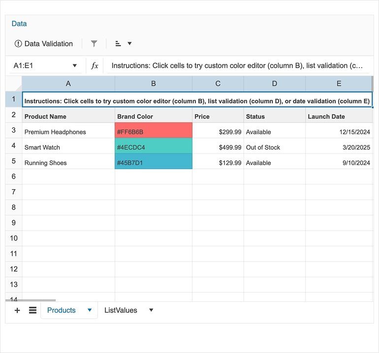
Spreadsheet Custom Cell Editors unlock specialized editing experiences
Custom Cell Editors let you plug specialized input components into Spreadsheet editing, making it easier to handle richer data types and tailored validation. Define editors with the cellEditors collection and connect user interactions back to cell ranges through action handlers, keeping editing logic clean and reusable. For deeper control over change flows and context, the SpreadsheetCellEditorHandlerArgs API and the broader Spreadsheet API surface the types you need to build robust editor integrations.
Get the full setup guide in the Spreadsheet Custom Cell Editors documentation.
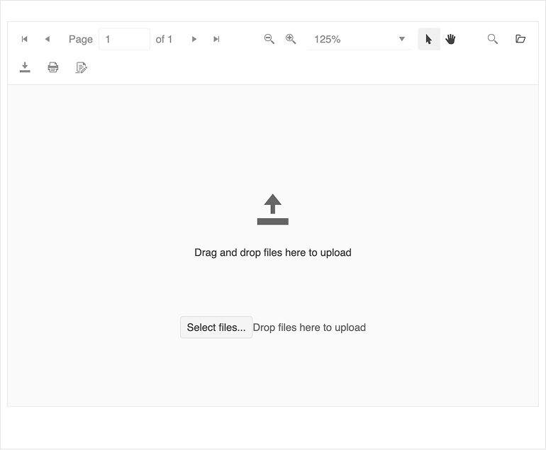
PDFViewer Blank Page improves empty-state UX and upload flows
PDFViewer now shows a purpose-built blank page when no document is loaded, complete with a drop zone for drag and drop and a file dialog upload option. Replace the default empty state with your own branding or upload flow using the BlankPageTemplateDirective and adjust default text through PDFViewerCustomMessagesComponent. If you need extra guardrails, handle the fileSelect event to validate file type, size or route the file through custom logic before loading.
Learn more in the PDFViewer Blank Page documentation.
Scheduler Month View now supports adaptive slot height
Month View in the Scheduler now supports adaptive slot height, helping dense calendars stay readable without hiding events behind a fixed row height. Set adaptiveSlotHeight to true to let each week row grow to fit the maximum number of displayed events, or enable it implicitly when using eventHeight='auto' or eventsPerDay='auto'. Use the MonthViewComponent API to fine-tune eventHeight, eventsPerDay and adaptiveSlotHeight together, and review shared options under View Features.
Follow the full guidance in the Scheduler Month View documentation.