Telerik UI for ASP.NET Core
What's New R3 2019
What's New HistoryOfficial Support for .NET Core 3.1
As a leading provider for ASP.NET Core components, we are always the first to provide compatibility with official release of .NET Core 3.0 which was released in September 2019. Now we are fully supporting .NET Core 3.1.

New Component: Timeline
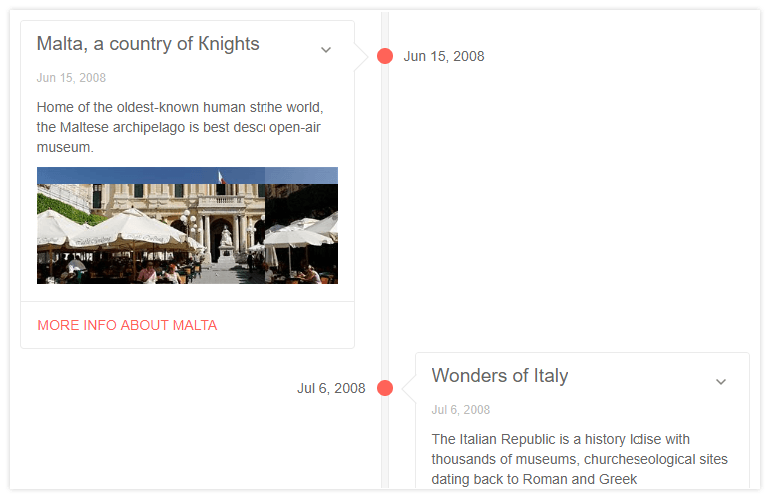
Displaying your company’s history or the set of events that lead to your most recent product success or trips is easy and simple with the new Telerik UI for ASP.NET Core Timeline control. The widget allows for portraying a customizable, databoundable list of events in chronological order on axis.You can do this in both - horizontal and vertical manner.

New Component: Rating
Collect measurable feedback on your products and services by using the Rating control. With multiple options to choose from, you can customize its rendering and behavior. Use a scale instead of discreet values, pick your favorite icon (stars, hearts, circles and more), let users use keyboard navigation with enhanced accessibility to give their vote.

New Component: Filter
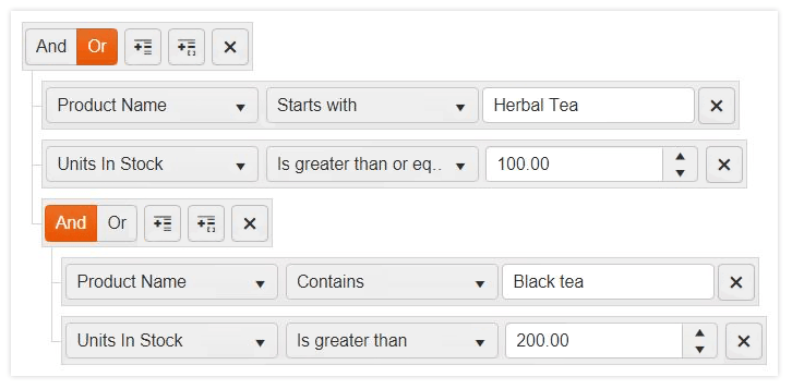
The Telerik UI for ASP.NET Core Filter component is a great partner to the Grid. It allows you to refine complex filtering expressions, combined by logical operators, on any databound control. This component enables users of your application to dynamically build custom filtering in a user friendly way.

New Component: Diagram
The Diagram component joins our ASP.NET Core bundle. Interactive diagrams and flowcharts are often needed in the business world and with this control it is so much easier to create them.
New Component: Card
We outdid ourselves this time around and added yet another new component. Telerik UI for ASP.NET Core is adding a new Card component to its suit. This component is used to group various pieces of content into a container which can be used throughout your application. It can be used to display bite-sized information in a variety of styles. Have a header with body or just an image with some buttons to display short bios of people, aggregating data sets or just popping up a reminder for an upcoming event
Built-in Search Panel in the Grid
Business data is ever increasing and understanding it requires good search, filter and sort capabilities in your tools. Our Grid component now hosts a built-in search panel, in addition to the existing grid filtering options. The search panel adds a search text box inside the grid toolbar and enables you to filter only the relevant records.
PDF Viewer Updates
The PDF viewer that we released in R2 received a set of enhancements. It now brandishes the ability to zoom and scale to the width of your page. Searching in the PDF and printing it from within our control is now also possible.

Document Processing Library in ASP.NET Core
Telerik Document Processing is one of our newest additions for ASP.NET Core. This functionality is a set of UI-independent and cross-platform libraries making converting content between different formats, PDF files generation and archive files management. Our document processing will include PDFProcessing, WordsProcessing, ZipLibrary & SpreadStreamProcessing.
Accessibility Improvements
Our ultimate goal is to have all of our components be WCAG compliant. For R3 we managed to get one step closer to this goal by improving the accessibility in the Grid, Editor, and MultiColumnComboBox to be compliant with the following standards: WAI-ARIA, WCAG 2.1, and Section 508.
To get more familiar with accessibility and its importance, check out our whitepaper focused on the topic to learn how accessibility affects your applications.
New features & Roadmap
Have a feature request?
Post your feedback via the ASP.NET Core UserVoice portal or the Public forums
What's new across all Telerik products?

Next Steps
See Telerik UI for ASP.NET Core in action and check out how much it can do out-of-the-box.
Check out the offers. Purchase an individual suite, or treat yourself to one of our bundles.
Try Telerik UI for ASP.NET Core with dedicated technical support.


