RadTimePicker Structure
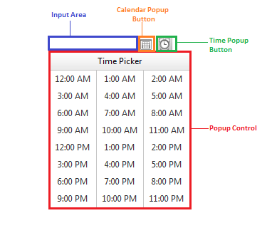
The RadDateTimePicker control is composite controls that combine the functionality of RadCalendar and RadTimeView with the functionality of RadDateInput to give the broadest possible range of options for selecting date and time values. The three controls have the same basic structure:

The three major components of a RadDatePicker, RadTimePicker or RadDateTimePicker control are:
-
InputArea - This is an embedded RadInput control, which validates dates or times as the user types.
-
Popup Control - This is a RadCalendar and RadTimeView control that is shown in a popup element, so that the user can select a date or time by clicking on the desired selection.
-
Calendar Popup Button and Time Popup Button - an image button, displayed next to the input area that shows and hides the popup control.
If the popup control is a RadCalendar control it must have AutoPostBack set to False in order to work properly. This means that a popup calendar cannot be used in multi-view mode.
Since RadDatePicker does not recognize other Time Popups excepts its own,it closes only the Calendar Popups. The following script can be added in order to allow the RadDatePicker to close all of the currently open Time Popups on the page:
<script type="text/javascript">
    Telerik.Web.UI.RadDatePicker.prototype._actionBeforeShowPopup_original = Telerik.Web.UI.RadDatePicker.prototype._actionBeforeShowPopup;
    Telerik.Web.UI.RadDatePicker.prototype._actionBeforeShowPopup = function () {
        this._actionBeforeShowPopup_original();
        if (Telerik.Web.UI.RadDateTimePicker) {
            Telerik.Web.UI.RadDateTimePicker.prototype._hideAllTimePopups();
        }
    }
</script>