Getting Started Overview
This tutorial will walk you through creating a Web page that uses RadTimePicker control. It shows how to:
-
Use a RadTimePicker control
-
Apply skins to change the overall look and feel of the control
-
Apply styles to tweak the appearance of the controls.
-
Configure the selection and navigation behavior of the RadCalendar control.
-
Add messages to appear when nothing is entered in the RadTimePicker.
-
Specify formats for display and editing.
Adding a RadTimePicker control
-
Drag a RadTimePicker control from the toolbox onto your Web page,below the RadDateTimePicker control.
-
In the RadTimePicker properties pane, set the Skin property to "Outlook" so that it matches the RadCalendar and RadDatePicker controls:

-
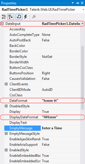
In the Behavior section of the properties pane, expand the DateInput property and configure the embedded RadDateInput control:
- Set the DateFormat property to "h:mm tt". This is the format string for when embedded RadDateInput control has focus (when the user can enter its value).
- Set the DisplayDateFormat property to "HH:mm". This causes the embedded RadDateInput control to format its value using a 24-hour clock when it does not have focus.
- Set the EmptyMessage property to " Enter a Time ", providing a prompt when the value of the RadTimePicker control has not been set.
- Set the TimeView-Interval property to "00:15:00", to specify 15-minute time intervals in the time picker popup.

-
Expand the TimeView property. This lets you configure the properties of the embedded RadTimeView control that acts as a popup for choosing time values. Set its BackColor property to "#DDEEFF", just like you did for the RadDateTimePicker control.
Running the application
-
Run the application. The RadTimePicker control shows an empty message, because no value has been assigned yet. The "Outlook" skin is used by the control.

-
Select a time value for the RadTimePicker control. Note the formatting changes depending on whether the controls have focus.