Tiles Overview
RadTile is a flexible UI component that brings the new Windows 8 Start Menu interface into the web applications and sites. In the previous version of Telerik® UI for ASP.NET AJAX they were used as a set of components in the RadTileList. Since Q3 2013 the Tiles can be used as a separate control outside of RadTileList.
Tile Types
The various tile types that are available are:
Common settings
The main feature and purpose of the control is navigation and it is controlled through the NavigateUrl and Target properties.
Each Tile has a Shape that controls how its position and size according to the other tiles.The possible values are Square (the default one, 150x150 pixels) and Wide(310x150 pixels).
Tiles can be easily designed and positioned in every part of the document.
Selection of tiles is also a major and can be preselected by using their Selected boolean property.
The Name property can be used to uniquely identify a tile (e.g. to get a reference to it) or to store some relevant information about it. It is an arbitrary string that should be unique among the collection of tiles. If duplicates are present onlythe first instance will be returned by the control.
The general appearance of the tiles is primarily controlled through the specific content set to each of them, yet there are some common properties for each tile:
-
BackColor will set the background of the tile and will override the default color that comes from the skin
-
ToolTip can be used to set the title attribute of the tile's HTML element and thus the browser will show a tooltip for it
-
Properties like BorderStyle, BorderWidth, BorderColor, ForeColor, Font-Bold, Font-Size, etc. can be used to change the appearance of the tile as they toggle the basic CSS properties of its content - border, font, etc.
-
Setting the Width and Height of each tile will override their default size.
Custom dimensions are supported only for standalone tiles and they can break the layout when used for tiles inside a RadTileList. Tiles used in a TileList only support the built-in dimensions (the Wide and Square options in the Shape property).
The Peek Template inner tag allows the declaration of a secondary content. Its behavior is controlled through the PeekTemplateSettings inner tag.
The Title and Badge inner tags allow the developer to control the additional information each of these elements shows on the tile.
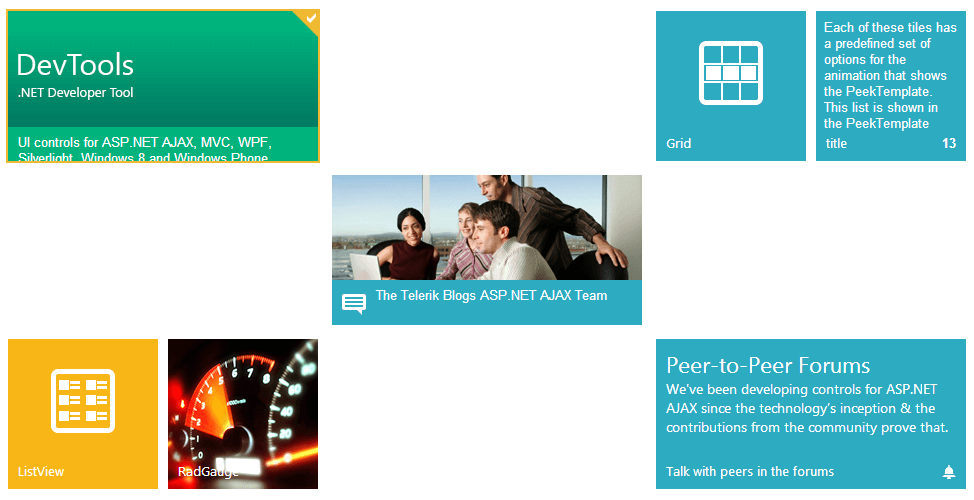
Here is an example of what you can achieve with the control:
