Getting Started
This tutorial will walk you through creating a RadTabStrip and shows how to:
-
Use the RadTabStrip item builder to add items to RadTabStrip.
-
Set properties on the items in the tab strip.
-
Apply a skin to specify the look and feel of the tab strip.
-
Use RadMultiPage to represent the content of tab pages.
-
Add pages to a RadMultiPage control.
-
Add controls to a page in a RadMultiPage control.
Creating a tab strip using the RadTabStrip Item Builder
-
Drag a RadTabStrip control from the toolbox onto your Web page. The RadTabStrip Smart Tag should appear automatically:
-
On the Smart Tag, choose Build RadTabStrip. The RadTabStrip Item Builder appears:
 **
** -
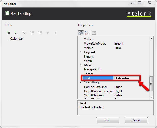
Click the Add root item button (
 ) to add a root item to your tab strip.
 -
The right pane of the RadTabStrip Item Builder displays the properties for your new root item. Change its Text property to "Calendar":
-
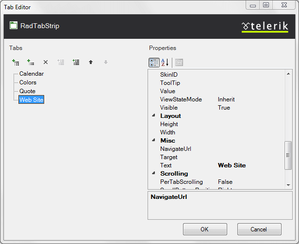
Click the Add root item button three more times to add three more root items to your tab strip. Set their properties as follows:
-
On the first new item (the second root item), set the Text property to "Colors".
-
On the next new item, set the Text property to "Quote" and the IsBreak property to True.
-
On the last new item, set the Text property to "Web Sites".The RadTabStrip Item Builder should now look like the following screen shot:
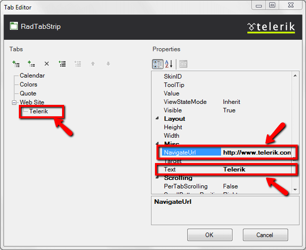
- Select the "Web Sites" root item, and then click the Add child item button (
 ) to add a child to that root item. With the child item selected, set the following properties:
-
Set the Text property to "Telerik".
-
Set the NavigateUrl property to "https://www.telerik.com".
- Select the "Web Sites" root item again, and add another child item.
-
Set its Text property to "Google".
-
Set its NavigateUrl property to
http://www.Google.com.The RadTabStrip Item Builder should now look like the following: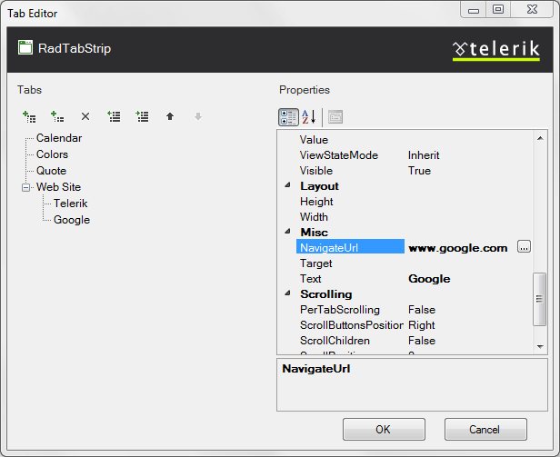
-
Click OK to exit the RadTabStrip Item Builder.
-
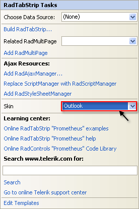
Back in the RadTabStrip Smart Tag, use the Skin drop-down to change the skin for the RadTabStrip to "Outlook":
-
The appearance of the RadTabStrip in the designer changes to reflect the new skin: You can also click on the tabs even in design time:
-
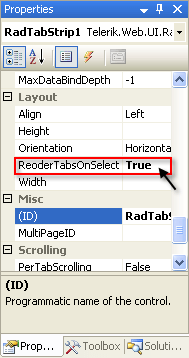
Right click on the RadTabStrip, and from its context menu, choose Properties.
-
In the Properties pane, set the ReorderTabsOnSelect property to True:
Creating a RadMultiPage control
-
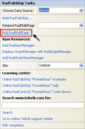
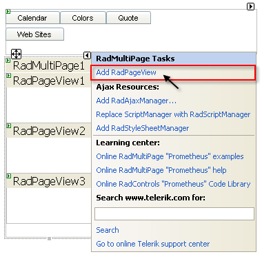
On the RadTabStrip Smart Tag, click the Add RadMultiPage link:
-
A RadMultiPage control appears on the Web page below the RadTabStrip. On the RadMultiPage Smart Tag, click the "Add RadPageView" link three times, to add three pages to the RadMultiPage control:Once you have added the RadPageView you can add pageviews to it using the RadPageView's SmartTag
-
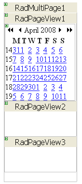
On the first RadPageView control ("RadPageView1"),
-
Delete the text that appeared by default.
-
Drag a RadCalendar control from the toolbox onto the surface of the RadPageView.
-
Set the Skin property of the RadCalendar control to "Outlook" so that it matches the look and feel of the tab strip:
-
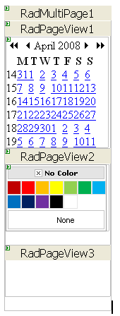
On the second RadPageView control ("RadPageView1"), drag a RadColorPicker control from the toolbox onto the surface of the RadPageView:
-
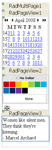
On the third RadPageView control ("RadPageView3"), type the text of a quotation onto the surface of the control:
-
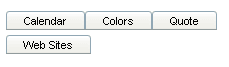
Run the application. The tab strip appears, containing two rows: the first three items appear in the first row, and the fourth item in a second row. This is because you set the IsBreak property to True for the third item, creating a break before the fourth item.
-
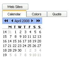
Click on one of the first three tabs. The tab moves down to the bottom row (because the ReorderTabsOnSelect property is True) and the corresponding page from the RadMultiPage control appears:
-
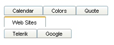
Click on the "Web Sites" tab. It moves down to the bottom row and displays tabs for the two child items:
-
Click on one of the child items. The Web page changes to the page you specified using the NavigateUrl property.