Common Issues
This help article lists the most common issues one can face when using the ASP.NET AJAX Chart control and offers possible solutions for them.
- Tooltips are hidden behind RadWindow or RadNotification.
- Legend is not visible.
- XAxis labels are cluttered or overlapping.
- YAxis is not rescaled in a stock chart when changing the selection range.
- There is a redundant space between pie or donut chart and its legend.
- PlotArea is Shrunk by the Legend / PlotArea Dimensions Depend on the Legend Size.
- RadHtmlChart cannot be bound to a data source that has special characters in its field names.
- Chart with display: none does not show itself
- Client Events are not Firing and Tooltip is not Functioning
- Overlapping Labels on Stacked Columns
Tooltips are Hidden Behind RadWindow or RadNotification
Solution: The chart's tooltip has a z-index of 1000 which is lower than the z-index of the RadWindow/RadNotification. You can ensure a higher z-index for the tooltips by overriding the default style:
<style type="text/css">
	html .k-tooltip.k-chart-tooltip {
		z-index: 100001;
	}
</style>
You can find the list of Telerik UI controls with absolute positioning and their default z-index in the Controlling Absolute Positioning with z-index help article.
Legend is Not Visible
Solution: The chart's legend consists of series' names for all series except for the pie, donut and funnel series where the items' names are used. You must set the Name property of each series/item for them to show in the legend.
XAxis Labels are Cluttered or Overlapping
Solution: This happens when the x-axis labels are either too long, or there are many labels on the x-axis (see the left chart in Figure 1). You can try one of the following steps (the fixed labels appearance is shown in the right chart in Figure 1):
- Render every n-th label through the XAxis.LabelsAppearance.Step property.
- Rotate x-axis labels to a particular angle through the XAxis.LabelsAppearance.RotationAngle property.
- Wrap labels through the "\n" line feed character. See an example in the Multiline Labels help article.
Figure 1: A chart with cluttered x-axis labels next to a chart with properly displayed x-axis labels. The code that creates both charts is available in Example 1.
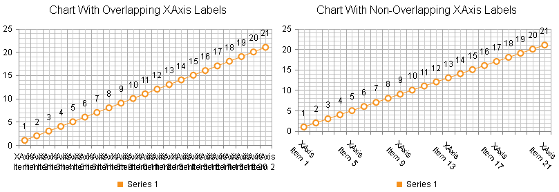
Example 1: Calling the FixAxisLabelsOverlapping() method for the right chart (Figure 1) resolves the x-axis labels cluttering in the left chart(Figure 1).
<style>
	.RadHtmlChart {
		display: inline-block;
	}
</style>
<telerik:RadHtmlChart runat="server" ID="RadHtmlChart1" Width="400px" Height="300px">
	<ChartTitle Text="Chart With Overlapping XAxis Labels"></ChartTitle>
	<PlotArea>
		<Series>
			<telerik:LineSeries Name="Series 1">
			</telerik:LineSeries>
		</Series>
	</PlotArea>
	<Legend>
		<Appearance Position="Bottom"></Appearance>
	</Legend>
</telerik:RadHtmlChart>
<telerik:RadHtmlChart runat="server" ID="RadHtmlChart2" Width="400px" Height="300px">
	<ChartTitle Text="Chart With Non-Overlapping XAxis Labels"></ChartTitle>
	<PlotArea>
		<Series>
			<telerik:LineSeries Name="Series 1">
			</telerik:LineSeries>
		</Series>
	</PlotArea>
	<Legend>
		<Appearance Position="Bottom"></Appearance>
	</Legend>
</telerik:RadHtmlChart>YAxis is not Rescaled in a Stock Chart When Changing the Selection Range
Solution: The YAxis.Name property of the main YAxis is set but the series' AxisName property is not. You must either remove the main axis' YAxis.Name property declaration or associate it to the corresponding series AxisName property.
There is a Redundant Space Between Pie or Donut Chart and its Legend
Solution: You can either offset the legend (see an example in the ADD legend positioning options for RadHtmlChart feedback item) or set a negative value for the Margin property of the chart's PlotArea (see Example 2).
Example 2: Decreasing the distance between the pie and its legend by setting a negative margin for its PlotArea.
<telerik:RadHtmlChart runat="server" ID="PieChart1" Width="400px" Height="400px">
	<PlotArea>
		<Appearance>
			<TextStyle Margin="-30" />
		</Appearance>
		<Series>
			<telerik:PieSeries>
				<SeriesItems>
					<telerik:PieSeriesItem Y="30" Name="Item 1" />
					<telerik:PieSeriesItem Y="10" Name="Item 2" />
					<telerik:PieSeriesItem Y="20" Name="Item 3" />
				</SeriesItems>
			</telerik:PieSeries>
		</Series>
	</PlotArea>
</telerik:RadHtmlChart>
PlotArea is Shrunk by the Legend / PlotArea Dimensions Depend on the Legend Size
Generally, the size of the chart's elements, including the PlotArea, is dynamic, so that all the elements can fit in with the chart's wrapper size. This, however, may lead to the following issues:
-
Longer legend names will shrunk the PlotArea dimensions.
-
Charts with similar dimensions and series but different legend size (e.g., the length of the legend items varies) will have a different PlotArea size.
Figure 2: Compare two charts with similar dimensions but different PlotArea sizes.
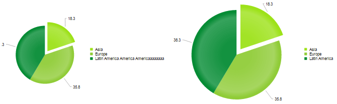
You can resolve these issues as follows:
-
Set additional margin between the PlotArea and the legend via the PlotArea.Appearance.TextStyle.Margin property.
-
Define a custom position for the legend via the Legend.Appearance.Position, OffsetX and OffsetY properties.
Figure 3: Comparing two charts with similar sized PlotAreas and wrapper elements.

Example 3: Set a custom position for the legend in order to get a fixed PlotArea size.
<telerik:RadHtmlChart runat="server" ID="PieChart1" Transitions="true" Width="750px" Height="400px">
	<Legend>
		<Appearance Position="Custom" OffsetX="450" OffsetY="150"></Appearance>
	</Legend>
	<PlotArea>
		<Appearance>
			<TextStyle Margin="0 250 0 0" />
		</Appearance>
		<Series>
			<telerik:PieSeries StartAngle="90">
				<SeriesItems>
					<telerik:PieSeriesItem BackgroundColor="#9de219" Exploded="true" Name="Asia" Y="18.3" />
					<telerik:PieSeriesItem BackgroundColor="#90cc38" Exploded="false" Name="Europe" Y="35.8" />
					<telerik:PieSeriesItem BackgroundColor="#068c35" Exploded="false" Name="Latin America America Americaaaaaaaa" Y="38.3" />
				</SeriesItems>
			</telerik:PieSeries>
		</Series>
	</PlotArea>
</telerik:RadHtmlChart>
<telerik:RadHtmlChart runat="server" ID="RadHtmlChart1" Transitions="true" Width="750px" Height="400px">
	<Legend>
		<Appearance Position="Custom" OffsetX="450" OffsetY="150"></Appearance>
	</Legend>
	<PlotArea>
		<Appearance>
			<TextStyle Margin="0 250 0 0" />
		</Appearance>
		<Series>
			<telerik:PieSeries StartAngle="90">
				<SeriesItems>
					<telerik:PieSeriesItem BackgroundColor="#9de219" Exploded="true" Name="Asia" Y="18.3" />
					<telerik:PieSeriesItem BackgroundColor="#90cc38" Exploded="false" Name="Europe" Y="35.8" />
					<telerik:PieSeriesItem BackgroundColor="#068c35" Exploded="false" Name="Latin America" Y="38.3" />
				</SeriesItems>
			</telerik:PieSeries>
		</Series>
	</PlotArea>
</telerik:RadHtmlChart>
RadHtmlChart Cannot be Bound to a Data Source that Has Special Characters in Its Field Names
Solution: Rename the field names in the query so they do not contain special symbols. Problematic field names include but are not limited to:
- white space (intervals)
- quotation marks
- apostrophes
- slashes
- brackets
- start with a number
- and others
Potential Workaround: Special characters in data source field names can sometimes be escaped by surrounding the name with quotes and brackets (see Example 4). This applies to properties of the axes. Properties of series may work without such escaping (see Example 5).
Certain special characters may still break this and you also need to make sure to escape the field names properly for JavaScript, such as in client templates (see Example 5) and that may not always be possible.
In such cases you need to rename the fields so they do not contain special symbols and so they follow the rules for JavaScript variable names. For example, field names cannot begin with a number, cannot contain whitespace or special characters.
There are invalid characters in data source field names that cannot be escaped including "(", ")", "[", "]", ".", "/", "". More information is available in the Datacolumn name illegal character forum post. Limitations coming from JavaScript variable names conventions (like starting with numbers) also cannot be escaped.
Example 4: Escaping special characters in field names by surrounding the name with quotes and brackets.
<telerik:RadHtmlChart runat="server" ID="ColumnChart" Width="600px" Height="400px">
	<PlotArea>
		<Series>
			<telerik:ColumnSeries DataFieldY="yValues" Name="Series 1"></telerik:ColumnSeries>
		</Series>
	</PlotArea>
</telerik:RadHtmlChart>const string DATA_TABLE_NAME = "@1my xvalues";
protected void Page_Load(object sender, EventArgs e)
{
//Escape data source field names that contain special characters with quotes surrounded by brackets
ColumnChart.PlotArea.XAxis.DataLabelsField = "[\\'" + DATA_TABLE_NAME + "\\']";
ColumnChart.DataSource = GetData();
ColumnChart.DataBind();
}
protected DataTable GetData()
{
DataTable table = new DataTable();
table.Columns.Add("yValues", typeof(int));
table.Columns.Add(DATA_TABLE_NAME, typeof(string));
table.Rows.Add(new object[] { 10, "item 1" });
table.Rows.Add(new object[] { 20, "item 2" });
return table;
}Example 5: Using fields with whitespace in the name in client templates and for series properties
protected void Page_Load(object sender, EventArgs e)
{
	RadHtmlChart chart = new RadHtmlChart();
	chart.ID = "theChart";
	Form.Controls.Add(chart);
	PieSeries series = new PieSeries();
	series.DataFieldY = "yValues";
	series.NameField = "my Field";
	series.TooltipsAppearance.ClientTemplate = "Category: #=dataItem[\\'my Field\\']#";
	chart.PlotArea.Series.Add(series);

	chart.DataSource = GetData();
	chart.DataBind();
}

protected DataTable GetData()
{
	DataTable table = new DataTable();
	table.Columns.Add("yValues", typeof(int));
	table.Columns.Add("my Field", typeof(string));
	table.Rows.Add(new object[] { 10, "item 1" });
	table.Rows.Add(new object[] { 20, "item 2" });
	return table;
}Chart with 'display: none' Does Not Show Itself
If you have a RadHtmlChart with display: none set to its wrapper element, toggling its CSS attribute to display: block, for example, may result in the chart not showing itself, remaining invisible or being distorted.
This happens because the hidden container does not let the control evaluate its dimensions, size and render properly.
To resolve this, call its repaint client-side method so the chart will redraw itself.
Example 6: Showing an initially hidden chart.
<script>
	function showChart() {
		var chartId = "<%=RadHtmlChart1.ClientID%>";
		var wrapper = $get(chartId);
		var chartObj = $find(chartId);
		wrapper.style.display = "";
		chartObj.repaint();
	}
</script>
<asp:Button ID="Button1" Text="show chart" OnClientClick="showChart(); return false;" runat="server" />
<telerik:RadHtmlChart runat="server" ID="RadHtmlChart1" Style="display: none;" Width="400px" Height="400px">
	<PlotArea>
		<Series>
			<telerik:PieSeries>
				<SeriesItems>
					<telerik:PieSeriesItem Y="1" Name="one" />
					<telerik:PieSeriesItem Y="2" Name="two" />
					<telerik:PieSeriesItem Y="3" Name="three" />
				</SeriesItems>
			</telerik:PieSeries>
		</Series>
	</PlotArea>
</telerik:RadHtmlChart>
Client Events are not Firing and Tooltip is not Functioning
There are two common causes for the client-side features of the chart to not work as expected:
- There is a JavaScript error on the page that breaks the scripts.
- The chart was moved in the DOM (something like
$telerik.$("#someElement").html($telerik.$("#chartContainer").html();) - this is not supported by the chart and you should try to render it in the place you need it. If you need it shown conditionally, keep it in a<div style="display:none">and call itsrepaint()method after showing it, or set its server-sideVisibleproperty tofalseand invoke a partial postback that will update it so you can toggle it totrue.
Overlapping Labels on Stacked Columns
If your RadHtmlChart uses a Stacked Series with Series Labels, you may observe that the labels are overlapping with small data values.
This occurs because the labels render a certain distance from the border of the series item. Adding some padding to the LabelsAppearance can help with increasing the distance between labels.
<telerik:ColumnSeries Name="A" Stacked="true" StackType="Normal">
    <SeriesItems>
        <telerik:CategorySeriesItem Y="1" />
    </SeriesItems>
<LabelsAppearance Visible="true">
    <TextStyle Padding="20" />
</LabelsAppearance>
</telerik:ColumnSeries>
Alternatively, you may choose to hide the labels for most series via their Visible property and show a totals label or ues a shared label.