.NET MAUI PromptInput Configuration
The PromptInput provides a number of settings for configuring the way its input area, built-in buttons, and attached files are displayed and behave.
Setting the Message
The PromptInput exposes the Message (object) property which gets or sets the message that is typed in the input area. You can bind the Message property to a view-model property and use it to retrieve the current value of the input.
Adding Placeholder
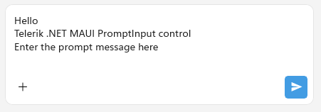
The PromptInput exposes the Placeholder (string) property that prompts the user what information is expected in the input area. The placeholder text is displayed when the control is empty.
The following example demonstrates how to set the Placeholder property:
<telerik:RadPromptInput Placeholder="Type a prompt" />Setting the Display Mode
The DisplayMode (Telerik.Maui.Controls.PromptInput.PromptInputDisplayMode) property allows you to control how the PromptInput is rendered. The property accepts the following values:
-
(Default on mobile)
Automatic—The control automatically chooses the most appropriate layout depending on the available space. When the affix or the more button are not visible, the control renders in a compact single-line layout when unfocused, when it gets focused, it renders in an expanded multi-line layout. -
Compact—The control renders in a compact single-line layout with all elements displayed in a single-line. -
(Default on desktop)
Expanded—The control renders in an expanded multi-line layout.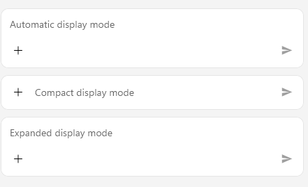
The following example demonstrates how to set the DisplayMode property to Automatic:
<telerik:RadPromptInput Placeholder="Automatic display mode" />The following example demonstrates how to set the DisplayMode property to Compact:
<telerik:RadPromptInput DisplayMode="Compact"
                        Placeholder="Compact display mode"
                        Grid.Row="1" />
The following example demonstrates how to set the DisplayMode property to Expanded:
<telerik:RadPromptInput DisplayMode="Expanded"
                        Placeholder="Expanded display mode"
                        Grid.Row="2" />
For a runnable example demonstrating the PromptInput DisplayMode options, see the SDKBrowser Demo Application and go to the PromptInput > Features category.
Defining the Max Input Lines
The MaxInputLines (int) property allows you to set the maximum number of lines the text input area displays before it becomes scrollable. The default value is 5. When the DisplayMode is set to Compact, the input area is always rendered on a single line regardless of this value.
The following example demonstrates how to set the MaxInputLines property:
<telerik:RadPromptInput x:Name="promptInput"
                        MaxInputLines="4" />
This is the result on WinUI:
For a runnable example demonstrating the PromptInput MaxInputLines property, see the SDKBrowser Demo Application and go to the PromptInput > Features category.
Controlling the Buttons Visibility
The PromptInput exposes the following properties that control the visibility of its built-in buttons:
IsMoreButtonVisible(bool)—Specifies whether the 'More' button is visible in the input area. When visible, the button provides access to additional actions, such as attaching files or photos. The default value istrue.IsSpeechToTextButtonVisible(bool)—Specifies whether the Speech-to-Text button is visible in the input area. When visible, end users can dictate their messages through speech recognition. The default value istrue.
The following example demonstrates how to control the visibility of the built-in buttons:
<telerik:RadPromptInput x:Name="promptInput"
                        IsMoreButtonVisible="False"
                        IsSpeechToTextButtonVisible="True" />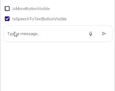
Configuring the Send Message Button
The SendMessageButtonImage (ImageSource) property allows you to set a custom image for the Send Message button.
<telerik:RadPromptInput SendMessageButtonImage="send_icon.png" />Configuring the More Button Actions
The 'More' button can display a collection of custom actions. The PromptInput exposes the following properties for configuring them:
MoreButtonActions(IList<PromptInputButtonAction>)—Defines the collection of actions displayed in the More button. The built-in default actions are Attach files, Attach photos and Take photo. You can add custom actions to the collection or replace the default ones entirely by setting the following property:AutoGenerateMoreButtonActions(bool)—Defines a value indicating whether default actions for the More button are automatically generated. The default value istrue.
Managing the Attached Files
The PromptInput displays the currently attached files that have not been sent yet through the AttachedFiles (ICollection<PromptInputAttachedFile>) property.
The PickFileTypes (FilePickerFileType) property allows you to specify the type of files that can be attached through the UI displayed when the end user taps the attach-files action.
For runnable examples demonstrating the PromptInput Configuration options, see the SDKBrowser Demo Application and go to the PromptInput > Features category.