.NET MAUI Editor Validation
The Telerik UI for .NET MAUI editor control provides a built-in validation mechanism. If the user enters a value that doesn't satisfy the requirements, the Editor will display an error message, which you can customize.
-
IsValueValid(bool)—Specifies whether the Text entered inside the control is valid. The default value istrue. -
ValidationErrorMessage(string)—Specifies the error message which is displayed when the text entered inside the control is not valid. -
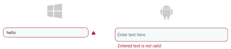
The control in
MacCatalystis preserving space on its right side for the error icon. If developers are not using the validation feature of the Entry, the control has an API that makes the control takes its entire space - theReserveSpaceForErrorView(bool) property. The default value istrue.
The image below shows the error icon that is displayed inside the reserved space:
Here is an example of how to use the validation properties:
<telerik:RadEditor ValidationErrorMessage="Value is not valid"
				   IsValueValid="False"
				   Placeholder="Enter text here"
				   PlaceholderColor="#99000000" />
Styling the Error View
Use the following properties to style the error view when validation applies:
ValidationErrorColor(Color)—Defines the custom color for the error views.ValidationErrorImageStyle(Stylewith target typeImage)—Defines the style that applies to the error icon.ValidationErrorLabelStyle(Stylewith target typeLabel)—Defines the style that applies to the error label.
For a runnable example demonstrating the Editor's Validation styling, see the SDKBrowser Demo Application and go to the Editor > Styling category.