.NET MAUI Editor Text Appearance
The Editor provides settings for configuring text appearance, placeholder text, read-only behavior, and other text-input options.
Setting the Text Input
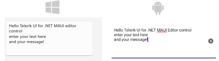
The following properties are related to the appearance and alignment of the text in the Editor control.
Text(string)—Defines the text.TextColor(Microsoft.Maui.Graphics)—Defines the color of the visible text.TextTransform(Microsoft.Maui.TextTransform)—Defines the transformation of the text.VerticalTextAlignment(Microsoft.Maui.TextAlignment)—Specifies the vertical alignment of the text.HorizontalTextAlignment(Microsoft.Maui.TextAlignment)—Specifies the horizontal alignment of the text.
This is the result when entering text in multiple lines:
Adding Placeholder
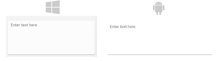
The Editor exposes the Placeholder (string) property that prompts users what information they are expected to enter in the text input. The placeholder text is displayed when the control is empty. Additionally, you can set the PlaceholderColor(Color) to customize the look of the watermark text as demonstrated in the following example.
<telerikInput:RadEditor Placeholder="Enter text here"
					    PlaceholderColor="#6EA3FF" />
The following image shows the end result.
Setting the Read-Only State
Use the IsReadOnly (bool) property to control whether end users can edit the Editor content. By default, IsReadOnly equals False. Set IsReadOnly to True to prevent editing.
<telerik:RadEditor x:Name="telerikEntry"
				   Text="Telerik UI for .NET MAUI Editor control"
				   IsReadOnly="True" />
Defining the Max Length
You can restrict the number of the symbols the Editor control allows for its input field by using the MaxLength (int) property.
The following example demonstrates how to set the maximum length of the input to 200 symbols.
<telerik:RadEditor x:Name="telerikEntry"
				   Placeholder="Enter text"
				   MaxLength="200" />
Defining the Max Lines
Use the MaxLines (int) property to set the maximum number of lines for the Editor input. By default, MaxLines equals 0, which means the Editor does not limit the number of lines.
Here is an example of how to set the MaxLines property:
<telerik:RadEditor x:Name="telerikEntry"
				   Placeholder="Enter text"
				   MaxLines="10" />
Configuring Auto-Size
The AutoSize (enum of type EditorAutoSizeOption) property controls whether the Editor changes its height automatically while users enter text. Automatic resizing is turned off by default.
The available options are:
Disabled(Default)—The Editor keeps its current height.TextChanges—The Editor grows and shrinks according to the entered text.
<telerik:RadEditor Placeholder="Enter text"
                   AutoSize="TextChanges"
                   MaxLines="10" />
Setting Spacing Between the Characters
The CharacterSpacing (double) property allows you to define the space between the characters inside the control.
Setting Text Prediction
The IsTextPredictionEnabled (bool) property allows you to define whether text prediction and automatic text correction are on or off. The default value is False (text prediction and automatic text correction are disabled).
<telerik:RadEditor x:Name="entry"
				   IsTextPredictionEnabled="True"
				   Placeholder="Enter Text" />
Setting the Keyboard Type
The Keyboard property of type Microsoft.Maui.Keyboard allows you to define the type of the keyboard that will be visualized by the device.
<telerik:RadEditor x:Name="entry"
				   Keyboard="Numeric"
				   Placeholder="Enter Number" />
Defining the Clear Button Visibility
The ClearButtonVisibility (Microsoft.Maui.ClearButtonVisibility) indicates when the clear button (the button that clears the text when pressed) can be displayed. The default value is WhileEditing.
If you want to hide the clear button while entering text inside the control, then set the ClearButtonVisibility to Never.