.NET MAUI CollectionView DragVisual & DropIndicator Templates
The CollectionView provides the following templates for customizing the drag cue during a drag-and-drop operation as well as the indicator where the dragged item will be dropped:
-
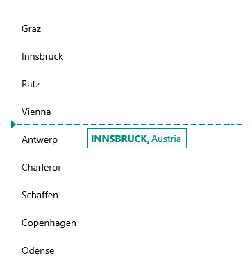
DragVisualTemplate(DataTemplate)—Represents the drag visual of the dragged item during a drag-and-drop operation. -
DropIndicatorTemplate(DataTemplate)—Represents the indicator shown between the CollectionView items during a drag-and-drop operation which shows where the dragged item will be dropped.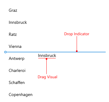
Check an example of the CollectionView with sample DragVisualTemplate and DropIndicatorTemplate:
1. Add a sample DataTemplate for the drop indicator to the page's resources:
<DataTemplate x:Key="CustomDropIndicatorTemplate">
<Grid ColumnDefinitions="Auto, *">
<Label FontFamily="TelerikFontExamples"
FontSize="20"
Text=""
TextColor="#00897B" />
<Line Grid.Column="1"
X2="100"
Aspect="UniformToFill"
Stroke="#00897B"
StrokeThickness="2"
StrokeDashArray="4, 2"
StrokeDashOffset="1"
VerticalOptions="Center" />
</Grid>
</DataTemplate>2. Add a sample DataTemplate for the drag visual to the page's resources:
<DataTemplate x:Key="CustomDragVisualTemplate">
    <telerik:RadBorder BackgroundColor="#FAFAFA"
                       BorderColor="#00897B"
                       BorderThickness="1">
        <Grid ColumnDefinitions="Auto, Auto, *"
              ColumnSpacing="2"
              Padding="4">
            <Label Text="{Binding City, StringFormat='{0},'}"
                   TextColor="#00897B"
                   TextTransform="Uppercase"
                   FontAttributes="Bold"
                   VerticalTextAlignment="Center" />
            <Label Grid.Column="1"
                   Text="{Binding Country}"
                   TextColor="#00897B"
                   VerticalTextAlignment="Center" />
        </Grid>
    </telerik:RadBorder>
</DataTemplate>
3. Add the RadCollectionView definition with the DragVisualTemplate and DropIndicatorTemplate set to the previously defined templates:
<telerik:RadCollectionView x:Name="collectionView"
                           ItemsSource="{Binding Locations}"
                           DisplayMemberPath="City"
                           IsDragDropEnabled="True"
                           SelectionMode="Single"
                           DropIndicatorTemplate="{StaticResource CustomDropIndicatorTemplate}"
                           DragVisualTemplate="{StaticResource CustomDragVisualTemplate}">
    <telerik:RadCollectionView.BindingContext>
        <local:ViewModel />
    </telerik:RadCollectionView.BindingContext>
</telerik:RadCollectionView>
For the purpose of the example, use the ViewModel and DataModel classes from the Drag and Drop Overview page.
Check the result below: