New to Telerik UI for .NET MAUI? Start a free 30-day trial
.NET MAUI CircularSlider Visual Structure
Updated on Aug 20, 2026
The visual structure of the .NET MAUI CircularSlider represents the anatomy of the UI component. Being familiar with the visual elements of the CircularSlider allows you to quickly find the information required to configure them.
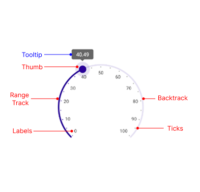
The following image shows the anatomy of the CircularSlider.
Displayed Elements
- Backtrack—The circular arc across which the value thumb slides.
- Thumb—A draggable handle which represents the CircularSlider value.
- Tooltip—A visual indicator of the current value selected with the thumb.
- Range Track—The part of the backtrack from its origin along to the value thumb.
- Ticks and Labels—Visual indicators of the underlying min-max range.