.NET MAUI Chart Bar Series
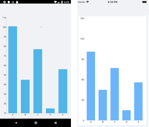
The Cartesian Chart visualizes each data point from the Bar Series as a rectangle (or a bar). These rectangles can be displayed either horizontally, or vertically, depending on whether the Categorical Axis is the vertical axis or the horizontal one. When the horizontal axis is categorical, the rectangles are displayed vertically. This means that they display an equal width while their height represents the numerical value of each of the data points. So, when the vertical axis is categorical, the rectangles have equal height, while their width represents the value of the data point.
The Bar Series inherits from the Categorical Series and requires one Categorical Axis and one Numerical Axis.
For more information about the common Categorical Series features that are also applicable to the Bar Series, refer to the article on series features.
Control Bar Thickness
For charts in the Telerik.Maui.Controls.Compatibility.Chart namespace, the categorical and datetime axes expose a GapLength property (double in the range [0,1]) that controls the relative spacing between categories or datetime values. Larger GapLength values increase the space between bars and make them appear thinner.
Set GapLength on the categorical or datetime axis that determines the bar thickness:
- For vertical bars, set it on the horizontal
CategoricalAxisorDateTimeContinuousAxisto adjust the bar width. - For horizontal bars, set it on the vertical
CategoricalAxisorDateTimeContinuousAxisto adjust the bar height. The bar width represents its numerical value, not its thickness.
GapLength is a relative spacing setting, not an absolute maximum bar width or height. The resulting thickness depends on the available plot area and the number of categories. A fixed GapLength value does not enforce a fixed maximum thickness when the chart is resized or the category count changes, including when only one category is present.
For property details and a configuration example, see Categorical Axis.
Example
The following example shows how to create a Cartesian Chart with Bar Series:
1. Create the needed business objects, for example:
public class CategoricalData
{
    public object Category { get; set; }
    public double Value { get; set; }
}
2. Create a ViewModel:
public class CategoricalDataViewModel
{
    public ObservableCollection<CategoricalData> Data { get; set; }

    public CategoricalDataViewModel()
    {
        this.Data = GetCategoricalData();
    }

    private static ObservableCollection<CategoricalData> GetCategoricalData()
    {
        var data = new ObservableCollection<CategoricalData>
        {
            new CategoricalData { Category = "A", Value = 101 },
            new CategoricalData { Category = "B", Value = 45 },
            new CategoricalData { Category = "C", Value = 77 },
            new CategoricalData { Category = "D", Value = 15 },
            new CategoricalData { Category = "E", Value = 56 },
        };
        return data;
    }
}
3. Use the following snippet to declare a Cartesian Chart with a Bar Series in XAML:
<telerik:RadCartesianChart>
    <telerik:RadCartesianChart.BindingContext>
        <local:CategoricalDataViewModel />
    </telerik:RadCartesianChart.BindingContext>
    <telerik:RadCartesianChart.HorizontalAxis>
        <telerik:CategoricalAxis LabelFitMode="MultiLine" />
    </telerik:RadCartesianChart.HorizontalAxis>
    <telerik:RadCartesianChart.VerticalAxis>
        <telerik:NumericalAxis LabelFitMode="MultiLine" />
    </telerik:RadCartesianChart.VerticalAxis>
    <telerik:RadCartesianChart.Series>
        <telerik:BarSeries ValueBinding="Value"
                        CategoryBinding="Category"
                        ItemsSource="{Binding Data}" />
    </telerik:RadCartesianChart.Series>
</telerik:RadCartesianChart>
The following image shows how the BarSeries looks: