New to Telerik UI for .NET MAUI? Start a free 30-day trial
Badge Types
Updated on Sep 14, 2026
The BadgeView supports a set of Badge indicator types.
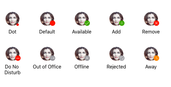
To change and specify the Badge type, use the BadgeType(of type Telerik.Maui.Controls.BadgeView.BadgeType) property, which exposes the following options:
- (Default)
Default AvailableAwayDoNotDisturbOfflineOutOfOfficeDotAddRemoveRejected
The following example demonstrates how to set the type of the Badge indicator.
1. Define the BadgeView:
XAML
<telerik:RadContentView.Resources>
    <ResourceDictionary>
        <Style x:Key="ItemStyle" TargetType="telerik:RadCollectionViewItemView">
            <Setter Property="VisualStateManager.VisualStateGroups">
                <VisualStateGroupList>
                    <VisualStateGroup Name="CommonStates">
                        <VisualState Name="Normal" />
                        <VisualState Name="Selected" />
                        <VisualState Name="MouseOver">
                            <VisualState.Setters>
                                <Setter Property="BackgroundColor" Value="Transparent" />
                            </VisualState.Setters>
                        </VisualState>
                    </VisualStateGroup>
                </VisualStateGroupList>
            </Setter>
        </Style>
    </ResourceDictionary>
</telerik:RadContentView.Resources>
<telerik:RadCollectionView x:Name="collectionView"
                           ItemViewStyle="{StaticResource ItemStyle}"
                           SelectionMode="None">
    <telerik:RadCollectionView.ItemTemplate>
        <DataTemplate>
            <VerticalStackLayout>
                <telerik:RadBadgeView x:Name="badge"
                                      BadgeVerticalPosition="End"
                                      BadgeOffsetX="-15"
                                      BadgeOffsetY="-10"
                                      BadgeType="{Binding .}"
                                      HorizontalOptions="Center"
                                      VerticalOptions="Center">
                    <telerik:RadBadgeView.Content>
                        <Image WidthRequest="55"
                               HeightRequest="55"
                               Source="avatar.png" />
                    </telerik:RadBadgeView.Content>
                </telerik:RadBadgeView>
                <Label HorizontalOptions="Center"
                       FontSize="{OnPlatform iOS='13', MacCatalyst='13', Android='10'}"
                       Text="{Binding .}" />
            </VerticalStackLayout>
        </DataTemplate>
    </telerik:RadCollectionView.ItemTemplate>
    <telerik:RadCollectionView.ItemsLayout>
        <telerik:CollectionViewGridLayout HorizontalItemSpacing="5"
                                          VerticalItemSpacing="25"
                                          ItemLength="{OnPlatform iOS='80', MacCatalyst='80'}"
                                          SpanCount="4" />
    </telerik:RadCollectionView.ItemsLayout>
</telerik:RadCollectionView>
2. Use the telerik namespace:
XAML
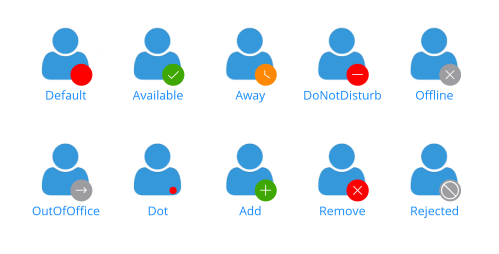
xmlns:telerik="http://schemas.telerik.com/2022/xaml/maui" The following image shows the final result.
For a runnable example with the Badge Types scenario, see the SDKBrowser Demo Application and go to BadgeView -> Features category.