WinForms R2 2021: New Callout Control, Color Variations for Office2019 Theme and Content Controls in RichTextEditor

Summarize with AI:
The second official release of 2021 is here for the Telerik UI for WinForms suite. Enjoy the variety of new controls and improvements coming in R2 2021.
We are thrilled to announce the new Callout control, dark and gray versions of the Office2019 theme, content controls in RadRichTextEditor, Swiss QR barcode, Toast notifications for .NET 5 and much more. Since customer satisfaction has always been our top priority, 70+ customer-requested issues have also been addressed.
Let’s dive into the sea of new features and enhancements:
Callout
RadCallout is like a tooltip with an arrow that can be used to display additional information, warnings or hints, or to highlight relevant data. The appearance of the control can be fully customized to satisfy the needs of your scenarios. RadCallout’s form is based on our ShapedForm, which allows users to define different shapes.
It can host any control, panel or UserControl. This gives you the ability to add the information in any design (using the full range of controls we offer) and interactivity (for example: buttons, switch buttons, check boxes, radio buttons, etc.).
Swiss QR Barcode
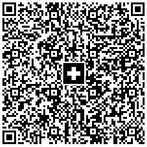
The QR-bill makes issuing and paying invoices simpler and is being introduced throughout Switzerland to modernize payment transactions. Its most striking feature is the Swiss QR code, which contains all the payment information in a digital format that can be read using a smart phone or a slip scanner.
The Swiss QR RadBarcode encodes all the information necessary for a payment in specific format and structure. Along with the printed information, the Swiss QR Code forms the payment part of the QR-bill. The allowed currencies for payments are CHF and EUR. The QR-bill also guarantees compliance with the regulatory requirements arising from the revised Anti-Money Laundering Ordinance.
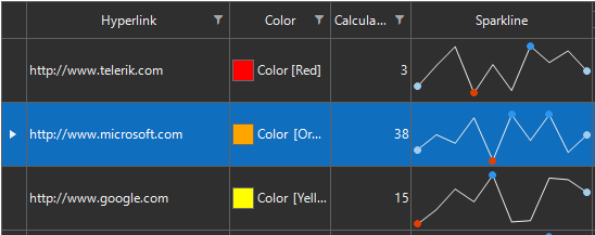
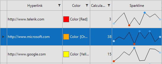
Gray and Dark Variations of Office2019 Theme
In R1 2021 we introduced the Office2019Light theme, which was greatly welcomed by our customers. That is why now we are launching gray and dark versions of the Office2019 theme, inspired by the well-known Microsoft Office productivity suite:
Content Controls in RadRichTextEditor
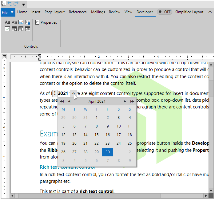
RadRichTextEditor can import and export content controls from and to Office Open XML (docx) and XAML formats. The easiest way to create a content control is through the user interface.
You can specify which type of content control you wish to insert from the predefined UI of RadRichTextEditor. You can select it from the Developer tab of the ribbon UI:
Embedded Labels and Keyboard Support in Text Editors
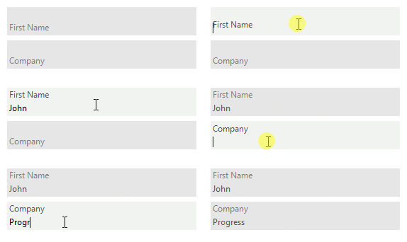
RadTextBox and RadTextBoxControl now support embedded labels. The embedded label shows text in the text box field, usually to indicate what text the user should enter. When the text box gets focus, the embedded label will go up, so the user can type in the text box field. The ShowEmbeddedLabel property controls whether the embedded label is shown. You can set the desired text by using the EmbeddedLabelText property.
RadTextBoxControl now supports undo/redo operations and Ctrl keyboard combinations.
Glyphs Support in RadBindingNavigator
RadBindingNavigator offers two new properties: ButtonDisplayStyle and ButtonGlyphSize. When ButtonDisplayStyle is set to Glyph, it automatically switches the BindingNavigator button images to a set of predefined Glyphs from TelerikWebUI font.
Improved Visual Studio Extensions Options
In the Visual Studio >> Tools >> Options dialog, there is a setting that controls whether the message for changing the default design time theme will be shown.
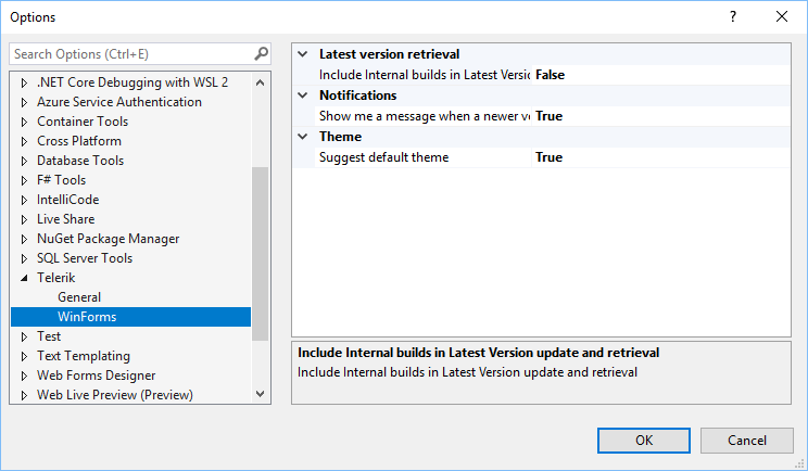
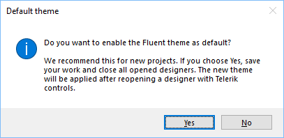
Thus, if this option is enabled, when you drag a Telerik RadControl from the toolbox and drop it onto the form, the following message will be prompted to the user:
If you accept the changes and restart the designer, the Fluent theme will be used as default theme for the design time experience.
Telerik and Kendo UI Community Forums Revamp
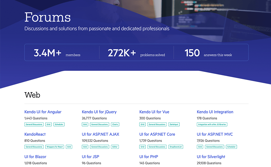
And last but not least, we revamped one of the favorite places that developers love hanging out—the Telerik and Kendo UI Community Forums. Check out the complete story of why and what in the dedicated blog post.
Try It Out and Share Your Feedback
The R2 2021 release is already available for download in customers’ accounts. If you are new to Telerik UI for WinForms, you can learn more about it via the product page. It comes with a 30-day free trial, giving you some time to explore the toolkit and consider using it for your current or upcoming WinForms development.
We would love to hear what you think, so should you have any questions and/or comments, please share them in our Feedback Portal.
You can also check our Release History page for a complete list of the included improvements.
Attend the Webinar or Twitch Events
We invite you to attend the Telerik R2 2021 Release Webinar—Web, Desktop and Mobile Products.
The webinar will cover all updates across Telerik UI for Blazor, UI for ASP.NET Core, UI for ASP.NET MVC, UI for ASP.NET AJAX, UI for WPF, UI for WinForms, UI for WinUI and UI for Xamarin.
Save Your Seat: Tuesday, May 18 I 11:00 am – 1:00 pm ET
The webinars will be complemented with live demo sessions on our CodeItLive Twitch channel, where you will see the newly released components and features in action and get ideas on how to use them in your projects.
Telerik Twitch events to note:
- Wednesday, May 19 I 9:00 – 10:30 am ET (Blazor, WinUI, Xamarin)
- Thursday, May 20 I 1:30 – 3:00 pm ET (Blazor, WinUI, Xamarin)

Desislava Yordanova
Desislava Yordanova is a proactive ambassador of diligent processes and a customer-caring professional. Currently, she is a Technical Support Engineer, Principal in the Document Processing team after a successful journey in the Telerik UI for WinForms team. She joined the company in 2013. Desislava holds a master’s degree in Computer Systems and Technologies from the Technical University in Sofia. Apart from her job, she is keen on snowboarding and travelling. You can find Desislava on LinkedIn.


