
What’s New in KendoReact with R2 2021

Summarize with AI:
R2 2021 means: TypeScript and hook-equivalent support for our samples and demos, new components like Skeleton and Circular Gauge, and a slew of improvements across several existing components like the Data Grid and Gantt.
May is here and that means another exciting release of KendoReact. R2 2021 brings new components like the Circular Gauge and some highly requested features across a huge set of our existing UI components. Let’s not drag things out and just jump straight into what’s new in KendoReact with R2 2021.
Hooks and TypeScript Demos
One of the biggest general notes around R2 2021 is that the KendoReact docs and demos now include equivalent demos for hooks as well as TypeScript for most of our code samples. We are actively expanding this to full coverage as we speak, but this means that for almost any given sample you can now choose:
- Class components using JavaScript
- Class components using TypeScript
- Function components and hooks using JavaScript
- Function components and hooks using TypeScript
As mentioned, we aren’t quite at 100% coverage for all samples yet, but we are actively working toward this and, depending on when you’re reading this, we may already be fully covered.
These are all selections you can do on a demo-by-demo basis, ensuring that no matter which approach you take to creating React applications today, KendoReact has your back with up-to-date samples.
The goal of this whole effort is to make it super easy to pick your favored approach and continue to copy and paste or learn from any of the KendoReact samples.
New Components
New Component: React External Drop Zone

The new React External Drop Zone component provides a new user experience around dragging and dropping files into a React application. What a developer does with the file after it has been dropped into this component is completely up to the dev, but often this is combined with some sort of upload process. This component can, of course, be fully customized to fit any design requirements.
Here’s a direct link to the new KendoReact External Drop Zone component demos.
New Component: React Skeleton

A trend in many modern user experiences is to increase the perceived performance and reduce overall surprises when loading a page by having placeholder elements representing the final layout of the page be displayed before everything has finished loading. This is where the new React Skeleton component comes in to play, as it provides several shapes (including line, rectangle and circle) that can be used to build any type of placeholder structures and have them be displayed while additional data or HTML is loaded.
To get inspiration for how to use this new component check out the KendoReact Skeleton component demos.
New Component: React Circular Gauge

Rounding out the list of new components, we have an actual round component: the new React Circular Gauge. With this new component, we flesh out the available gauges KendoReact has available for developers to choose from by providing a fully circular gauge. This new component comes with support for ticks to represent values as well as the ability to display text in the center and so much more.
For more information, head on over to the KendoReact Circular Gauge component docs & demos.
Expanded Component Features
React Gantt: Customize Column Headers
Kicking things off with new features for existing components, the KendoReact Gantt component now has support for customizing its column headers, letting developers provide a custom renderer for the header of any column to ensure it can be a natural fit for any design requirements.
Check out this KendoReact Gantt GanttHeaderCellProps API article for more information.
React Gantt: Year View
The React Gantt component also extended its existing set of views by adding the new Year View feature. This lets users see all tasks for the entire year. This can be the default view of the Gantt, or a part of a list of existing views (day, week, month, etc.) that users can select from.
To see the React Gantt component’s Year View feature, you can refer to this demo and select “Year” from the dropdown in the upper right-hand corner.
React Grid - Range Selection

With R2 2021, the KendoReact Grid adds quite a few features, including the new Range Selection capability. This allows users to select a range of cells by highlighting an area by dragging their mouse to control the selection.
Head on over to the KendoReact Grid Range Selection demo to see this in action.
React Grid: Placeholders During Virtualization

While the KendoReact Data Grid is blazing fast to render, there may be scenarios where users are scrolling through content before the network has had a chance to catch up, and the Grid may just display empty cells. With R2 2021, the React Data Table can now display a placeholder element that indicates to the user that data is coming.
To see how you can take advantage of these placeholders in your own implementation of the React Data Grid, check out the KendoReact Grid Virtualization demos.
React Grid: Expand and Collapse All Groups
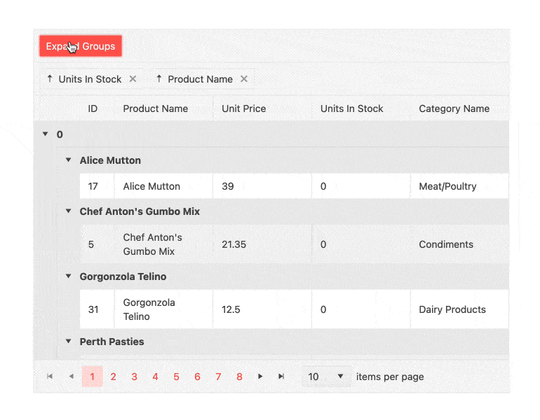
Adding to the list of great quality-of-life improvements with the KendoReact Data Grid, the component now includes a built-in feature to expand and collapse all groups within the data table. This can be done by the user by interacting with an element within the Grid itself but can also be done programmatically for scenarios that call for that type of interaction.
Check out the expand and collapse all groups demo from the KendoReact Data Grid.
React Grid: Persist Group State During Paging

The last feature we added to the KendoReact Data Grid with R2 2021 is the ability to persist group state during data operations and paging, which means that the collapsed and expanded state of the groups will now maintain as users navigate back and forth between pages.
Head on over to the KendoReact Data Table docs & demos for more information.
React DatePicker & DateTimePicker: Floating Labels

Floating labels were popularized by the Material Design Language and have definitely become a part of many other design systems since. While KendoReact has had support for floating labels for many of our input elements, the last holdouts have been the DatePicker and DateTimePicker components. Well, they are holdouts no more, as with R2 2021 both the React DatePicker and DateTimePicker components feature the ability to add floating labels.
To see this in action, head on over to the KendoReact DatePicker and DateTimePicker Floating Label demos.
React PDF Generator: Export Any SVG
A popular library within KendoReact is the PDF Generator, which can export any chunk of HTML to a PDF file. While we have been able to export our SVG-based data visualization components with ease so far, generic SVG elements have been a bit tougher. This is why I’m excited to mention that, with R2 2021, the React PDF Generator can now export any generic SVG element as a part of the PDF creation process.
To see what generated SVG elements look like in PDF, check out the KendoReact PDF Processing demos and simply add in an SVG element in to the content you are exporting.
React Scheduler: Multiple Event Selection

The React Scheduler also received some love with R2 2021 by adding the ability for multiple events to be selected at once. This can open up the ability for a group of events to be dragged and dropped to move their position, or to potentially access the selected items programmatically and manipulate the selection in some way.
See the Multiple Event Selection in the KendoReact Scheduler right here.
React ColorPicker: Contrast Color

The KendoReact ColorPicker component added a new Contrast Color feature with R2 2021. This feature lets users select a contrasted color based on the currently selected primary color. This is especially helpful for anything related to accessibility, supporting two contrast levels: AA (minimum contrast) and AAA (enhanced contrast).
Check out the KendoReact ColorPicker component with Contrast Color enabled right here.
React Input: Character Count
Last but not least, with R2 2021 KendoReact Input component also added the ability to work with one of our React Hint components to make a character counter.
Here’s a look at the KendoReact Input Character Counter demo.
Telerik and Kendo UI Community Forums Revamp
And last but not least, we revamped one of the favorite places that developers love hanging out—the Telerik and Kendo UI Community Forums. Check out the complete story of why and what in the dedicated blog post.

Got Feedback?
Did we miss a particular component or feature that you were looking for? We want to hear from you. Head on over to the KendoReact Public Feedback Portal and vote for your favorite feature or component—or submit your own ideas. Everything that we deliver during a release comes from feedback from users like you, so now is your chance to influence the roadmap of KendoReact directly.
Webinar and Live Streams
Want to see everything I mentioned above live and in action? Well, do I have good news for you. On Thursday, May 20, at 11 am ET we are hosting the Kendo UI R2 2021 release webinar. This session will cover everything I mentioned here, plus information about jQuery, Angular and Vue.
On top of this, we will also have a Twitch live stream diving in deeper in to Kendo UI for Angular and KendoReact on Tuesday, May 18, from 9:00 – 10:30 AM ET and Wednesday May 19, from 1:30 – 3:00 pm ET.
Tons of fun will be had, so head on over to the Kendo UI R2 2021 webinar registration page to reserve your seat and join in on the festivities.

Carl Bergenhem
Carl Bergenhem was the Product Manager for Kendo UI.