What’s New in the Kendo UI Angular Components with R2 2020

Summarize with AI:
The R2 2020 release of the Kendo UI for Angular components is here! This release comes packed with new components, the RTM release of the TreeList component, and a new resource to help all Angular developers build gorgeous forms. Let’s dive right in and check out the latest and greatest within R2 2020.
Forms Guideline
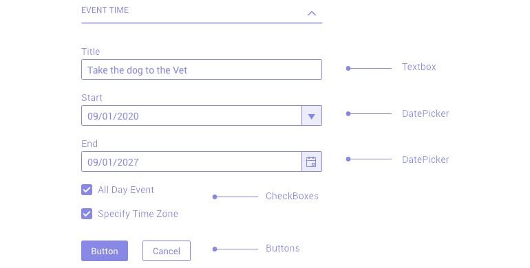
Building forms is more than just adding UI components to a form element. There are so many things to keep in mind. The overall layout of the form, how to handle validation, what to do with larger forms or how to break down elements in to logical groups.
With this in mind the Kendo UI for Angular team put together a new type of resource: the Form Design Guidelines. This is a dedicated resource for building the best possible user experience around forms, regardless of what UI components you may be using. Throughout the iteration of these guidelines I certainly learned a lot personally, and we hope that all Angular developers find them useful!
Start building better forms by going through the Kendo UI for Angular Form Guidelines!
New Angular Components
New Component: Stepper

With R2 2020 we are introducing the Kendo UI for Angular Stepper Component. This new component provides users with a list of steps that should be followed from start to finish in a logical order. The component has built-in styling for finished, current, and unfinished steps, and moving from one to the next highlights the move with some lovely animations. The Kendo UI for Angular Stepper also has additional styles for valid or invalid steps, offering developers to apply validation logic for each individual step.
The content for each step is completely controlled by the developer, which means the Kendo UI for Angular Stepper is extremely flexible and can be used in a large range of scenarios.
For a deeper look into the Kendo UI for Angular Stepper component check out this docs & demos section!
New Component: External Drop Zone
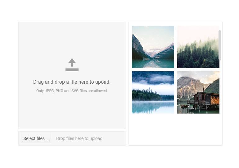
A piece of feedback that we found interesting from the Kendo UI for Angular Upload component was for a standalone component for allowing the dropping of files from a file system in an Angular component. This is why we are introducing the External Drop Zone component which allows developers to highlight an area (with styling like the image above) of their application where end-users can drag files from their file system and drop them in the component.
The External Drop Zone is also available as a directive which simply enables the drag & drop functionality to the element you apply the directive to, but does not apply styling.
For more information on how you can start using the Kendo UI for Angular External Drop Zone component refer to this docs page.
New Component: Pager
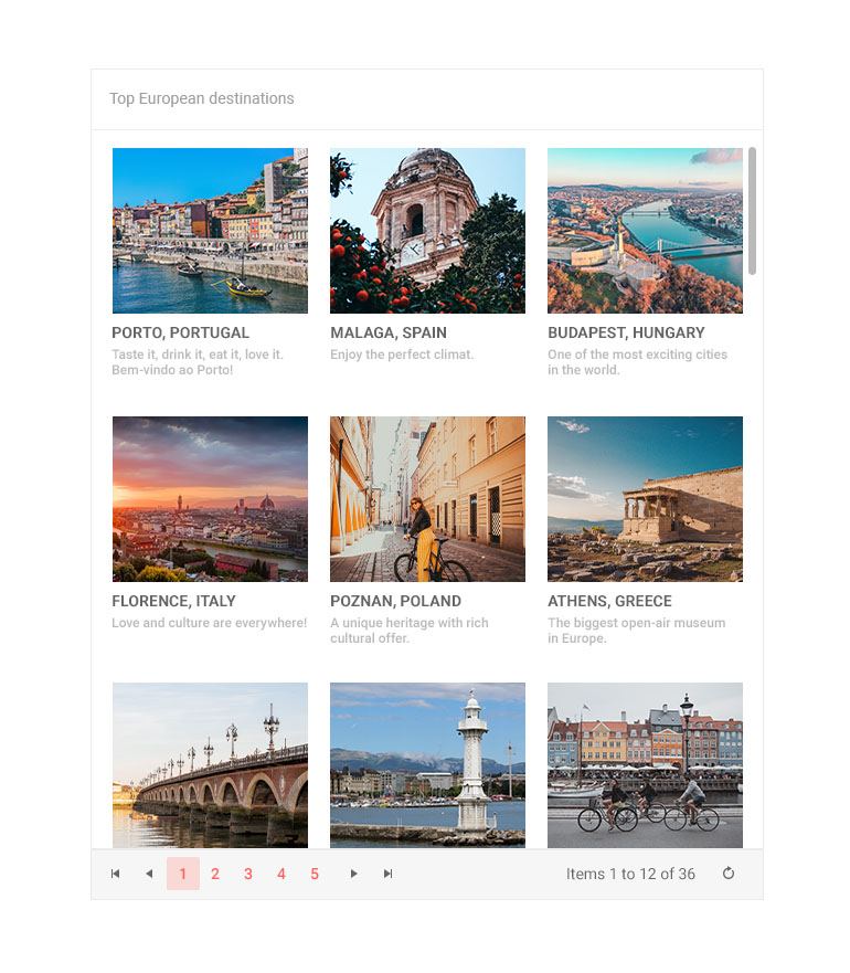
Previously only an integrated component inside of our Data Grid, with R2 2020 we are introducing a standalone Angular Pager component. This will allow any Angular application to provide a user experience around paging through larger sets of data, with built-in components for navigating back and forth through pages, picking a specific page, and increasing or decreasing the page size.
Check out the Kendo UI for Angular Pager component live in action right here.
New Component: Label

For those of you that recognize this as a part of the Kendo UI for Angular library already, previously Kendo UI for Angular only provided a directive for labels. However, we realized that we could serve Angular developers better by creating a standalone Angular component. One result of introducing this component rather than just a directive is that it allows for displaying optional labels.
This all comes from the work that we did with the Form Guidelines, along with customer feedback. This component helps round out the Kendo UI for Angular Form components, ensuring that we offer as many building block for forms as possible out-of-the-box.
Head on over to the Kendo UI for Angular Label component demos by clicking right here.
New Components: FormField, Hint, and Error
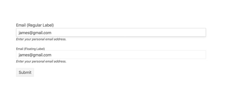
Because these new Angular components are building blocks for forms I’m grouping them all into one single category, even though they are independent components. All these components focus on enabling Angular developers to build the best possible forms possible.
The FormField component helps to structure forms and represents a single field and collection of components related to that field (label, input, hints, etc.).
The Angular Hint component enables a display of a hint message (that tiny label beneath an input) for what users should be typing in to a form element.
The Angular Error component specifically covers validation error messages underneath any form element.
Expanded Component Features
TreeList - RTM Release
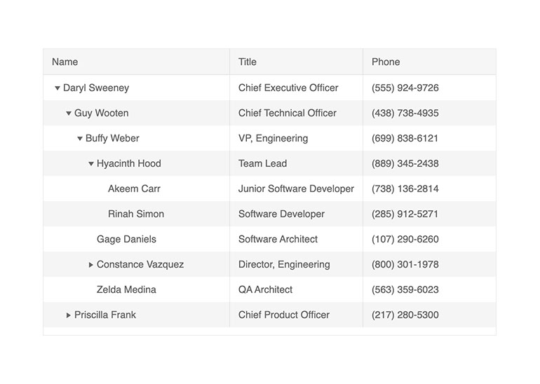
As a part of R2 2020, the Kendo UI for Angular TreeList is officially released as RTM! Previously available in a beta form, this new release includes several of our must-have features that we wanted to add in before we could release this component officially.
As a part of this RTM release we have included:
- Virtualization
- Selection
- Keyboard Navigation
- Accessibility Compliance
Head on over to the TreeList docs and demos to see the new features in action!
TreeView - Load More Button
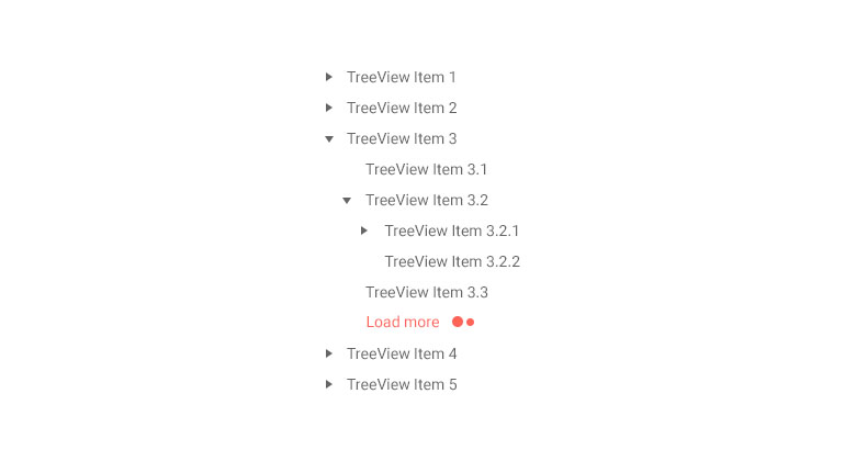
The Kendo UI for Angular TreeView is often responsible for loading thousands of nodes all at once. Just rendering the HTML for that amount of data can be a bit taxing in any browser.
To assist with scenarios that require a large amount of data in a particular node we are introducing the “Load More” button which will display in a list of nodes. Clicking on this button will load a set of additional nodes (predetermined via a configuration option) within that hierarchy level. This introduces a mechanism similar to paging within the nodes of the TreeView to help load data on demand and improve performance of the TreeView across the board.
To see how you can take advantage of the Kendo UI for Angular TreeView Load More button check out this page.
Grid - Persist Expand and Collapse State of Detail Rows
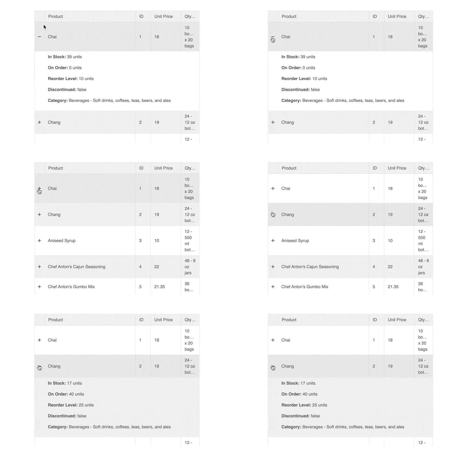
With R2 2020 the Kendo UI for Angular Grid can persist the expand and collapse state of detail rows when hierarchy has been added. This persistence can help with keeping items correctly expanded or collapsed as users work with data operations within the Kendo UI for Angular Grid like paging, sorting, filtering, and grouping.
Check out the persisting expand and collapse state of detail rows demo right here.
Upload - Updated Styling
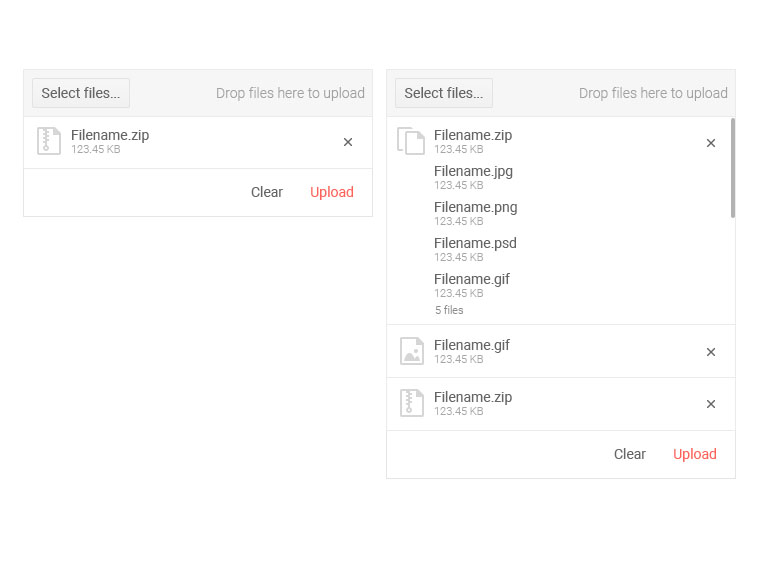
The Kendo UI for Angular Upload component also got some love this release with an updated design. This update includes updates to the look-and-feel like file icons corresponding to the type of the selected file among other tweaks to the overall user experience.
The updated design of the Kendo UI for Angular Upload component can be seen here.
Conversational UI - Support for DialogFlow v2 API
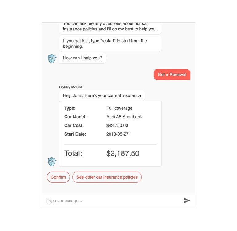
DialogFlow, one of the more popular backends for chatbots, released an official v2 version of its API. This introduced quite a few changes and to ensure that we are compatible with the R2 2020 release we updated our demos showcasing integration with DialogFlow to ensure that there should be no problems working with the new version of their API.
To get a deep dive in to DialogFlow and the Kendo UI for Angular Conversational UI component click right here.
Have Some Feedback?
That’s it for the R2 2020 release! Did we miss a particular component or feature that you’ve been waiting for? Let us know by submitting feedback in our public feedback portal! You can search for other feedback items and see if someone has submitted a similar request and then vote and comment on it, or submit your own feedback if it hasn’t been requested previously.
Join Us For a Live Webinar
If you want to see everything I just mentioned (and more) live and in action then you should join myself and my Developer Advocate colleagues for our live Kendo UI Webinar on Tuesday, May 19th at 11:00 AM ET. We are covering all products within the Kendo UI bundle, with the Angular session starting at 11:00 AM ET. We have limited seats for this webinar so make sure you head over and register to reserve your seat today!

Carl Bergenhem
Carl Bergenhem was the Product Manager for Kendo UI.
