What App Designers Can Do to Reduce User Churn

Summarize with AI:
If you’ve built an app that has a high churn rate, it’s time to work your magic on the UX and turn bored, dissatisfied and frustrated users into loyal and happy ones.
Whether you’re building freemium mobile apps or subscription web apps, there’s one statistic that you need to keep your eyes on at all times:
The user churn rate.
This is the number of users an app loses divided by the total number of users over a set time period. So, an app that loses 15 users out of 100 in the month of June has a 15% churn rate.
While the data is mixed in terms of what average churn rates are for apps, and it tends to change over time, there’s one thing that’s for certain and that’s this: High churn is costly.
Today, we’re going to look at what your app stands to lose when it churns too many users and what you can do to improve the user experience and keep it from happening in the first place.
How to Reduce User Churn
A high churn rate can do major damage to an app’s reputation and revenue.
For starters, it’s really expensive in terms of money, time and resources to build and maintain an app. If you’re not able to retain users for the long haul, the ROI is going to drop significantly.
Secondly, it costs much more money to acquire new users through marketing and ad campaigns than it does to retain users with good UX and relationship-building strategies.
There’s also a greater likelihood you’ll get bad reviews and ratings with a higher churn rate. After all, consumers are much more likely to leave a negative review than a good one.
For an app to succeed, it needs to have a very low churn rate. And an improved UX is the key to turning your numbers around.
Here are some things you can do to turn the situation around with your app:
Adjust Your Landing Page or App Listing
One of the reasons why users churn is because they realize it just isn’t a good fit for them in terms of solution. This is something you may encounter a lot when your app is free or has a free trial, since prospects who are on the fence probably assume, “I’ll give it a try. What harm could it do?”
Granted, the whole point in giving something away for free is so users have a chance to see if it’s right for them. The problem, however, is if too many of those users come to that conclusion after you’ve spent time, money and resources on them. For instance:
- Server resources are expended on them and the time they spend in the app.
- Data is collected on them and then takes up space in your database.
- Free trial users receive follow-up emails from your marketing software or calls from your sales reps.
What you need to do, then, is change the way you introduce your product to prospects on your landing page (for web apps) or your app store listing (for mobile apps). If you can communicate who exactly the app is for and how it works, you’re less likely to appeal to these wishy-washy users and onboard more of the ones with greater staying power.
Let’s use the example of project management software.
When someone searches for “project management software” or a “project management tool,” they’re going to get recommendations for the same set of apps, more or less. Asana. Trello. Teamwork. ClickUp. And Basecamp.
It used to be pretty hard to tell most of these tools apart just from their websites, which I bet led to major user churn.
Basecamp, for example, looked like this when I first started using it in 2013:
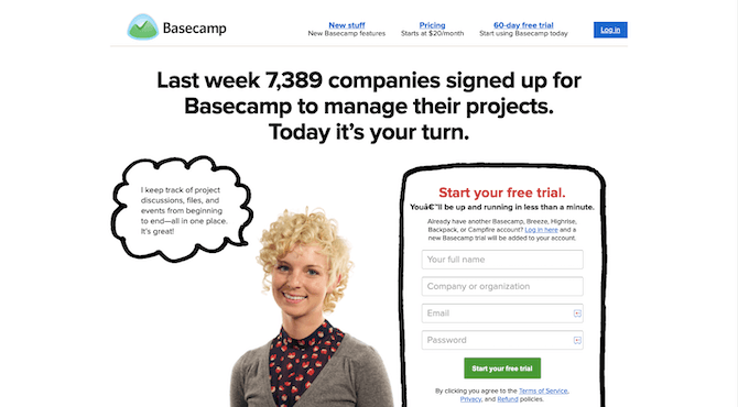
Nowhere on the homepage do prospects actually see the product. That said, it had a cheeky take on marketing and its social proof numbers were admirable, so I think that helped it gain attention. But I remember when my employer first directed me to the site to log in, I thought it was a joke.
Prospects who took the time to look through “New stuff” might’ve found some screenshots of the app, but there really wasn’t much there that showed them what the experience of managing projects was like.
I’m willing to bet that Basecamp in 2021 has much less churn now. Here’s what we now see on the homepage:
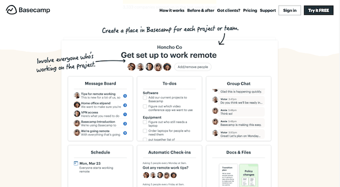
The “How It Works” page also has a great video that shows off the app’s great UI and UX:
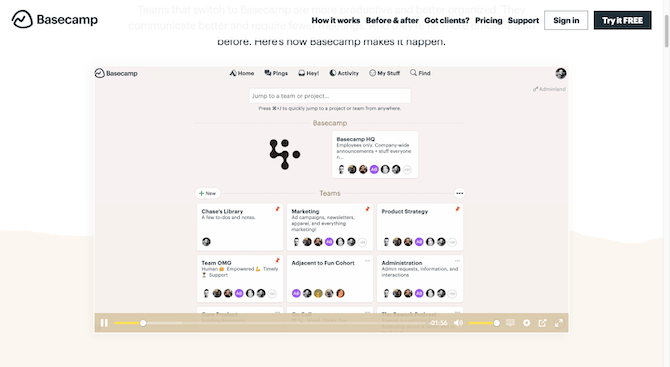
This is a much more effective way to educate prospects on what your app looks like, how it works and what’s in it for them.
Ask for Feedback
When you’re struggling to retain users, you’re of course going to ask yourself and your colleagues: “Why???”
Some of the data you collect on your users may shed some light on the problems you’re facing. But rather than drive yourself crazy trying to interpret the steps users take in Google Analytics or agonizing over heat maps and user session recordings, why not just go to the source?
In UX design, interviews and surveys are used to gather meaningful insights from actual users. And while that isn’t always the easiest thing to do when you’re first building an app, once an app is live, you have no excuse not to.
Here’s the great thing about asking users for feedback on an existing app:
- If they’re happy with the experience, they’ll want to give you feedback on what they like, what they don’t like and what else they’d like to see so you can further improve the experience.
- If they’re on the fence about the app but they see promise in it, they’ll take the opportunity to directly inform you about what needs to be done and wait around to see what you do about it.
In other words, you might possibly prevent a bunch of user churn while increasing overall retention rates by simply asking:
What do you think of our app?
There are a couple of ways to handle this.
Meetup has a simple solution:
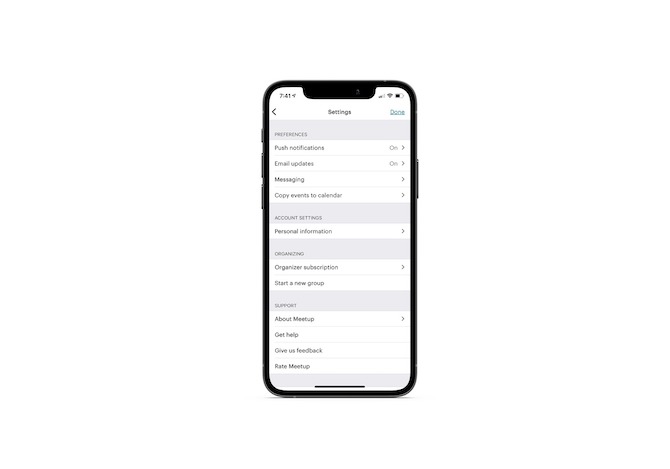
When users click “Give us feedback,” they’re taken to an auto-populated email that goes to the support team’s inbox:
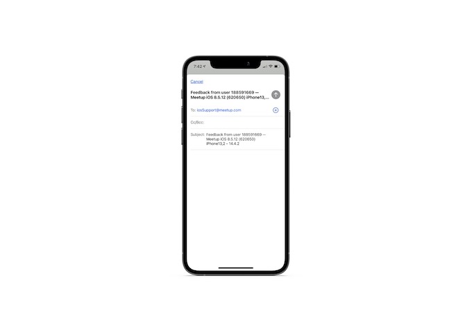
Notice how the user’s device info is included in the message. If they’re providing feedback on the app’s functionality, that’s one less email the support team will need to send in order to figure out what’s going on.
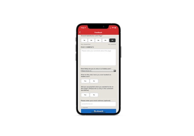
If it makes more sense to open the feedback up to other parts of the user experience, or if you want to ensure that you collect all pertinent details, you can send them to a form as Hotels.com does:
Fix Smaller Frictions with A/B Testing
While the first two points will significantly improve the in-app experience for your users, there’s one more thing you can do. And that’s to always be testing.
Now, when it comes to getting user feedback, I have a feeling they’re going to focus on bigger things.
“Can you make this faster?”
“How about a new box to track XYZ in the dashboard?”
“What about dark mode?”
But that’s not the only way to improve the overall user experience. There are many ways users can lose interest or become frustrated with an app, and sometimes it’s the tiny details that make a big difference.
Let’s use the Feedly news aggregator as our hypothetical app. What could we A/B test in this app that would make significant improvements to the users’ experience?
Idea #1: Font Size
It’s not unheard of for A/B tests to prove that going up a single point size is beneficial for readability.
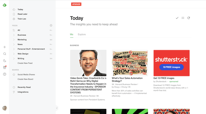
Feedly actually has a setting that allows users to adjust the font size:
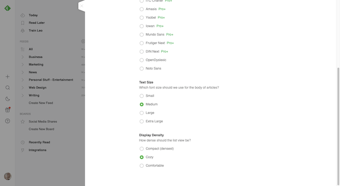
When I switch it from “Medium” (which is what you see above) to “Extra Large,” this is what we get:
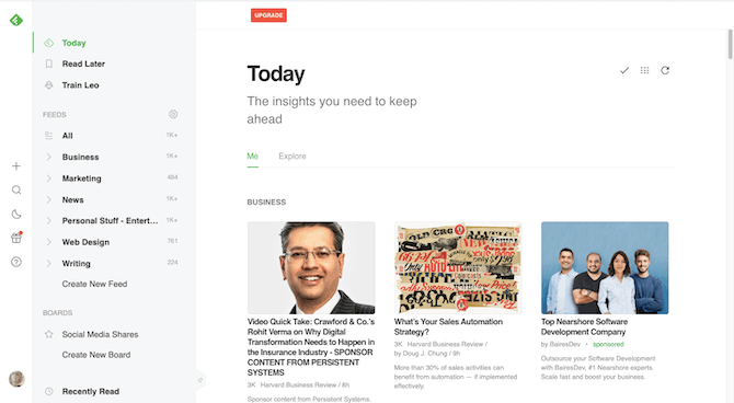
If you have this setting built into your app, you can use existing user data regarding preferred font sizes to form the basis for your hypothesis. For instance:
“Even though the Extra Large font size pushes stories deeper down on the page, these users have higher click-through rates.”
Even if you don’t have that data on hand, making your own hypotheses won’t be too difficult for something like font size.
Idea #2: Card Hover Options
How about the quick-action links that appear when a user hovers over each news image?
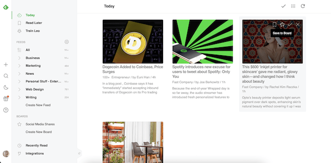
You could assess:
- If these icons are easy enough to recognize and remember.
- Whether users even take advantage of them or are more likely to just click the image.
- If they’ll be used more frequently with a filled design as opposed to the ghost icons that are there now.
- What would happen if the image were to black out completely upon hover and the images were centered and larger.
Idea #3: Icons
Iconography is like typography. It might seem like an insignificant detail, but you may find that it’s a valuable element to test.
![]()
With an app like Feedly that uses so many icons around the interface, it’s especially important to test your icon design choices:
- Icon graphic
- Label
- Placement
- Size
- Color
- Fill
It also might be worthwhile testing whether all those icons are even needed or if perhaps standalone labels (like in the drop-down seen above) are a better solution.
Again, I know these seem like minor details in the scheme of things, but you may find that users are willing to spend more time with your app than looking around for others if you fine-tune all the details within it.
Wrap-up
High user churn rates come about for a number of reasons.
- The users weren’t a good fit for the app in the first place, but didn’t know any better.
- They’re dissatisfied with the app’s features and how incomplete the solution seems.
- It’s often a challenge spending even the briefest moments interacting with it.
If you find that your churn rates are too high (and by that I mean where you’re barely breaking even between revenue and costs), then it’s time to look at ways to fix these underlying issues through design.

Suzanne Scacca
A former project manager and web design agency manager, Suzanne Scacca now writes about the changing landscape of design, development and software.
