KPIs That Let You Know It’s Time for a Redesign

Summarize with AI:
These seven key performance metrics will show you where your strategy may have gone awry and can help pinpoint smaller issues keeping your website from being a success.
You build a website. You launch it. And then … crickets. Or perhaps there’s some activity on the site, but it’s not amounting to what you or your client had predicted would happen.
Is this just one of those cases where you need to give it time? It depends.
If the issue is that your pages aren’t ranking #1 on Google one month after launch, then yes, give it more time. It can take months—if not a whole year—to get an optimized site to rank at the top of search results.
However, if the issue is that:
- You’re not seeing any organic traffic from Google at all …
- There’s traffic, but it doesn’t stick around for very long …
- You’re seeing a decent amount of traffic, but your conversion rate stinks …
Then you probably shouldn’t wait to investigate the issue. Your site is going to need a touch-up to get it moving in the right direction.
Below, we’re going to look at which key performance metrics (KPIs) will let you know when something’s wrong and how you can use them to do a successful redesign of the site.
Key Performance Metrics to Help You Redesign Your Site
The best way to approach a redesign is to systematically chip away at the elements that don’t work on your site. For this, you’ll need to do the following:
- Analyze the key performance metrics being generated by your live website.
- Identify specific elements of your website that are keeping its goals from being realized (e.g. homepage SEO, contact form design, navigation layout, etc.).
- Zero in on the primary offender—the one that’s causing the most problems for the critical pages on your site (e.g. the subscriber form).
- Come up with a hypothesis using your data (e.g. “The contact form on the homepage isn’t generating leads because it’s too difficult to fill out.”).
- Confirm your theory with an A/B test (one test for each troublesome element on the site).
This might seem like a tedious way to do a redesign, but it’s the most efficient way to do it.
By prioritizing the elements getting in your way—from the worst offenders to those that are a minor nuisance—you’ll remove major barriers keeping your website from generating leads and making sales. Then, as you start to open the floodgates, you’ll see more conversions come in, which will take the pressure off as you work to incrementally tackle each of the problematic designs that remain.
With that said, let’s look at the seven KPIs you should focus on:
1. Demographics
Where can you find this data?
Google Analytics under the Audience module. There are lots of visitor demographics you’ll find here:
- Age
- Gender
- Interests
- Language
- Location
- Browser
- Device
What does it tell us?
Before you build a website, one of the first things you do is to create a user persona. Until you have leads or customers flowing through the site, this data will tell you how well you’ve connected with your target user persona.
What should you do with this data?
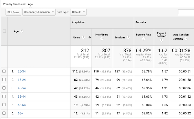
Make note of which demographics are responding best to your site. For instance, you can see that the website above does a good job in attracting visitors under 54 years of age as well as motivating them to engage with the content (see the average time on page for these age groups).
But what if these metrics were for a retirement blog? If it were a “How to Retire in 20 Years” blog with saving and investing tips, then the existing users would match the original user persona. But if it were a “What to Do With Yourself Now That You’re in Retirement” blog, this would be a big problem.
So, you’ll have to compare these metrics against the initial user persona you wanted to attract. If you aren’t reaching the right segment, then you can experiment with changing elements like:
- Search metadata (to clarify who the content is for)
- The homepage design or message (in case it’s not obvious who benefits from the site)
- Branding (as the style and personality might be better suited for a different audience)
You can also use this data to reconfigure your site for the audience that is responding well to it. You might not have realized there was an audience there, but your existing website data now proves that there is.
2. Acquisition Source
Where can you find this data?
Google Analytics under Acquisition > All Traffic > Source/Medium.
What does it tell us?
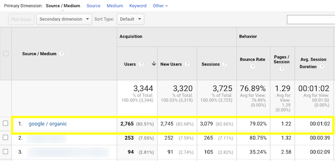
There are different kinds of sources your website may receive traffic from. The one you want to focus on is Google organic traffic (you’ll see other search engine traffic here, too).
Organic traffic refers to the people who did a search, looked through the results pages and clicked on one of your links. Without an organic search presence, your website will have to depend on word-of-mouth, marketing and advertising to get found—which requires a bigger investment of time and money.
What should you do with this data?
While you want a healthy mix of acquisition sources, organic search traffic should be the primary one.
If it isn’t, then it’s time to revisit your most critical pages and find out why they aren’t starting to make waves in search. I’d say by your sixth month, organic search should be the predominant source of traffic to your site.
One thing to focus on would be the meta title and description for your key landing pages. The way they’re worded might be misleading or too vague and that’s why you can’t entice anyone to visit your site from search.
Then again, there are a ton of variables that affect a website’s ability to rank (as well as each of its pages). Start with testing out new metadata. Then, move onto other factors that affect how your site ranks. (We’ll look at two of them in the next points.)
3. Mobile Responsive Design
Where can you find this data?
Although Google has a mobile-friendliness testing tool, it’s not going to tell you much besides whether your site is mobile-friendly or not. Instead, use Google Search Console’s Coverage tool.
What does it tell us?
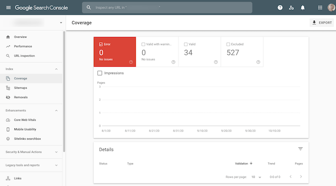
There are two coverage warnings Google may show you:
- Error means that the page was not able to be indexed.
- Valid with warning means that the page was indexed, but there’s something wrong with the content.
The error will appear under the “Details” section at the bottom of the page.
What should you do with this data?
First, make sure all coverage issues are resolved. Unless you meant to publish pages that are non-indexable, you should not let these errors slide.
As it pertains to mobile responsiveness, it’s the “valid with warning” issues that tell you where you have problems—like with images getting cut off, text being too small and so on.
If you confirm the errors on your end, fix them right away and then submit the page for validation.
Don’t just stop at Google’s errors though. If there’s one issue with mobile, there might be more that Google’s bots weren’t able to easily detect. Give your mobile site a good look-through.
You might find that it would be beneficial to reconsider the design and layout. For instance, let’s say you have a financial services website. If it takes a few scrolls for a visitor to find a “Book an Appointment” form, you might want to move it closer to the top of the homepage (especially if you know that’s what most prospective customers want to do first thing).
4. Mobile Page Speeds
Where can you find this data?
What does it tell us?
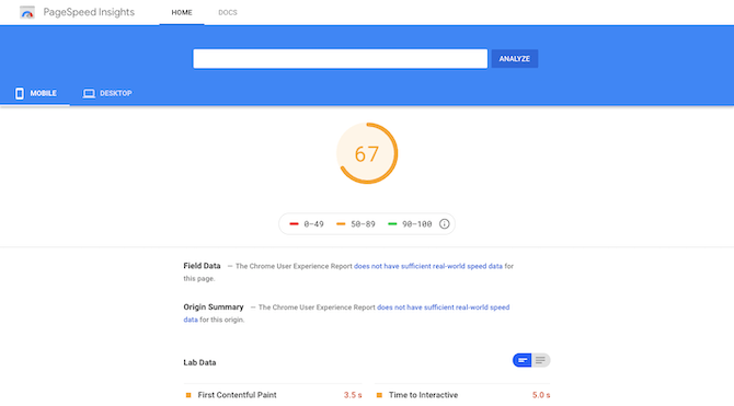
Google won’t arbitrarily assign a website a so-so (orange) or bad (red) page speed score. Consumer data tells us that web pages that take more than three seconds to load have higher visitor churn, so those are the ones Google is going to flag. And if Google has flagged it here, then its algorithm is seeing the same thing (which isn’t good since speed is a ranking factor).
If you’re curious how long it’s actually taking for your site to load, use Pingdom’s Website Speed Test to check it out.
What should you do with this data?
Knowing your pagespeed score can help you determine if this is one of the reasons why Google doesn’t rank your pages all that well.
It can also help you pinpoint issues along the user journey. If you’re noticing people don’t stick around for more than a matter of seconds, your slow pages could be the reason why.
So, you need to consider any score not in the green as something you absolutely need to fix.
Google’s performance enhancement suggestions will help you optimize your site for speed. However, one thing Google won’t tell you is to use fewer images or to embed videos from a hosted source (like YouTube). If you have a lot of heavy imagery on your server, you might want to experiment with a more lightweight design to see if that helps.
5. Bounce Rate
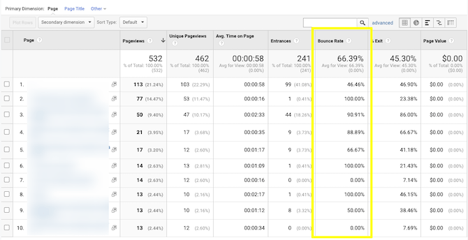
Where can you find this data?
The screenshot above comes from Google Analytics under Behavior > Site Content > All Pages. However, you can find the bounce rate under most sections of Google Analytics.
What does it tell us?
The bounce rate is the percentage of visitors that terminate. You can use it to analyze things like:
- Types of users (demographics) that bounce too quickly
- Specific pages that don’t encourage visitors to look at anything else on the site
- Sources (websites, social media, organic traffic, etc.) that draw in higher quality of traffic (i.e. ones who don’t bounce)
If you’re curious to know how a segment of your audience feels about your site or company, the bounce rate is a good indicator of that.
What should you do with this data?
A high bounce rate isn’t always a bad thing. It depends on what page it occurred on.
For instance, a high bounce rate on the homepage is bad as it suggests that visitors have a negative first impression of it. A high bounce rate on the Contact page, however, isn’t bad if that’s the final touchpoint you want visitors to make.
So, really, you should focus on the pages that appear earlier in the user journey. They should have lower bounce rates (under 50%). The same goes for visitors that match your user persona requirements. They should have an average bounce rate that’s much lower than other people who’ve found their way to your site.
If it’s the issue of a page with a high bounce rate, you’ll have to figure out why there are so many bounces. For starters, is the page even needed or can it be scrapped so visitors can get to more meaningful or useful pages? If it’s a necessary part of the experience, where does the friction lie?
You’ll probably need other tools like heatmaps and session recorders (which you can get from a tool like Hotjar) to figure out why the visitors’ journeys are ending there.
6. Average Time on Page
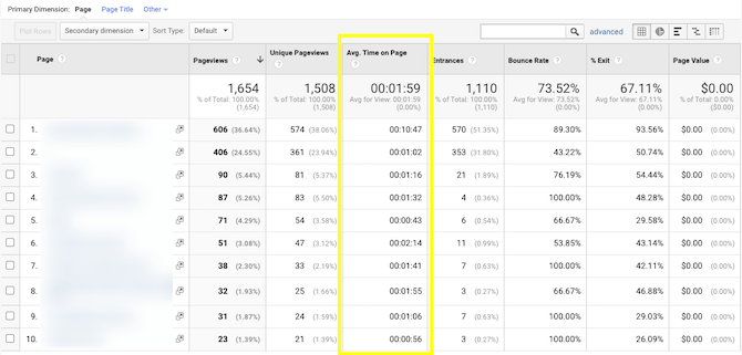
Where can you find this data?
This is another metric that you can measure most Google Analytics metrics against. The example above shows where you’ll find the average time on page under Behavior > Site Content > All Pages.
What does it tell us?
This is a super revealing metric, but you’ll have to dig around through Google Analytics to really figure out what it’s telling you.
Under Behavior, for instance, you’ll see how long visitors stick around on each of your pages. This is useful because it’s something you can easily measure against the actual length and depth of a page.
What should you do with this data?
Let’s say you have a long sales landing page that only has an average time-on-page of a minute or so. If that’s the case, you have a big problem with the messaging, design or both.
You can go deeper, too. So, let’s say the average landing page timing isn’t great. But what if you add a secondary dimension like “Country”? You might find that people in the U.S. are more likely to read the page for 10 minutes as opposed to those in Italy who only stay for about 10 seconds.
If you discover that your visitors have little to no interest in one of your more important pages, then a redesign is in order. It may be a simple change (switching up the hero image, for instance) or it could be a massive undertaking (rewriting the whole page).
I’d recommend using a heatmap tool to help you pinpoint the problem areas. It’ll show you where people lose their focus, don’t know where to click, or if they resort to scanning rather than reading the page.
7. User Journey
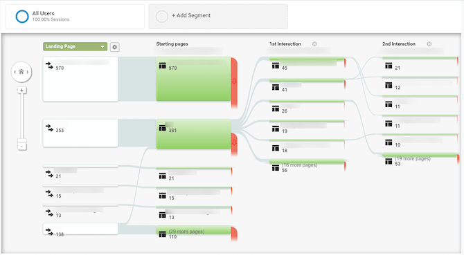
Where can you find this data?
There are two spots in Google Analytics where you can track this. Audience > Users Flow enables you to view user pathways based on demographics and acquisition type.
The one you see above comes from Behavior > Behavior Flow. This enables you to view the start of the user journey using any of the metrics in Google Analytics as a starting point (e.g. country, source, landing page, event type, etc.).
What does it tell us?
If you don’t have a session recording tool like Hotjar, this is a good way to “watch” your visitors as they move from page to page on your website.
Choose your main user metric and let Google Analytics show you:
- The landing page they entered the site on
- The next page they visited (“1st Interaction”)
- The second page they visited (“2nd Interaction”)
You’ll also see how many people dropped off at each interaction and on which page.
What should you do with this data?
If you know what your users’ journey is supposed to look like, use this tool to do a side-by-side comparison and ask:
- Are your highest priority search-optimized pages bringing visitors’ into the site?
- Are visitors picking up the trail of breadcrumbs you left for them in the form of CTA buttons, promotional blocks or bars, or otherwise engaging content?
- Do the majority of visitors tend to follow the same pathway and does it make more sense than the one you established for them?
If these things aren’t happening or you detect major gaps in the journey, then it’s time to sit down and figure out what’s wrong.
For example, if visitors are more likely to choose their own destination from the homepage than to take the one you created for them, then you need to look at the primary call-to-action. Is it too far down on the page? Is the button not big or colorful enough? Is the rest of the site drowning it out?
The Behavior Flow tool will only show you the first few steps of the journey, but that’s okay as these are a really important part of the journey. This is your chance to weed out the top-of-funnel visitors that aren’t the right fit for your business and to drive as many bottom-of-funnel visitors to conversion as possible.
That said, if no one’s getting through these early pages, then you have to remove those chokepoints.
Wrap-up
In addition to monitoring the metrics above, it’s important to set goals for your website and to keep an eye on them as well.
For example, when you launch a new website, you might set the following:
- 5,000 visitors a day by Month 3
- 5% conversion rate on mobile site
- 10 new newsletter subscribers a week
This will allow you to quantitatively determine if your website is doing what it’s supposed to be doing. So, rather than working strictly on intuition, the missed benchmarks will let you know that it’s time to assess your KPIs and initiate a redesign.
The process will then start all over again. After the redesign is done, you’ll use the original goal to determine how successful the implementation was. And once you’ve completely repaired your website so that it’s hitting all your benchmarks for success, you can continue to use this process to improve your website even further.

Suzanne Scacca
A former project manager and web design agency manager, Suzanne Scacca now writes about the changing landscape of design, development and software.

