
Top 5 Features of Telerik UI for Blazor Grid for Developers

Summarize with AI:
One developer shares his favorite five features of the Telerik UI for Blazor Grid.
Grids are one of the most important components in the world of web development, allowing you to work with tabular data. Undoubtedly, the more features the component we use has, the greater the customizations you can achieve in your clients’ applications.
That’s why, in this post, I’m going to tell you about five powerful features of the Progress Telerik UI for Blazor Grid control that will make you fall in love with it. Let’s get started!
1. Smart AI Features
Did you know that it’s possible to add AI to a Blazor Grid? Wasn’t AI just for writing posts, poems, etc.? The truth is, no. The Progress Telerik team has worked very hard to equip the Grid with unique AI-powered features. Imagine being able to filter data with a single instruction to find only the information you’re interested in or to sort records using natural language.
To achieve this, you must first install the NuGet package Telerik.AI.SmartComponents.Extensions. Next, you need to have a page-type component where you use the Blazor DataGrid component. It is also essential to have a client configured that can connect to an AI service, such as OpenAI, Azure OpenAI, a local model, etc. In my case, I will combine the use of Azure OpenAI with Microsoft.Extensions.AI to inject a ChatClient using Blazor.
The next step is to assign the @ref property of your TelerikGrid component a reference declared in the code section of type TelerikGrid, which uses the generic type based on the model that underlies the information displayed in the Grid:
<TelerikGrid Data="@GridData"
             Height="400px" @ref="GridRef">
            ...
</TelerikGrid>
@code {
    public TelerikGrid<Employee> GridRef { get; set; }
    ...
}
The generic type will be used to determine the best operation to execute based on the user’s prompt through the AI model. Now, back in the TelerikGrid component, you need to add a GridToolBar section where you can include the GridToolBarAIAssistantTool tool, setting the PromptSuggestions property to display a list of prompt suggestions, as well as the OnPromptRequest property, which will allow processing the user’s request:
<TelerikGrid Data="@GridData"
             Height="400px" @ref="GridRef">
    <GridToolBar>
        <GridToolBarAIAssistantTool>
            <GridToolBarAIAssistantToolSettings>
                <GridToolBarAIAssistantToolPromptSettings OnPromptRequest="@OnAIPromptRequest"
                                                          PromptSuggestions="@AIPromptSuggestions">
                </GridToolBarAIAssistantToolPromptSettings>
            </GridToolBarAIAssistantToolSettings>
        </GridToolBarAIAssistantTool>
    </GridToolBar>
</TelerikGrid>
In the code section, you need to add the list of prompt suggestions, as well as the event handler:
@code {

    public TelerikGrid<Employee> GridRef { get; set; }
    private List<string> AIPromptSuggestions { get; set; } = new List<string>
    {
        "Order Employees by Position",
        "Group by Department",
        "Highlight only Active Employees"
    };

    private async Task OnAIPromptRequest(AIPromptPromptRequestEventArgs args)
    {
        try
        {

            var options = new ChatCompletionOptions();

            var requestData = GridRef.GetAIRequest(args.Prompt);

            ChatTools.AddGridChatTools(
                    requestData.Columns.Select(x => new GridAIColumn
                    {
                        Field = x.Field,
                        Values = x.Values
                    }).ToList(),
                    options
                );

            var conversationMessages = requestData.Contents
                .Select(m => new UserChatMessage(m.Text))
                .ToList();

            var chatService = MyChatClient.GetService<ChatClient>();
            var result = await chatService.CompleteChatAsync(conversationMessages, options);

            ChatCompletion completion = result.Value;

            var gridOptions = completion.ToolCalls.ExtractGridOptions();

            var json = System.Text.Json.JsonSerializer.Serialize(gridOptions, new System.Text.Json.JsonSerializerOptions { WriteIndented = true });

            args.Output = $"The request was processed. {string.Join(". ", aiResponse.Messages)}.";
            args.Response = json;
        }
        catch (Exception)
        {
            args.Output = "The request returned no results. Try another request.";
        }
    }
    ...
In my example, I have created this code directly in the event handler; however, you might choose to add it in a Web API type project. What happens in the OnAIPromptRequest method is as follows:
- Completion options are created, which will serve to add more tools later.
- Based on the Grid reference, an AI request is built based on the model data and the prompt.
- Tools are exposed from the information of the columns in the Grid.
- A series of
UserChatMessageare created from the user’s prompt. - A Chat service is created to use the
CompleteChatAsyncmethod to generate an AI response. - Subsequently, the result value is obtained, and the
ExtractGridOptionsmethod is executed, which will extract the most convenient operations to execute on the Grid according to the AI response. - The result is serialized to make it compatible with the
Resposeproperty, used later. - An object of type
GridAIResponseis created, with the purpose of obtaining in text format the operations that will be applied to the data. The plain text messages will be shown to the user. - Through the
Outputproperties, plain text messages are displayed to the user regarding the execution result, while the JSON string is assigned to theResponseproperty to execute the operation on the data.
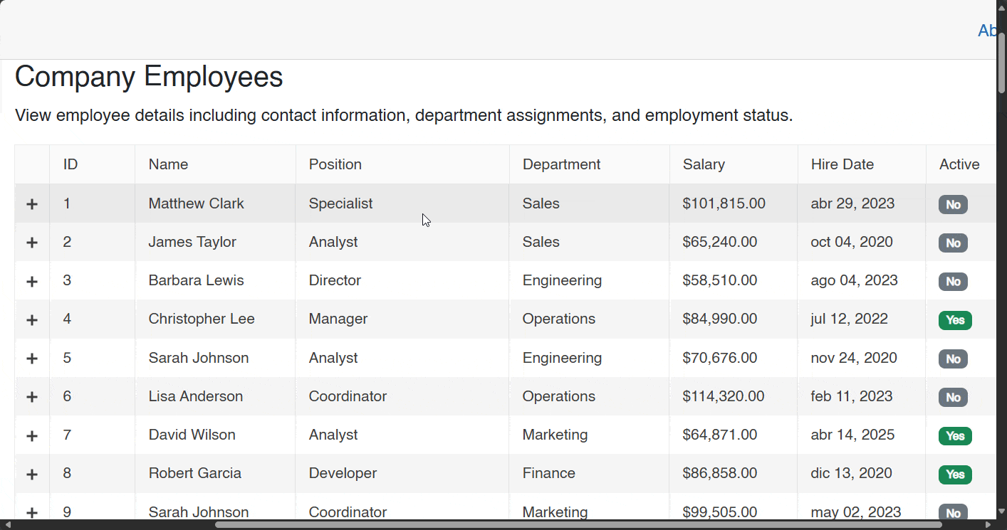
The result of the execution is what you can see below:
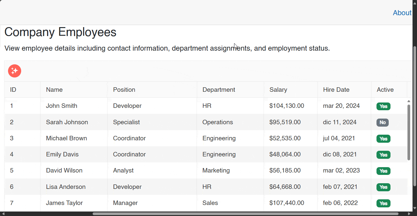
In the image above, you can see how sorting and grouping operations are performed through natural language prompts.
2. Virtualization for High-Performance Apps
Although within the Telerik suite for Blazor we have a pagination component, there are times when you will need to skip its use. In these cases, it is most convenient to use row virtualization, which will allow only the rows that are visible on the screen to be rendered as the user scrolls.
This is made possible by a technique for recycling HTML elements. This approach prevents loading all rows at once, making navigation a smooth experience. I want you to observe the following image, where I load 10,000 records in the UI, causing the page loading process to take a few seconds:
To activate virtualization, you need to follow a few simple steps:
- Modify the parameter
ScrollModewith a valueGridScrollMode.Virtual. - Assign a CSS value to the parameter
Height. - Set the parameter
RowHeightto a decimal value in pixels. - Assign the parameter
PageSize.
You can see an example of the component configuration with a virtualization mode below:
<TelerikGrid Data="@GridData"
             Height="400px" @ref="GridRef"
             ScrollMode="GridScrollMode.Virtual"
             PageSize="20"
             RowHeight="40">
             ...
</TelerikGrid>
If we run the application with this modification, we will see a noticeable improvement:
Without a doubt, this small change represents an improvement in the interaction with the application.
3. Multiple Editing Modes and Integrated Validation
Unlike several grid solutions available in the market for Blazor, the Telerik Grid control offers three editing modes, which undoubtedly provides greater flexibility in creating web solutions. The available modes are:
- In-Cell: Allows editing per cell
- Inline: Allows editing per row
- Popup: Allows editing through a popup form
To implement any of these modes, you need to follow a series of steps:
- Enable any of these modes by using the
EditModeproperty, assigning the valuesGridEditMode.InCell,GridEditMode.InlineorGridEditMode.Popup. - Define the commands and events for the editing mode and operations.
For our example, I will create a button to be able to edit the item and its respective event handler:
<TelerikGrid Data=@GridData
             ...
             EditMode="GridEditMode.Popup"
             OnUpdate="@OnGridUpdate">
             ...
            <GridColumns>
                ...
                <GridCommandColumn Width="180px">
                    <GridCommandButton Command="Edit">Edit</GridCommandButton>
                </GridCommandColumn>
            </GridColumns>
</TelerikGrid>

@code {
    private async Task OnGridUpdate(GridCommandEventArgs args)
    {
        var updatedEmployee = (Employee)args.Item;
        var target = GridData.FirstOrDefault(e => e.Id == updatedEmployee.Id);
        if (target != null)
        {
            target.Name = updatedEmployee.Name;
            target.Position = updatedEmployee.Position;
            target.Department = updatedEmployee.Department;
            target.Salary = updatedEmployee.Salary;
            target.HireDate = updatedEmployee.HireDate;
            target.IsActive = updatedEmployee.IsActive;
        }
    }

    private async Task OnGridRead(GridReadEventArgs args)
    {
        args.Data = GridData;
        args.Total = GridData.Count;
    }
    ...
}
Similarly, if we use Data Annotations in the models, we will have automatic validation. For example, let’s assume we have the following property:
[MaxLength(10)]
public string Position { get; set; } = string.Empty;
By combining an editing mode and Data Annotations, we will achieve a result like the following:
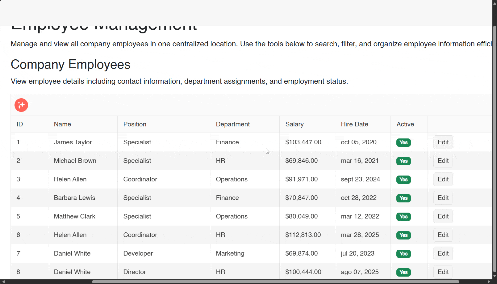
4. Support for Master-Detail Hierarchical Structures
The next feature that I love about the Telerik UI for Blazor DataGrid is the ability to create hierarchies within the component—something that is not very common to find in datagrid components. Although it may seem like a complex operation to implement, you can enable it with just a few lines of code.
This is made possible by the DetailTemplate tag, which allows access to the model for the selected row through the context parameter. By performing a conversion to the specific type of your context model, you can access the detail properties of your row and display them with the component or format that you prefer, although it is common to use another datagrid for this task.
Suppose that as part of an employee model, you have a property that shows the associated projects for each employee, like the following:
    public class Employee
    {
        public int Id { get; set; }
        ...
        public List<EmployeeProject> Projects { get; set; } = new List<EmployeeProject>();
    }
In the component, you need to add the section DetailTemplate as shown below:
<TelerikGrid Data=@GridData>
    <DetailTemplate Context="employeeContext">
        @{
            var employee = employeeContext as Employee;
            <TelerikGrid Data="employee.Projects" Pageable="true" PageSize="5">
                <GridColumns>
                    <GridColumn Field="@nameof(EmployeeProject.Id)" Title="Project ID"></GridColumn>
                    <GridColumn Field="@nameof(EmployeeProject.ProjectName)" Title="Project Name"></GridColumn>
                    <GridColumn Field="@nameof(EmployeeProject.Status)" Title="Status"></GridColumn>
                    <GridColumn Field="@nameof(EmployeeProject.CompletionPercentage)" Title="Progress %"></GridColumn>
                    <GridColumn Field="@nameof(EmployeeProject.StartDate)" Title="Start Date">
                        <Template>
                            @{
                                var project = context as EmployeeProject;
                            }
                            @project?.StartDate.ToString("MMM dd, yyyy")
                        </Template>
                    </GridColumn>
                </GridColumns>
            </TelerikGrid>
        }
    </DetailTemplate>
    ...
</TelerikGrid>
In the code above, there are a few points to highlight:
- The name
employeeContextis defined as the context name. - An
TelerikGridis created that will display the detail information, associating the details property data, in addition to other properties such as whether it will have pagination and the number of items per page. - The structure of the Grid is specified through the use of several
GridColumn.
And that’s it! There’s nothing more to do. The execution gives us the following result:
5. Built-in Export to Multiple Formats
The last feature we will discuss is the ability to export data from the Grid for Blazor. Natively, it is possible to export information in the formats CSV, Excel and PDF, which are common formats in this type of scenarios. What I like the most about this feature is that it is very easy to implement.
First, you need to add in the GridToolBar section the tool of the format type you want to use. Additionally, you also need to define a GridExport section where you specify the type of exporter, as shown below.
To export to CSV format:
<TelerikGrid Data=@GridData
            ...>
        <GridToolBar>
            <GridToolBarCsvExportTool>
                Export to CSV
            </GridToolBarCsvExportTool>
        </GridToolBar>

        <GridExport>
            <GridCsvExport FileName="telerik-grid-export" />
        </GridExport>
</TelerikGrid>
To export to Excel format:
<TelerikGrid Data=@GridData
            ...>
        <GridToolBar>
            <GridToolBarExcelExportTool>
                Export to Excel
            </GridToolBarExcelExportTool>
        </GridToolBar>

        <GridExport>
            <GridExcelExport FileName="telerik-grid-export" />
        </GridExport>
</TelerikGrid>
To export to PDF format:
<TelerikGrid Data=@GridData
            ...>
        <GridToolBar>
            <GridToolBarPdfExportTool>
                Export to PDF
            </GridToolBarPdfExportTool>
        </GridToolBar>

        <GridExport>
            <GridPdfExport FileName="telerik-grid-export"/>
        </GridExport>
</TelerikGrid>
You should know that each exporter has unique properties that you can specify to indicate data, such as orientation, paper size, file name, among other details, which you can find in the official documentation of the Telerik UI for Blazor DataGrid component.
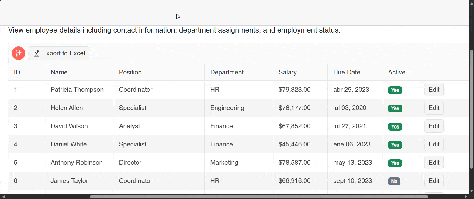
For my example, I have configured the exporter to Excel, which allows for an export in this format as shown in the following image:
Conclusion
Throughout this post, you have seen that the Telerik UI for Blazor DataGrid component is one of the best existing controls for displaying tabular information. From supporting AI model integration to creating hierarchies, using this component in your Blazor projects will undoubtedly make your applications stand out.
To try out the Telerik UI for Blazor Grid and 120+ other components, get started with the free 30-day trial:

Héctor Pérez
Héctor Pérez is a Microsoft MVP with more than 10 years of experience in software development. He is an independent consultant, working with business and government clients to achieve their goals. Additionally, he is an author of books and an instructor at El Camino Dev and Devs School.
Related Posts
Comments
All articles
Topics
Web MobileMobile
Desktop
Design
Productivity
People
