Tips for Building Accessible Design Systems

Summarize with AI:
Address six of today’s common accessibility issues within your design system for fast, reliably consistent, user-friendly builds every time.
Design systems provide the guiding principles, components and rules we use to build and maintain websites and apps. And while they take some time to put together upfront, a well-documented design system comes with big benefits:
- New team members can get up and running with a product in no time at all
- It’s much easier to create a brand with a crystal-clear visual identity
- Reusable components allow for faster design and development
- Thorough rules and guidelines ensure consistency across the product
- Updates go smoothly as you can universally push updates out to components and snippets
One of the benefits we don’t always see associated with design systems, however, is accessibility.
While it’s great that design systems make a designer’s life easier, they also need to enable you to create better products and user experiences. And what is accessibility if not the assurance that all users, regardless of limitation, can have the best experience with and equal access to your digital product and its features.
But how exactly do you build accessibility into a design system?
Today, we’re going to look at some of the biggest problems in web accessibility and how they can be addressed with your design systems.
Common Issues with Web Accessibility and How We Can Address Them with Design Systems
The WebAIM Million is an annual study that reports on the state of web accessibility. More specifically, what it does is unpack the biggest accessibility issues found in the top 1,000,000 websites.
For instance, it detected 60,909,278 accessibility errors on homepages for these top websites in 2020.
I’m going to use 2020’s report to identify what the most common issues are and provide tips along with real-world examples from public design systems to show you how to address them.
Problem 1: Low Contrast Text
This is the most prevalent of accessibility issues that WebAIM observed.
86.3% of homepages had issues with low contrast text. 85.4% of internal pages had the same problem.
Nor was this a one-off issue. Home pages, on average, had 36 instances of low contrast issues while interior pages had 30.3. Even if the page had thousands of words on it, that’s still way too many areas of low readability.
What we want to see in terms of contrast between the color of text and the background behind it is a ratio of at least 4.5:1 for body text and 3:1 for headers. That would make your website or app Level AA compliant.
Atlassian’s design system addresses this issue in a number of ways.
The first is by requiring a Level AA compliance to color contrast for all text, with the exception of disabled states and decorative images.
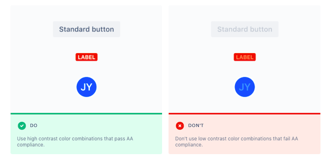
While it’s certainly useful for design systems and brand guidelines to have color palettes that inherently have contrast built in, there’s no guarantee that designers will use them correctly.
To ensure that every pairing has the right contrast—be it text, a graphic, a button or a colorful block against a different color background—your design system must spell this point out and provide clear examples as Atlassian does.
Problem 2: Missing Alt Text
According to WebAIM’s report:
66% of homepage images were missing alternative text, while 61.9% of internal pages had this issue.
For those images that had alt text, 9.3% of them had useless descriptors, like “[file name]”, “image” and “blank.”
Now, unless you have a bunch of decorative images that add nothing to a user’s comprehension of what’s on the page, there should be alt text included for each image. And it should be full of descriptive details so that everyone—even if they can’t see the imagery—understands what is on the screen.
As Material Design points out to designers, missing alt text leaves screen readers and their users with nothing more than the word “image”:
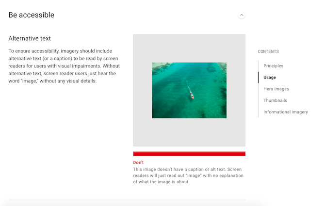
Think about what would happen if a travel site were missing alt text.
Websites like these heavily depend on images in order to sell their experiences—just like the one of the boat speeding through blue-green waters above. If your images don’t include a complete visual description as alt text, visually impaired visitors will miss out on those important, conversion-making details.
If your design system doesn’t have a section on imagery (or other visual content like videos), make sure you include one along with guidance on alt text.
Problem 3: Poor Visual Hierarchy in Text
There are a number of ways in which web pages go wrong when it comes to visual hierarchy:
Too many H1s.
20.5% of the homepages that WebAIM looked at had multiple <h1> tags.
This is a problem since there should only be one <h1> tag per page—and it should be the title of the page. If you have more than one of these tags, screen readers, your users and search bots are going to struggle
with figuring out what the page is actually about.
Incorrectly used headers.
39.1% of pages had skipped headings.
Header tags aren’t strictly used to make one string of text stand out from another. If that’s your only goal, bolding would suffice.
We use header tags to convey a sense of hierarchy within content. We also use them to improve scannability of a page.
So, if <h1> is our title tag, then all the <h2> tags indicate where the main arguments of the page are. Any sub-sections related to <h2> are then styled with <h3>. And on
and on it goes.
When a page doesn’t use header tags in the proper order, then the organization and comprehension of the page’s content can be compromised.
No header tags present.
12.4% of pages had no header tags at all.
Unless your page literally has 50 words of text and no other content present, there’s no excuse for having a header tag–less page. Even then, you’d still need to use an <h1> to communicate the title of the page.
I really like how Shopify’s design system spells this out. Not only does it define the style and size for each header element on its site, it literally tells designers where to use each for consistent application:
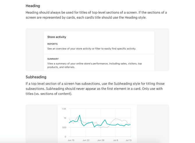
By explaining the when and why of these typography styling choices, designers won’t just be reading off of a design system. They’ll understand how to properly establish a visual hierarchy for readability and accessibility through the use of headers.
Problem 4: Empty Links and Buttons
The WebAIM study focused a lot on the matter of empty links and buttons—i.e. those without any text.
Here’s what the data revealed about this issue:
- 59.9% of homepages contained empty links and 28.7% had empty buttons.
- 63.4% of internal pages had empty links and 36.7% had empty buttons.
- 10.8% of pages had “Skip Navigation” links present, but 11.1% of them were broken.
I think the overarching issue is the same for each. By not providing the right supporting text, you impair a user’s ability to navigate around your site or app.
There are a number of ways in which you might end up with an empty link.
One way is if you use an icon (like an arrowhead) instead of text on a button.
Another way is if you decide to link a string of text as well as a matching image to the same page. So long as the text hyperlink appears before the image and makes it clear that the subsequent image belongs to the reference, you don’t need to add a link to the image.
Now, that doesn’t mean that standalone images can’t be linked. However, if you’re going to do this, you need to have alt text that explains to users what happens after they click the link. This will resolve the empty link issue, so make sure to address it in your design system if this is a common practice.
The same goes for something like skip links. Always make sure your anchor links contain descriptive text so users know exactly where they’re being directed to on the page.
This isn’t something I’ve commonly found in design systems. However, it’s not a bad idea to provide the correct link and button syntax within your system to ensure that designers provide the right information each time.
Problem 5: Ambiguous Links and Buttons
On a related note, the study took a look at the issue of unclear links and buttons—i.e. those with non-descriptive text.
According to the report, 24% of pages used ambiguous link text.
While this issue can certainly impede the navigability of a website or app, the bigger issue is one of click confidence. Let’s take a look at some examples of how that happens.
Here’s one from the Atlassian design system:

As you can see, the “Do” example clearly spells out why the user should click the link and what they’ll find when they do. By contrast, the “Don’t” shows us how a vague text label tells the user nothing.
This is an important detail for all users, not just ones who use screen readers and other assistive devices to scour the web.
Material Design gives us another example of why this should be explained in a design system:
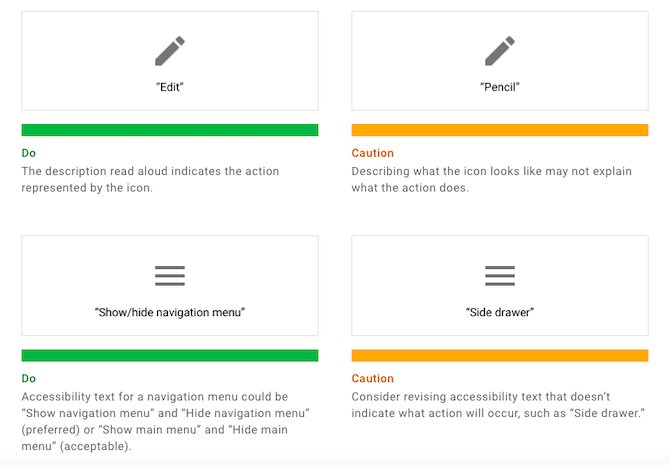
When it pertains to something like an image, corresponding text needs to describe what users “see.” However, when it comes to buttons and other clickable components, it’s a different story.
Visually impaired users might not know what the screen reader means when it says “hamburger menu icon.” They need you to spell out the action so they can feel confident in following the link or taking the action.
Again, make sure your design system reinforces this practice so designers understand why button text needs to be written that way.
Problem 6: Missing Form Input Labels
Contact forms are a critical component on every website you build. Without it, users are either forced to find another way to get in touch (which requires extra clicks to other sites) or to find someone else who readily provides this option.
But it’s not just the presence of a form that appeases visitors, especially those with accessibility issues.
According to WebAIM:
53.8% of homepages have forms that are missing input labels. And 56.1% of internal pages suffer from the same issue.
These labels are an important part of form design as they tell users what’s needed in the field. If those labels are instead placed inside the fields as placeholder text, that could present a serious issue for usability in general.
Incorrect coding of the labels can also be problematic, as the Carbon Design System explains here:
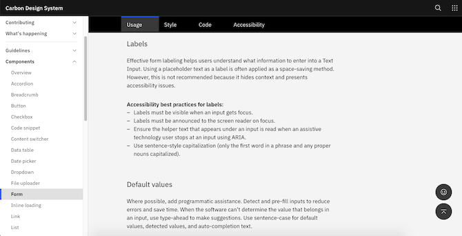
This design system breaks down not only how each of its components are to be designed, but it provides accessibility best practices for each as it does here for form labels.
By ensuring that form labels are visible at all times, and that screen readers and other assistive technologies can find labels as well as other helper text, you’ll ensure that every user can fill out a form with ease. So, make sure your design system defines the accessibility rules for form design.
Wrap-up
This is just the tip of the iceberg when it comes to making your websites and apps accessible.
That said, based on the data we have from the top one million websites, the above six issues are all too common. If your design system can nip them in the bud, updating your design system to account for other accessible components and design choices should be a piece of cake.

Suzanne Scacca
A former project manager and web design agency manager, Suzanne Scacca now writes about the changing landscape of design, development and software.

