The Missing Ingredient to Your Spreadsheets—Charts

Summarize with AI:
Telerik UI for WPF recently introduced a major feature for the RadSpreadsheet and RadSpreadProcessing components - adding charts to your spreadsheet documents to visualize data and more. Learn how you can use it in your spreadsheets today.
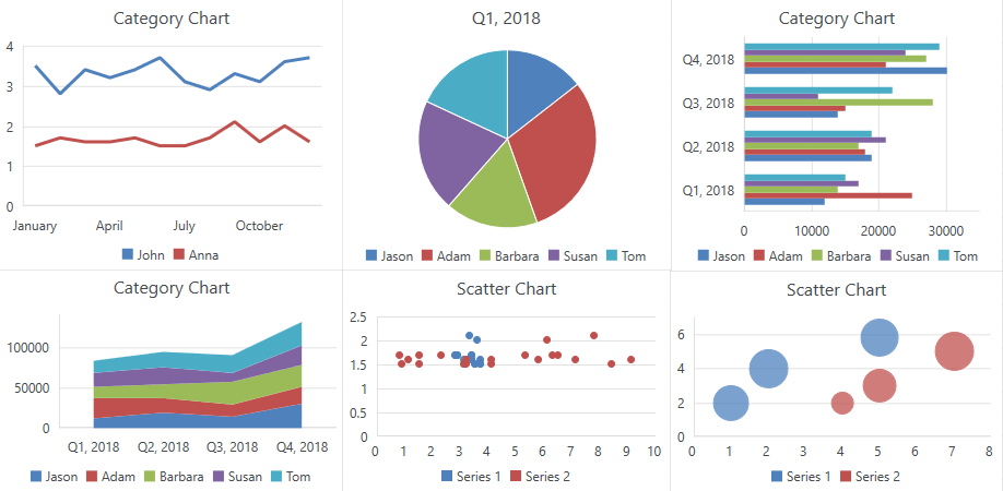
I bet most of you love charts. Those sets of elements that combined together can make a lovely graphical representation of your data. Bar charts, line charts, pie charts, area charts - so many charts! - and if used properly, they make your data come to life. I am happy to announce that this essential ingredient is now part of the RadSpreadsheet control and RadSpreadProcessing library in Telerik UI for WPF.
With only few steps you can now transform your data into a beautiful chart.
How to Add Charts in Your Spreadsheet
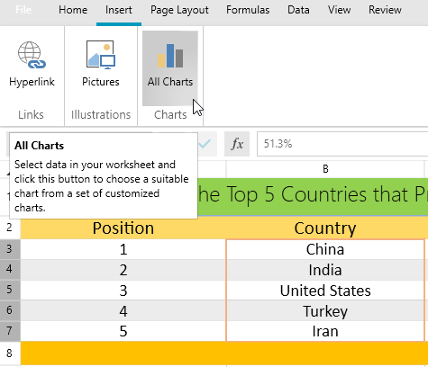
It is pretty easy actually. Once you have your spreadsheet ready and all the data typed in the cells, go to the “Insert” menu tab item and click the “All Charts” button. You can then choose among the chart types you would like to use. This approach should be automatically available for you if you are using Telerik UI for WPF R1 2019 version or higher.
Another way to create charts is to work directly with the Charts API.
Supported Chart Types
Let me briefly introduce what kind of charts can be used at this time with RadSpeadsheet and RadSpreadProcessing, and what they are best for.
- Line: Best for showing values change over time. They work very well for a high number of values increasing or decreasing continuously.
- Column: Display values as sets of columns grouped by category. Great choice for showing columns that grow from smallest on the left to largest on the right on the horizontal axis. Used to compare values of each category. Good for showing ordinal data.
- Bar: Analogical to the Column chart type. The main difference is the orientation of the bars. Good in situations when you have long category labels. Good for showing nominal data (ranges).
- Pie and Doughnut: Easily understood they display percentage of proportional data where each slice represents percentage of the whole. Doughnut charts extend the Pie charts further by being able to show more than one set of data.
- Area: Used in scenarios to plot change over time and draw attention to the total value across a trend. As opposed to Line charts, Area charts are able to show volume.
- Scatter [coming in R2 2019]: Used when you want to show the relationship between two variables. Good for comparing large number of data points. Both axes of Scatter chart are Value axes.
- Bubble [coming in R2 2019]: A bubble chart is a variation of a scatter chart in which the data points are replaced with bubbles. In addition to the Scatter chart, Bubble plots X values, Y values and Z values (size).
You can create a simple DocumentChart object, which is empty, and can then set the desired values. This object represents the chart itself and contains the following properties:
- SeriesGroup: Represents a collection of the groups in which the series of the chart are organized.
- PrimaryAxes: Represents the primary group of axes of the chart.
- SecondaryAxes: Represents the secondary group of axes of the chart. It is used when there is more than one group of series (combo chart).
- Title: Represents the title of the chart.
- Legend: Represents the legend of the chart.
Create a Chart through FloatingChartShape and Add it to a Worksheet
And how do you bind the data and the chart? Let’s assume you have your data already populated in a document within the following range of cells:
Now let’s execute the code below:
FloatingChartShape chartShape = new FloatingChartShape(this.radSpreadsheet.ActiveWorksheet, new CellIndex(2, 7), new CellRange(0, 0, 4, 3), ChartType.Column)
{
    Width = 480,
    Height = 288,
};
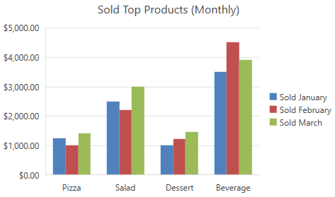
chartShape.Chart.Legend = new Legend() { Position = LegendPosition.Right };
chartShape.Chart.Title = new TextTitle( “Sold Top Products (Monthly)");
this.radSpreadsheet.ActiveWorksheet.Shapes.Add(chartShape);
In a blink of an eye we now have the following column chart:
The charts are wrapped in shapes. FloatingChartShape class is the wrapper allowing you to add a chart to a document. It exposes the following constructors, which parse the data in the chartDataRange parameter and create a chart with all data already filled:
FloatingChartShape(Worksheet worksheet, CellIndex cellIndex, CellRange

chartDataRange, params ChartType[] chartTypes)
FloatingChartShape(Worksheet worksheet, CellIndex cellIndex, CellRange chartDataRange, SeriesRangesOrientation seriesRangesOrientation, params ChartType[] chartTypes)
Legend and Title
You probably noticed that running the code above adds a legend to the chart. Adding the legend is a piece of cake. It can be added or edited through the Legend property of the DocumentChart object and can be positioned through the LegendPosition enumeration with members for Top, Bottom, Left and Right.
The same is also true for chart’s title.You can access and set it by using the Title property of the DocumentChart.
Insert Chart Dialog
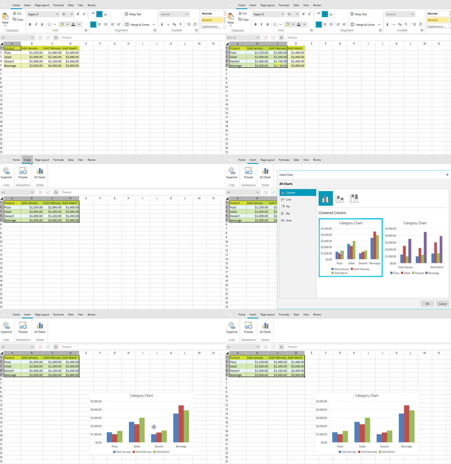
Wait! What if you don’t have a document containing your data, and you would like to create everything from scratch? Using the RadSpreadsheet control, just fill in your data and simply select the cells. Then insert a chart via the "All Charts" button located under the "Insert" menu item.
Hitting the "All Charts" button brings us to the "Insert Charts" dialog. And a question comes to my mind. What if you are not sure what type of chart would best fit your scenario, or you simply want to see how your data would look like in a Bar chart instead of a Column chart (just in case if you are not sure that your labels are short enough)?
Working with RadSpreadsheet’s UI gives you the ability to choose between all available chart types supported by RadSpreadsheet through the “Insert Charts” dialog. We are working on providing more and more chart types which will automatically be added to the dialog, so stay tuned for more.
Update Chart Data
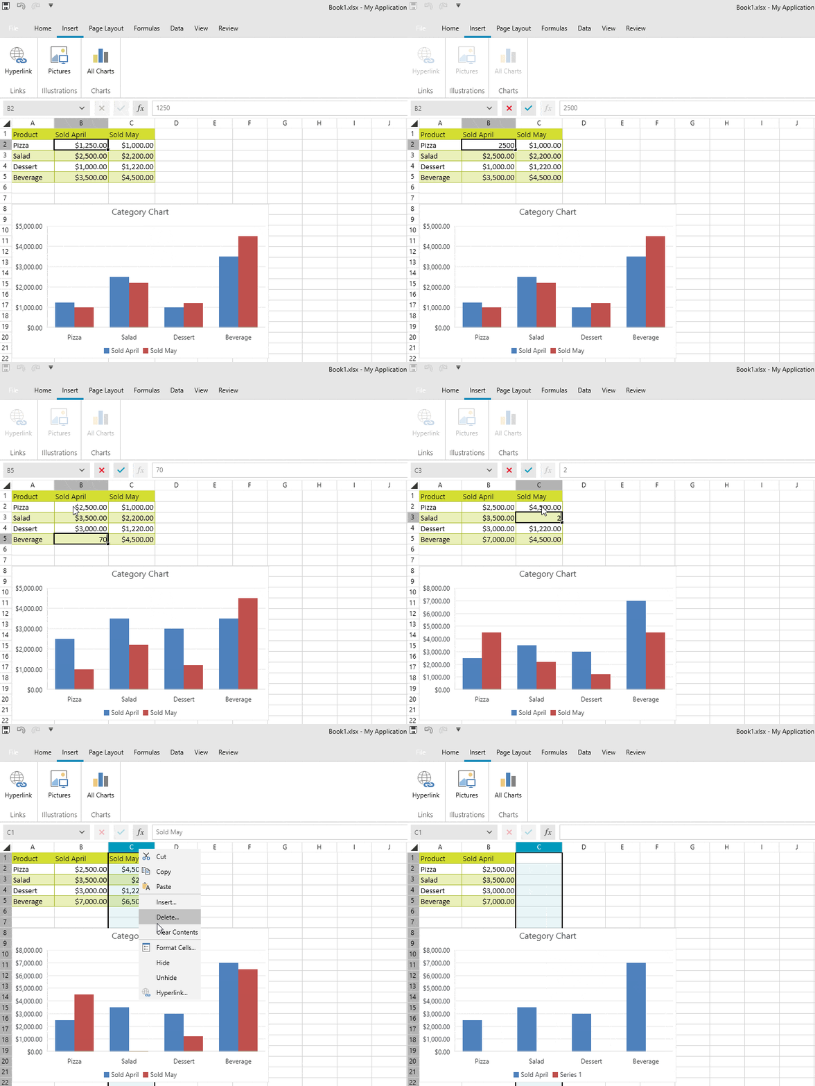
So far, so good. It looks great, doesn’t it? But what if you want to make changes to the data? That ability is only a few keystrokes away. Select and update the cell values and all the changes will be automatically applied to the bound chart. Do this by editing the document via RadSpreadsheet’s UI or using the Charts API.
Exporting Charts
And that’s not all. An essential part of RadSpreadsheet’s model is the ability to export a document to another file format. Charts can easily be exported to PDF and Excel though XlsxFormatProvider and PdfFormatProvider.
What’s Next
We are planning on supporting more of the most commonly used chart types and we will keep you posted. Please share your thoughts and feedback about what other chart types would you expect or what could be improved. Help us make Telerik UI for WPF even better!
For those of you who are hearing about Telerik UI for WPF for the first time and want to learn more, head over to the product page or download a free trial today to get started.

Petar Horozov
Petar Horozov is a Principal QA Engineer at Progress with more than 12 years of experience. He holds a master degree in Software Technologies. He is keen on cooking and loves sports, especially skiing and CrossFit.

