
Telerik and Kendo UI September 2023 Update

Summarize with AI:
See a highlight of what’s new this month in the Progress Telerik and Kendo UI component libraries.
Common Release Items
Classic Theme Support in ThemeBuilder
Great news! Progress ThemeBuilder now supports the classic theme, allowing everyone to style their projects effortlessly using this revamped Sass theme. With a modern twist, the classic theme opens up exciting new possibilities for project customization.
Compatibility with .NET 8 Preview 7
The Telerik UI for Blazor and ASP.NET Core libraries are now compatible with Microsoft’s .NET 8 Preview 7, which is the final preview release for .NET 8.

If you are curious to learn more about the latest preview and .NET 8, don’t forget to check:
- ASP.NET Core updates in .NET 8 Preview 7
- ASP.NET Core in the full ASP.NET Core roadmap for .NET 8 on GitHub.
Telerik UI for Blazor
New DropDownButton Component
Announcing the latest addition to our Telerik UI for Blazor library—the DropDownButton component.
The DropDownButton for Blazor combines a button and a dropdown, offering a concise interface for organizing a set of related user actions. It allows users to click the main button and access a popup menu to choose from additional actions.

Check out the Telerik UI for Blazor DropDownButton demo.
New Waterfall Chart Component
We have enriched our Telerik UI for Blazor Charts suite with a new addition—the Waterfall Chart component.
The Blazor Waterfall Chart visualizes cumulative effects of sequential values, whether time-based or category-based. It aids quantitative analysis for inventory, cash flows and performance.
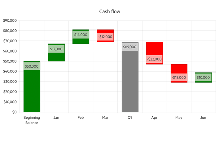
Check out the Telerik UI for Blazor Waterfall Chart demo.
Charts Enhancements
We have now made our Charts a lot more interactive—check the new drilldown capability and events below:
- The Telerik UI for Blazor Charts now supports drilldown functionality for exploring data.
- New ways to interact with Telerik UI for Blazor Chart components:
- OnAxisLabelClick fires when the user clicks a label item on any of the Chart axes.
- OnLegendItemClick is triggered upon clicking on any item in the Chart legend.
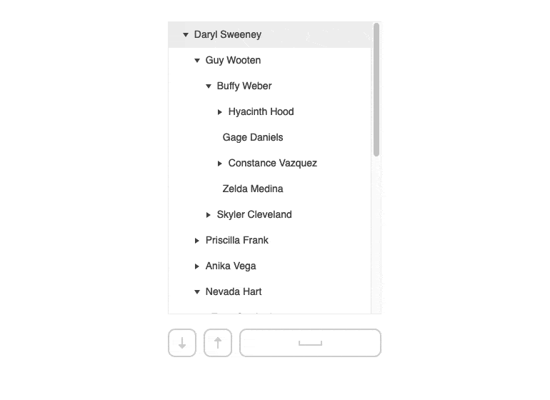
Gantt Enhancement: Popup Editing
The built-in editing popup in Telerik UI for Blazor Gantt Chart now displays three different tabs:
- General tab allows users to edit the title, completion ratio and start and end dates of a given task, as well as change the parent task.
- Predecessors tab displays the list of all predecessor dependencies for a certain task. The edit mode allows the user to update a dependency’s starting task, create a new dependency or remove an existing one.
- Successors tab displays a list of all successor dependencies for a certain task. The edit mode enables the user to update a dependency’s finishing task, create a new dependency or remove an existing one.
See the Telerik UI for Blazor Gantt popup editing demo.
For more details on the latest release, check the full Telerik UI for Blazor 4.5.0 release notes.
Telerik UI for ASP.NET Core and MVC
Stay awake—we’re cooking up something very exciting! In this release, we’ve concentrated on enhancing the accessibility of our components and ensuring they comply with CSP regulations.
For more details on the latest release, check the full ASP.NET Core R2 2023 SP2 (version 2023.2.829) and ASP.NET MVC R2 2023 SP2 (version 2023.2.829) release notes.
Kendo UI for jQuery
Pyramid Chart
Our new Kendo UI for jQuery Pyramid Chart component is designed for visualizing data within a pyramidal structure, conveniently divided into horizontal sections. This unique chart shape allows each section to have a distinct size, visually representing the hierarchy among topics based on the width of each section.
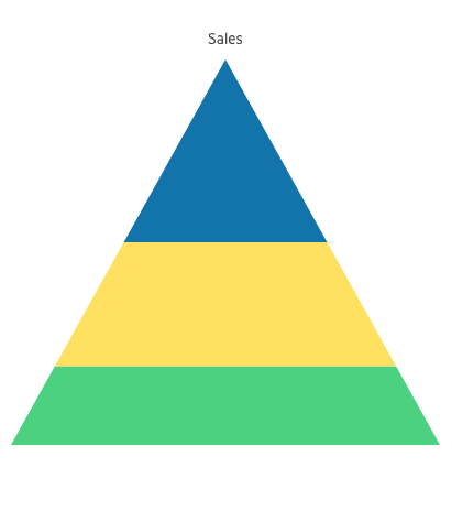
See a demo of the Kendo UI for jQuery Pyramid Chart component.
Grid ContextMenu
Our Grid component now includes a feature-rich built-in Context Menu, offering capabilities such as copy selection, item addition, editing, deletion, row reordering and more. Developers can effortlessly harness these functionalities by enabling the menu, making it a powerful addition for enhancing user interactions.
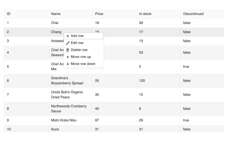
See the new Context Menu feature of the Kendo UI for jQuery Grid.
CSP Improvements
We always focus on security and want to ensure our components follow the latest security standards. Our team has made several improvements to make our product even more secure.
Simply Kendo UI for jQuery Distribution
Beginning with our major release in October, we’re streamlining the Kendo UI for jQuery distribution by removing the bundled jQuery script. Our backward-compatible components empower you to select your preferred supported jQuery version, offering a lighter package that grants you complete flexibility with your jQuery setup.
Kendo UI for Angular
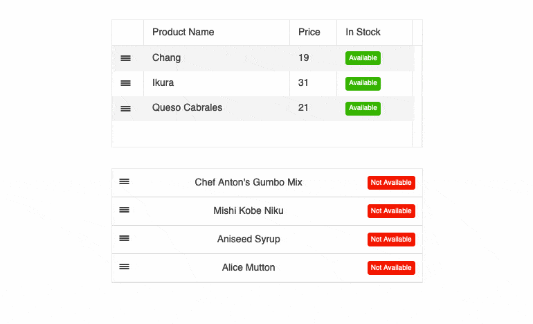
Drag & Drop Between ListView and Grid
Our latest update for Kendo UI for Angular includes a new demo that simplifies data management. You can easily drag and drop items between a ListView and a Data Grid component for smoother data organization.
Pyramid Chart Type
Introducing the KendoReact Chart component, purpose-built for displaying data in a pyramidal structure, with horizontal sections that dynamically adjust in size. This distinct chart format visually conveys topic hierarchy, where section width corresponds directly to each topic’s level.
See a demo of the Kendo UI for Angular Pyramid Chart component.
Enhanced Getting Started Pages
We’re happy to share updates to our “Getting Started” pages, designed to provide everyone a smoother and more intuitive experience. These improvements aim to help you swiftly and effortlessly get up and running with our components.
KendoReact
Spreadsheet Improvements
The KendoReact SpreadSheet continues to evolve and improve. Since its initial release, we’ve been closely attuned to your feedback, and we’re excited to announce a host of new features in today’s release:
- Enhanced editing and formatting tools
- Custom functions
- Error handling support
See a demo of the Spreadsheet with the new formating and error handling features.
Support for Disabled Items
Our latest DropDowns feature allows you to disable specific list items, offering greater control over user interactions to align with your business needs. Ensure users can only select available options, enhancing usability and efficiency. This feature is available for the following components: DropDownList, AutoComplete, ComboBox and MultiSelect.
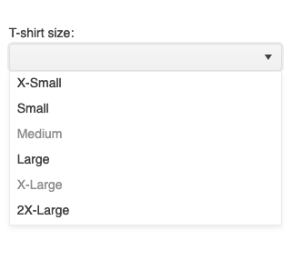
See demo of KendoReact DropDownList with disabled items.
Map’s Pin SVG Icons Support
We’ve enhanced the Map component in our ongoing commitment to incorporating SVG icons seamlessly. Now, you have the flexibility to effortlessly integrate custom SVG icons to mark precise points on your map, further personalizing your mapping experience.
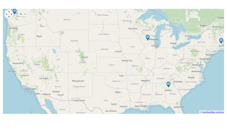
See demo of KendoReact Map component.
Timeline Keyboard Navigation
To enhance our Timeline component, we’re introducing keyboard navigation functionality, enabling users to move between timeline items effortlessly. This addition enhances usability and improves the component’s accessibility, ensuring a seamless experience for all users.
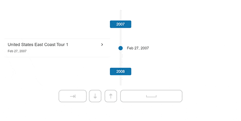
Check out our new KendoReact Timeline Keyboard Navigation demo.
Keyboard Navigation Utility
Introducing our latest utility component, designed to streamline accessibility: Keyboard Navigation. Developers can now effortlessly integrate keyboard navigation into any component, including custom ones, ensuring enhanced accessibility across your entire application.
Check out the new KendoReact Keyboard Navigation Utility.
Breadcrumb Size Options
Our Breadcrumb component now offers small, medium and large sizing options, granting developers the flexibility to adapt it to various scenarios, from compact mode to mobile-friendly sizes. With these straightforward options, customization is a breeze, ensuring a seamless fit for your design needs.
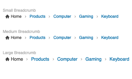
Try our all of the sizing options of the KendoReact Breadcrumb component.
Data Grid Helper
Introducing the GridHelper, a powerful component that augments the capabilities of KendoReact Grid. It offers a user-friendly interface with built-in features for data operations, common functionalities and extensive customization options for end users, such as column hiding and PDF/Excel export, making it a valuable addition to your toolkit.
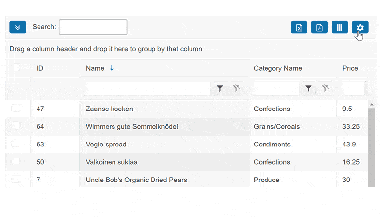
See the new KendoReact Grid Helper and configure all options with ease.
More Coming Soon
The next major release, R3 2023, is coming soon. Stay tuned to learn more about what updates will be available.

Lyubomir Atanasov
Lyubomir Atanasov is a Product Manager with a passion for software development, UI design, and design thinking. He excels in creating impactful and innovative software products by challenging the status quo, collaborating closely with customers, and embracing a spirit of experimentation. His dedication to delivering exceptional UI solutions makes him an invaluable asset, providing immense value through his expertise and innovative approach. Follow him on LinkedIn.
Related Posts
Comments
All articles
Topics
Web MobileMobile
Desktop
Design
Productivity
People
