
Telerik and Kendo UI April 2023 Update

Summarize with AI:
See a highlight of what’s new this month in the Progress Telerik and Kendo UI component libraries.
Common Release Items
Design System Documentation
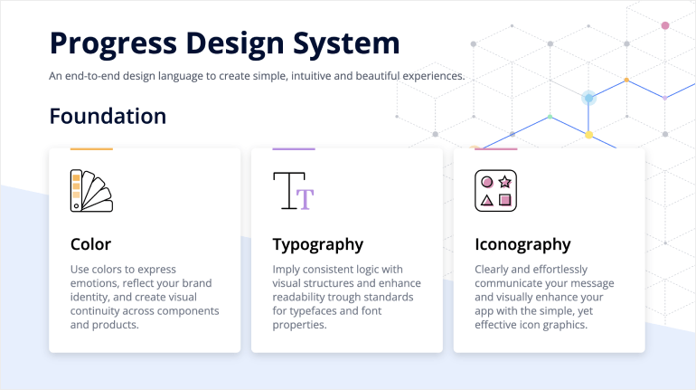
One of the release highlights in the April update of Telerik and Kendo UI is the launch of the new design system documentation site containing resources, design assets and frontend documentation for Telerik and Kendo UI libraries.
This initial release of the Progress Design System site contains related design and frontend documentation for nearly 20 of the most essential components, and we aim to continuously expand it with the ultimate goal of providing everything you need to create intuitive and beautiful digital experiences and design systems based on Telerik and Kendo UI component libraries.
Compatibility with .NET 8 Preview 3
We continue to follow the evolution of .NET 8 and we are happy to announce that this month both Telerik UI for Blazor and UI for ASP.NET Core libraries are compatible with the latest preview 3.

Adaptive Rendering for Dropdowns & Pickers
We put strong emphasis on the adaptive rendering of the Kendo UI, and in this release we ensured mobile-friendly rendering of dropdown components in Kendo UI for Angular and KendoReact.
In Kendo UI for Angular, the adaptive behavior can be enabled via the new “adaptiveMode” parameter, which was added to all dropdown components, including DropDownTree, MultiSelectTree, AutoComplete, DropDownList, ComboBox, MultiSelect and MultiColumnComboBox components.
In KendoReact, the “adaptive” property has to be set to true and is available for the MultiColumnComboBox, MultiSelect, DropDownTree, DropDownList, MultiSelectTree and DatePicker components.
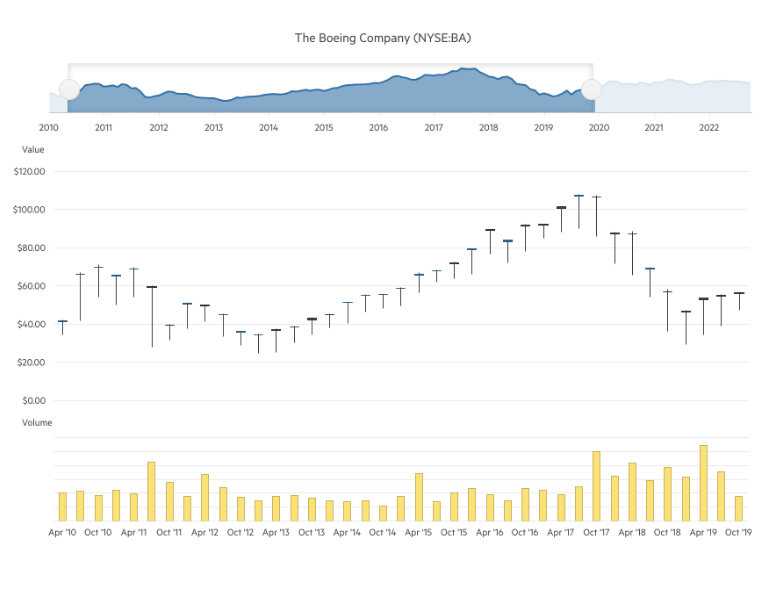
StockChart Position Configuration
The StockChart UI component has been enhanced with a new property allowing you to position its navigator on top (in addition to the existing bottom position). The feature is available in the following products:
- Telerik UI for ASP.NET Core StockChart Navigator Top Position
- Telerik UI for ASP.NET MVC StockChart Navigator Top Position
- Kendo UI for Angular StockChart Navigator Top Position
- Kendo UI for jQuery StockChart Navigator Top Position
Telerik UI for Blazor
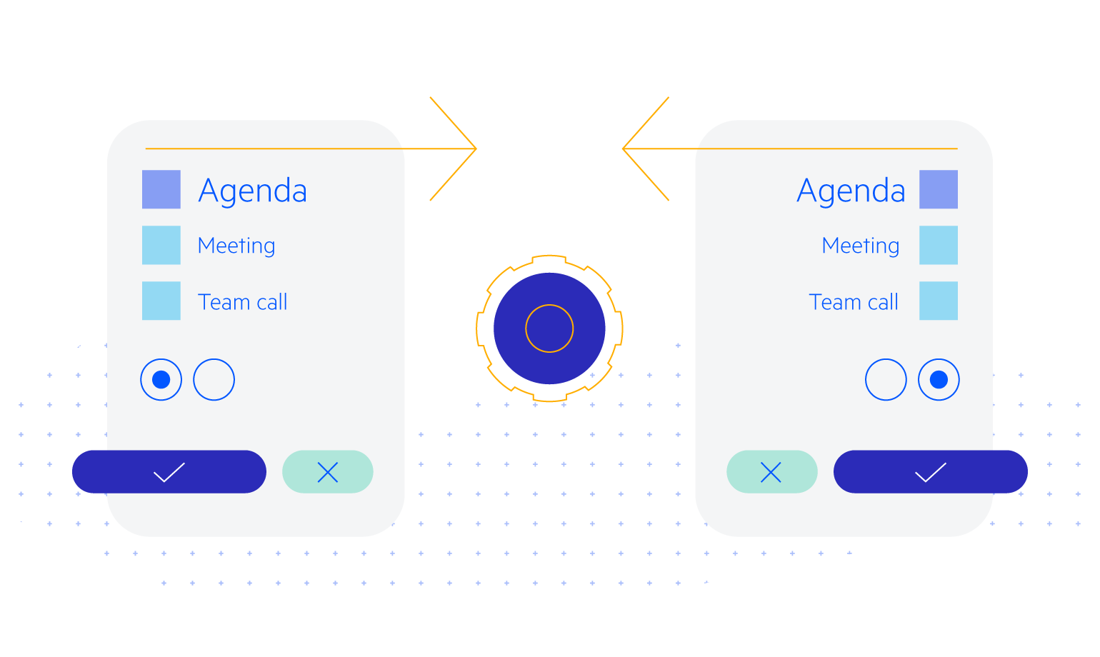
Right-to-Left Support
We are happy to announce that Telerik UI for Blazor components now support right-to-left (RTL) languages! This feature is available in the latest 4.2.0 release of Telerik UI for Blazor and brings a range of benefits to developers building applications for audiences that read and write in RTL languages.
With the new RTL support, developers can now easily create applications that cater to the needs of RTL language users, without having to manually modify the layout or styles. This means that components like grids, charts and dropdowns will automatically adjust their layout to support RTL languages. Additionally, text alignment, text direction and other layout features will be optimized for RTL languages, making it easier for users to navigate and interact with the application.
The RTL support in UI for Blazor can be turned on with a single property EnableRtl once at the TelerikRootComponent, and that would let all of the components take advantage of the feature. More details and specifics for popups can be found in the UI for Blazor RTL support documentation article.
Popup Edit Form Enhancements in Grid and TreeList
Another handy new feature we are shipping this month is the ability to customize the Data Grid and TreeList when the edit mode is set to popup edit. We’re introducing two templates—PopupEditFormTemplate and PopupEditFormButtonsTemplate—that will allow developers to customize both the form itself and the buttons below the form.
Check out the code snippet to see how to implement the new feature, and note that we’ve also added two API methods—OpenEditPopup and CloseEditPopup—to change the visible state of the component.
- See a demo of the UI for Blazor DataGrid popup edit form template.
- See a demo of the UI for Blazor TreeList popup edit form template.
ContextMenu Refresh Method
The Telerik UI for Blazor ContextMenu now allows for refreshing the popup of a context menu while it’s already open. The Refresh method within the ContextMenu enables the programmatic re-render of the component, providing more control and flexibility in managing the rendering of context menus.
This functionality is particularly useful in scenarios where the context menu’s content changes dynamically, resulting in a smoother and more intuitive user experience without having to close and reopen it.
Telerik UI for ASP.NET Core and MVC
API Reference for TagHelpers
The Telerik UI for ASP.NET Core API reference has been enhanced with a dedicated section for the TagHelpers syntax flavor of the library, allowing you to easily reference all related attributes and child tags.
See an example of UI for ASP.NET Core Actionsheet TagHelper API reference.

UI & UX Improvements in Multiple Components Forms
With the current release of UI for ASP.NET Core and UI for ASP.NET MVC, we shipped multiple design and layout improvements across the libraries related to adding, editing and uploading dialogs in multiple components including Data Grid, TreeList, Gantt, FileManager, Editor and more.
Customization of DateInput Messages
You can now easily customize the message placeholder of the date input within the Date and Time Picker components, via the Messages option in the DateInput UI component. The component also provides the .Format() option and it can be leveraged to set the date format, which will be used to parse and format the machine date.
Scheduler Integration with Google Calendar
For those of you who need to implement integration between the UI for ASP.NET Core Scheduler component and Google calendar, we have added a “how to” article and a sample project.
Kendo UI for Angular
Data Grid Enhancements
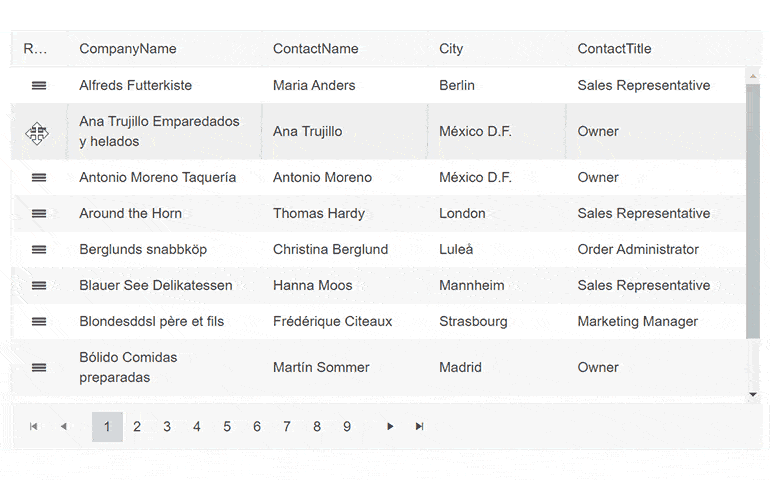
Row Reordering
The Row reordering feature enhances the rows of the Grid allowing them to be shuffled on demand with a drag and drop of a specified hint element. To enable the Row reordering set the rowReorderable property
of the Grid to true and Define a RowReorderColumn.
See a demo of the Kendo UI for Angular row reordering in Grid.
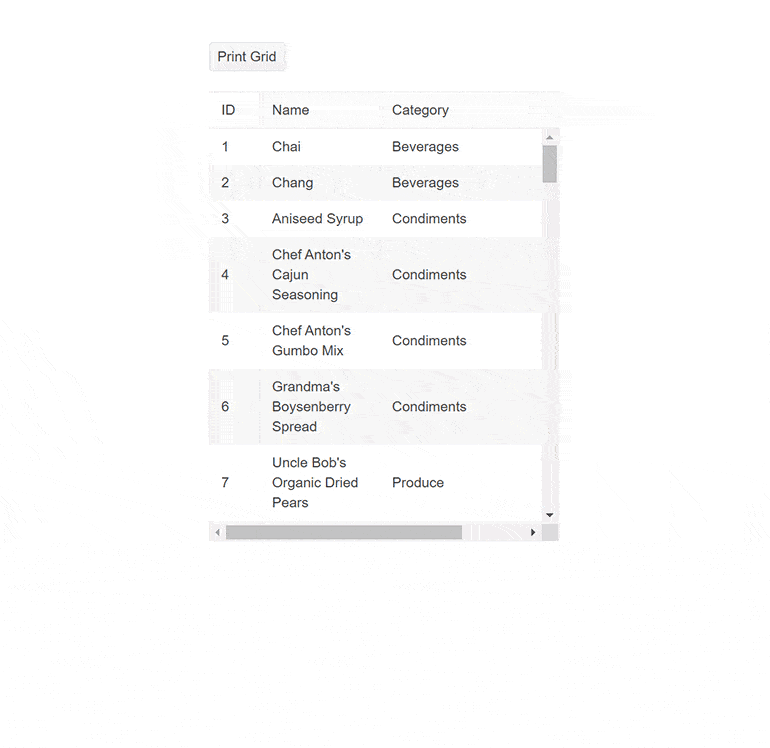
Data Grid Printing Demo
The printing demo shows
you how to build a printer-friendly Data Grid component. It works with both scrollable and pageable grids—you’ll have to disable the corresponding scrollable or pageable parameters and remove any predefined grid sizing. The demo
code modifies the grid styling for print and then reverts it back once printing is done.
See a demo of the Kendo UI for Angular built-in print in Grid.
ListBox Accessibility
We’ve improved the accessibility of the ListBox component by adding Globalization KeyboardNavigation to it to improve the experience and make it WCAG 2.1 AA and Section 508 compliant.
See a demo of the Kendo UI for Angular ListBox Accessibility.
Drag and Drop Utility Upgrade—Drag and Drop Targets
Drag and Drop Utility now allows you to specify DragTargetContainer to a container element, enabling you to configure multiple elements within а container as drag targets. Correspondingly, you can apply DropTargetContainer, which would enable you to set multiple elements within a container as drop targets.
- See a demo of the Kendo UI for Angular Drag and Drop Drag targets.
- See a demo of the Kendo UI for Angular Drag and Drop Drop targets.
Dialog Actions Layouts Update
In the Dialog component, we’ve updated the behavior of the actionLayout by modifying the existing options from: normal / end/ stretched to start / center/ end / stretched. This adds the new center option and changes the “normal” option to “start” keeping the same behavior.
KendoReact
Scroll to Index Helper Method
We shipped further enhancement in the scrolling experience of the KendoReact DataGrid component. In addition to the option to scroll to a specific item, users can now easily check if a selected row is currently visible within the Grid, and, if not, scroll it to the top.
This new functionality is particularly useful in scenarios where users need to quickly locate and interact with a specific row, even when working with a large dataset. With this feature, users can simply select the desired row, and the Grid will automatically check if it is currently visible. If the row is not visible, it will be smoothly scrolled to the top, ensuring that the user can quickly and easily interact with the selected row.
It is worth noting that the feature has been designed to ensure that rows are only scrolled to the top when necessary. Specifically, if 90% of the row’s height is currently visible, it will be considered “visible” and will not be scrolled to the top. Additionally, the rowHeight parameter should be set to match the height of the row according to the design, to ensure that the scrolling behavior is accurate.
See a demo of the KendoReact ScrollIntoView Data Grid feature.
Data Grouping
The data grouping features provide the option to display data in groups inside a component. The grouping can be used and queried by filtering the component. To enable Data Grouping, you need to define the groupField property. The Data Grouping feature is now available for AutoComplete, DropDownList, MultiSelect, ComboBox and MultiColumnComboBox.
Kendo UI for Vue
New Native Vue MultiSelectTree component
The new native MultiSelectTree component in Kendo UI for Vue is a brand-new addition to the dropdown family of components. It allows users to browse through and select multiple items from a hierarchical selection.
The MultiSelectTree component has built-in filtering and numerous options for customized rendering. It has seamless integration with Forms, enabling you to validate input values and prevent the submission of forms that are in an invalid state.
See a demo of the Kendo UI for Vue MultiSelectTree component.
New Events for Native Date and Time Pickers
We introduced new events for Date and Time Pickers in Kendo UI for Vue handling open and close events, allowing you to specify custom logic when the popup of a component is opened/closed. The feature is available for the DatePicker, DateTimePicker, TimePicker and DateRangePicker components.
See the API of the Kendo UI for Vue Date Inputs for more information.
Wrap-up
We hope you’ve enjoyed this highlight look of updated features in our Kendo UI and Telerik libraries. R2 is coming in June, so look forward to more then!

Maria Ivanova
Maria Ivanova is a Manager of Product Management at Progress, for Telerik and Kendo UI components and developer tooling. She joined the company in 2019 as a Product Manager for Telerik UI web components and is passionate about developing impactful and innovative software products. Maria believes that to create great products, it's important to challenge the status quo, closely collaborate with customers, and embrace a spirit of experimentation.
Related Posts
Comments
All articles
Topics
Web MobileMobile
Desktop
Design
Productivity
People
