A Picture is Worth a Thousand Words: Meet the WinForms PictureBox

Summarize with AI:
The first Telerik UI for WinForms release for 2021 brought our customers a brand new Office2019Light theme, Toast notifications, RadPictureBox, Metro theme with vector images and support for Visual Studio design-time in .NET Core/.NET 5.0. In this blog we will take a more detailed look at RadPictureBox, its features and even a fully functional demo.
Let’s first describe what a RadPictureBox is. Similar to the framed pictures that we hang on our walls, a picture box control allows us to “hang” images in our applications. Indeed, RadPictureBox is designed to display images and interact with them. The control supports the well-known raster image formats like PNG, JPG, BMP, ICO and so on. In order to extend the vector image support we introduced in R2 2020, we provided support for SVGs (scalable vector graphics) in RadPictureBox.
Features
The main functionalities of the brand new RadPictureBox control are:
- Zoom. This allows users to view even the smallest details of an image by using the zoom feature.
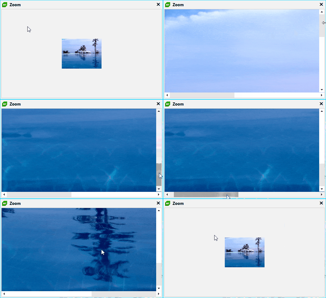
Zooming vector images preserves the quality no matter how much you zoom it. Below you can find a comparison between the same raster and vector image before and after zoom-in:


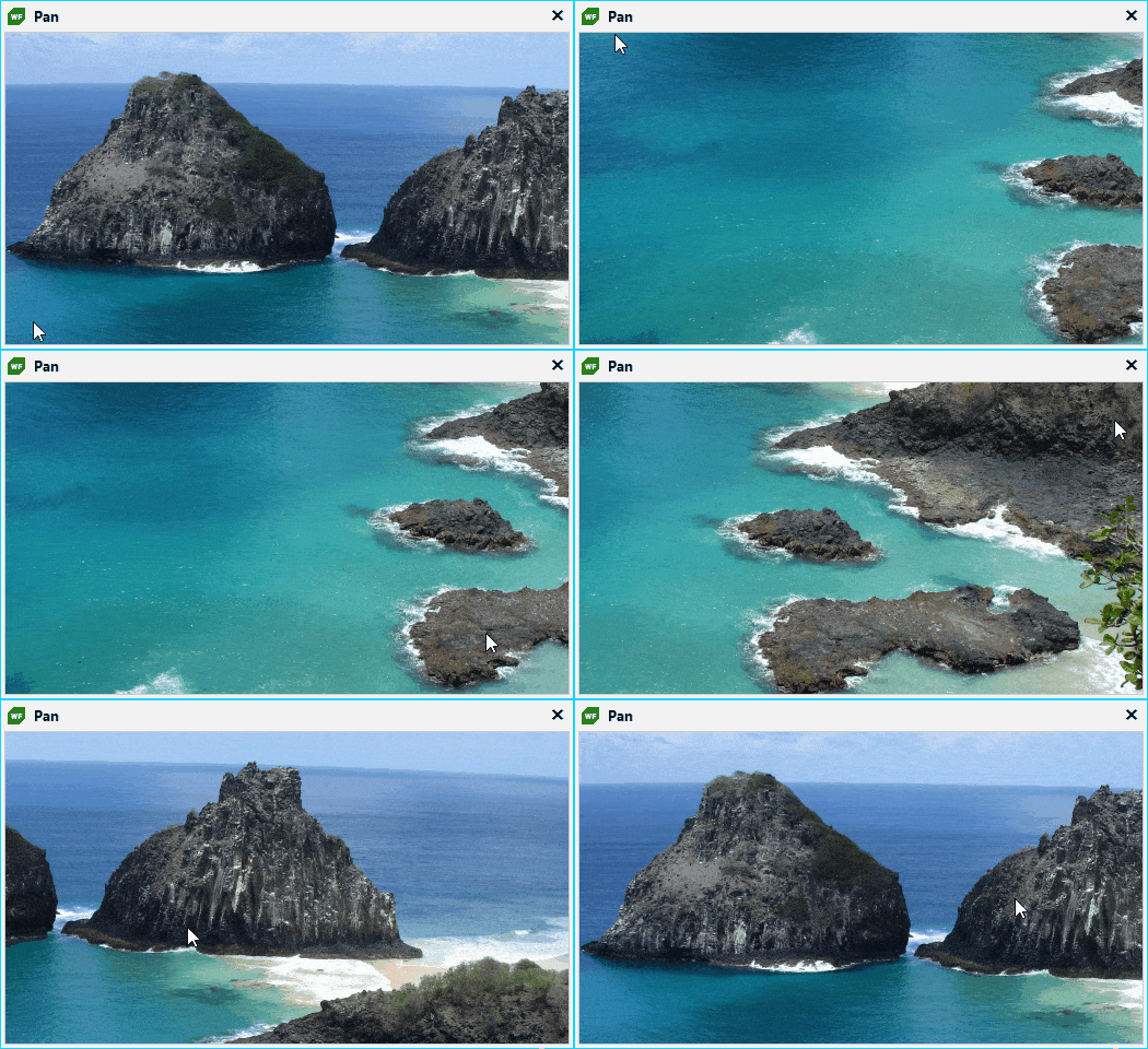
- Panning and Scrolling large images.
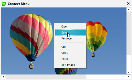
- Context menu with different modification options.
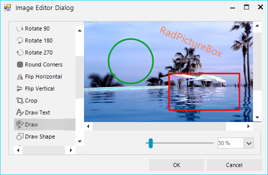
- Editing images using the RadImageEditor control.
- Panels (toolbars) on each side. These allow adding buttons, labels and any other TPF elements (we will have a detailed look at them later).
- Different ways to position the image over the control by setting one of the following options: Stretch, Center, Zoom, Tile, FitIntoBounds or None.
- Touch support for seamless use on any touch device.
Panels
The panels, or toolbars, provide an easy way to add new functionalities to the RadPictureBox control. The toolbars are positioned on the four sides of the control—top, bottom, left and right.
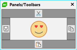
Panel Modes
Panels can be displayed in three different modes:
- Always – Panels will be visible at all times.
- OnMouseHover – Panels are shown only when the mouse is over the picture box control.
- None – Panels are not visible, and you need to show them programmatically.
These modes are controlled by the PanelDisplayMode property of the control.
Horizontal or Vertical Priority
RadPictureBox can arrange with priority for either the horizontal or the vertical panel, which is controlled with the PanelOverflowMode property.
The difference between the two modes is illustrated in the screenshot below:

Item Collections
The top panel has Left, Center and RightItems, which allow you to directly add items in each corner or in the center of panel, with no need to write custom layouts.
Moreover, each of the item collections is hosted by an element stack, which is a visual element that is responsible for the layout of the items and provides different customization options such as setting background colors and borders and controlling the distance between elements.
this.radPictureBox1.TopPanel.CenterElementsStack.ElementSpacing = 3;this.radPictureBox1.TopPanel.BackColor = Color.FromArgb(100, Color.DarkBlue);this.radPictureBox1.TopPanel.BorderColor = Color.FromArgb(100, Color.DarkBlue);
Demo
After talking through the control and its panels, we are going to create a demo together using RadPictureBox. 😋 The goal is to create an application that navigates through images in a certain directory.
Let’s start with creating a new Windows Form. Drag a RadPictureBox control from the toolbox and dock it to fill. We will no longer use the designer, so we can close it.
To navigate through the images in the directory, we will add two buttons on the left and the right side. And this is how our form’s constructor looks:
public RadForm1(){ this.InitializeComponent(); RadButtonElement previousButton = new RadButtonElement(); previousButton.ToolTipText = "Previous image"; previousButton.Text = "\ue016"; previousButton.CustomFont = "TelerikWebUI"; previousButton.CustomFontSize = 16; previousButton.Click += this.PreviousButton_Click; this.radPictureBox1.LeftPanel.CenterItems.Add(previousButton); RadButtonElement nextButton = new RadButtonElement(); nextButton.ToolTipText = "Next image"; nextButton.Text = "\ue014"; nextButton.CustomFont = "TelerikWebUI"; nextButton.CustomFontSize = 16; nextButton.Click += this.NextButton_Click; this.radPictureBox1.RightPanel.CenterItems.Add(nextButton);}This is how it looks:
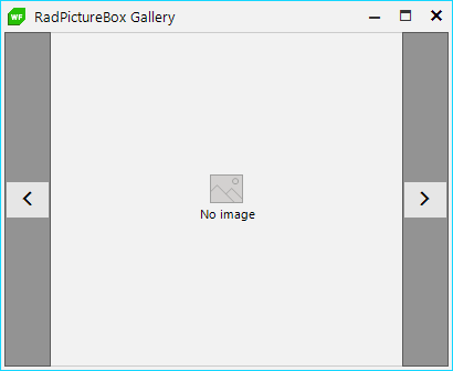
The panel background occupies the entire control from the top to the bottom. We can remove it by setting the DrawFill and DrawBorder of left and right panels to false.
this.radPictureBox1.LeftPanel.DrawFill = false;this.radPictureBox1.LeftPanel.DrawBorder = false;this.radPictureBox1.RightPanel.DrawFill = false;this.radPictureBox1.RightPanel.DrawBorder = false;Here is the result 👏:
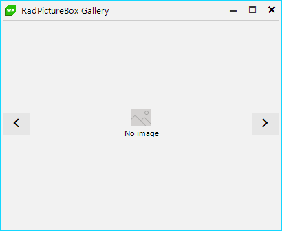
But now we need to highlight these buttons somehow, so they can be clearly visible on a gray background. This can be achieved by setting the padding, background and border to the CenterElementsStack of left and right panels.
this.radPictureBox1.LeftPanel.CenterElementsStack.Padding = new Padding(3);this.radPictureBox1.LeftPanel.CenterElementsStack.DrawFill = true;this.radPictureBox1.LeftPanel.CenterElementsStack.DrawBorder = true;this.radPictureBox1.LeftPanel.CenterElementsStack.BackColor = Color.FromArgb(175, Color.DarkSlateBlue);this.radPictureBox1.LeftPanel.CenterElementsStack.BorderColor = Color.FromArgb(175, Color.DarkSlateBlue);this.radPictureBox1.RightPanel.CenterElementsStack.Padding = new Padding(3);this.radPictureBox1.RightPanel.CenterElementsStack.DrawFill = true;this.radPictureBox1.RightPanel.CenterElementsStack.DrawBorder = true;this.radPictureBox1.RightPanel.CenterElementsStack.BackColor = Color.FromArgb(175, Color.DarkSlateBlue);this.radPictureBox1.RightPanel.CenterElementsStack.BorderColor = Color.FromArgb(175, Color.DarkSlateBlue);Now the buttons are very clearly visible. 😄
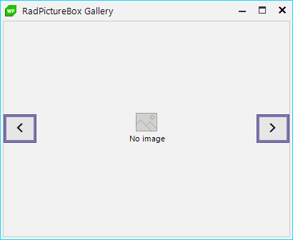
❗❗ It is important to note that if we want to have solid buttons placed on a semi-transparent panel, we need to use transparency in the back and border color. If we set the Opacity property of the panel, this will make our buttons semi-transparent too.
The panels are displayed by default when the mouse is over the control. They are shown with animation, by animating the Opacity property (fade animation). We can customize the animation and animate another property. Our goal is to change the fade animation to a slide. To achieve this, we will set the DisplayProperty that is changed when the panel is shown or hidden from Opacity to PositionOffset.
this.radPictureBox1.LeftPanel.DisplayProperty = RadElement.PositionOffsetProperty;this.radPictureBox1.RightPanel.DisplayProperty = RadElement.PositionOffsetProperty;In addition to this, each panel provides two properties, VisibleValue and HiddenValue, which are respectively 1 and 0 when we use the Opacity property. We need to change their values to a valid value for the PositionOffset property.
// Reset the Opacity to its visible valuethis.radPictureBox1.LeftPanel.Opacity = 1;this.radPictureBox1.RightPanel.Opacity = 1; // Load the element tree, so we can have valid Bounds of the panelsthis.radPictureBox1.LoadElementTree();this.radPictureBox1.LeftPanel.VisibleValue = new SizeF(0, 0);this.radPictureBox1.LeftPanel.HiddenValue = new SizeF(-this.radPictureBox1.LeftPanel.Bounds.Width, 0); this.radPictureBox1.RightPanel.VisibleValue = new SizeF(0, 0);this.radPictureBox1.RightPanel.HiddenValue = new SizeF(this.radPictureBox1.RightPanel.Bounds.Width, 0);Nice slide animation for the navigation buttons. 😇
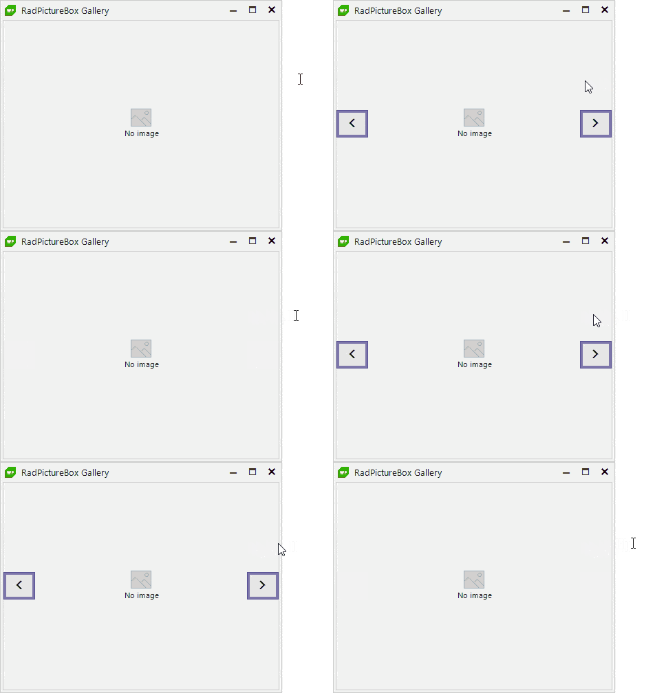
So far, we have added some buttons to our picture box control and customized the panels. Now, let’s add the paths of all images located in the “Images” folder of our project, store them in a collection and display the first image in the RadPictureBox control:
// Save all image paths in a listprivate List<string> paths;// Store selected image index, We will use it during navigation with buttonsprivate int selectedImageIndex;public RadForm1(){ // ... previous code this.selectedImageIndex = 0; this.paths = Directory.EnumerateFiles(@"..\..\Images").ToList(); this.radPictureBox1.Image = Image.FromFile(this.paths[this.selectedImageIndex]);}The last step is to make the previous and next buttons fully functional:
private void PreviousButton_Click(object sender, EventArgs e){ this.selectedImageIndex--; if (this.selectedImageIndex < 0) { this.selectedImageIndex = this.paths.Count - 1; } this.radPictureBox1.Image = Image.FromFile(this.paths[this.selectedImageIndex]);}private void NextButton_Click(object sender, EventArgs e){ this.selectedImageIndex++; if (this.selectedImageIndex >= this.paths.Count) { this.selectedImageIndex = 0; } this.radPictureBox1.Image = Image.FromFile(this.paths[this.selectedImageIndex]);}And the result 😍:
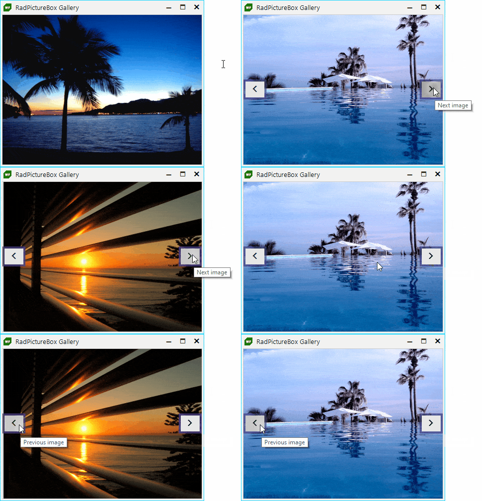
Share Your Feedback
Feel free to drop us a comment below sharing your thoughts. We would love to hear how all this works for you. 😊 You can visit our UI for Winforms Feedback portal and let us know if you have any suggestions for particular features/controls.
If you haven't tried the Telerik UI for WinForms, you should check out our free trial or—better yet—go though all our UI suites in the DevCraft bundle!

Todor Vyagov
Todor Vyagov is a Software Developer on the WinForms team at Progress.
