Learning To Use Menu Bar in .NET MAUI

Summarize with AI:
Today in our .NET MAUI explorations, let’s see how to use one of the primary tools for any app—a menu bar!
In your day to day, you usually use desktop applications containing a menu bar that offers a set of options to execute certain actions. This is super useful for you as a user, and that’s why today we will learn how to do it in .NET MAUI in a very simple and fast way! Let’s see! 🤓
What Exactly Is a Menu Bar?
It’s a container that presents a set of menus in a horizontal row, at the top of a desktop application.
Hierarchies of a Menu Bar
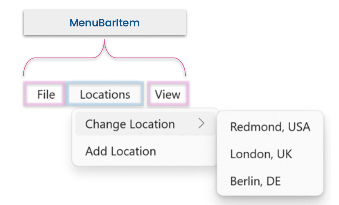
Before we learn how to do it in code, let’s look at a general example of what menu bar hierarchies might look like, which I’ll then show you how to build step by step.

In the example above, you can see a complete hierarchy of a menu bar. However, it is important to know that your menu bar does not necessarily have to have these specific items—you can add as many as you need!
⚠ The image of the Menu Bar on which we base our project to explain its structure was obtained from the official documentation.
Let’s break it down into steps and learn how to apply each of the levels shown in the previous image!
Start a Menu Bar
To start the implementation of a Menu Bar, add the MenuBarItems tags to your Page. In this case, we will use a ContentPage, as shown below:
<ContentPage.MenuBarItems>
  <!-- Add here the explanation of the next step.-->
</ContentPage.MenuBarItems>
⚠ Make sure you open and close the tags correctly.
First Level ➡ MenuBarItem
Now, let’s work with the MenuBarItem, which is an object that represents the top-level menus added to the menu bar. You must add the tags that represent it within the previous step. I’ll show you how to do it below, but first let’s understand its visual structure more closely and I want to highlight some points to consider for its implementation.
➖ Understand its visual structure.

Let’s see the points to consider for its implementation:
➖ First of all, you must know the properties you need to use with the MenuBarItem, which are the following:
🔹 Text: Receives a string value and is the title of the menu.
🔹 IsEnabled: Receives a boolean value and is responsible for establishing whether the menu is enabled or not. You just have to send this parameter if you want to disable a menu. Otherwise it’s not necessary because the default value is True.
➖ Implementation in code:
<MenuBarItem Text="File">
    <!-- Add here the explanation of the next step.-->
</MenuBarItem>
<!-- Add here all the MenuBarItem you need.-->
⚠ Important:
- Add these same tags for each menu you need.
- All of these properties are BindableProperty, which means that they can be targets of data bindings and styled.
Second Level ➡ MenuFlyoutSubItem
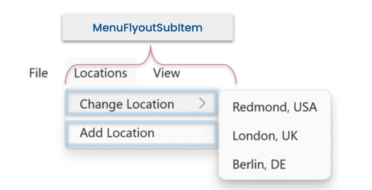
MenuFlyoutSubItem allows you to nest menu items at a second level of the menu hierarchy. This receives a Text, which, as in the previous step, is the Title of the menu.
To identify its structure, let’s see it in the following image:

➖ Implementation in code:
<MenuFlyoutSubItem Text="Change Location"> <!-- Add here the explanation of the next step.--> </MenuFlyoutSubItem><!-- Add here all the MenuFlyoutSubItem you need.-->
Third Level ➡ MenuFlyoutItem
Finally, we arrive at the MenuFlyoutItem. As we saw in the image of the example main hierarchy, this allows us to add items to our menu bar at a third level (sub-menu), before its implementation. Let’s look at its visual structure!

➖ Learn some of the properties you need to use with the MenuFlyoutItem:
🔹 Text: Receives a string value and is the title of the menu.
🔹 Command: You can send a Command so that once the user clicks on the action it is executed.
🔹 Clicked: Or you can also add an event so that once the user clicks on the action it is executed.
➖ Implementation in code:
<MenuFlyoutItem Text="Redmond, USA"
			    Command="{Binding YourCommand}"
			    CommandParameter="Redmond" />

<!-- Add here all the MenuFlyoutItem you need.-->
⚠ Each MenuFlyoutItem defines a menu item that executes an ICommand when selected.
All Together
And done!! 🎊 From now on, you can create your own menu bar!! 😍
Finally, the set of steps explained above, summarized should look like the following code block:
<ContentPage ...>
  <ContentPage.MenuBarItems>
    <MenuBarItem Text="File">
    	    <MenuFlyoutSubItem Text="Change Location">
		    <MenuFlyoutItem Text="Redmond, USA"
		    Command="{Binding YourCommand}"
		    CommandParameter="Redmond" />
		    <!-- Add here all the MenuFlyoutItem you need.-->
	    </MenuFlyoutSubItem>
	    <!-- Add here all the MenuFlyoutSubItem you need.-->
    </MenuBarItem>
    <!-- Add here all the MenuBarItem you need.-->
  </ContentPage.MenuBarItems>
</ContentPage>
Before We Wrap Up
Let’s learn about some limitations of Mac Catalyst:
.NET MAUI Mac Catalyst applications are limited to 50 menu items, so if you try to add more, your application will throw an exception.
The good news is that by implementing the code block that I will give you below, you can add additional menu items to the initial 50 allowed. For this, you just have to paste the following code in your AppDelegate:
[Export("MenuItem50: ")]
internal void MenuItem50(UICommand uICommand)
{
    uICommand.SendClicked();
}
And that’s all! 😎
Conclusion
We have reached the end of this post, I hope it has been very useful to you and that you liked it! 💚💕
See you later! 🙋♀️
References: https://docs.microsoft.com/en-us/dotnet/maui/user-interface/menubar
Use a component library in sync with .NET MAUI’s release cadence. Try Telerik UI for .NET MAUI for free.

Leomaris Reyes
Leomaris Reyes is a software engineer from the Dominican Republic specializing in mobile development. She is a 7-time Microsoft MVP and actively builds mobile applications while sharing practical knowledge through technical articles and developer-focused content.
Through her work, she explains programming concepts, developer tools and real-world development practices to help developers grow in their careers.
You can follow her on Instagram and TikTok at @leomarisreyes.dev, read her articles on AskXammy, and connect with her on LinkedIn, where she shares tutorials, insights and resources for developers.

