Image Optimization in Angular Applications

Summarize with AI:
In this guide, we will see how to use Angular’s NgOptimizedImage directive to address some common image optimization concerns effortlessly.
There is hardly a website you will come across that does not have images, and this shows how indispensable they are in driving sales, enhancing credibility and improving user engagement.
While this is good news, on the other hand, images contribute to 42% of why websites are slow, as they take up significant bandwidth and are a major contributor to why websites do not meet the standard requirements for performance on the internet, as defined by Google’s Core Web Vitals and its LCP metric.
This raises the important question of how best to take advantage of images. The answer is image optimization—a set of techniques that enable web developers to effectively use images and deliver the best user experience.
Framework developers, having understood the difficulties developers face while using images, have created tools to do the heavy lifting. In this article, we will go through the use of Angular’s NgOptimizedImage directive, which builds on top of the traditional <img/> element with some enhancements. We will see how it can be used to address some common image optimization concerns effortlessly.
Things We Need to Optimize When Using Images
This section will discuss a set of areas that require attention to get it right with images, irrespective of the platform on which images are used. The browser provides two main tags to work with images: <picture/> and <img/>, with the latter being the preferred option.
As we go over these areas and the techniques used, where necessary we will also specify attributes provided by the img element that can be used to solve these problems.
We will split our optimization concerns into three categories:
- Those that have to do with a single image
- Working with multiple images
- Meeting standards
Single Image
Optimizing a single image involves the following:
Format
Different image formats provide different compression levels and are best suited for different purposes:
- Verify that the right image format is used for the right purpose. For example, PNGs are best suited for graphic content, and AVIF or WebP should be preferred over older formats like JPEG, since they yield smaller file sizes with greater quality and reduced bandwidth.
- For local images, you may need to use tools like Photoshop, FFmpeg, Squoosh or another media manipulation tool to convert between formats before using them on your website. However, if images are stored on a CDN provisioned by some provider (e.g., Cloudinary), tools are provided to convert between formats.
Resolution Switching and Viewport-Based Sizing
Devices have different resolutions and pixel densities/ratios. Developers need to serve the right image to the right device.
Device pixel ratio, in simple terms, refers to how many of the device’s physical pixels can fit into the dimensions of a CSS pixel. So a device with a higher DPR should be served a high-resolution image and vice versa.
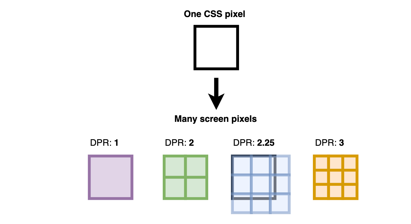
The img element ships with two main attributes to solve this problem. The srcset attribute allows developers to configure the candidate images to enable browsers to select the right one.
Multiple Images
When working with multiple images, optimization concerns involve the following:
- Lazy loading images
- Giving priority to more important images
Lazy Loading Images
Lazy loading means that only the required image(s) are presented to the user, which saves bandwidth and reduces the page’s critical rendering path, which in turn lowers its load time. The img tag ships with the loading attribute, which can be set to “lazy” to achieve this behavior.
Low-quality image placeholders should be used in conjunction with lazy loading to minimize the perceived loading time while the browser downloads the actual image. For local images, developers may need to generate placeholders manually or use specialized tools. When using a remote provider, some JavaScript is still required to display the placeholder before the browser downloads the actual image.
Giving Priority to More Important Image(s)
Not all images on a page are of equal importance (e.g., LCP—Largest Contentful Paint—images). Developers should prioritize more important images over less important ones. The img tag provides the loading and fetchPriority attributes to solve these issues, together with preloading the image using the link element.
Optimizing for Standard
Optimizing a standard image involves the following:
- Optimize for LCP (Largest Contentful Paint)
- Optimize for CLS (Cumulative Layout Shift)
Optimize for LCP
The LCP of a webpage is a measure of how long it takes to display its main content—it could be an image, a section, a video, etc. A good LCP is within the range of 0-2.5s.
When the LCP element on a page is an image, developers should load that image to the webpage as soon as possible while also verifying that the image size is optimized. The img element provides us with loading and fetchPriority attributes. The link element can also be used to prioritize fetching important assets, such as images on the webpage.
Optimize for CLS
Layout shifts occur when there is a sudden movement of one or more elements on the webpage because something changed or was introduced to the DOM while the webpage was still loading. With images, it occurs when the browser loads the image at a later time after loading some of the other content on the page, and when space was not reserved for the image. So after the image is added to the DOM, other elements are displaced.
When images are not used as background images, it is essential to define a width and height for the image so that the space is reserved for the image, even when the load time is delayed.
The NgOptimizedImage Directive
We have discussed the different things we need to optimize when using images, and those that we can resolve using combinations of one or more attributes provided by the img element. One might wonder why we still need the NgOptimizedImage directive. Let’s go over a few points.
The NgOptimizedImage directive builds on top of the img element and enhances it in the following ways:
- First, out of the box, it defines some important attributes when using the
imgelement, so that developers do not have to remember to use them and can focus on building their applications. - It enables developers to use images optimized to meet standard requirements. By default, when using this directive, you are required to provide a
widthandheightwhen images are not used as background images, so that layout shifts do not happen when loading images. - Out of the box, it integrates well with third-party media providers such as Cloudinary, ImageKit, Cloudflare, etc., so developers can easily use these services and get even better optimization.
NgOptimizedImage in Action
Let’s now see this directive in action. We will revisit the image optimization areas we listed earlier and see firsthand how to use the NgOptimizedImage directive in code. We will see how each step can be achieved with local and remote images.
Project Setup
Run the command below to clone the starter project:
https://github.com/christiannwamba/ng-image-optimization
Our starter application has a few local images in its /public folder.
Apart from the root app component, the demo application defines three other components:
local.component.ts: The component in this file will show how to use local images.remote-image.component.ts: The component in this file will show how to use remote images.local-and-remote-image.component.ts: We will update this component later to see how to use local and remote images in one component using custom loaders.
Basic Use
Let’s start by showing the basic use of this directive.
Local Image
Update your local.component.ts file with the following:
import { Component } from "@angular/core";
import { NgOptimizedImage } from "@angular/common";
@Component({
  selector: "local-use",
  imports: [NgOptimizedImage],
  template: `
    <h3>Local image</h3>
    @for (img of localImages; track $index) {
    <div style="padding-top: 700px">
      <img width="800" height="600" [ngSrc]="img" />
    </div>
    }
  `,
  styles: ``,
})
export class LocalImageComponent {
  localImages = [
    "2.webp",
    "3.webp",
    "4.jpg",
    "5.jpg",
    "6.jpg",
    "7.jpg",
    "8.jpg",
    "9.jpg",
  ];
}
Remote Image
Update your remote-image.component.ts file with the following:
import { NgOptimizedImage, provideCloudinaryLoader } from "@angular/common";
import { Component } from "@angular/core";
@Component({
  selector: "remote-image-use",
  imports: [NgOptimizedImage],
  providers: [
    provideCloudinaryLoader("https://res.cloudinary.com/chrisnwamba1"),
  ],
  template: `
    <h3>Remote images</h3>
    @for (img of remoteImages; track $index) {
    <div class="">
      <img width="800" height="600" [ngSrc]="img" />
    </div>
    }
  `,
  styles: ``,
})
export class RemoteImageComponent {
  remoteImages = [
    "jcuh90sdncxwugdsqh40",
    "qowugcszjxcdixvalvcp",
    "err9wujrz1epkrhjbjtz",
    "fypu0o7ea3ssvu4m97uh",
  ];
}
We start by importing the NgOptimizedImage directive and injecting it into the imports array.
In each component, we defined an array of local and remote images in the localImages and remoteImages variables, respectively.
Since we want our remote images to be managed for us by a third-party provider, Cloudinary, in our case, we created a Cloudinary account and uploaded a few images there.
Feel free to use your preferred media provider solution; we just chose to go with Cloudinary in this article.
To work with remote images, we make use of loaders, which are just functions that resolve to URLs. We can create custom loaders or use those that are supported by default. We used the Cloudinary loader by injecting provideCloudinaryLoader, which we fed the base URL pointing to our cloud name.
We used the ngSrc property to set the image source. It is mandatory to define a width and height for images; this helps prevent layout shifts if the image is delayed during loading. Failure to do so will likely result in errors.

You can start your application server by running npm run start. If you go ahead and inspect the img elements, you will notice that both local and remote images are lazy-loaded by default, as indicated by the loading="lazy" attribute, and there is no priority assigned to any image as specified by fetchPriority="auto".

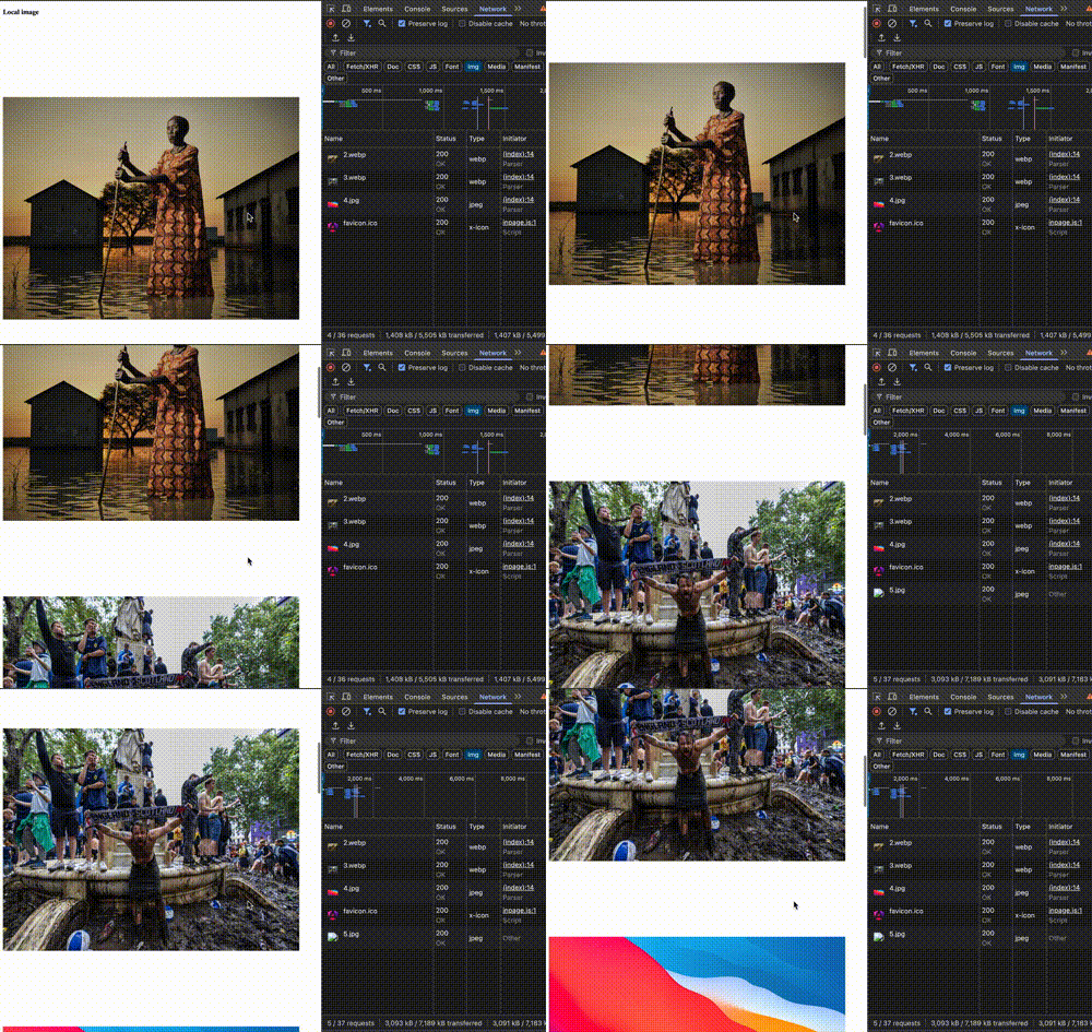
By default, the srcset attribute is added for remote images, and it defines candidate images for different DPRs.

Just by using the ngSrc attribute, the benefits of the NgOptimizedImage directive are immediately obvious. Let’s now proceed to make some tweaks in our app to address the following areas:
- Using images as backgrounds
- Lazy loading with placeholders
- Loading high-priority images (improving LCP)
- Resolution switching and viewport-based sizing
Using Images as Backgrounds
Update the local.component.ts file with the following:
@Component({
  selector: 'local-use',
  imports: [NgOptimizedImage],
  template: `
  <div
  style="
    width: 300px;
    height: 700px;
    overflow: hidden;
    position: relative;
    margin-inline: auto;
    margin-top:700px;
    padding:30px;
  "
>
  <img
    fill
    [ngSrc]="localImages[3]"
    style="object-fit: cover; z-index: -1"
  />
  <H1>Hello</H1>
  <p>testing Backgrounds</p>
</div>
By using the fill attribute, we can use images as backgrounds. This property overlays the image in its parent container using CSS. The fill attribute does not require us to specify a width or height property.
Here is a sample output:

Lazy Loading with Placeholders
Local Image
<h3>Local image</h3>
    <img
    width="800"
    height="600"
    [ngSrc]="localImages[3]"
    placeholder="data:image/webp;base64,UklGRtAAAABXRUJQVlA4IMQAAABwBQCdASoeABYAPn04lEeko6IhN/qoAJAPiWUAtOmMvNuEG3k3qonsrAxlVBwKRSuctL6AAP5RW9WtEC0SDum4fF68ZQfeqBp3ieyso2Hc2ynsYXNcHAVa/DMTVvEUDdP0bRJtvmL3wvsyJ806MJRwREZAAVSaRrRK08CE6p8y76jW+EO/e7rKmFK5yUhVi3z7XYbOSbwkJ+X7ferG15xGCnyYvNIHoozVzX9IOCk0RxXcw5ZqEee3QgU+m05NtntkAAAA"
  />
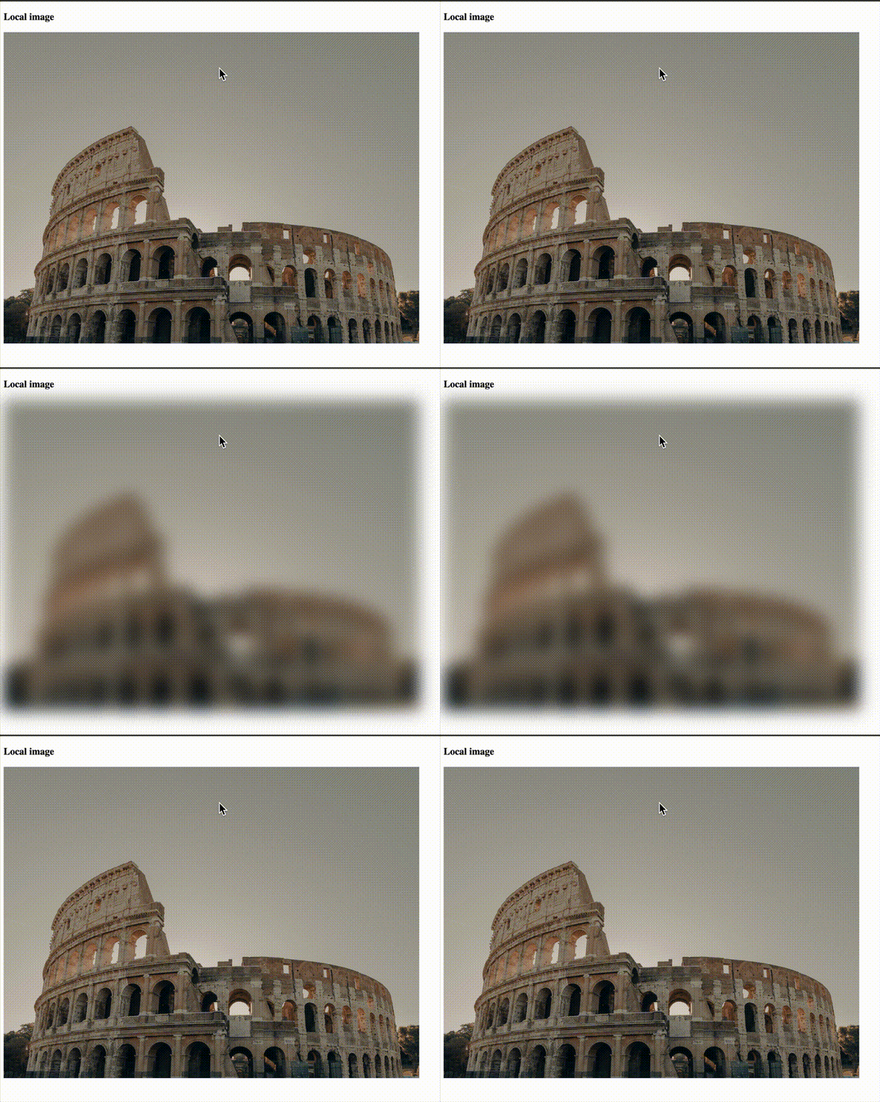
For local images, the image placeholder property must be manually set to a data URL as shown above. It is recommended that data URLs should be kept within 4KB in size. You can use tools like FFmpeg or visit websites like blurred.dev to generate placeholders. Failure to use a data URL will generate an error.
Remote Image
@for (img of remoteImages; track $index) {
  <div class="">
    <img
      width="800"
      height="590"
      [ngSrc]="img"
      placeholder
    />
  </div>
}
For remote images, just by setting the placeholder property, the loader generates a placeholder URL for all our images.
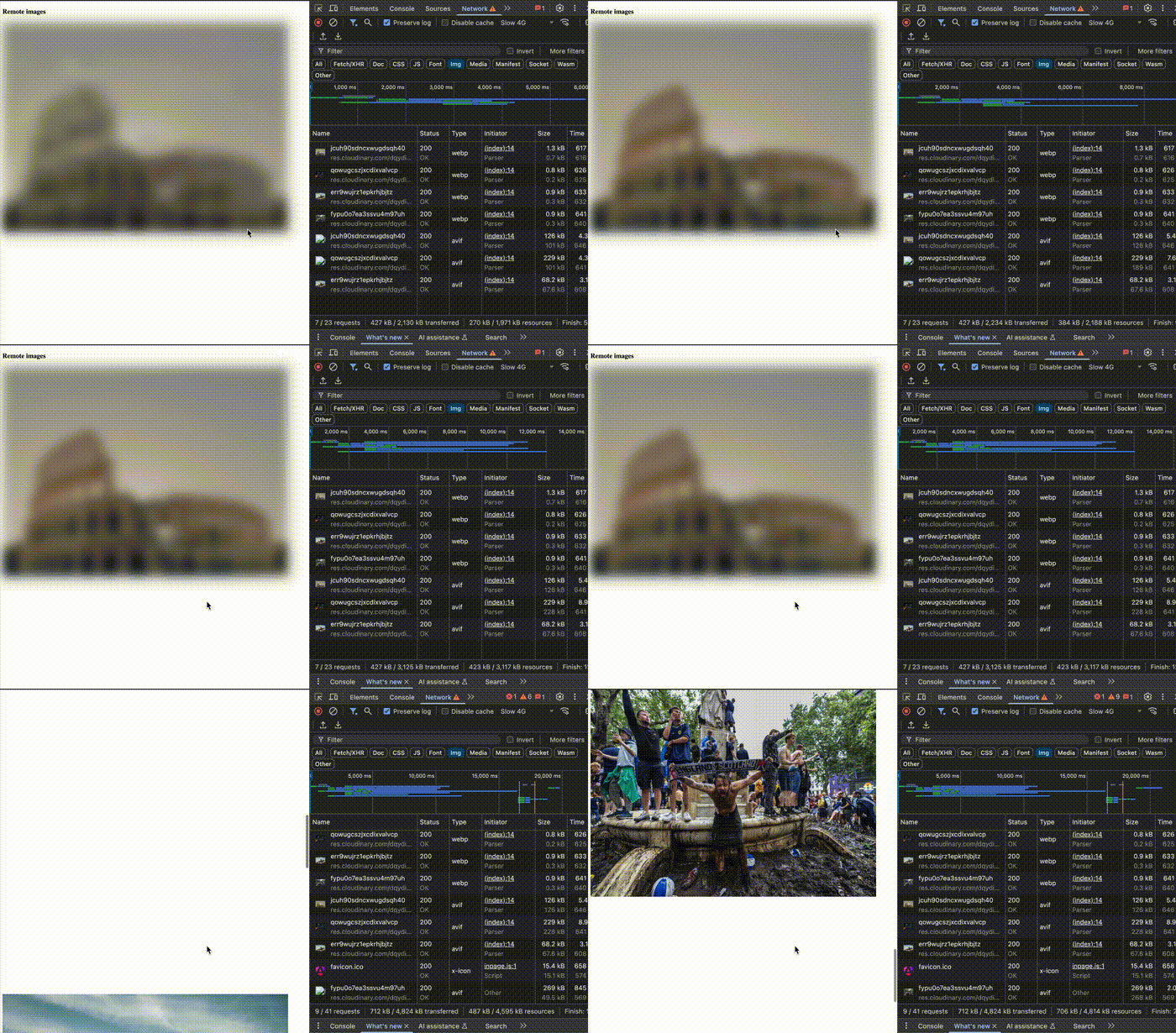
By default, placeholders have a width of 30 px in the generated URL as shown in the image below:

Customizing Placeholders
Width
We can customize the width of placeholders by using the IMAGE_CONFIG injection token. This is only applicable when using remote images.
import { IMAGE_CONFIG, NgOptimizedImage, provideCloudinaryLoader } from '@angular/common';
import { Component } from '@angular/core';
@Component({
  selector: 'remote-image-use',
  imports: [NgOptimizedImage],
  providers: [provideCloudinaryLoader('https://res.cloudinary.com/dqydioa17'),
    {
      provide: IMAGE_CONFIG,
      useValue: {
        placeholderResolution: 40,
      }
    },
  ],
If you set the placeholderResolution to 40, you’ll notice that the request URL is updated as shown below:

Appearance
By default, placeholder images are blurred out. As we saw earlier, the placeholderConfig property is an object that allows us to enable or disable the blur effect. It accepts an object with only one property called blur and can be used for both remote and local images.
@for (img of remoteImages; track $index) {
  <div style="padding-bottom: 900px">
    <img
      width="800"
      height="590"
      [ngSrc]="img"
      placeholder
      [placeholderConfig]="{blur:false}"
    />
  </div>
}
Loading High-Priority Images (Improving LCP)
Websites may use one or more images, depending on the use case. Some images may need to be loaded earlier than others because an image could be the LCP element on the page. Hence, the need to give certain images a higher loading priority over others.
@for (img of remoteImages; track $index) {
  <div style="padding-bottom: 900px">
    <img
      width="800"
      height="590"
      [ngSrc]="img"
      placeholder
      [placeholderConfig]="{blur:false}"
      [priority]="$index ===2"
    />
  </div>
}
For demonstration purposes, we set the priority property for the third image to true, simply assuming it is our LCP image.

As seen above, this sets the loading and fetchPriority to eager and high respectively.
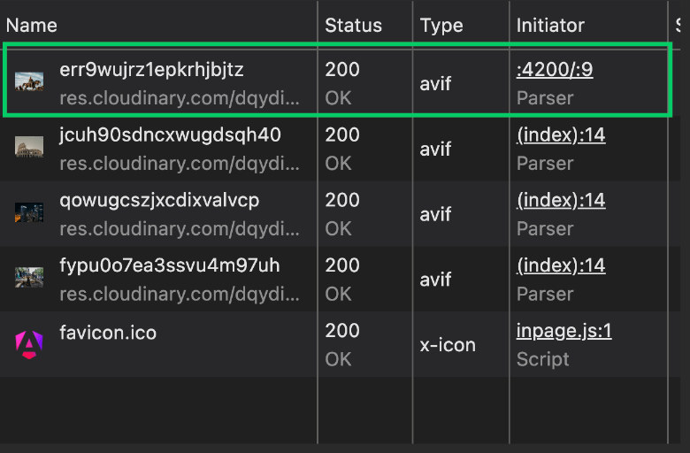
As seen above, the image with higher priority is loaded before other resources. For the img element, it sets the loading and fetchPriority attributes on the image to eager and high respectively, so that the browser downloads the image as soon as possible and prioritizes it over any other resources being loaded.

Since we also enabled server-side rendering in our project, a link element is injected in the head section of the page. The rel="preload" instructs the browser to load the given asset (the image) as soon as possible.
Optimizing Quality and Resolution
Remote Images
As stated earlier, optimizing images for quality and resolution involves two steps:
- Define one or more candidate images based on some criteria (e.g., width descriptors or DPR) using the
srcsetattribute - If our candidate images are width descriptors, we may optionally specify the criteria to help the browser select an image using the
sizesprop
We already established earlier that simply setting the ngSrc prop, the srcset attribute is populated. Different candidates are generated for device pixel ratios/densities in the srcset field, as shown below:

Another way to look at it is that by default, ngSrcset="1x, 2x". The ngSrcset attribute allows us to define candidate images for the browser to choose from. It takes a comma-separated list of DPRs or width descriptors.
Density descriptors or DPR can only be one of 1x, 2x, or 3x; anything outside these will result in an error. Width descriptors are a comma-separated list of numbers with a w suffix (e.g., 200w, 700w, 900w), which can be thought of as 200 px, 700 px and 900 px. However, px is not used.
Define Different Resolutions of the Image Based on Screen Widths
The ngSrcset attribute allows us to customize the candidate image URLs to be populated in the img element’s srcset attribute using a shorter syntax. Let’s update the local.component.ts file to see it in action:
@for (img of remoteImages; track $index) {
  <div style="padding-bottom: 900px">
    <img
      width="800"
      height="590"
      [ngSrc]="img"
      placeholder
      [placeholderConfig]="{blur:false}"
      [priority]="$index ===0"
      ngSrcset="200w, 700w, 900w"
    />
  </div>
}
This tells the browser to generate three URLs at 200 px, 700 px and 900 px. When we look at the DOM, we see that the srcset attribute now defines three images based on the specified sizes, as shown below:

When we define selection rules using the sizes prop, we instruct the browser how to select the candidate image in the srcset attribute based on available space.
@for (img of remoteImages; track $index) {
  <div style="padding-bottom: 900px">
    <img
      width="800"
      height="590"
      [ngSrc]="img"
      placeholder
      [placeholderConfig]="{blur:false}"
      [priority]="$index ===0"
      sizes="(max-width: 30em) 100vw"
    />
  </div>
}
In the code above, we stated that if the viewport size is less than 30em, the browser should display the image that is 100vw.
To put it into context, assuming 30em maps to 480 px, if the width of the device is less than or equal to 480 px, then the image to be displayed is the one at 100vw.
If 100vw for the target device maps to, say, 300 px, the browser looks at the list of images specified in the srcset and renders the one equal to or greater than, but closest to, 300 px. So if there were images of 900w, 650w and 1200w, the one at 650w is selected.
Specifying sizes informs the NgOptimizedImage directive that we want width descriptors. Since we didn’t specify any above, like we did with ngSrcset previously, it automatically populates the srcset attribute with the default set of width descriptors it maintains, as shown below:
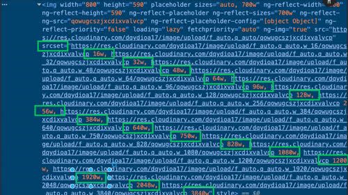
To customize the generated widths, we can either define an ngSrcset per image, as we did, or define them globally using the IMAGE_CONFIG injection token.
providers: [
    {
      provide: IMAGE_CONFIG,
      useValue: {
      placeholderResolution: 30,
      breakpoints: [500, 600, 1000]
    }
    },
When we refresh the application and inspect the DOM now, we notice that the srcset fields have been updated.

Introducing Custom Loaders
We already established that loaders are functions that receive some parameters and resolve a URL based on some predefined rules. So far, we have been using one of the default loaders (provideCloudinaryLoader), and this works well. However, there are situations when we have more complex requirements in our app that would require us to create a custom loader to achieve our goals.
Here is a list of things we want to support in our app and why we will be needing one:
- We want to use both local and remote images together in a single component
- For our remote images, on our Cloudinary account, we want to be able to apply cool effects to image assets
- We also want to be able to fetch a random image on the internet, store it in our Cloudinary account and apply effects to the image before rendering it in the browser
Some other reasons why you might need to define an image loader include:
- Using multiple remote media provider solutions at once (e.g., Cloudinary, S3 and Imgix)
All the code we will write here will be in the local-and-remote-image.component.ts file. Update the file to look like so:
import {
  IMAGE_LOADER,
  ImageLoaderConfig,
  NgOptimizedImage,
} from "@angular/common";
import { Component } from "@angular/core";
@Component({
  selector: "local-and-remote-image",
  imports: [NgOptimizedImage],
  providers: [
    {
      provide: IMAGE_LOADER,
      useValue: (config: ImageLoaderConfig) => {
        if (config && config.loaderParams && config.loaderParams["local"]) {
          return "/" + config.src;
        }
        const deliveryType =
          (config.loaderParams && config.loaderParams["delivery_type"]) ||
          "upload";
        let url = `https://res.cloudinary.com/dqydioa17/image/${deliveryType}`;
        if (config.loaderParams && config.loaderParams["tf"]) {
          url += config.loaderParams["tf"];
        }
        if (config.width) {
          url += `/w_${config.width}`;
        }
        url += `/${config.src}`;
        return url;
      },
    },
  ],
  template: `
    <div style="padding-top: 50px">
      <h2>local image</h2>
      <img
        width="800"
        height="600"
        [ngSrc]="'8.jpg'"
        [loaderParams]="{ local: true }"
      />
    </div>
    <div style="padding-top: 50px">
      <h2>remote image with effects</h2>
      <img
        width="800"
        height="600"
        [ngSrc]="'jcuh90sdncxwugdsqh40'"
        placeholder
        [loaderParams]="{ tf: '/e_enhance' }"
      />
    </div>
    <div style="padding-top: 50px">
      <h2>remote image with effects</h2>
      <img
        width="600"
        height="700"
        [ngSrc]="
          'https://upload.wikimedia.org/wikipedia/commons/1/13/Benedict_Cumberbatch_2011.png'
        "
        [loaderParams]="{ delivery_type: 'fetch', tf: '/e_vignette' }"
      />
    </div>
  `,
  styles: ``,
})
export class LocalAndRemoteImageComponent {}

Our new component shows how we can use a custom loader to do amazing things. This component displays three images: a local one and two remote images with some effects applied. It starts by defining a custom loader, which is just a function bound to the IMAGE_LOADER injection token, which accepts an object that looks like so:
interface ImageLoaderConfig {
  src: string;
  width?: number;
  isPlaceholder?: boolean;
  loaderParams?: {
    [key: string]: any;
  };
}
Of all these properties, the one we tinkered with most is the one called loaderParams, which allows us to define arbitrary key-value pairs to enable our loader to effectively decide how to resolve the URL. For the local image, we defined a local property.
For the remote images, we defined two:
tf: This holds image effects as defined in the Cloudinary docsdelivery_type: Setting this to fetch means that the image is first fetched remotely, then added to our remote assets
Conclusion
Images are an integral part of the web. This guide shows how to use images effectively. Even though our focus was on the Angular framework, there are still a lot of takeaways to apply when using images in future projects.

Christian Nwamba
Chris Nwamba is a Senior Developer Advocate at AWS focusing on AWS Amplify. He is also a teacher with years of experience building products and communities.

