How to Use a Vue Stock Chart UI Component in Your Web App

Summarize with AI:
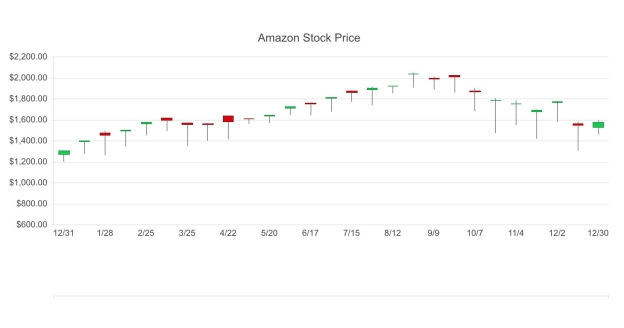
A candlestick chart is a stock chart that helps visualize the performance of a stock, including the high, low and close. See how you can easily add it to your web apps.
In the previous article, we learned how to create an area chart with Kendo UI for Vue. In this article, we will create a candlestick chart.
A candlestick chart shows the open, high, low, and close values for a stock. It has a solid portion that is the body and two wicks extending above and below the body. The body shows the range between the open and close price. The top of the upper wick represents the highest trading price. The bottom of the lower wick is the lowest trading price. Candlestick charts are used to analyze patterns in price movements such as if the price is moving in an upward trend or a downward trend. Up next, we will create our chart using stock data we fetch from an API.
Getting Started
First, we will initialize our project using the Vue webpack-simple template. Then, we will install Kendo UI, a theme, and the Chart and DataSource components.
npm install --save @progress/kendo-ui
npm install --save @progress/kendo-theme-default
npm install --save @progress/kendo-charts-vue-wrapper
npm install --save @progress/kendo-datasource-vue-wrapper
In the main.js file, the packages are imported. The Chart and DataSource are registered globally and added to the component list.
import Vue from 'vue'
import App from './App.vue'
import '@progress/kendo-ui'
import '@progress/kendo-theme-default/dist/all.css'
import { Chart, ChartInstaller } from '@progress/kendo-charts-vue-wrapper'
import { DataSource, DataSourceInstaller } from '@progress/kendo-datasource-vue-wrapper'

Vue.use(ChartInstaller)
Vue.use(DataSourceInstaller)

new Vue({
  el: '#app',
  components: {
  	Chart,
  	DataSource
  },
  render: h => h(App)
})
Creating the Chart
Our Chart component includes a reference to the data source component, a title, a date field, a series, and a theme. The data source component needs a URL and data type. The data is provided by IEX. We will use the API endpoint to retrieve Amazon’s stock data for one year. The following is the URL:
https://api.iextrading.com/1.0/stock/amzn/chart/1y
The dateField property of the chart is used as the categories. In the series we will specify the type, openField, highField, lowField, closeField, color, and downColor. The color and downColor are used to fill in the body of the candlestick. If the close is higher than the open, the price went up. The value of the color option is used to fill in the body in this case. If the open is higher than the close that means the price went down. The body will be the value of the downColor. In the App.vue file we add the DataSource and Chart component to the template and the chart’s data to the script.
<template>
  <div id="app">
    <kendo-datasource
      ref="dataSource"
      :transport-read-url="'https://api.iextrading.com/1.0/stock/amzn/chart/1y'"
      :transport-read-data-type="'json'">
    </kendo-datasource>
    <kendo-stockchart
      :data-source-ref="'dataSource'"
      :title="title"
      :dateField="dateField"
      :series="series"
      :theme="'material'">
    </kendo-stockchart>
  </div>
</template>

<script>
export default {
  name: 'app',
  data () {
    return {
      title: {
        text: 'Amazon Stock Price'
      },
      dateField: 'date',
      series: [{
        type: 'candlestick',
        openField: 'open',
        highField: 'high',
        lowField: 'low',
        closeField: 'close',
        color: '#00c853',
        downColor: '#d50000'
      }]
    }
  }
}
</script>

<style>
#app {
  margin-top: 60px;
}
</style>

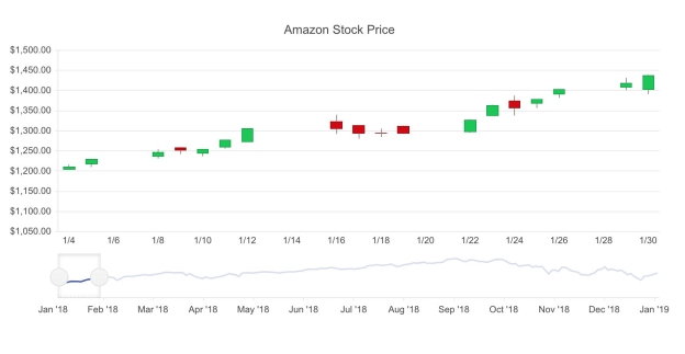
We can also add a navigator to the chart. A navigator lets you select which time periods to show on the chart. It also has its own chart. You can add a series to the navigator and specify the chart type and which field to use from the data source. In this example, we create a line chart using the close field. We also pre-select a date range to display. First, we add the navigator attribute to the Chart component.
<kendo-stockchart
  :data-source-ref="'dataSource'"
  :title="title"
  :dateField="dateField"
  :series="series"
  :theme="'material'">
  :navigator="navigator"
</kendo-stockchart>
``
Then we configure the navigator property in the data.

 ```js
export default {
  name: 'app',
  data () {
    return {
      ...
      navigator: {
        series: {
          type: 'line',
          field: 'close'
        },
        select: {
          from: '2018/01/03',
          to: '2018/01/31',
        }
      }
    }
  }
}

This is the link to the project’s repo: https://github.com/albertaw/kendoui-stockchart
Summary
A candlestick chart shows the open and close on the body of the candlestick and the high and low on the wicks. The minimum needed to create a chart is a date field and a series. A candlestick chart can also include a navigator to select certain date ranges.
In the next article, we will learn how to create a sparkline. A sparkline is a very small chart drawn without an axis or other chart-specific elements.
Resources
- Project repo
- Vue Webpack-Simple Template
- DataSource Overview
- Stock Chart Overview
- Kendo UI Vue Docs and Demos
- Vue.js Webpack-Simple Template
Try Out Kendo UI for Yourself
Want to start taking advantage of the more than 70+ ready-made Kendo UI components, like the Grid or Scheduler? You can begin a free trial of Kendo UI for Vue today and start developing your apps faster.
Angular, React, and jQuery Versions
Looking for UI component to support specific frameworks? Check out Kendo UI for Angular, Kendo UI for React, or Kendo UI for jQuery.

Alberta Williams
Alberta is a software developer and writer from New Orleans. Learn more about Alberta at github.com/albertaw.
