How to Use a Vue Area Chart UI Component in Your Web App

Summarize with AI:
Area charts make it easy to visualize a trend over time. Learn how to easily add an area chart to your web app.
In the last article, we learned about the pie and the donut chart in Kendo UI for Vue. In this article, we will learn how to create an area chart.
In an area chart, each data point is connected with a line and the space beneath the line is filled in with color. Area charts are useful for visualizing an overall trend as opposed to individual values. For example, a line chart can show a stock’s price over time. Such a chart would make it clear if the price is trending higher or lower. An area chart of the same data would emphasize how much the price has increased or decreased.
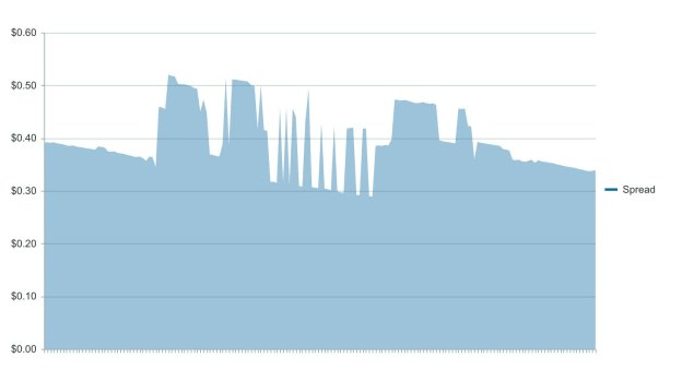
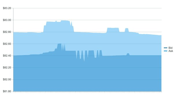
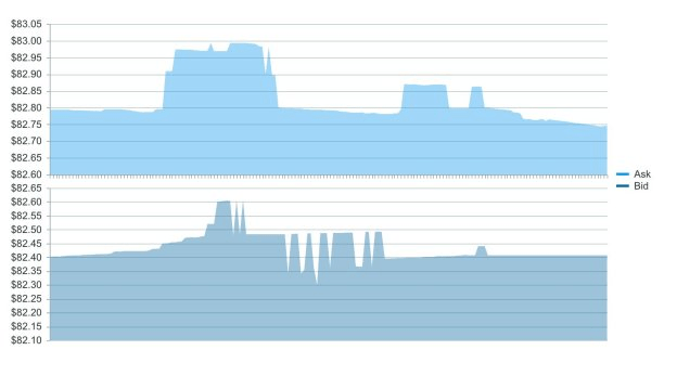
Coming up, we will create an area chart to show the bid-ask spread for a cryptocurrency. Then we will create another chart plotting the bid and the ask together and in different panes so you can see the spread in a different view.
Getting Started
We will first initialize a Vue project using the webpack-simple template. Building our chart requires Kendo UI, a theme, the Charts package, and the DataSourcepackage. We will install these dependencies with the following commands.
npm install --save @progress/kendo-ui
npm install --save @progress/kendo-theme-default
npm install --save @progress/kendo-charts-vue-wrapper
npm install --save @progress/kendo-datasource-vue-wrapper
Inside the main.js file, we import our packages, register the Chart and DataSource globally, then add them to the component list.
import Vue from 'vue'
import App from './App.vue'
import '@progress/kendo-ui'
import '@progress/kendo-theme-default/dist/all.css'
import { Chart, ChartInstaller } from '@progress/kendo-charts-vue-wrapper'
import { DataSource, DataSourceInstaller } from '@progress/kendo-datasource-vue-wrapper'

Vue.use(ChartInstaller)
Vue.use(DataSourceInstaller)

new Vue({
  el: '#app',
  components: {
  	Chart,
  	DataSource
  },
  render: h => h(App)
})
We want to graph the bid-ask spread for the cryptocurrency Dash. The spread is the difference between the highest price a buyer is willing to pay and the lowest price a seller is willing to accept. The price a buyer is willing to pay is called the bid. The price a seller is willing to accept is the ask. If the highest bid is , the spread is $2. An area chart is helpful for visualizing this kind of data because we will be able to see the magnitude of the spread over time. The area under the curve will be larger when the spread is higher and smaller when the spread is lower.
Creating the Area Chart
First, we will configure the DataSource component. This requires a reference name, a URL and a data type. Because the data is not in a format we can use, we will also need to parse it.
The data will be retrieved from an API endpoint then saved locally to a JSON file. The source of the data is Kraken. The API returns the bid, ask and timestamp. We will calculate the spread by taking the difference of the bid and ask. The endpoint for the data is the following:
https://api.kraken.com/0/public/Spread?pair=dashusd
In the App.vue file, we add the DataSource component to the template and a method to the script to parse the data. This is the updated file.
<template>
  <div id="app">
    <kendo-datasource
      ref="dataSource"
      :transport-read-url="'Spread.json'"
      :transport-read-data-type="'json'"
      :schema-parse="schemaParse">
    </kendo-datasource>
  </div>
</template>

<script>
export default {
  name: 'app',
  methods: {
    schemaParse: function(response) {
      return response.result.DASHUSD.map(function(arr) {
        return {
          timestamp: arr[0],
          bid: arr[1],
          ask: arr[2],
          spread: arr[2] - arr[1]
        }
      });
    }
  }
}
</script>
Next, we will create the chart component. It will have a reference to the DataSource component, a tooltip, a series, a category axis, a value axis, and a theme. The series type will be set to area. The series field property will use the custom field we created called spread. The categoryField will be the timestamp. The following code adds the Chart component to the template and adds the chart’s data to the script.
<template>
  <div id="app">
    ...
    <kendo-chart
      :data-source-ref="'dataSource'"
      :tooltip="tooltip"
      :series="series"
      :category-axis="categoryAxis"
      :value-axis="valueAxis"
      :theme="'blueopal'">
    </kendo-chart>
  </div>
</template>

<script>
export default {
  name: 'app',
  data () {
    return {
      tooltip: {
        visible: true,
        format: 'c6'
      },
      series: [{
        type: 'area',
        field: 'spread',
        categoryField: 'timestamp',
        name: 'Spread'
      }],
      categoryAxis: {
        labels: {
          visible: false
        },
        majorGridLines: {
          visible: false
        }
      },
      valueAxis: {
        labels: {
          format: 'c2'
        }
      }
    }
  },
  ...
}
</script>

Creating an Area Chart With Two Series
First, we will create an overlapping area chart to show the bid and ask. Then we will use the chart to show each series in separate panes. The following code updates our series with the information for our bid and ask.
series: [{
  type: 'area',
  field: 'bid',
  categoryField: 'timestamp',
  name: 'Bid'
},
{
  type: 'area',
  field: 'ask',
  categoryField: 'timestamp',
  name: 'Ask'
}],

Next, we will add the panes. The panes attribute will be added to the chart component and the panes will be defined in the data. Each pane will be given a name so it can be associated with an axis. Then we will create two axis for the value axis. Each axis is associated with a pane by setting its pane option. Last, the series needs to be associated with the axis by setting its axis attribute. The following is the updated App.vue file.
<template>
  <div id="app">
    <kendo-datasource
      ref="dataSource"
      :transport-read-url="'Spread.json'"
      :transport-read-data-type="'json'"
      :schema-parse="schemaParse">
    </kendo-datasource>
    <kendo-chart
      :data-source-ref="'dataSource'"
      :tooltip="tooltip"
      :series="series"
      :category-axis="categoryAxis"
      :value-axis="valueAxis"
      :theme="'blueopal'"
      :panes="panes">
    </kendo-chart>
  </div>
</template>

<script>
export default {
  name: 'app',
  data () {
    return {
      tooltip: {
        visible: true,
        format: 'c6'
      },
      series: [{
        type: 'area',
        field: 'bid',
        categoryField: 'timestamp',
        name: 'Bid',
        axis: 'Bid'
      },
      {
        type: 'area',
        field: 'ask',
        categoryField: 'timestamp',
        name: 'Ask',
        axis: 'Ask'
      }],
      categoryAxis: {
        labels: {
          visible: false
        },
        majorGridLines: {
          visible: false
        }
      },
       valueAxis: [
      {
        name: 'Ask',
        pane: 'top-pane',
        labels: {
          format: 'c2'
        }
      },
      {
        name: 'Bid',
        pane: 'bottom-pane',
        labels: {
          format: 'c2'
        }
      }],
       panes:[
        {name: 'top-pane'},
        {name: 'bottom-pane'}
      ]
    }
  },
  methods: {
    schemaParse: function(response) {
      return response.result.DASHUSD.map(function(arr) {
        return {
          timestamp: arr[0],
          bid: arr[1],
          ask: arr[2],
          spread: arr[2] - arr[1]
        }
      });
    }
  }
}
</script>

<style>
#app {
  margin-top: 60px;
}
</style>

For a closer look, here's a link to the project’s repo: https://github.com/albertaw/kendoui-areachart
Summary
We built an area chart to show the spread for the cryptocurrency Dash. Then we made an area chart to show the bid and ask prices with the data plots overlapping each other and with the data in separate panes. An area chart can also be visualized as a stacked chart or a 100% stacked chart. A stacked area chart lets you see how each series compares to the whole. A 100% stacked area chart shows the part-whole relationship as percentages.
In the next article, we will see how to build a candlestick chart. A candlestick chart is a stock chart that shows a stock’s open, high, low and close prices.
Resources
- Project Repo
- Vue Webpack-Simple Template
- DataSource Overview
- Charts Overview
- Kendo UI Vue Docs and Demos
- Vue.js Webpack-Simple Template
Try Out Kendo UI for Yourself
Want to start taking advantage of the more than 70+ ready-made Kendo UI components, like the Grid or Scheduler? You can begin a free trial of Kendo UI for Vue today and start developing your apps faster.
Angular, React, and jQuery Versions
Looking for UI component to support specific frameworks? Check out Kendo UI for Angular, Kendo UI for React, or Kendo UI for jQuery.

Alberta Williams
Alberta is a software developer and writer from New Orleans. Learn more about Alberta at github.com/albertaw.
