How to Improve a Website’s Internal Link Strategy

Summarize with AI:
Internal links might seem like the copywriter’s concern. But there are actually a number of things you should do as a web designer or developer to strengthen a website’s SEO strategy via internal links. This post will guide you through them.
Internal link building is one of the most important things you can do for a website’s SEO strategy. I know that backlinks tend to get all the fanfare since you can derive all kinds of authority and rankability simply for being noticed by a well-established website. But it’s unrealistic for most brands to rely on backlinks as an SEO model. What’s more, they do nothing for the user experience.
Internal links, when done right, can:
- Make a website much easier for users to navigate.
- Make a website much easier for search bots to detect and rank your pages.
- Lower your average bounce rate.
- Improve user discoverability of new content, products or other pages.
- Speed up the time it takes newer pages to rank in search.
Even though web designers and developers don’t typically write the copy for websites or determine which internal links to put on them, they have a role to play in developing a good internal link strategy. In this post, I’m going to break down four things that you can do to ensure your website reaps all the benefits from its internal links.
Internal Link Best Practices for Web Designers & Developers
There are certain things I’d talk about when developing an internal link building strategy. Like how to choose your anchor text, the number of links to include on each page and so on. But those are matters for your copywriter and SEO to worry about.
As a designer or developer, here are some things you can help out with that will make a difference:
1. Be Aware That Internal Links Come in All Shapes and Forms
There are different types of internal links you can place on a web page. Familiarize yourself with the different types as this will help you get creative when adding internal links to your site. Rather than try to jam them all into the text on each page, you can utilize other areas where links naturally fit.
For instance:
Header: The header typically includes a logo image link, navigation text links and CTA button link. Ecommerce sites will also include relevant internal links and icons for the cart, account page and so on.
You can also use a sticky notification bar to add more internal links to the header.

Other links might appear here—like social media icons or click-to-call text links—but they’re often external links.
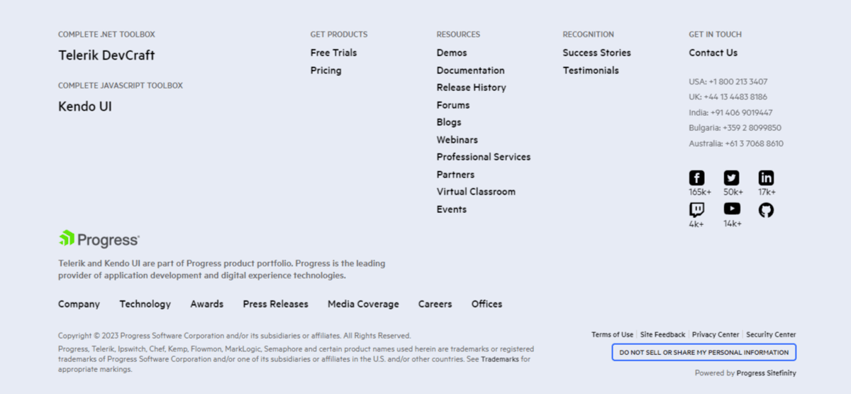
Footer: The website footer usually has links to top-level navigation links or it serves as a place to store a larger menu. It also commonly includes internal links to the company’s policy pages. For instance:
- Terms of service
- Privacy policy
- Accessibility
- Relevant regulatory compliance (like HIPAA, PCI, etc.)
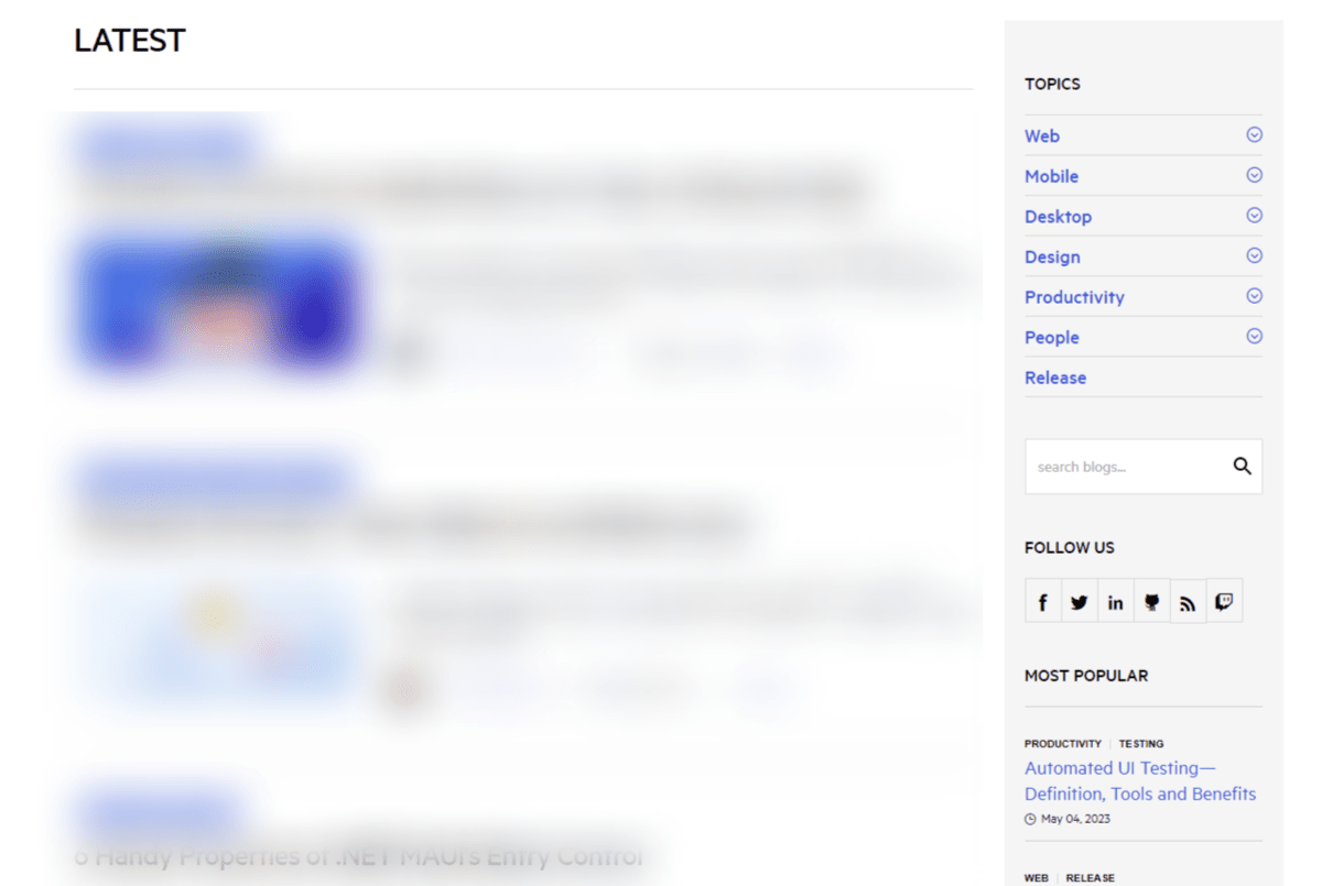
Sidebar: There are a number of reasons you may include a sidebar on some pages of your site. An ecommerce sidebar, for instance, might hold your search filters.
A blog sidebar, on the other hand, presents an opportunity for internal linking that improves the user experience. You could put links to blog categories, most recent posts or most popular content there.
Contextual: These are commonly the text links that appear within the copy on a page. While they can appear on any page, blog posts are the place where you’ll find lots of internal links.
The top of the page, for instance, is a great spot to include internal links to:
- Author page
- Category pages
- Tag pages
- Comments feed

Ecommerce product pages can be another place to add several internal links. In this case, they’re presented in a breadcrumbs trail at the top of the page.
Buttons: Every button element on your site represents an internal link. In order to preserve the potency of buttons, they should be used sparingly. So they should only be used to represent the primary calls to action on your site.

Callouts: The last common type of internal link comes in the form of a callout. How these callouts are designed depends on the page they appear on. That said, they’re usually used to display various options side by side—like blog post recommendations, related products or top features to explore.
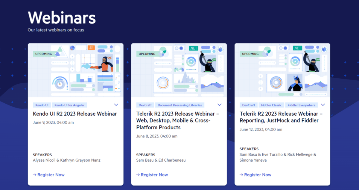
These types of links are typically entire blocks or boxes as opposed to individual text or button links within them.
2. Pay Attention to the Visual Presentation of Internal Links
Now that we’ve discussed the different ways to incorporate internal links, let’s talk about best practices for design.
Tip 1: Use a Mix of Links Whenever Possible
On some pages, you may only need to add an internal link or two (if that). In that case, you don’t have to worry about coming up with different link styles to keep things visually
interesting.
However, think about something like a lengthy blog post. Depending on the subject, there could realistically be a contextual link every 100 words or so. By the time a reader gets to the bottom of the post, they might be so fatigued on text links that the last thing they want to see is a list of related post text links to consider.
Grey Matter, for instance, includes a block of related news at the bottom of each post in the content hub:
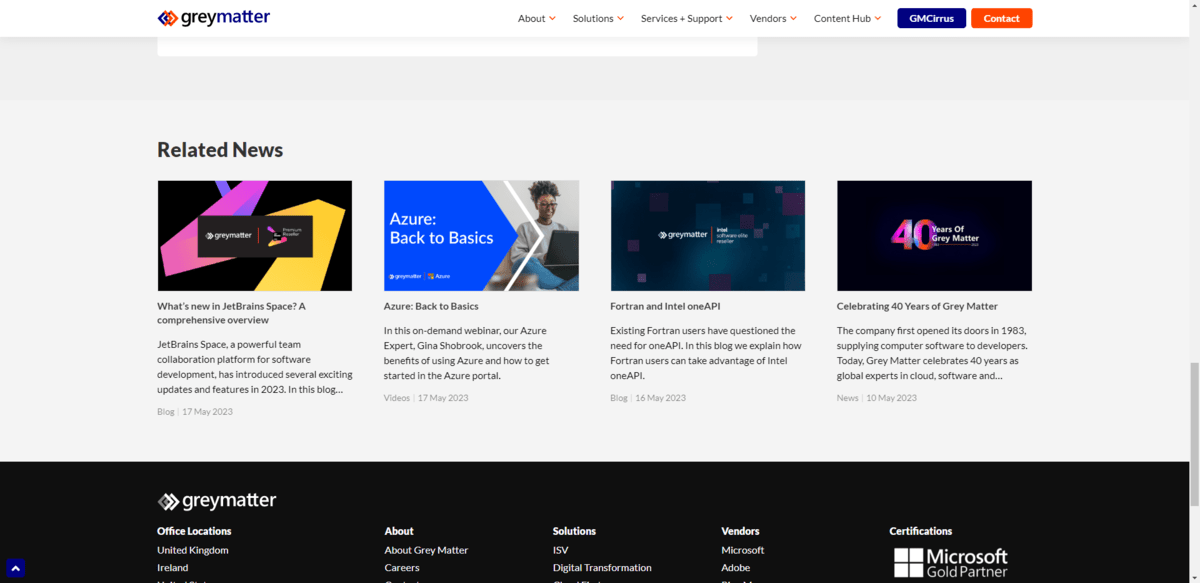
By adding more visually compelling links to a page—the end or even in the middle—you can break up any link fatigue your users may be feeling. You can also use this as a way to establish hierarchy. Contextual links are great as they provide more info as it’s needed. Other types of links, however, are meant to add more value to the users’ experience or to simplify next steps.
Tip 2: Follow the WCAG’s Guidelines for Color Contrast
For most internal links, color plays a big part in distinguishing it from non-linked text. Because of this, accessibility has to be taken into account. Specifically, the
matter of color contrast.
There are three levels of accessibility compliance you should try to meet.
Level A has three stipulations:
- The contrast between the text link color and the color of the surrounding text is 3:1.
- Color can’t be the only way that people are able to identify a link.
- Additional focus cues should be provided as needed.
I’ll touch on the last two points coming up.
Level AA adds on an additional requirement for links. The contrast between the link’s color and the background is 4.5:1. Level AAA takes it up a notch and sets the contrast ratio to a 7:1.
You can use WebAIM’s Contrast Checker tool to ensure that the colors you choose for your link and body text have the proper contrast.
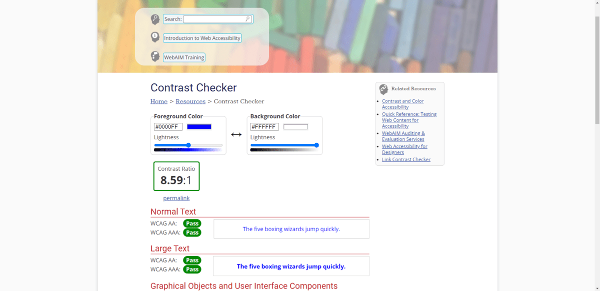
This tool will also come in handy to ensure that the color of your buttons contrast significantly enough against your page’s background.
Tip 3: Make the Link Respond to “Touch”
This is dealt with in the second part of the WCAG’s guidelines. There are a few ways to think about this.
Let’s start with what happens to the cursor. For people moving their mouse around the page, a cursor that changes state is an important cue that they’ve encountered an interactive element or link.
You could do as Insight’s home page demonstrates and change the arrow cursor into a hand as they pass over elements like buttons and navigation links.
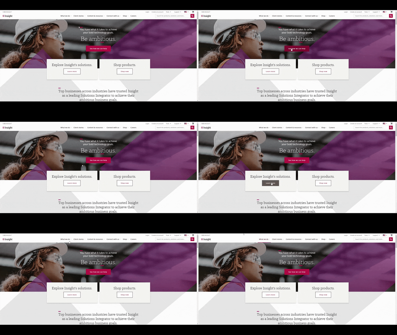
This GIF also demonstrates another way to signal to visitors that an element has a link. In the case of the hero section buttons, they turn a visibly darker color or go from hollow to solid. With the navigation links, on the other hand, a line appears beneath them.
You could also play around with changing the size of the button or modifying the boldness of the text. So long as there’s an obvious difference between its original state and it doesn’t depend on color, it will work.
You’ll also need to think about what more you can do, especially for people using their keyboard to get around. For instance, you could add an outline around linked text or buttons.
Here’s another example from Insight:
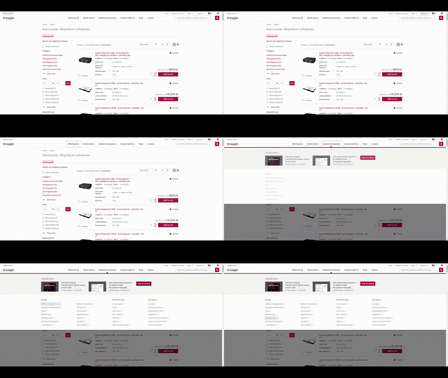
Watch the top of the screen as I hit the Tab button. A blue rectangle appears around each of the links in the header. It provides confirmation that, if I were to click the link, I’d select the right one.
3. Create a Hierarchy of Links
Hierarchy is one of those principles we deal with a lot when it comes to the size, position and even color of elements in design. It subconsciously signals to visitors what the most important stuff is while also helping them to focus on things in the order of importance.
It also should factor into how you plan out your internal link strategy.
When it comes to internal links, there are two things you should be thinking about when it comes to hierarchy: quantity and authority.
There are a couple of tools you can use to identify which pages are at the top of that hierarchy and what to do about them when it comes to internal links.
The first is Google Search Console. Go to the “Links” section and you’ll find a list of the pages on your site with the most internal links:
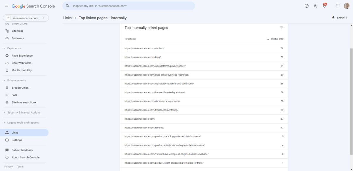
A greater number of internal links suggests that a page is more important than others. The pages in your main navigation, for instance, should each have more links than any other page on the site. The same goes for cornerstone content in your blog.
If you find pages at the top of this list that don’t belong there, give your team guidance on how to revise the internal link structure so that the most important and valuable content has the most visibility and authority via links. And vice versa.
Another tool you can use is SEMrush’s Site Audit. Go down to the bottom of the page and look for the list of pages passing the most internal LinkRank:
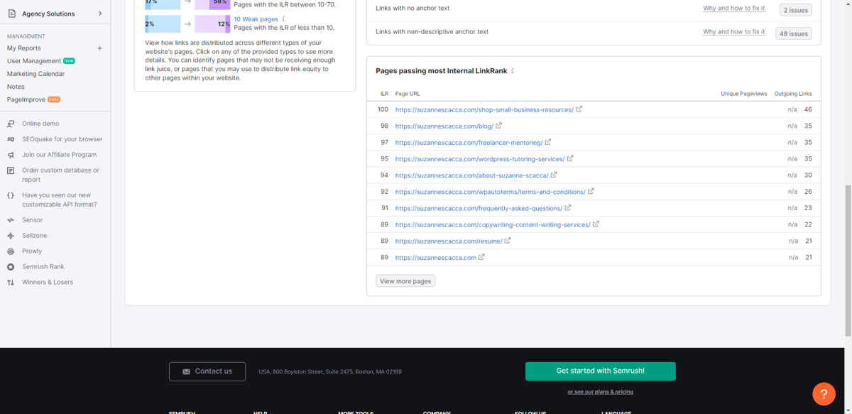
This is different from measuring the quantity of most linked-to pages. These pages have the most potent link juice. In other words, they’re recognized as being authoritative by search engines. So when you link to these pages, the links pass on some of that authority.
This is especially useful information to have if you want to quickly boost the authority and rank of a newly added page. Just make sure that the authoritative internal link you create is relevant and related.
4. Perform an Internal Link Audit Semi-Regularly
Last but not least, let’s talk about internal link audits. You’ll be able to use the SEMrush auditing tool for this as well.
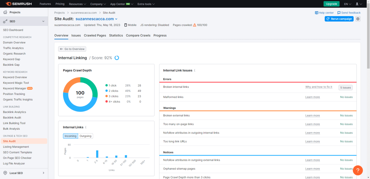
Now, the Site Audit is going to scan your entire domain for SEO-related issues. However, you’ll be able to drill down and look at issues specifically related to your internal links here too.
You may already be watching for some of these things when you perform audits of your digital products. However, there may be additional things related to internal links that you weren’t aware of.
So let’s go through what this tool in particular will keep tabs on:
- Broken links – Someone either deleted the page or renamed the URL.
- Malformed links – These are ones with misspellings or improper syntax.
- Overly long links – They’re generally bad for usability and SEO.
- Excessive linking – Usually more than 100 per page is considered too much.
- Missing anchor text – Every link should have a target URL and text that represents it on the page, in the button, etc.
- Vague anchor text – The anchor text should describe the destination, not say “here” or “next.”
- Nofollow attributes – We use the nofollow attribute so that Google won’t pass link juice onto external links. This shouldn’t be used internally.
- Orphaned pages – These are pages with zero internal links on them. If that’s the case, why bother including the unrelated page among the rest?
- Page crawl depth – Internal link structure goes deeper than three clicks, which can be bad for usability.
- Permanent redirects – We use temporary 301 redirects after renaming or moving pages in order to preserve link juice. We should never use permanent ones for this.
This tool will be super helpful to you in cleaning up an internal link structure.
One other tool that will come in handy during your audit is the free MozBar browser extension.
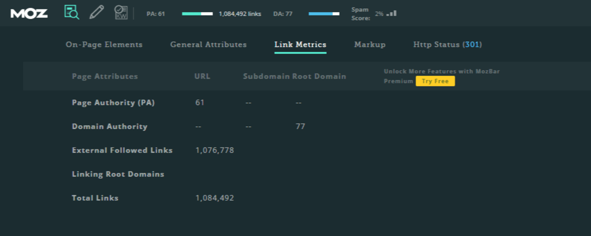
You’ll find both the page authority (PA) and domain authority (DA) for any page you’re looking at in your browser.
These are valuable metrics to keep track of over time. The goal is to get both numbers as close to 100 as possible. The stronger these numbers are, the greater the authority of your pages and site will be as a whole. And if you can strengthen the authority of your pages via internal linking, you can get your website to rank more effectively and quickly over time.
Wrap-up
A website built for its users is one that is going to convert at higher rates and perform better in search results. There are so many obvious ways to craft this ideal user experience—designing modern UIs, making digital products responsive and streamlining the user journey, for instance.
Internal linking might not be as obvious a strategy. However, when it’s implemented well, it can do wonders to enhance the user experience. While you might not have a hand in writing copy or choosing internal links, there are other decisions you make as a web designer/dev that can impact how useful they are in the end. And the four tips above will allow you to do that.

Suzanne Scacca
A former project manager and web design agency manager, Suzanne Scacca now writes about the changing landscape of design, development and software.

