The Do’s and Don’ts of What To Put in the Website Footer

Summarize with AI:
A website’s footer serves an important purpose for many users. In this post, we’ll look at what you can add to your website footer to maximize its usability.
If you were to look at a scroll heatmap of your website, what percentage of visitors do you think make it to the footer? To be honest, it’s not going to be a lot.
But it’s not the act of scrolling the full length of the page that matters. What matters is where users focus their attention most.
A study from NNG on scrolling and attention shows us that 4% of the time spent looking at a webpage is spent at the very bottom of it:
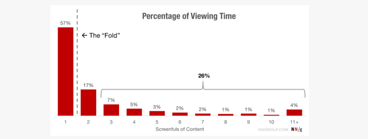
The footer might not get as much attention as content above the fold or just below it. However, users are spending more time looking at it than they are at the bottom half of the page.
This suggests that the footer holds some value for visitors. The key to making the footer a useful component of a website is to include only essential content and then to design it so that it’s easy to peruse.
Website Footer Design Tips
Every website has a footer. Some are big, some are small. But it’s not the size that matters. What does is what you put in there and how easy the information is to find.
Visitors have a tendency to use the footer for two reasons:
- To locate a link they couldn’t find in the header.
- To locate an element they expect a website footer to have.
Which links and elements appear in the footer will depend on what kind of website you’re building. Let’s take a look at some examples of the commonly found footer content and when it makes the most sense to include it:
1. Include Small Print at the Very Bottom
There’s one type of small print that every website footer needs to include—and that’s the copyright line.
Granted, the second you create and publish a website, it’s copyright protected. However, including that line at the bottom of the website serves as an extra layer of protection in case someone decides to rip off your content and you need to take them to court over it.
That’s not the only type of small print you may feel is necessary to include at the bottom of your website.
For example, the Humane Society includes information on its nonprofit status. It also provides information on tax-deductible contributions to the organization:
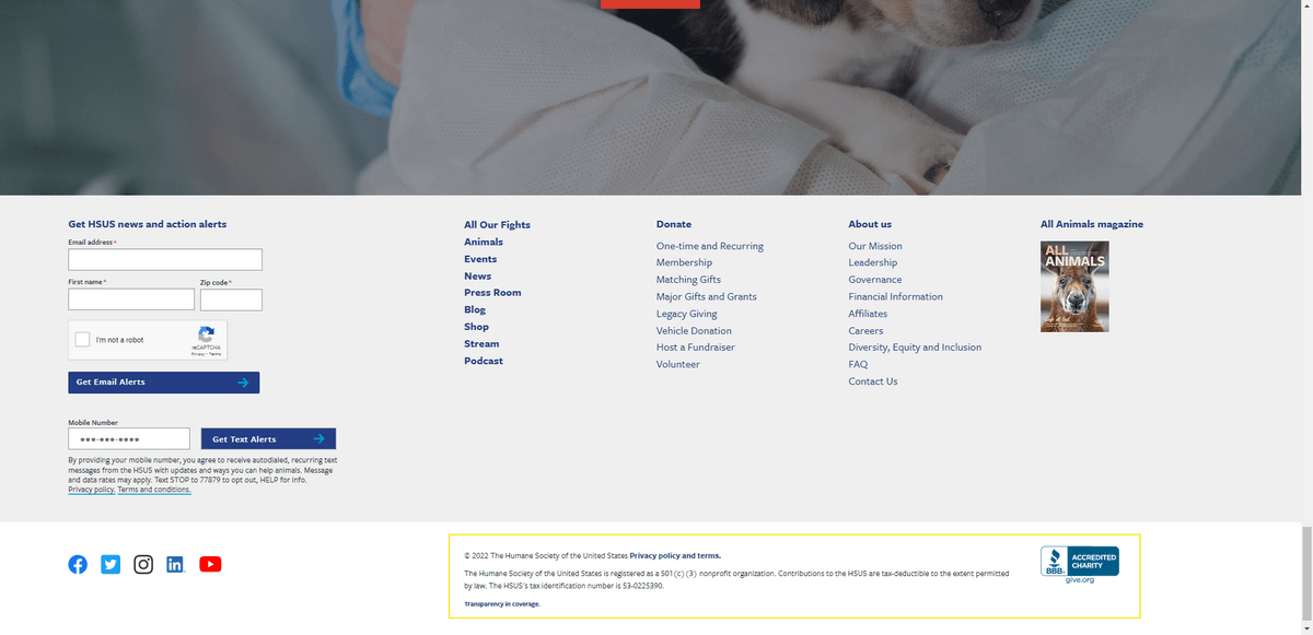
Next to the small print is a BBB logo, designating the Humane Society as an accredited charity. This goes along nicely with the other information provided here.
In terms of what type of small print you might want to include, it could be related to the company’s statuses and accreditation, the sourcing of the imagery used on the site, etc.
2. Use the Footer to Explain Your Website’s Individual Policies
This is another footer element that should appear on every website. The most common policies included in the footer are the Privacy Policy and Terms of Use. However, you may need to include additional ones depending on the type of activity that takes place on the website.
For example, the footer on the website for Ripley’s Believe It or Not! includes a link to Community Guidelines:
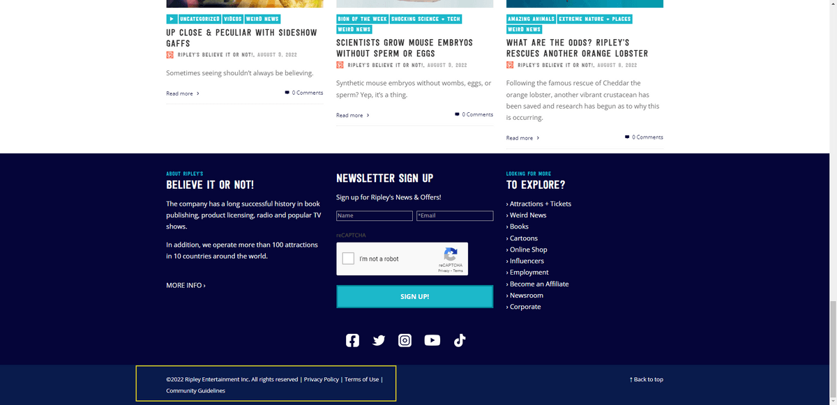
These rules break down Ripley’s policy for how users should publicly engage on the platform.
An ecommerce website like Gaiam, on the other hand, has to include additional policies:
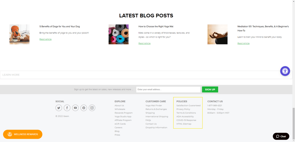
There are policy links for:
- Satisfaction Guaranteed
- Privacy Policy
- Terms & Conditions
- ADA Accessibility
- COVID-19 Response
There are other links you might want to include under your footer policies. Like regarding returns and refunds. Or if your store operates out of Europe, then one related to GDPR would be necessary. And for California retailers, a Do Not Sell My Information link is usually required.
3. Include a Site Map for Large Websites
There’s a time and a place when a mega menu belongs in the header of a website. Namely, in ecommerce and news websites. Even then, you don’t want the menu to be so monstrous that it goes more than three levels deep.
But what about for other large sites? The mega menu doesn’t always make a ton of sense.
Take, for example, the main navigation for GWI, a SaaS that enables companies to gain insights on their target audiences. The website is large. However, the main navigation only contains links for:
- Our data
- Our platform
- Resources
- Pricing
- About
That’s it.
The footer’s site map gives this enterprise the ability to keep the main navigation lightweight and easy to use:
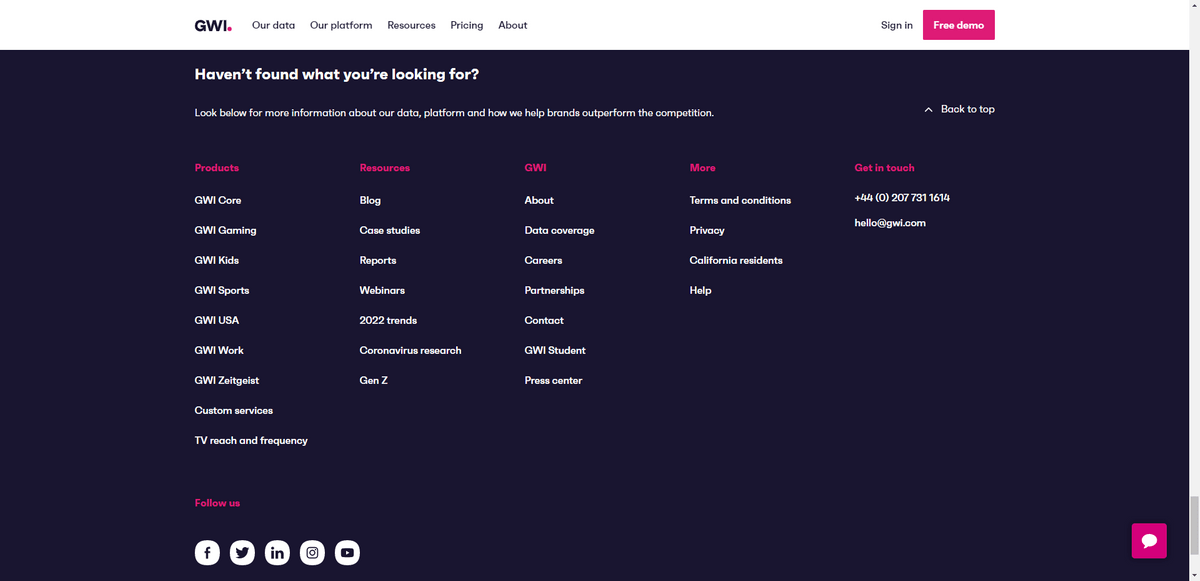
This is a great example to follow not just because it demonstrates how to offload navigation links to the footer, but it’s also a really great-looking design. The footer links are well labeled and categorized. And the cascading column structures are visually pleasing.
Alternatively, if you have a lot of other stuff to put in the footer, a link to the site map will suffice. While I’ve seen a lot of website footers with links to site maps, it’s really only necessary when you have a website with more than 30 pages.
4. Add Secondary Navigation Links to the Footer to Minimize the Header Menu Size
The footer is also a great place to put secondary links. So, rather than display the entire site map of pages or high-level categories, it will serve as a place for anything that doesn’t belong in the header.
To determine what exactly belongs in the footer, you’ll need to understand who your users are and what their primary goals are. For example, this is the footer on the University of Central Florida website:

Who are the main visitors to a university website? It’s most likely prospective students and parents.
Do you think that they’re laser-focused on reading up on UCF News? Or on reporting a concern? Nope. They want to learn about the admissions process, the available programs and so on.
Rather than bog down the main navigation with secondary actions, educational institutions (and other kinds of organizations) can place those links in the footer. The majority of website visitors will automatically realize that if they can’t find links to Faculty, Public Records or Regulations in the header, they’ll find them in the footer.
5. Include a Subscription Form When Relevant
You’re going to have plenty of opportunities to invite website visitors to subscribe to your newsletter or loyalty program—in entry pop-ups, on the homepage, as well as internally on the website. But what if your visitors don’t want to hunt around the website for the subscription form?
Placing the form in the footer can spare a lot of visitors the hassle of looking around for it.
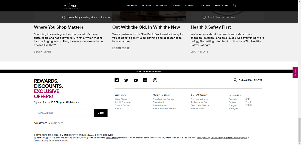
You have a couple of options in terms of footer placement—it just depends on what else is in there. One option is to place it within the footer block as Simon Premium Outlets does:
If you find that your link and small print text is getting too small, you may want to move the form outside of the footer as Minted has done:
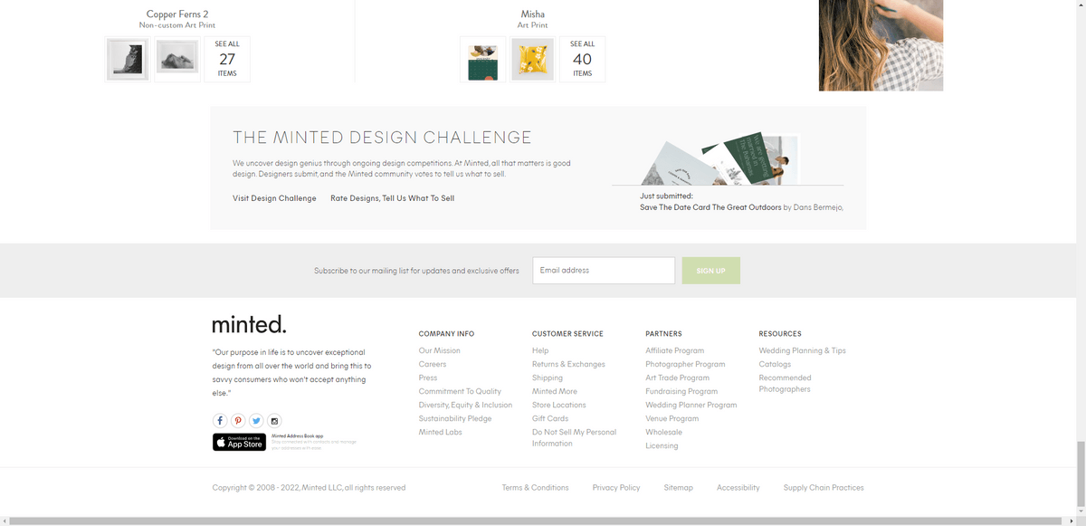
This is also a good option if you want to give your subscription form some breathing room. This way, visitors can evaluate the form on its own, then turn their attention to the footer content once they’ve decided whether or not to fill it out.
6. Place Active Social Media Links in the Footer
A website cannot exist on its own. Email and social media marketing, in particular, are two ways to create a steady loop of people moving through the website.
This is why the subscription form and social media links are so often present in website footers. They should only be there, however, if there’s an active marketing effort going on on the other side of things.
Space X is a good example of a brand that’s hyper-engaged with users on social media:
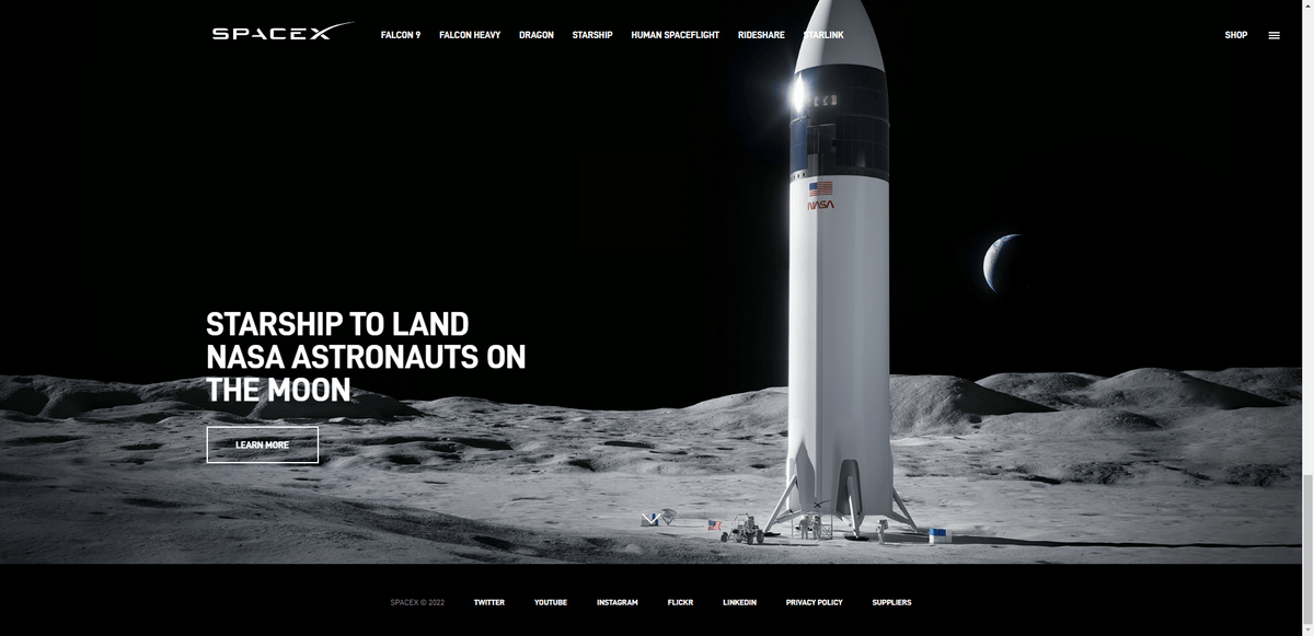
I’m not sure if I’d recommend the same approach to including social media links in the footer though. It works well for a brand like SpaceX that uses a minimal design in order to emphasize its photos.
For websites where the footer contains other information, consider taking an approach similar to The Florida Standard and using visual icons instead of text names for social media channels:
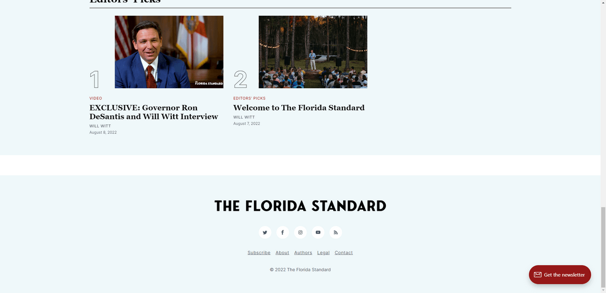
This is a new news site in the state of Florida, so growing a community on social media is important to them. It makes sense that the social media links would have a prominent spot and eye-catching design in the footer.
7. Include Contact Information for Local Businesses
Contact information doesn’t really need to be spelled out in the footer for online or international businesses. A link to the Contact page will suffice.
For smaller local businesses, however, the footer is a great spot to include contact information like the address, phone number and email address. If you have the room for it, you can do as Bigger Better Hair does and include the hours of operation as well:
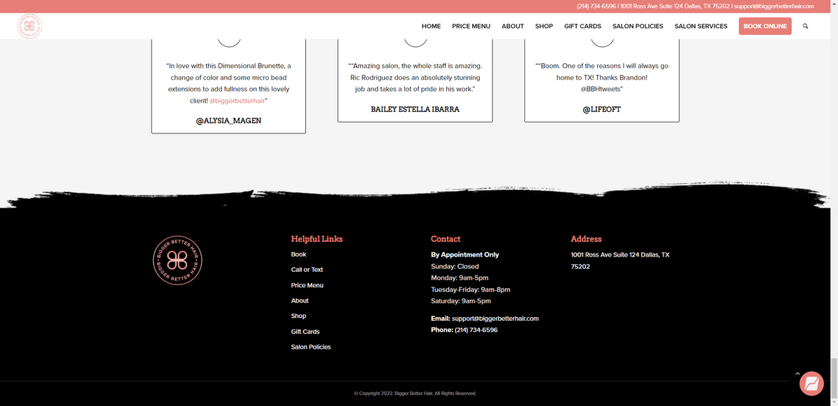
Just be careful about overdoing it with contact information.
For a time there, footers were being exploited for SEO purposes. (I still see it done from time to time today.)
Only include contact information that your visitors can use—like referencing the store hours or a click-to-call phone number. Listing out location names and ZIP codes, or otherwise stuffing location-specific information into the footer, can actually work against you in terms of SEO. So only include the details that are useful to your visitors.
8. Add App Store Links if There’s a Mobile App Counterpart
If you’re building a website that has a mobile app counterpart, place the app store links in the footer.
It doesn’t matter if you already included them in the header, in a homepage hero image or on a dedicated mobile app page. The footer can serve as a quick way to access those links for visitors that might have missed them elsewhere on the site.
The NFL is one such example of a website that has its mobile app links in the footer:
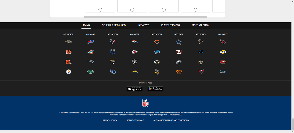
They’re kind of hard to see from the Teams view because of the icon overload. However, if users click on the other footer headers there, the icons will go away and the app links will become more prominent.
Meetup is perhaps a better example of app store links in the footer:
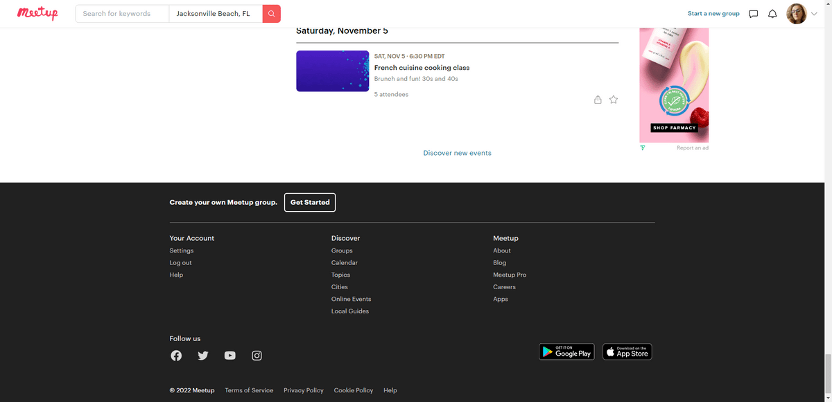
Because of their placement away from other content and the ample white space around them, the two app store links stand out really nicely. There’s also a bit of color in the Google Play one, which should draw user attention to that bottom area of the footer more than, say, the social media links to the left of it.
Wrap-up
Is the website footer something that web designers should spend a lot of time thinking about? Yes.
It’s not very likely that 100% of your visitors will make their way to the footer on the website. At least not on every visit. However, the ones that do scroll to the footer expect to find a well-designed, organized and helpful collection of content. The list above should help you figure out which elements will create that kind of footer experience for your website.

Suzanne Scacca
A former project manager and web design agency manager, Suzanne Scacca now writes about the changing landscape of design, development and software.

