Why Web Designers Should Design for Social Media and Other Platforms

Summarize with AI:
In this post, we’ll look at what your clients stand to gain when they have a web designer help them create their marketing assets—as well as three brand examples to show you how it’s done.
There was a design agency I once worked for where we offered our web design clients a package of freebies at the end of each job. It included things like banners for social media and a newsletter template.
There was just one problem with this freebie pack. Our clients would get super excited that we had given them assets to help them market their new website. However, they’d inevitably come back to us disappointed that they couldn’t customize the files nor did they have any guidance on what to do with them.
After discussing it with a number of clients, we determined that the custom marketing assets were something that most of them wanted. However, just as they didn’t want to be burdened with designing their own website, they didn’t want to deal with the marketing graphics either. They wanted us to take care of all of it for them.
When I look at many companies’ marketing channels these days, I don’t see much of a web designer’s touch on them. I think that’s a big mistake.
Marketing is omnichannel. In order for these channels to work together and to drive traffic back to the website, they have to look the same. While you won’t have a ton of control over the UI of a page on Facebook or Yelp, there are other ways you can help as a web designer.
In this post, I’d like to explore why this is an important role for designers and look at some brand examples that demonstrate how much of a difference designers can make in marketing.
The Benefits of Designing Beyond the Website
Social media. Email. Online ads. These are all just extensions of the website when you think about it. So why shouldn’t the visual assets used on these platforms be designed by the visionaries who created the websites in the first place?
Here are some reasons why a designer’s touch can instantly improve the success of a marketing campaign and the website it’s connected to:
- A designer doesn’t have to depend on templates to create marketing assets. They can come up with custom visuals that feel authentic and natural.
- Designer-generated visuals can elevate a brand’s presence on third-party platforms where competitors don’t spend as much time creating custom assets.
- The visuals from platform to platform will consistently represent the brand’s style and personality, making them easier to spot.
- Well-chosen or designed marketing assets perform better in terms of engagement when compared to stock photos or no visuals at all.
- Carefully crafted visuals on listings and review platforms like Yelp, TripAdvisor, Google, etc. signal to users that the brand actually owns their digital presence.
Think about your own experiences engaging with brands on these other platforms. It’s always a more pleasant experience when the page and content look attractive and it’s clear that someone is actively managing it all. That’s essentially what designers do for clients when they handle the design of their marketing assets.
What Kinds of Marketing Assets Should Designers Create?
Every client is going to have different needs when it comes to marketing. For some clients, you may have a lot of steady design work to do. For others, it may just require some initial setup with occasional assistance creating assets for seasonal campaigns, new opportunities and so on.
In terms of which platforms you should be well-versed in, it depends on your niche. For instance, if you design websites for financial services companies, you might do a newsletter, blog content, banner ads, and perhaps some visuals for LinkedIn or Twitter. For more youthful, creative and/or rebellious companies or products, you could end up designing for many more platforms.
Before you offer this kind of work up to your clients, do your research. Find out what top companies are doing to market their brands and what kinds of visuals they’re using when they do.
Don’t forget to think outside the box. Social media is pretty much a given these days and it’s easy enough to guess which platforms different clients will use. But you also need to consider other platforms they might need designs for.
Let’s have a look at examples of three brands and how their visual identities go far beyond the pages of their websites. In the first example, you’ll see what I mean when I talk about platforms that are a bit outside the box:
OUAI
OUAI is an ecommerce company that sells products for the body.
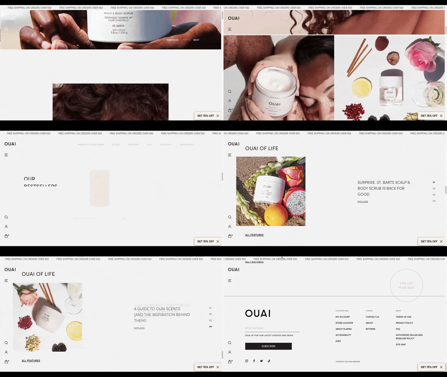
While a brand like this is going to have a big presence on social media, they’re not going to need much help from web designers. They already have an abundance of beautiful product imagery they can use to promote their store.
Now, customers are able to buy OUAI products directly from the company’s website. However, they also have the option of buying them from third-party retailers. In many cases, these companies give sellers the opportunity to brand their dedicated landing pages.
For example, Sephora’s OUAI landing page displays a tall promotional banner for the company beside its inventory:
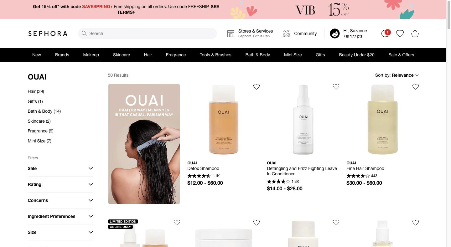
So far as I can tell, this image doesn’t appear on the OUAI website. Even the text is unique to this banner—it’s a shorter version of the copy that appears on the homepage that explains how to pronounce the company’s name.
Target is another website where OUAI’s products are sold:
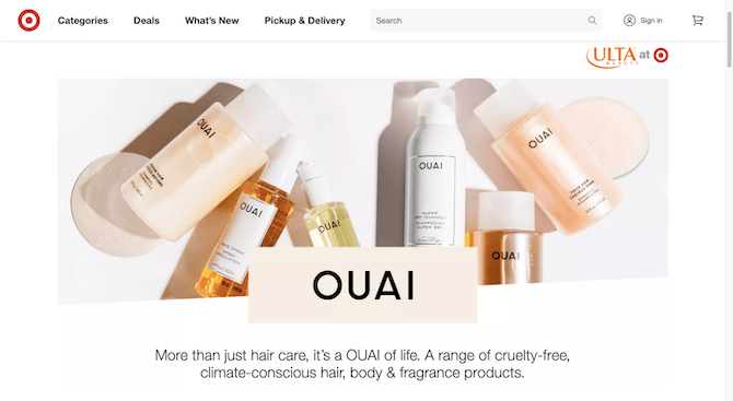
This is a completely different style of image from the one we find on Sephora. It could be because Target gives its sellers a larger promotional space to work with. It could also be that the designer wanted to create something that would be more appropriate for Target’s budget shoppers.
Amazon shoppers also encounter custom promotional imagery for OUAI:
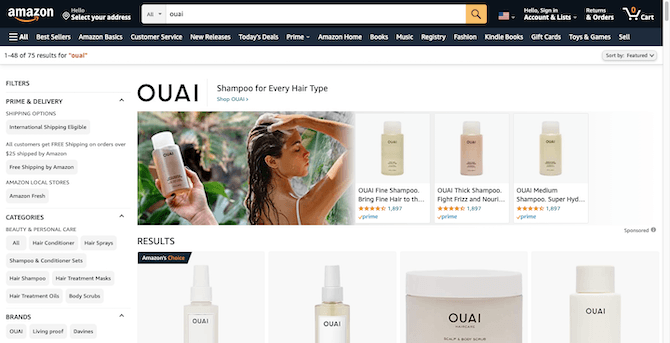
This is the promotional image that appears at the top of the OUAI search results page. When someone clicks on the blue “Shop OUAI” link, they’ll be taken to this landing page:
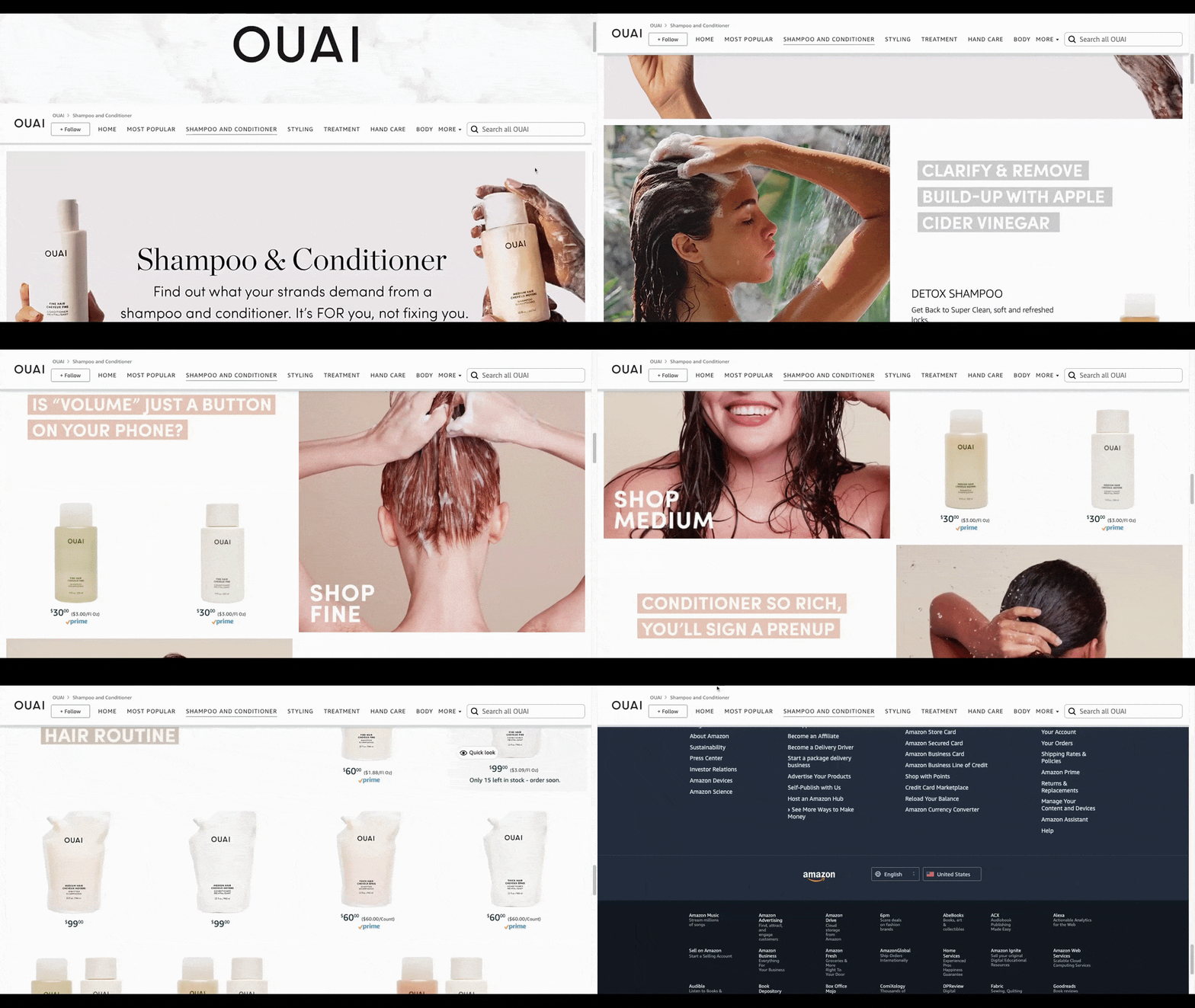
OUAI has an entire microsite here and they’ve taken full advantage of it. Not only are there landing pages for their different product types, there’s a ton of custom imagery and copy on each page.
It’s important to note that this site resides on Amazon, uses Amazon branding and provides links out to Amazon’s inventory. It’s no substitute for a website. However, it’s definitely worth taking advantage of this opportunity as the high-quality visuals and engaging copy can help Amazon sellers attract shoppers that might not have otherwise found out about their brand on their own.
Omaha Steaks
Omaha Steaks is a food retailer that operates both an ecommerce website as well as storefronts across the United States.
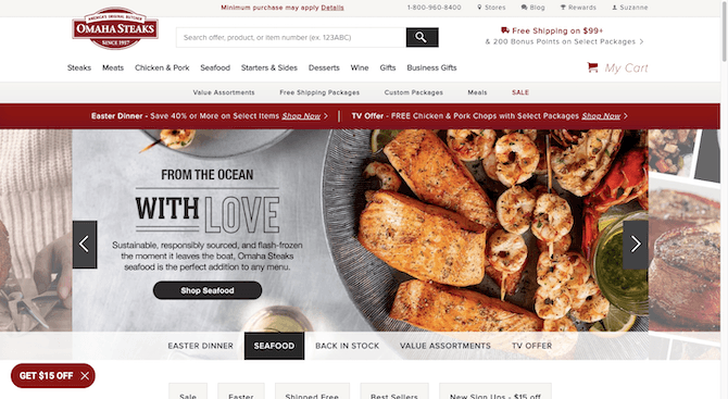
As can be expected, the Omaha Steaks website is chock full of drool-worthy food imagery. But it doesn’t keep this visually enticing content relegated to its webpages.
The first place where Omaha Steaks branches out into marketing is on its blog:
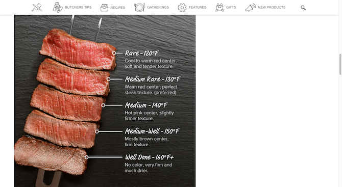
The purpose of this post is to provide a guide that shows people how to cook the perfect steak. While the Omaha Steaks website is full of steak imagery, this one was clearly created for the blog—with each slice of meat accompanied by a description of its temperature.
Omaha Steaks also uses email for marketing:
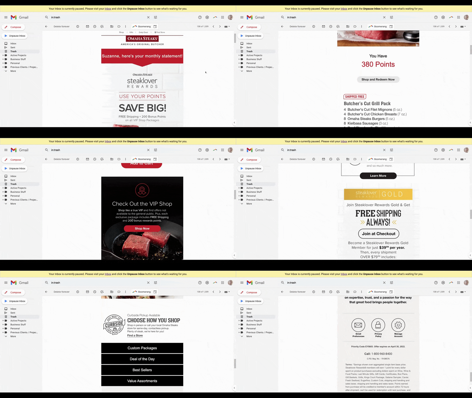
This isn’t your standard reward points reminder. I get those from other brands I subscribe to and they often just use a boring template—the company logo up top, a dynamic section in the middle that updates me on my points total, and that’s about it.
Omaha Steaks’ designer has done a good job of crafting a responsive rewards email. After telling customers how many points they have, the email provides them with tips on how to use their points on special VIP items, meat bundles and more.
You can see the designer’s work on Omaha Steaks’ social media platforms as well. For instance, this is what the top of its Instagram page looks like:
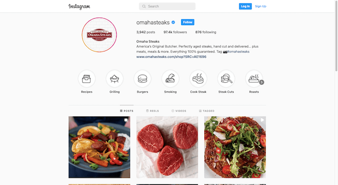
That area in the middle with the circles (Recipes, Grilling, Burgers, etc.) is where Instagram users are able to save and categorize their saved posts. With some brands, you’ll see a preview thumbnail from one of the posts. Others might use plain text labels.
Omaha Steaks, however, took the time to create custom icons for each category. They’re similar to the icons people see at the top of the Omaha Steaks blog.
Another social media platform where we see the designer’s touch is Pinterest:
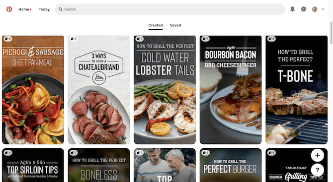
This page is mainly used to show off blog post recipes. Each promotional image is unique—the food imagery appears toward the bottom of the graphic with a custom header (and occasional icon) for the blog post title. While there may be a basic template that demonstrates the general layout for each, it’s clear that a designer has a hand in creating these.
For brands like these, there might not be a whole lot for you to do on social media platforms like Facebook, Twitter and so on. So long as you create blog post banners that fit on social media, your clients can easily use them to promote their own content. That said, there are other platforms where visuals play a bigger role where you’ll be needed to create custom imagery—like Instagram, Pinterest, YouTube (for video covers) and maybe even TikTok.
First Watch
First Watch is a chain of restaurants in the U.S. that serves breakfast and brunch. The website is a good reflection of the vibe of the restaurant establishment:
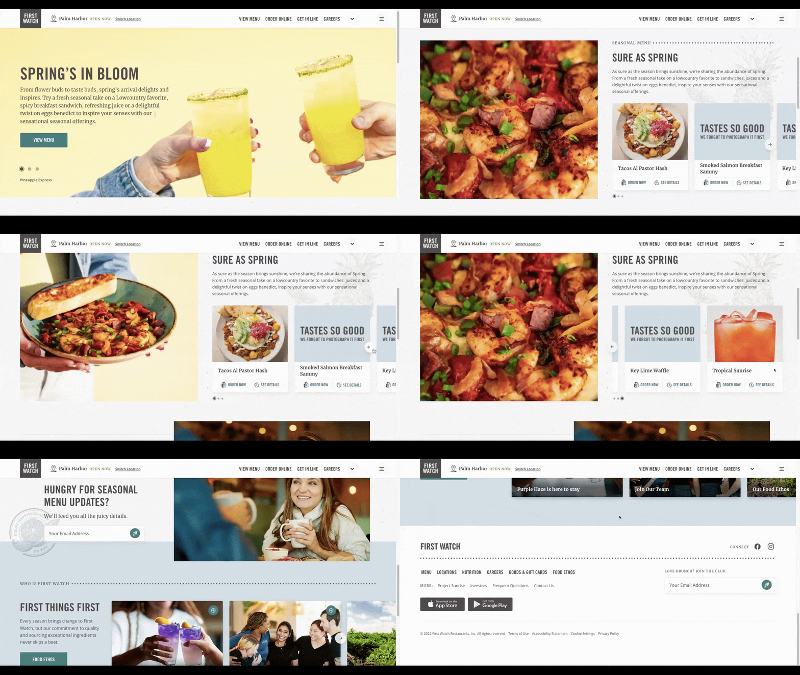
The design feels light and airy, much like the interior of the restaurant. In both instances, this leaves plenty of room for the freshly made food and drinks to stand out.
This isn’t the only place online where we see the designer work their magic on the restaurant’s visuals. For instance, here’s a promotional image recently featured on First Watch’s Facebook page:
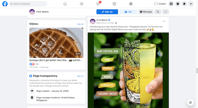
The post is promoting a new juice drink called Pineapple Express. Rather than just show the drink in the glass, the graphic is bisected. One half shows what the drink actually looks like while the other half is an illustration of its natural, fruity ingredients.
There are custom illustrations all around the First Watch website. However, they’re usually tucked into the background somewhere or occasionally thrown in to represent menu items. To see them come front and center on social media is cool. It’s an original way to make a restaurant’s food and drink imagery stand out.
First Watch’s Instagram page is another place where social media imagery gets some love from a designer. Like this original meme:
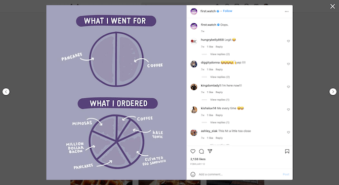
The concept isn’t necessarily original, but the execution and content is. It also uses the purple color that’s often featured in the restaurant’s branding and drink offerings.
It’s not just the illustrations where we get the sense that a designer is contributing something more behind the scenes. Whenever a new seasonal or holiday menu comes out, we start to see images and videos like these on First Watch’s social media accounts:
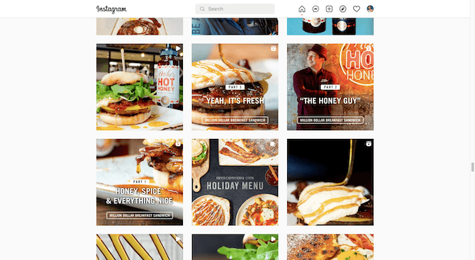
A local restaurant brand like First Watch could easily get away with filling its social media feeds with photo after photo of its food and drinks. However, it goes above and beyond to promote special menus and new items with labeled imagery. Since these kinds of posts appear infrequently, they’re bound to capture Instagram users’ attention when they do show up.
Wrap-up
You can’t do business solely from a website these days. You have to be everywhere all at once—Facebook and Instagram, Yelp and TripAdvisor, Gmail and more. As such, I think the web in web designer needs to stand for more than just websites. It needs to stand for the web as a whole.
Omnichannel marketing is the only way to be really successful in this day and age, and I think web designers have an important role to play in helping their clients maximize this opportunity.

Suzanne Scacca
A former project manager and web design agency manager, Suzanne Scacca now writes about the changing landscape of design, development and software.

