How to Get a Responsive Data Grid

Need to squeeze more data on screen for your web app? Check out the compact grid option now available in our React, Angular, Vue and Blazor libraries!
Data grids can be a tough thing to conquer in a web app. More and more, all clients seem to be needing as much data as physically possible squished onto one screen. The Kendo UI DataGrid has a nifty new feature for the React, Angular and Vue flavors (plus in Telerik UI for Blazor) that easily allows you to toggle the view to squeeze in more data.
An additional two rows are now visible in this example:
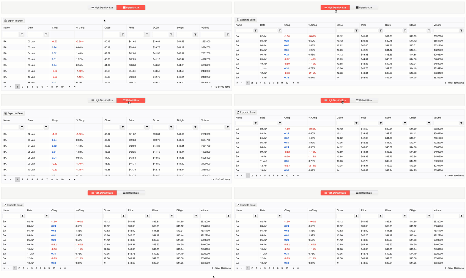
First, before we can enable this more compact version of the data grid, we need to install it.
In the root of your Angular project, go ahead and run this command in your terminal:
ng add @progress/kendo-angular-gridNow that you have the Kendo UI Data Grid downloaded, you can add it anywhere in your app using this tag:
<kendo-grid [data]="gridData">
</kendo-grid>
Inside the grid, you define columns and what data belongs to each like so:
<kendo-grid [data]="gridData">
    <kendo-grid-column field="ProductID" title="ID"> </kendo-grid-column>
    <kendo-grid-column field="ProductName" title="Name"> </kendo-grid-column>
    <kendo-grid-column field="Category.CategoryName" title="Category"> </kendo-grid-column>
    <kendo-grid-column field="UnitPrice" title="Price"> </kendo-grid-column>
</kendo-grid>
The data in the above grid is structured like this in the components TypeScript file:
public gridData: Product[] = [
    {
        ProductID: 1,
        ProductName: 'Coffee Milk Tea',
        UnitPrice: 5,
        Category: {
            CategoryID: 1,
            CategoryName: 'Beverages'
        }
    },
    {
       /*...*/
    }
];
On top of grouping, filtering, paging, sorting, exporting, etc., there is a new feature to the Kendo UI Grid to adjust the sizing of the grid to a more compact view. Let’s take a look at how to enable this!
There is a sizing option to the Grid, which adjusts the padding of all elements in the Grid. The size attribute supports three options: small, medium and none (removes styling related to sizing).
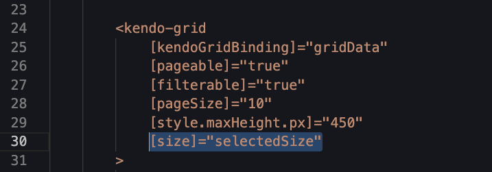
Check out the live demo here: https://stackblitz.com/edit/angular-pu17ff?embed=1&file=src/app/app.component.ts
You can see here, with the three buttons I created, the difference between the default (medium), the small (compact option) and even what it looks like to pass none to the sizing option.
This truly is a wonderful new addition to the already full features list of the Kendo UI Grid. BUT, she doesn’t happen auto-magically when the screen size is smaller/larger. So, let’s see one way of accomplishing such a thing.
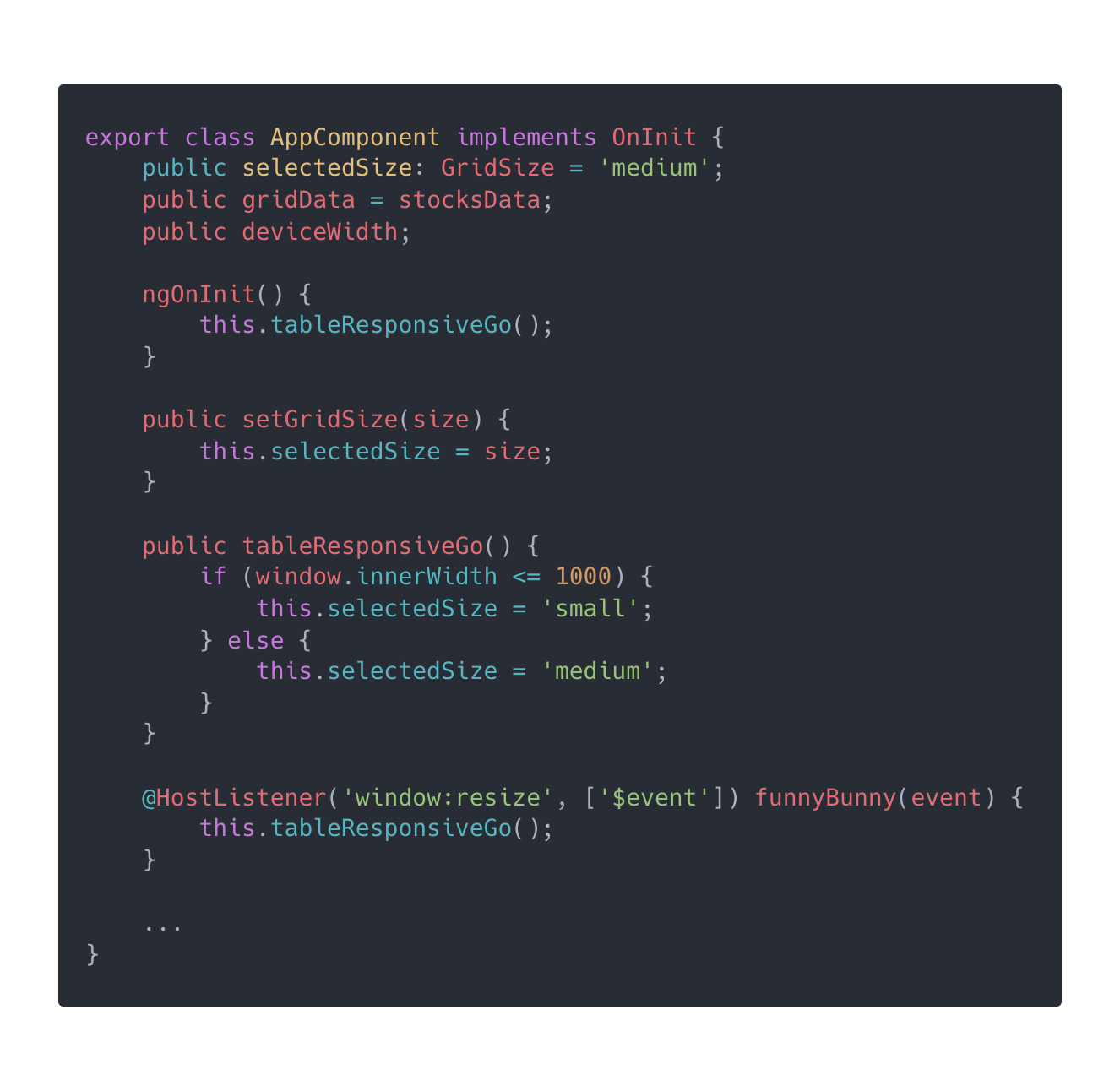
So here I created a HostListener (the Angular way of attaching an event to fit into the proper flow of Angular’s change detection). This way, I don’t have to worry about initializing it on creation or removing it on destroy—Angular will take care of that for me, because I used a HostListener. But this snippet will look very much the same in React, Vue or jQuery. At the end of the day, we are just utilizing JavaScript’s window access to alert our data grid when the screen size changes or starts off smaller/larger.
This now toggles the size from the default “medium” to “small” when the screen is smaller than 1000px. Check out and clone the demo for yourself, here: https://stackblitz.com/edit/angular-pu17ff?file=src%2Fapp%2Fapp.component.ts.
The Grid syntax for plugging in this different size attribute/property, of course, will look slightly different too. For example, here is how to change the size in a React Data Grid:
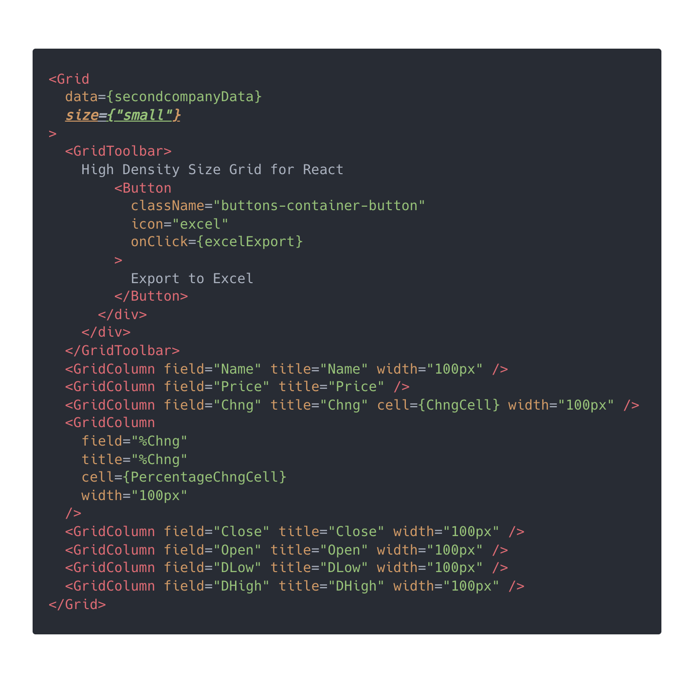
Here we see setting the grid size to small in React. For the full demo, check out the docs: https://www.telerik.com/kendo-react-ui/components/grid/sizing.
Now, let’s take a peek at how to do this in Vue:
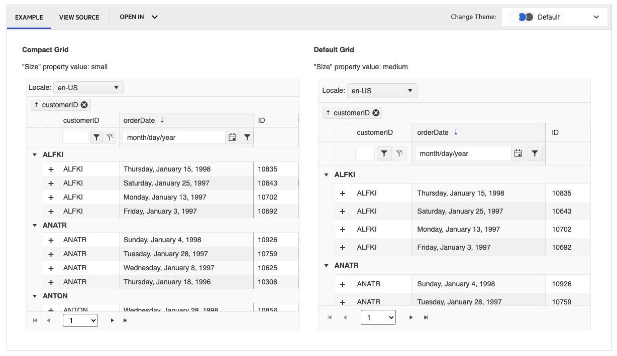
Here, you can see the side-by-side differences with small enabled. So much more data fits into the same space! This is accomplished with this syntax in the Kendo UI Data Grid for Vue:
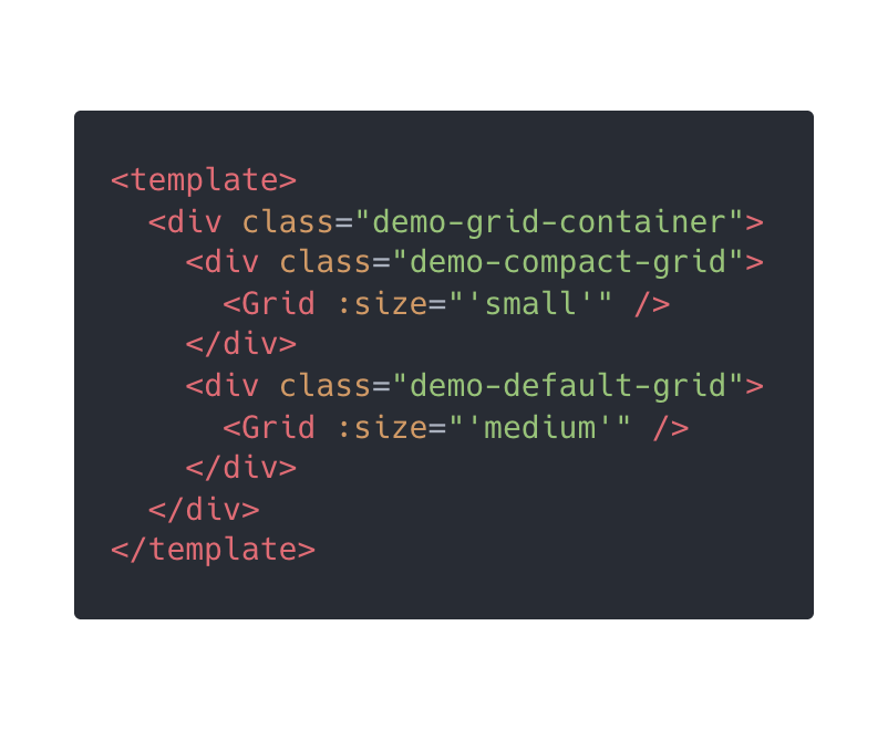
Check out the full demo, here, in the docs: https://www.telerik.com/kendo-vue-ui/components/grid/compact-grid!
Kendo UI for jQuery will have this feature as of R2 2023, and our components over on the .NET side are also adding this cool feature! Check out how to accomplish this in Telerik UI for Blazor:
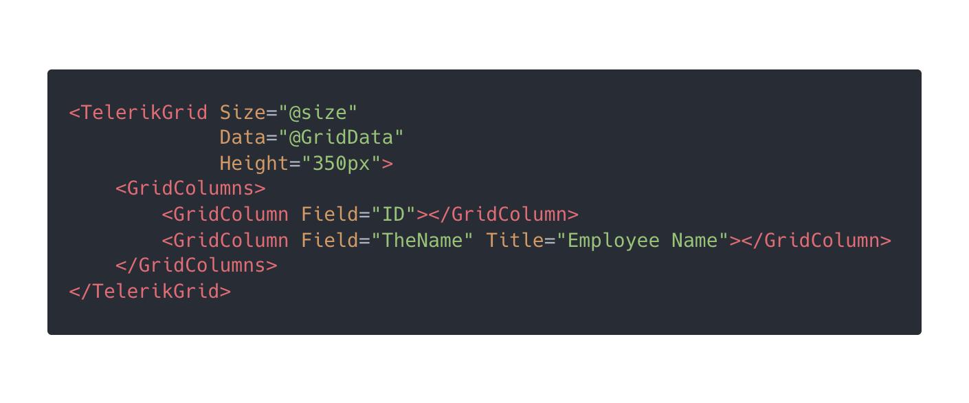
The full demo for Telerik UI for Blazor DataGrid can be found here in the docs: https://docs.telerik.com/blazor-ui/components/grid/sizing. And this nice blog post walks you through a handy example: Introducing Compact Mode: Optimize Available Screen Space with Blazor DataGrid.
So much power with such a simple attribute—a very welcome addition to the Kendo UI and Telerik UI DataGrids’ already FULL feature sets! If you’d like to use these cool components but don’t have an account yet, you can sign up for
a month-long free trial →
https://www.telerik.com/kendo-ui. ![]()

Alyssa Nicoll
Alyssa is an Angular Developer Advocate & GDE. Her two degrees (Web Design & Development and Psychology) feed her speaking career. She has spoken at over 30 conferences internationally, specializing in motivational soft talks, enjoys gaming on Xbox and scuba diving in her spare time. Her DM is always open, come talk sometime.

