
Getting Started with Kendo UI for Angular Grid

Summarize with AI:
The Kendo UI for Angular Data Grid is a robust solution for displaying and managing data in Angular applications, including advanced capabilities like virtualization, accessibility and integration.
Building modern Angular applications often requires displaying and managing large datasets in a user-friendly format. While basic HTML tables can handle simple data presentation, enterprise applications usually demand more sophisticated features like sorting, filtering, paging and real-time updates. This is where a robust data grid component becomes important.
In this article, we’ll explore the Progress Kendo UI for Angular Grid designed specifically for Angular applications. We’ll walk through how data binding works with the grid and how to enable some essential data operations.
Kendo UI for Angular Grid is part of Kendo UI for Angular, a professional-grade UI library with 110+ components for building modern and feature-rich applications. To try it out, sign up for a free 30-day trial.
Kendo UI for Angular Grid
The Kendo UI for Angular Grid component provides a comprehensive set of ready-to-use features. It’s designed to be highly customizable and performant, making it easy to handle large datasets efficiently.
Let’s start with a basic example:
import { Component } from '@angular/core';
import { KENDO_GRID } from '@progress/kendo-angular-grid';

interface Employee {
  EmployeeID: number;
  FirstName: string;
  LastName: string;
  Title: string;
  Department: string;
  Salary: number;
  HireDate: Date;
}

@Component({
  standalone: true,
  imports: [KENDO_GRID],
  selector: 'my-app',
  template: `
    <kendo-grid [data]="employees" [height]="400">
      <kendo-grid-column field="EmployeeID" title="ID" [width]="80"></kendo-grid-column>
      <kendo-grid-column field="FirstName" title="First Name" [width]="120"></kendo-grid-column>
      <kendo-grid-column field="LastName" title="Last Name" [width]="120"></kendo-grid-column>
      <kendo-grid-column field="Title" title="Job Title" [width]="200"></kendo-grid-column>
      <kendo-grid-column field="Department" title="Department" [width]="150"></kendo-grid-column>
      <kendo-grid-column field="Salary" title="Salary" [width]="120" format="{0:c}"></kendo-grid-column>
      <kendo-grid-column field="HireDate" title="Hire Date" [width]="120" format="{0:d}"></kendo-grid-column>
    </kendo-grid>
  `
})
export class AppComponent {
  public employees: Employee[] = [
    {
      EmployeeID: 1,
      FirstName: 'Sarah',
      LastName: 'Chen',
      Title: 'Senior Developer',
      Department: 'Engineering',
      Salary: 95000,
      HireDate: new Date('2022-03-15')
    },
    {
      EmployeeID: 2,
      FirstName: 'Marcus',
      LastName: 'Johnson',
      Title: 'Product Manager',
      Department: 'Product',
      Salary: 110000,
      HireDate: new Date('2021-08-22')
    },
    {
      EmployeeID: 3,
      FirstName: 'Elena',
      LastName: 'Rodriguez',
      Title: 'UX Designer',
      Department: 'Design',
      Salary: 78000,
      HireDate: new Date('2023-01-10')
    },
    {
      EmployeeID: 4,
      FirstName: 'David',
      LastName: 'Kim',
      Title: 'DevOps Engineer',
      Department: 'Engineering',
      Salary: 88000,
      HireDate: new Date('2022-11-05')
    }
  ];
}
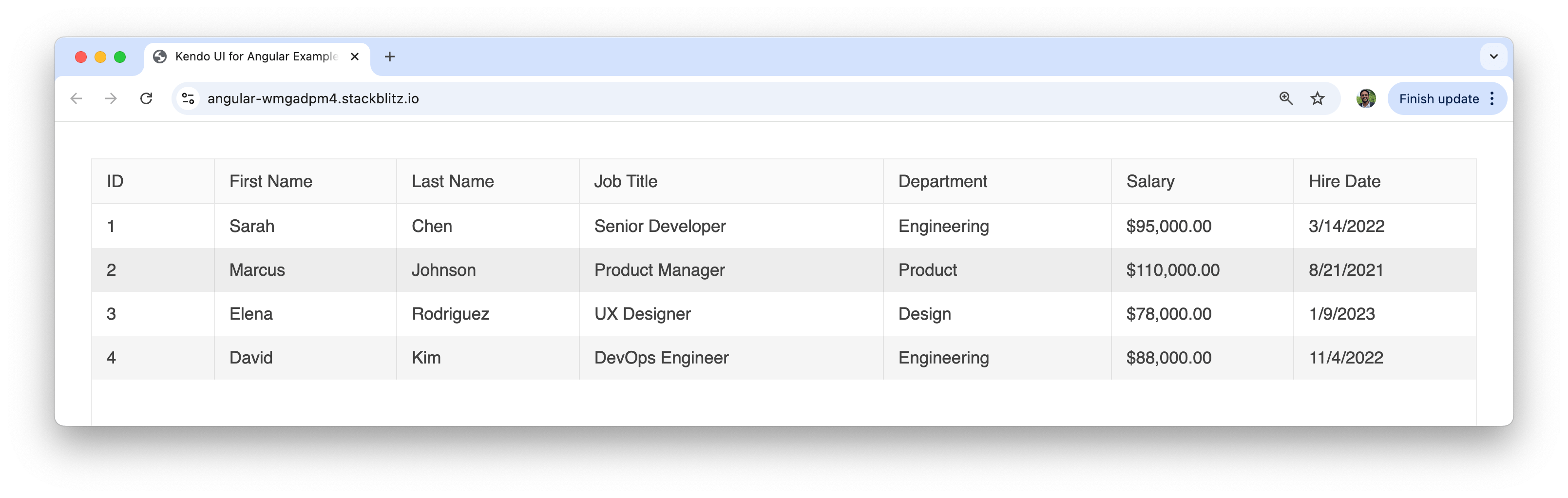
In the above example, we’ve created a basic employee grid that displays company staff information. The grid automatically renders columns based on our data structure, and we’ve applied formatting to the salary (currency) and hire date (date) columns for better readability.
Data Binding Options
One of the most important aspects of working with any data grid is how we bind data to it. The Kendo UI for Angular Grid supports multiple data binding approaches, each suited for different scenarios and requirements.
Local Data Binding
Local data binding is ideal when we have a dataset available on the client-side and want to perform operations locally. This approach provides the fastest user experience since all data operations happen in memory.
Like we’ve seen in the example above, the simplest way to bind data is by setting the data property directly:
import { Component } from '@angular/core';
import { KENDO_GRID } from '@progress/kendo-angular-grid';

@Component({
  standalone: true,
  imports: [KENDO_GRID],
  selector: 'my-app',
  template: `
    <kendo-grid [data]="productData" [height]="300">
      <kendo-grid-column field="ProductID" title="ID" [width]="80"></kendo-grid-column>
      <kendo-grid-column field="ProductName" title="Product" [width]="200"></kendo-grid-column>
      <kendo-grid-column field="Category" title="Category" [width]="150"></kendo-grid-column>
      <kendo-grid-column field="Price" title="Price" [width]="100" format="{0:c}"></kendo-grid-column>
      <kendo-grid-column field="InStock" title="In Stock" [width]="100"></kendo-grid-column>
    </kendo-grid>
  `,
})
export class AppComponent {
  public productData = [
    {
      ProductID: 1,
      ProductName: 'Laptop Pro 15"',
      Category: 'Electronics',
      Price: 1299.99,
      InStock: 45,
    },
    {
      ProductID: 2,
      ProductName: 'Wireless Mouse',
      Category: 'Accessories',
      Price: 29.99,
      InStock: 120,
    },
    {
      ProductID: 3,
      ProductName: 'Mechanical Keyboard',
      Category: 'Accessories',
      Price: 89.99,
      InStock: 67,
    },
    {
      ProductID: 4,
      ProductName: 'Monitor 27" 4K',
      Category: 'Electronics',
      Price: 399.99,
      InStock: 23,
    },
    {
      ProductID: 5,
      ProductName: 'USB-C Hub',
      Category: 'Accessories',
      Price: 49.99,
      InStock: 89,
    },
  ];
}
Using the Data Binding Directive
For more advanced scenarios with built-in data operations, we can use the kendoGridBinding directive. This approach automatically handles sorting, filtering, paging and grouping operations:
import { Component } from '@angular/core';
import { KENDO_GRID } from '@progress/kendo-angular-grid';

@Component({
  standalone: true,
  imports: [KENDO_GRID],
  selector: 'my-app',
  template: `
    <kendo-grid
      [kendoGridBinding]="salesData"
      [pageable]="true"
      [pageSize]="5"
      [sortable]="true"
      [filterable]="true"
      [groupable]="true"
      [height]="400">
      <kendo-grid-column field="SaleID" title="Sale ID" [width]="100"></kendo-grid-column>
      <kendo-grid-column field="CustomerName" title="Customer" [width]="180"></kendo-grid-column>
      <kendo-grid-column field="Product" title="Product" [width]="200"></kendo-grid-column>
      <kendo-grid-column field="Amount" title="Amount" [width]="120" format="{0:c}"></kendo-grid-column>
      <kendo-grid-column field="SaleDate" title="Date" [width]="120" format="{0:d}"></kendo-grid-column>
      <kendo-grid-column field="Region" title="Region" [width]="100"></kendo-grid-column>
    </kendo-grid>
  `,
})
export class AppComponent {
  public salesData = [
    {
      SaleID: 1001,
      CustomerName: 'Acme Corp',
      Product: 'Enterprise Software License',
      Amount: 15000,
      SaleDate: new Date('2024-01-15'),
      Region: 'North',
    },
    {
      SaleID: 1002,
      CustomerName: 'Tech Solutions Inc',
      Product: 'Cloud Storage Plan',
      Amount: 2400,
      SaleDate: new Date('2024-01-18'),
      Region: 'South',
    },
    {
      SaleID: 1003,
      CustomerName: 'Global Industries',
      Product: 'Security Suite',
      Amount: 8500,
      SaleDate: new Date('2024-01-20'),
      Region: 'East',
    },
    {
      SaleID: 1004,
      CustomerName: 'StartUp Innovations',
      Product: 'Development Tools',
      Amount: 1200,
      SaleDate: new Date('2024-01-22'),
      Region: 'West',
    },
    {
      SaleID: 1005,
      CustomerName: 'Mega Retail Chain',
      Product: 'POS System',
      Amount: 25000,
      SaleDate: new Date('2024-01-25'),
      Region: 'North',
    },
    {
      SaleID: 1006,
      CustomerName: 'Healthcare Partners',
      Product: 'Patient Management System',
      Amount: 18000,
      SaleDate: new Date('2024-01-28'),
      Region: 'South',
    },
    {
      SaleID: 1007,
      CustomerName: 'Education District',
      Product: 'Learning Platform',
      Amount: 12000,
      SaleDate: new Date('2024-02-01'),
      Region: 'East',
    },
    {
      SaleID: 1008,
      CustomerName: 'Finance Group',
      Product: 'Trading Software',
      Amount: 35000,
      SaleDate: new Date('2024-02-03'),
      Region: 'West',
    },
  ];
}
With the kendoGridBinding directive, users can now sort columns by clicking headers, filter data using the filter row, group data by dragging column headers to the grouping area, and navigate through pages.
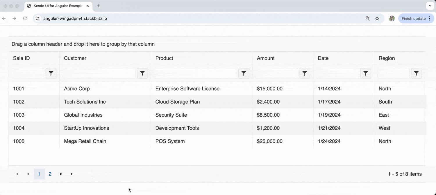
In the upcoming Data Operations section, we’ll spend more time discussing some of these data operations.
Remote Data Binding
When working with large datasets or server-side processing, remote data binding becomes important. This approach fetches data from a server and can handle data operations on the backend for more optimal performance.
import { Component, OnInit } from '@angular/core';
import { CommonModule } from '@angular/common';
import { HttpClient, HttpClientModule } from '@angular/common/http';
import { Observable } from 'rxjs';
import { KENDO_GRID, GridDataResult } from '@progress/kendo-angular-grid';
import { State } from '@progress/kendo-data-query';

@Component({
  standalone: true,
  imports: [CommonModule, HttpClientModule, KENDO_GRID],
  selector: 'my-app',
  template: `
    <kendo-grid
      [data]="gridData | async"
      [loading]="loading"
      [pageable]="true"
      [pageSize]="state.take"
      [skip]="state.skip"
      [sortable]="true"
      [sort]="state.sort"
      (dataStateChange)="dataStateChange($event)"
      [height]="500">
      <kendo-grid-column field="CustomerID" title="Customer ID" [width]="120"></kendo-grid-column>
      <kendo-grid-column field="CompanyName" title="Company" [width]="200"></kendo-grid-column>
      <kendo-grid-column field="ContactName" title="Contact" [width]="150"></kendo-grid-column>
      <kendo-grid-column field="City" title="City" [width]="120"></kendo-grid-column>
      <kendo-grid-column field="Country" title="Country" [width]="120"></kendo-grid-column>
    </kendo-grid>
  `
})
export class AppComponent implements OnInit {
  public gridData: Observable<GridDataResult>;
  public state: State = {
    skip: 0,
    take: 10
  };
  public loading = false;

  constructor(private http: HttpClient) {}

  ngOnInit() {
    this.loadData();
  }

  public dataStateChange(state: any): void {
    this.state = state;
    this.loadData();
  }

  private loadData(): void {
    this.loading = true;

    // Simulate API call with query parameters
    const queryParams = `?skip=${this.state.skip}&take=${this.state.take}`;

    this.gridData = this.http.get<GridDataResult>(`/api/customers${queryParams}`);

    // In a real scenario, you'd handle the loading state properly
    setTimeout(() => this.loading = false, 1000);
  }
}
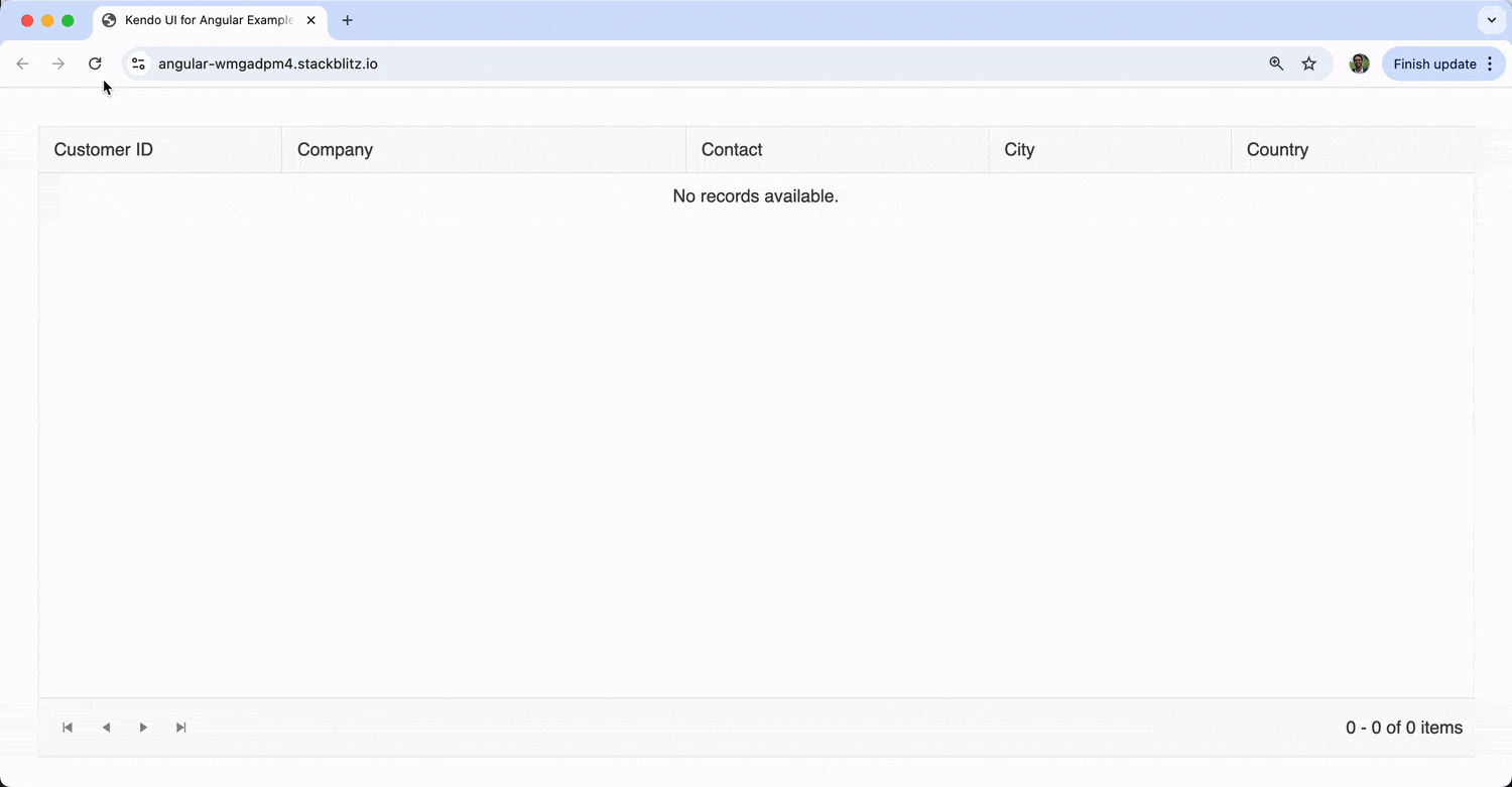
This remote binding example demonstrates how to handle server-side paging and sorting. The dataStateChange event fires whenever users interact with the grid, allowing us to send the updated state to our backend API. Keep in mind the above example does a simulated API call so no data is actually shown at the moment.
Data Operations
The Kendo UI for Angular Grid excels at providing built-in data operations that enhance user experience and data management capabilities. We’ve seen some examples of this in one of the examples above, but let’s further explore some of these key operations.
Paging
Paging is essential when dealing with large datasets. Instead of loading thousands of records at once, paging breaks the data into manageable chunks:
import { Component } from '@angular/core';
import { KENDO_GRID } from '@progress/kendo-angular-grid';

@Component({
  standalone: true,
  imports: [KENDO_GRID],
  selector: 'my-app',
  template: `
    <kendo-grid
      [kendoGridBinding]="orders"
      [pageable]="pageSettings"
      [height]="400">
      <kendo-grid-column field="OrderID" title="Order ID" [width]="100"></kendo-grid-column>
      <kendo-grid-column field="CustomerName" title="Customer" [width]="180"></kendo-grid-column>
      <kendo-grid-column field="OrderDate" title="Order Date" [width]="120" format="{0:d}"></kendo-grid-column>
      <kendo-grid-column field="ShipCity" title="Ship City" [width]="120"></kendo-grid-column>
      <kendo-grid-column field="Total" title="Total" [width]="100" format="{0:c}"></kendo-grid-column>
    </kendo-grid>
  `,
})
export class AppComponent {
  public pageSettings = {
    buttonCount: 5,
    info: true,
    type: 'numeric',
    pageSizes: [5, 10, 20, 50],
    previousNext: true,
  };

  public orders = [
    {
      OrderID: 10248,
      CustomerName: 'Vins et alcools Chevalier',
      OrderDate: new Date('2024-01-15'),
      ShipCity: 'Reims',
      Total: 440.0,
    },
    {
      OrderID: 10249,
      CustomerName: 'Toms Spezialitäten',
      OrderDate: new Date('2024-01-16'),
      ShipCity: 'Münster',
      Total: 1863.4,
    },
    {
      OrderID: 10250,
      CustomerName: 'Hanari Carnes',
      OrderDate: new Date('2024-01-17'),
      ShipCity: 'Rio de Janeiro',
      Total: 1552.6,
    },
    // ... more order data
  ];
}
The pager can be customized with various options, including page size selectors, navigation buttons and information displays about the current page and total records.
Sorting
Sorting allows users to order data by any column in ascending or descending order. The grid supports both single and multiple column sorting:
import { Component } from '@angular/core';
import { KENDO_GRID } from '@progress/kendo-angular-grid';
import { SortDescriptor } from '@progress/kendo-data-query';

@Component({
  standalone: true,
  imports: [KENDO_GRID],
  selector: 'my-app',
  template: `
    <kendo-grid
      [kendoGridBinding]="inventory"
      [sortable]="sortSettings"
      [sort]="initialSort"
      [height]="350">
      <kendo-grid-column field="ProductName" title="Product" [width]="200"></kendo-grid-column>
      <kendo-grid-column field="Category" title="Category" [width]="150"></kendo-grid-column>
      <kendo-grid-column field="UnitsInStock" title="Stock" [width]="100"></kendo-grid-column>
      <kendo-grid-column field="UnitPrice" title="Price" [width]="100" format="{0:c}"></kendo-grid-column>
      <kendo-grid-column field="LastUpdated" title="Last Updated" [width]="120" format="{0:d}"></kendo-grid-column>
    </kendo-grid>
  `,
})
export class AppComponent {
  public sortSettings = {
    allowUnsort: true,
    mode: 'multiple', // Allows sorting by multiple columns
  };

  public initialSort: SortDescriptor[] = [
    { field: 'Category', dir: 'asc' },
    { field: 'UnitsInStock', dir: 'desc' },
  ];

  public inventory = [
    {
      ProductName: 'Gaming Laptop',
      Category: 'Electronics',
      UnitsInStock: 25,
      UnitPrice: 1499.99,
      LastUpdated: new Date('2024-01-20'),
    },
    {
      ProductName: 'Office Chair',
      Category: 'Furniture',
      UnitsInStock: 50,
      UnitPrice: 299.99,
      LastUpdated: new Date('2024-01-18'),
    },
    {
      ProductName: 'Smartphone',
      Category: 'Electronics',
      UnitsInStock: 75,
      UnitPrice: 799.99,
      LastUpdated: new Date('2024-01-22'),
    },
    {
      ProductName: 'Desk Lamp',
      Category: 'Furniture',
      UnitsInStock: 30,
      UnitPrice: 59.99,
      LastUpdated: new Date('2024-01-19'),
    },
  ];
}
Users can click column headers to sort, and with multiple sorting enabled, they can hold Ctrl/Cmd while clicking additional columns to sort by various criteria.
Filtering
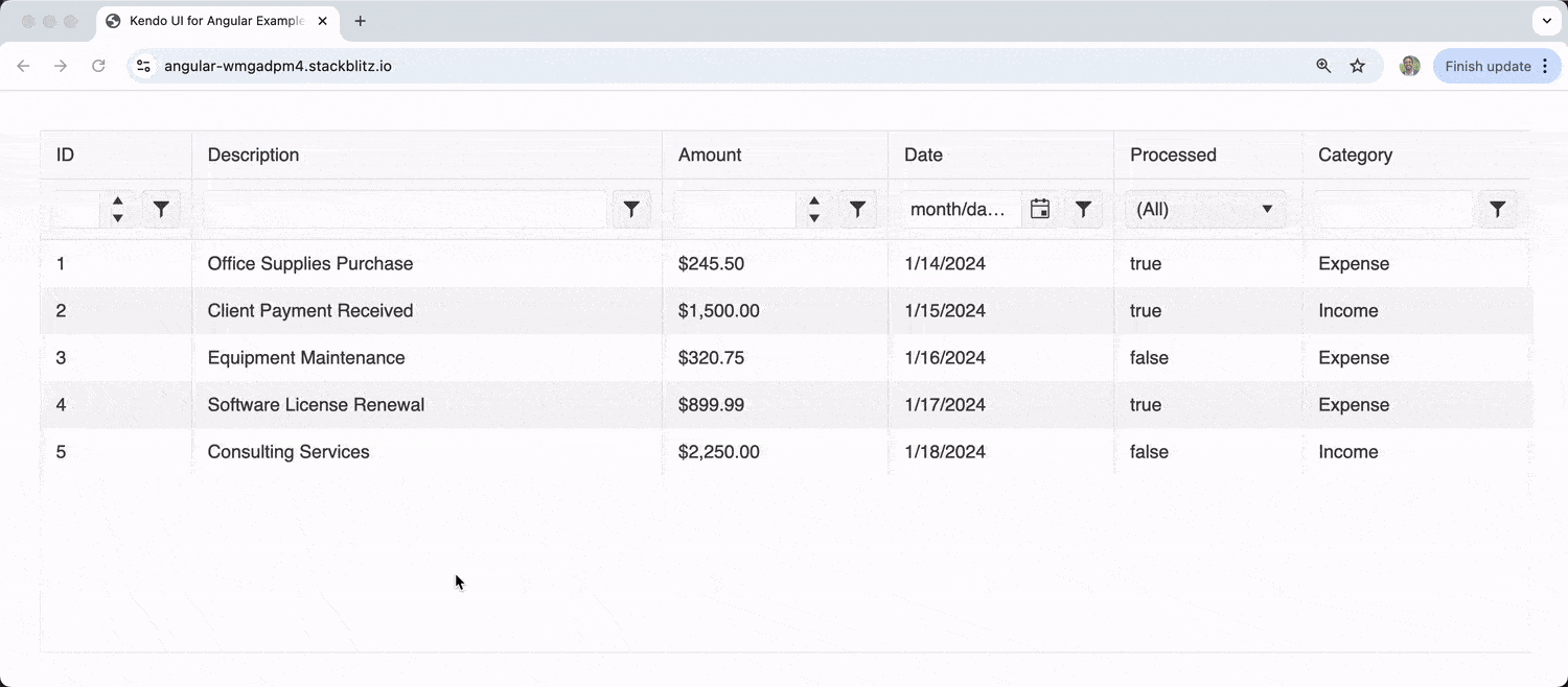
Filtering enables users to display only the data that meets specific criteria. The grid supports various filter types, including text, numeric, date and boolean filters:
import { Component } from '@angular/core';
import { KENDO_GRID } from '@progress/kendo-angular-grid';

@Component({
  standalone: true,
  imports: [KENDO_GRID],
  selector: 'my-app',
  template: `
    <kendo-grid
      [kendoGridBinding]="transactions"
      [filterable]="true"
      [height]="400">
      <kendo-grid-column field="TransactionID" title="ID" [width]="80" filter="numeric"></kendo-grid-column>
      <kendo-grid-column field="Description" title="Description" [width]="250" filter="text"></kendo-grid-column>
      <kendo-grid-column field="Amount" title="Amount" [width]="120" filter="numeric" format="{0:c}"></kendo-grid-column>
      <kendo-grid-column field="TransactionDate" title="Date" [width]="120" filter="date" format="{0:d}"></kendo-grid-column>
      <kendo-grid-column field="IsProcessed" title="Processed" [width]="100" filter="boolean"></kendo-grid-column>
      <kendo-grid-column field="Category" title="Category" [width]="120" filter="text"></kendo-grid-column>
    </kendo-grid>
  `,
})
export class AppComponent {
  public transactions = [
    {
      TransactionID: 1,
      Description: 'Office Supplies Purchase',
      Amount: 245.5,
      TransactionDate: new Date('2024-01-15'),
      IsProcessed: true,
      Category: 'Expense',
    },
    {
      TransactionID: 2,
      Description: 'Client Payment Received',
      Amount: 1500.0,
      TransactionDate: new Date('2024-01-16'),
      IsProcessed: true,
      Category: 'Income',
    },
    {
      TransactionID: 3,
      Description: 'Equipment Maintenance',
      Amount: 320.75,
      TransactionDate: new Date('2024-01-17'),
      IsProcessed: false,
      Category: 'Expense',
    },
    {
      TransactionID: 4,
      Description: 'Software License Renewal',
      Amount: 899.99,
      TransactionDate: new Date('2024-01-18'),
      IsProcessed: true,
      Category: 'Expense',
    },
    {
      TransactionID: 5,
      Description: 'Consulting Services',
      Amount: 2250.0,
      TransactionDate: new Date('2024-01-19'),
      IsProcessed: false,
      Category: 'Income',
    },
  ];
}
Each column can have its own filter type, and the grid automatically provides appropriate filter controls based on the data type.
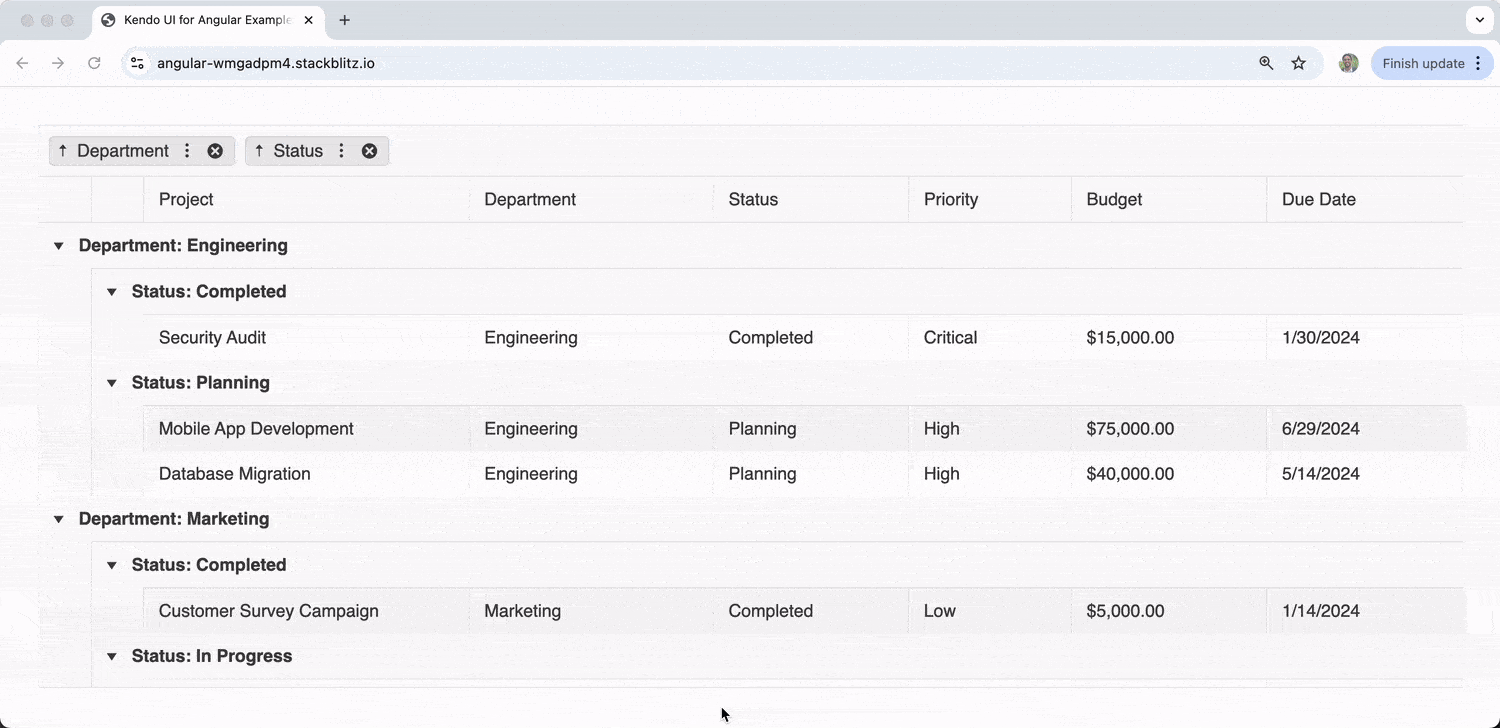
Grouping
Grouping allows users to organize data into collapsible groups based on column values, making it easier to analyze and understand large datasets:
import { Component } from '@angular/core';
import { KENDO_GRID } from '@progress/kendo-angular-grid';
import { GroupDescriptor } from '@progress/kendo-data-query';

@Component({
  standalone: true,
  imports: [KENDO_GRID],
  selector: 'my-app',
  template: `
    <kendo-grid
      [kendoGridBinding]="projectData"
      [groupable]="true"
      [group]="initialGrouping"
      [height]="450">
      <kendo-grid-column field="ProjectName" title="Project" [width]="200"></kendo-grid-column>
      <kendo-grid-column field="Department" title="Department" [width]="150"></kendo-grid-column>
      <kendo-grid-column field="Status" title="Status" [width]="120"></kendo-grid-column>
      <kendo-grid-column field="Priority" title="Priority" [width]="100"></kendo-grid-column>
      <kendo-grid-column field="Budget" title="Budget" [width]="120" format="{0:c}"></kendo-grid-column>
      <kendo-grid-column field="DueDate" title="Due Date" [width]="120" format="{0:d}"></kendo-grid-column>
    </kendo-grid>
  `,
})
export class AppComponent {
  public initialGrouping: GroupDescriptor[] = [
    { field: 'Department' },
    { field: 'Status' },
  ];

  public projectData = [
    {
      ProjectName: 'Website Redesign',
      Department: 'Marketing',
      Status: 'In Progress',
      Priority: 'High',
      Budget: 25000,
      DueDate: new Date('2024-03-15'),
    },
    {
      ProjectName: 'Mobile App Development',
      Department: 'Engineering',
      Status: 'Planning',
      Priority: 'High',
      Budget: 75000,
      DueDate: new Date('2024-06-30'),
    },
    {
      ProjectName: 'Security Audit',
      Department: 'Engineering',
      Status: 'Completed',
      Priority: 'Critical',
      Budget: 15000,
      DueDate: new Date('2024-01-31'),
    },
    {
      ProjectName: 'Brand Guidelines Update',
      Department: 'Marketing',
      Status: 'In Progress',
      Priority: 'Medium',
      Budget: 8000,
      DueDate: new Date('2024-02-28'),
    },
    {
      ProjectName: 'Database Migration',
      Department: 'Engineering',
      Status: 'Planning',
      Priority: 'High',
      Budget: 40000,
      DueDate: new Date('2024-05-15'),
    },
    {
      ProjectName: 'Customer Survey Campaign',
      Department: 'Marketing',
      Status: 'Completed',
      Priority: 'Low',
      Budget: 5000,
      DueDate: new Date('2024-01-15'),
    },
  ];
}
Users can drag column headers to the grouping area to create groups, and the grid displays expandable/collapsible group headers with aggregate information.
Wrap-up
The Kendo UI for Angular Data Grid is a comprehensive solution for displaying and managing data in Angular applications. In this article, we’ve explored some of its core capabilities, like data binding and the supported data operations.
Beyond these core data operations, the grid offers advanced capabilities including virtualization for performance optimization, real-time data updates, accessibility compliance and seamless integration with other Kendo UI for Angular components.
For more details on advanced features and configuration options, be sure to check out the official Kendo UI for Angular Grid documentation! And remember, you can try the Kendo UI for Angular library yourself free for 30 days!

Hassan Djirdeh
Hassan is a senior frontend engineer and has helped build large production applications at-scale at organizations like Doordash, Instacart and Shopify. Hassan is also a published author and course instructor where he’s helped thousands of students learn in-depth frontend engineering skills like React, Vue, TypeScript, and GraphQL.
Related Posts
Comments
All articles
Topics
Web MobileMobile
Desktop
Design
Productivity
People
