Getting Started with Date and Time Picker for Xamarin

Summarize with AI:
Learn about the new Date and Time Picker control in Telerik UI for Xamarin, and see how to easily let users select dates, times or a combination of both in your Xamarin apps.
In the first Telerik UI for Xamarin release of 2020 we introduced a set of brand new picker controls: List Picker, Date and Time Picker and Templated (Custom) Picker.
The new Telerik UI for Xamarin Date and Time Picker control enables your users to select dates and times in a variety of different use cases. For example, if you want to rent a car, you will definitely need date and time picker. Developing an alarm app? The Time Picker will enable you to easily implement a time picker for your daily alarm. If you happen to be working on a booking/reservation app, your users will need to pick a date to make a reservation. Whatever the use case, our Date Picker control for Xamarin is here to help you speed up your development!
The DateTimePicker is a combination of a DatePicker and a TimePicker. You can easily choose a date, time or a combination of both depending on the used format string.
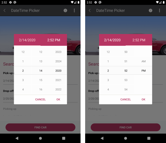
As in the List Picker, its items are visualized inside a popup. The DateTime Picker control has a number of features that allow you to set a date range, DateTime format and fully customize the dialog appearance such as its header and footer.
In this blog post, I will get you familiar with the DateTime Picker control and the features it provides.
String Format
Date and Time Picker for Xamarin allows you to use standard or custom date and time format strings through the SpinnerFormatString property. Depending on what format is set, the picker visualizes spinner controls with prepopulated values to be picked. This feature allows you to create a date picker, time picker or combination of both.
Date Picker
<telerikInput:RadDateTimePicker StartDate="2019,12,25"
                      EndDate="2020,02,14"
                      SpinnerFormatString="d"/>
Time Picker
<telerikInput:RadDateTimePicker StartDate="2019,12,25"
                      EndDate="2020,02,14"
                      SpinnerFormatString="T"
                      DisplayStringFormat="HH:mm:ss"
                      Placeholder="Pick a time!"
                      AreSpinnerHeadersVisible="True"/>
DateTime Picker
<telerikInput:RadDateTimePicker />
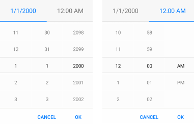
And here is the default look of the Date and Time Picker control:
Date Range
The StartDate and EndDate options in the DateTimePicker are used to set the earliest and latest date that can be selected from the picker.
<telerikInput:RadDateTimePicker  StartDate="2020,02,14"
                       EndDate="2020,12,31"/>
The SelectedDate option allows you to define the date which will be selected when the picker dialog is open.
DisplayString Format
DisplayStringFormat property defines what text will be displayed when date/time is selected, and you can also apply format string to it. The format set for DisplayStringFormat should be a valid datetime format.
Sample code:
<telerikInput:RadDateTimePicker AreSpinnerHeadersVisible="True"
                      SpinnerFormatString="T"
                      Placeholder="SELECT TIME!"
                      DisplayStringFormat="H:mm tt"/>
and the result when DisplayStringFormat="H:mm tt"

Flexible Styling API
We have exposed a flexible styling API which allows you to design the perfect date and time picker for your mobile application.
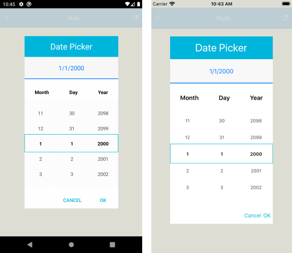
For more information and sample demo please review our Styling article.
DateTimePicker for Xamarin.Forms Demo
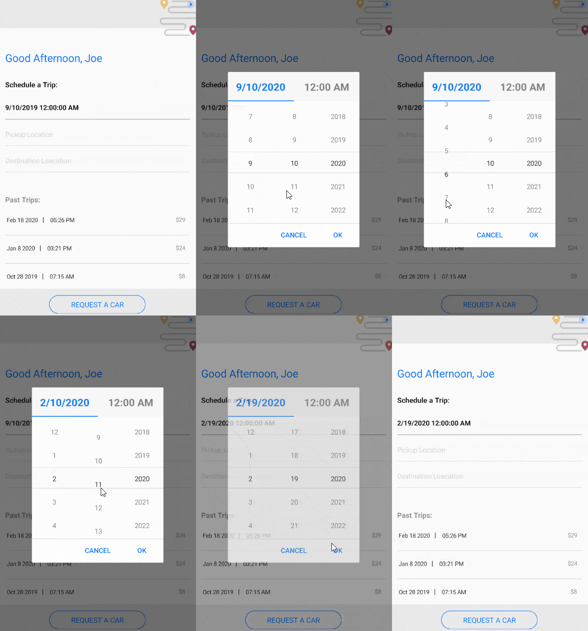
Let's create a demo that allows you to request a car for your trip. The Date and Time picker will be used for picking a date and time for the trip.
Here is a sample TripData model:
public class TripData
{
    public DateTime Date { get; set; }
    public DateTime Time { get; set; }
    public string Cost { get; set; }
}
and the ViewModel:
public class ViewModel
{
    public ViewModel()
    {
        this.Data = new ObservableCollection<TripData>
        {
            new TripData{Date = new DateTime(2020,02,18), Time = new DateTime(2020,02,18,17,26,20), Cost = "$29"},
            new TripData{Date = new DateTime(2020,01,8), Time = new DateTime(2020,01,8,15,21,21), Cost = "$24"},
            new TripData{Date = new DateTime(2019,10,28), Time = new DateTime(2019,10,28,7,15,15), Cost = "$8"},
            new TripData{Date = new DateTime(2019,09,28), Time = new DateTime(2019,09,28,15,43,43), Cost = "$21"},
            new TripData{Date = new DateTime(2019,09,15), Time = new DateTime(2019,09,15,6,12,12), Cost = "$33"},
        };
    }
    public ObservableCollection<TripData> Data { get; set; }
}
How the Date and Time Picker is defined in XAML:
<ContentPage.BindingContext>
    <local:ViewModel/>
</ContentPage.BindingContext>
<ContentPage.Content>
    <Grid>
        <Grid.RowDefinitions>
            <RowDefinition Height="60"/>
            <RowDefinition Height="Auto"/>
            <RowDefinition Height="*"/>
            <RowDefinition Height="Auto"/>
        </Grid.RowDefinitions>
        <StackLayout Grid.Row="0" BackgroundColor="#EAEAEA" HeightRequest="60">
            <Image Source="graphic.png" VerticalOptions="End" HorizontalOptions="End"/>
        </StackLayout>
        <StackLayout Margin="16, 40, 16, 0" Grid.Row="1">
            <Label Text="Good Afternoon, Joe" TextColor="#007AFF" FontSize="22" Margin="0,0,0,24"/>
            <Label Text="Schedule a Trip:" TextColor="Black" FontSize="15" FontAttributes="Bold" Margin="0, 0, 0, 21"/>
            <telerikInput:RadDateTimePicker x:Name="genrePicker"
                                            PlaceholderLabelStyle="{StaticResource PlaceholderLabelStyle}"
                                            DisplayLabelStyle="{StaticResource DisplayLabelStyle}"
                                            TabStripItemStyle="{StaticResource TabStripItemStyle}"
                                            SelectedDate="2019,9,10"
                                            Placeholder="Select Date & Time"/>

            <telerikPrimitives:RadBorder Style="{StaticResource BorderStyle}" />

            <telerikInput:RadListPicker Placeholder="Pickup Location" IsEnabled="False"/>

            <telerikPrimitives:RadBorder Style="{StaticResource DisabledBorderStyle}"/>

            <telerikInput:RadListPicker Placeholder="Destination Loacation" IsEnabled="False"/>

            <telerikPrimitives:RadBorder Style="{StaticResource DisabledBorderStyle}"/>

            <Label Text="Past Trips:" TextColor="#919191" FontAttributes="Bold" FontSize="15" Margin="0, 25, 0, 0"/>
        </StackLayout>

        <telerikDataControls:RadListView Grid.Row="2" ItemsSource="{Binding Data}" Margin="16,0,16,0">
            <telerikDataControls:RadListView.ItemTemplate>
                <DataTemplate>
                    <listView:ListViewTemplateCell>
                        <listView:ListViewTemplateCell.View>
                            <Grid>
                                <Grid.RowDefinitions>
                                    <RowDefinition Height="Auto"/>
                                    <RowDefinition Height="Auto"/>
                                </Grid.RowDefinitions>
                                <Grid.ColumnDefinitions>
                                    <ColumnDefinition Width="2*"/>
                                    <ColumnDefinition Width="*"/>
                                </Grid.ColumnDefinitions>
                                <StackLayout Grid.Column="0" Orientation="Horizontal" Margin="0, 15, 10, 15" VerticalOptions="Center">
                                    <Label Text="{Binding Date, StringFormat='{0: MMM d yyyy}'}" Style="{StaticResource ListViewLabelStyle}" />
                                    <Label Text=" | " FontAttributes="Bold" TextColor="Black" Margin="0,0,0,2"/>
                                    <Label Text="{Binding Time, StringFormat='{0: hh:mm tt}'}" Style="{StaticResource ListViewLabelStyle}" />
                                </StackLayout>
                                <StackLayout Grid.Column="1" HorizontalOptions="End" VerticalOptions="Center" Margin="0,0,10,0">
                                    <Label Text="{Binding Cost}" FontSize="12" TextColor="#919191" VerticalOptions="Center" HorizontalOptions="Center"/>
                                </StackLayout>
                                <telerikPrimitives:RadBorder Style="{StaticResource DisabledBorderStyle}" Grid.ColumnSpan="2" Grid.Row="1" Margin="0"/>
                            </Grid>
                        </listView:ListViewTemplateCell.View>
                    </listView:ListViewTemplateCell>
                </DataTemplate>
            </telerikDataControls:RadListView.ItemTemplate>
        </telerikDataControls:RadListView>

        <StackLayout Grid.Row="3" BackgroundColor="#EAEAEA" HeightRequest="65">
            <telerikPrimitives:RadBorder VerticalOptions="CenterAndExpand"
                                            WidthRequest="200"
                                            HeightRequest="40"
                                            HorizontalOptions="CenterAndExpand">
                <telerikInput:RadButton Text="Request a Car"
                                        CornerRadius="20"
                                        Padding="10,5,10,5"
                                        BorderColor="#007AFF"
                                        BorderWidth="1"
                                        TextColor="#007AFF"
                                        FontSize="15"
                                        Clicked="OnCarRequested"
                                        BackgroundColor="Transparent"/>
            </telerikPrimitives:RadBorder>
        </StackLayout>
    </Grid>
</ContentPage.Content>
You also need to add the needed styles to the page Resources:
<ContentPage.Resources>
    <ResourceDictionary>
        <Style TargetType="Label" x:Key="PlaceholderLabelStyle">
            <Setter Property="TextColor" Value="#919191"/>
        </Style>
        <Style TargetType="Label" x:Key="DisplayLabelStyle">
            <Setter Property="TextColor" Value="Black"/>
            <Setter Property="FontAttributes" Value="Bold"/>
        </Style>
        <Style TargetType="telerikPrimitives:RadBorder" x:Key="BorderStyle">
            <Setter Property="BorderColor" Value="#919191"/>
            <Setter Property="BorderThickness" Value="0, 0, 0, 1"/>
            <Setter Property="Margin" Value="0, 8, 0, 15"/>
        </Style>
        <Style TargetType="telerikPrimitives:RadBorder" x:Key="DisabledBorderStyle">
            <Setter Property="BorderColor" Value="#919191"/>
            <Setter Property="BorderThickness" Value="0, 0, 0, 0.3"/>
            <Setter Property="Margin" Value="0, 8, 0, 15"/>
        </Style>
        <Style TargetType="Label" x:Key="ListViewLabelStyle">
            <Setter Property="TextColor" Value="#000000"/>
            <Setter Property="FontSize" Value="12"/>
            <Setter Property="VerticalTextAlignment" Value="Center"/>
            <Setter Property="HorizontalTextAlignment" Value="Start"/>
        </Style>
        <Style TargetType="telerikInput:DateTimeSelectorTabStripItem" x:Key="TabStripItemStyle">
            <Setter Property="HorizontalTextAlignment" Value="Center"/>
            <Setter Property="VerticalTextAlignment" Value="Center"/>
            <Setter Property="TextColor" Value="Gray"/>
            <Setter Property="SelectedColor" Value="#007AFF"/>
            <Setter Property="HeightRequest" Value="60"/>
            <Setter Property="FontSize" Value="21"/>
            <Setter Property="FontAttributes" Value="Bold"/>
        </Style>

    </ResourceDictionary>
</ContentPage.Resources>
This is the final result:
Tell Us What You Think
We would love to hear what you think about the Date and Time Picker control and how we can continue to improve it. If you have any ideas for features to add, do not hesitate to share this information with us on our Telerik UI for Xamarin Feedback portal.
Don’t forget to check out the various demos of the control in our SDK Sample Browser and the Telerik UI for Xamarin Demos application.
If you have not yet tried the Telerik UI for Xamarin suite, take it out for a spin with a 30-day free trial, offering all the functionalities and controls at your disposal at zero cost.
Happy coding with our controls and stay with us! If you are curious about Custom Picker and its usage, we would love to share more with you in our upcoming blog post about Getting Started with Templated (Custom) Picker for Xamarin :). And don't forget to check out our post on Getting Started with the List Picker as well.

Dobrinka Yordanova
Dobrinka Yordanova is a Technical Support Engineer, part of the Progress Telerik UI for Xamarin & UWP team in Sofia, Bulgaria. She holds a master's degree in Computer Systems and Technologies. Her passion is traveling around the world and exploring multicultural environments. In her spare time she likes making sushi, playing console games and hanging out with friends.
