Getting Started with List Picker for Xamarin

Summarize with AI:
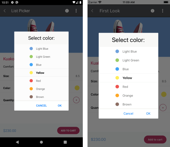
Need a Picker control which allows you to select a single item from a list of items? – Check out the freshly released Telerik UI for Xamarin List Picker control.
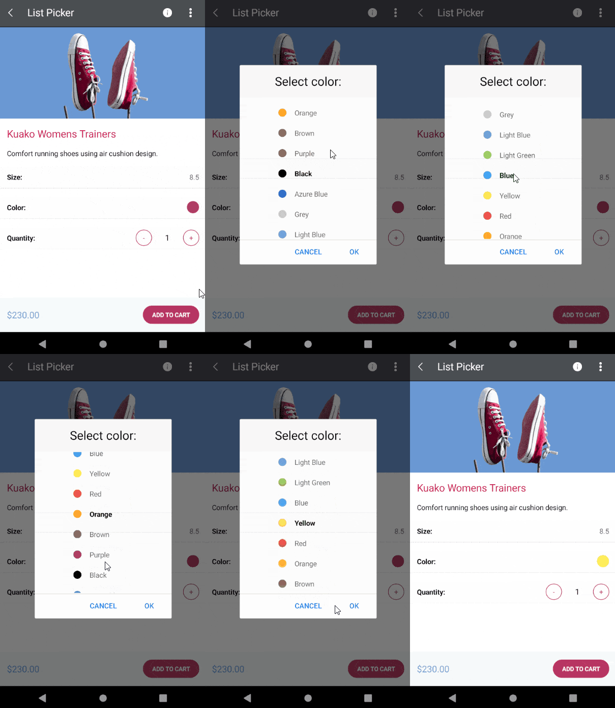
For Xamarin developers, the new List Picker in Telerik UI for Xamarin can be used in various scenarios. For example, you can pick a color from a list of colors, create a list of sizes and pick one of them, etc.
We have added fancy features to the list picker control, as well as the ability to fully customize its look and appearance through the flexible styling API.

In this blog post I will get you familiar with the new List Picker control and the features it provides.
Features:
- Looping - a very useful feature if you want to loop a list of items and infinitely scroll them
- Templates - define a template for the list items, as well as the selected one
- UI Virtualization - visual elements are reused when scrolling to boost performance
- Display String Format - chose what text to display when an item from the list is picked
- Flexible Styling API - style the items, popup, header and footer of the picker
- Command Support - commands for clearing a selected item, opening and closing the dialog
Looping
The List Picker for Xamarin provides a looping functionality which allows you to loop the list of items after reaching the last item. It is very easy to enable this feature, just set the List Picker IsLooping property to true and your list of items will have the ability to scroll infinitely.
<telerikInput:RadListPicker Placeholder="Select color:"
                   ItemsSource="{Binding Colors}"
                   IsLooping="True">
    <telerikInput:RadListPicker.ItemTemplate>
        <DataTemplate>
             <!-- your datatemplate -->
        </DataTemplate>
    </telerikInput:RadListPicker.ItemTemplate>
</telerikInput:RadListPicker>

Templates
You can fully customize the appearance of the List Picker items through the ItemTemplate property and customize the look of the selected one through the SelectedItemTemplate property. The list itself is visualized inside a popup, so we also give you the option to customize its header and footer through the HeaderTemplate and the FooterTemplate properties. List Picker for Xamarin offers the useful functionality of placeholder text. Developers can define what text is to be displayed when no item is selected, thus indicating to the end user the data they need to input, e.g. “Select color.” You can set a text using the Placeholder property or customize the default look through the PlaceholderTemplate property.
Sample ItemTemplate definition
<DataTemplate x:Key="itemTemplate">
    <Label Text="{Binding Population}"
         BackgroundColor="LightYellow"
         HorizontalTextAlignment="Center"
         VerticalTextAlignment="Center"/>
</DataTemplate>
SelectedItemTemplate
<DataTemplate x:Key="selectedItemTemplate">
    <Label Text="{Binding Name}"
         BackgroundColor="LightBlue"
         HorizontalTextAlignment="Center"
         VerticalTextAlignment="Center"/>
</DataTemplate>
PlaceholderTemplate
<ControlTemplate x:Key="footerTemplate">
    <StackLayout Orientation="Horizontal"
             Spacing="0"
             HorizontalOptions="FillAndExpand"
             BackgroundColor="#B73562">
        <Button Text="Cancel"
             TextColor="White"
             BackgroundColor="Transparent"
             Command="{TemplateBinding CancelCommand}" />
        <Button Text="OK"
             TextColor="White"
             BackgroundColor="Transparent"
             Command="{TemplateBinding AcceptCommand}" />
    </StackLayout>
</ControlTemplate>
For more details about List Picker Templates and a sample demo, visit the Templates article from our documentation.
DisplayString
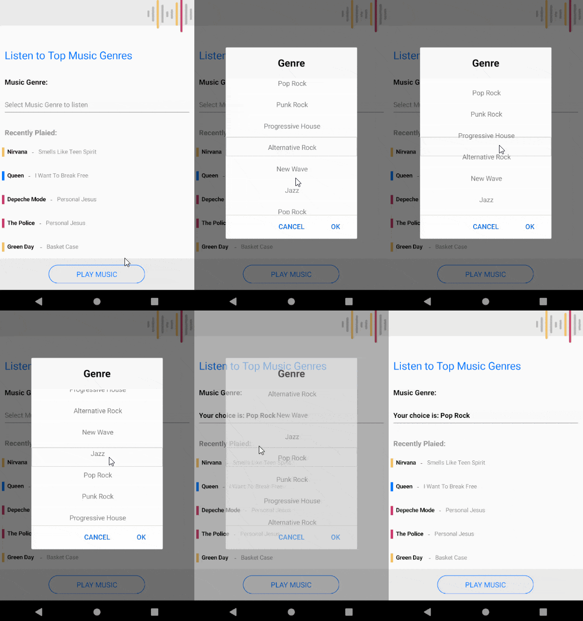
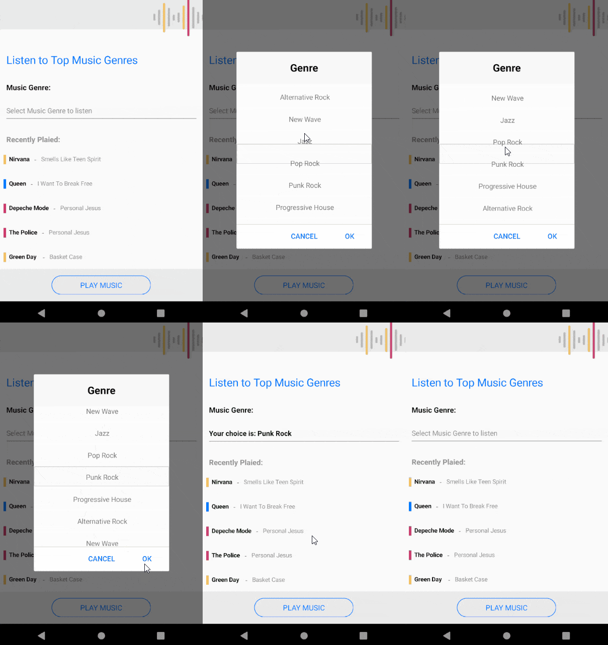
The DisplayStringFormat property defines what text will be displayed when an item is selected, and you can also apply it when an item is selected.

Additionally, we have added a DisplayMemberPath property which allows you to define the path of the property which is to be displayed as DisplayString.
Flexible Styling API
We have exposed flexible Styling API which allows you easily style the List Picker control. For example:
ItemStyleproperty gives you the opportunity to style the items of the list and theSelectedItemStyle, the selected itemSelectionHighlightStylePlaceholderLabelStyleallows you to style the placeholder of the List Picker, and if the default placeholder does not suit your needs you can customize it using thePlaceholderTemplateproperty.DisplayLabelStylegives you the opportunity to style the text displayed when an item from the list is picked.
In addition we have exposed a styling API for the popup. You can easily style its header, footer, cancel and accept buttons. All you need to do is set the ListPicker.SelectorSettings property. The property is of type PickerPopupSelectorSettings and it provides the following styling options for the popup and its header view:
PopupHeaderViewHeaderStyleHeaderLabelStyleFooterStyle- To add the buttons inside the footer, use
AcceptButtonStyleandCancelButtonStyle - Set a background color outside of the popup using the
PopupOutsideBackgroundColor - Change the text for the Popup header using the
HeaderLabelText - Change the text inside the accept and cancel buttons, or for example you can set an icon, through the
AcceptButtonTextandCancelButtonTextproperties
We have a styling article in our documentation which describes the styling capabilities of the control.
Getting started with ListPicker for Xamarin.Forms
Let’s create a demo that allows you to choose a music genre from a list or genres.
Here is a sample Genre model:
public class Genre
{
    public Genre(string musicGenre)
    {
        this.MusicGenre = musicGenre;
    }
    public string MusicGenre { get; set; }
}
and the Music model:
public class Music
{
    public Music(string artist, string song, Color iconColor)
    {
        this.Artist = artist;
        this.Song = song;
        this.IconColor = iconColor;
    }
    public string Artist { get; set; }
    public string Song { get; set; }
    public Color IconColor { get; set; }
}
here is the ViewModel:
public class ViewModel : NotifyPropertyChangedBase
{
    public ViewModel()
    {
        this.Genres = new ObservableItemCollection<Genre>()
        {
            new Genre("Alternative Rock"),
            new Genre("New Wave"),
            new Genre("Jazz"),
            new Genre("Pop Rock"),
            new Genre("Punk Rock"),
            new Genre("Progressive House"),
        };

        this.RecentlyPlayed = new ObservableItemCollection<Music>()
        {
            new Music("Nirvana","Smells Like Teen Spirit", Color.FromHex("#F3C163")),
            new Music("Queen","I Want To Break Free", Color.FromHex("#007AFF")),
            new Music("Depeche Mode","Personal Jesus", Color.FromHex("#CE3A6D")),
            new Music("The Police","Personal Jesus", Color.FromHex("#CE3A6D")),
            new Music("Green Day ","Basket Case", Color.FromHex("#F3C163")),
            new Music("David Guetta ft. Ne-Yo, Akon","Play Hard", Color.FromHex("#CE3A6D")),
            new Music("Louis Armstrong","What a wonderful world", Color.FromHex("#007AFF")),
            new Music("Radiohead ","Creep", Color.FromHex("#F3C163")),
            new Music("The Clash","Should I Stay or Should I Go ", Color.FromHex("#007AFF")),
            new Music("Blondie","Call Me", Color.FromHex("#CE3A6D")),
            new Music("Calvin Harris","Call Me", Color.FromHex("#CE3A6D")),
            new Music("Ray Charles ","I got a woman", Color.FromHex("#007AFF")),
            new Music("Red Hot Chili Peppers","Aeroplane", Color.FromHex("#F3C163")),
            new Music("The Beatles","Help", Color.FromHex("#007AFF")),

        };
    }
    public ObservableItemCollection<Genre> Genres { get; set; }
    public ObservableItemCollection<Music> RecentlyPlayed { get; set; }
}
Here is how the List Picker is defined in XAML:
<ContentPage.BindingContext>
    <local:ViewModel/>
</ContentPage.BindingContext>
<ContentPage.Content>
    <Grid>
        <Grid.RowDefinitions>
            <RowDefinition Height="60"/>
            <RowDefinition Height="Auto"/>
            <RowDefinition Height="*"/>
            <RowDefinition Height="Auto"/>
        </Grid.RowDefinitions>
        <StackLayout Grid.Row="0" BackgroundColor="#EAEAEA" HeightRequest="60">
            <Image Source="music.png" VerticalOptions="End" HorizontalOptions="End"/>
        </StackLayout>
        <StackLayout Margin="16, 40, 16, 0" Grid.Row="1">
            <Label Text="Listen to Top Music Genres" TextColor="#007AFF" FontSize="22" Margin="0,0,0,24"/>
            <Label Text="Music Genre:" TextColor="Black" FontSize="15" FontAttributes="Bold" Margin="0, 0, 0, 21"/>
            <telerikInput:RadListPicker x:Name="genrePicker"
                                        Placeholder="Select Music Genre to listen"
                                        ItemsSource="{Binding Genres}"
                                        IsLooping="True"
                                        SelectionHighlightStyle="{StaticResource SelectionHighlightStyle}"
                                        DisplayStringFormat="Your choice is: {0}"
                                        DisplayMemberPath="MusicGenre"
                                        DisplayLabelStyle="{StaticResource displayLabelStyle}"
                                        PlaceholderLabelStyle="{StaticResource placeholderLabelStyle}">
                <telerikInput:RadListPicker.ItemTemplate>
                    <DataTemplate>
                        <Label Text="{Binding MusicGenre}"
                                HorizontalTextAlignment="Center"
                                VerticalTextAlignment="Center"/>
                    </DataTemplate>
                </telerikInput:RadListPicker.ItemTemplate>
                <telerikInput:RadListPicker.SelectorSettings>
                    <telerikInput:PickerPopupSelectorSettings HeaderLabelText="Genre"
                                                                HeaderStyle="{StaticResource HeaderStyle}"
                                                                HeaderLabelStyle="{StaticResource HeaderLabelStyle}"/>
                </telerikInput:RadListPicker.SelectorSettings>
            </telerikInput:RadListPicker>

            <telerikPrimitives:RadBorder BorderThickness="0, 0, 0, 1" BorderColor="#919191"/>

            <Label Text="Recently Plaied:" TextColor="#919191" FontAttributes="Bold" FontSize="15" Margin="0, 25, 0, 0"/>
        </StackLayout>

        <telerikDataControls:RadListView Grid.Row="2" ItemsSource="{Binding RecentlyPlayed}">
            <telerikDataControls:RadListView.ItemTemplate>
                <DataTemplate>
                    <listView:ListViewTemplateCell>
                        <listView:ListViewTemplateCell.View>
                            <Grid>
                                <StackLayout Orientation="Horizontal" Margin="10, 15, 10, 15" VerticalOptions="Center" HorizontalOptions="Start">
                                    <telerikPrimitives:RadBorder BorderColor="{Binding IconColor}" BorderThickness="3" BackgroundColor="{Binding IconColor}" WidthRequest="5" HeightRequest="5"/>
                                    <Label Text="{Binding Artist}" FontSize="12" FontAttributes="Bold" TextColor="Black" />
                                    <Label Text=" - "/>
                                    <Label Text="{Binding Song}" FontSize="12" TextColor="#919191" />
                                </StackLayout>
                            </Grid>
                        </listView:ListViewTemplateCell.View>
                    </listView:ListViewTemplateCell>
                </DataTemplate>
            </telerikDataControls:RadListView.ItemTemplate>
        </telerikDataControls:RadListView>

        <StackLayout Grid.Row="3" BackgroundColor="#EAEAEA" HeightRequest="65">
            <telerikPrimitives:RadBorder VerticalOptions="CenterAndExpand"
                                            WidthRequest="200"
                                            HeightRequest="40"
                                            HorizontalOptions="CenterAndExpand">
                <telerikInput:RadButton Text="Play Music"
                                        CornerRadius="20"
                                        Padding="10,5,10,5"
                                        BorderColor="#007AFF"
                                        BorderWidth="1"
                                        TextColor="#007AFF"
                                        FontSize="15"
                                        Clicked="OnPlayButtonClicked"
                                        BackgroundColor="Transparent"/>
            </telerikPrimitives:RadBorder>
        </StackLayout>
    </Grid>
</ContentPage.Content>
You also need to add the needed styles to the page Resources:
<ContentPage.Resources>
    <ResourceDictionary>
        <Style TargetType="Label" x:Key="placeholderLabelStyle">
            <Setter Property="TextColor" Value="#919191"/>
        </Style>
        <Style TargetType="Label" x:Key="displayLabelStyle">
            <Setter Property="TextColor" Value="Black"/>
            <Setter Property="FontAttributes" Value="Bold"/>
        </Style>
        <Style TargetType="Label" x:Key="HeaderLabelStyle">
            <Setter Property="TextColor" Value="Black"/>
            <Setter Property="FontAttributes" Value="Bold"/>
            <Setter Property="FontSize" Value="21"/>
            <Setter Property="HorizontalOptions" Value="Center"/>
            <Setter Property="VerticalOptions" Value="Center"/>
        </Style>
        <Style TargetType="telerikInput:PickerPopupHeaderView" x:Key="HeaderStyle">
            <Setter Property="BackgroundColor" Value="#F8F8F8"/>
            <Setter Property="HeightRequest" Value="64"/>
        </Style>
        <Style TargetType="telerikPrimitives:RadBorder" x:Key="SelectionHighlightStyle">
            <Setter Property="BorderColor" Value="LightGray"/>
            <Setter Property="CornerRadius" Value="2"/>
        </Style>
    </ResourceDictionary>
</ContentPage.Resources>
This is the final result:

Tell Us What You Think
We would love to hear what you think about the List Picker control and how we can continue to improve it. If you have any ideas for features to add, do not hesitate to share this information with us on our Telerik UI for Xamarin Feedback portal.
Don’t forget to check out the various demos of the control in our SDK Sample Browser and the Telerik UI for Xamarin Demos application.
If you have not yet tried the Telerik UI for Xamarin suite, take it out for a spin with a 30-day free trial, offering all the functionalities and controls at your disposal at zero cost.
Happy coding with our controls and stay with us! A blog post with everything you need to know about our Date and Time Picker is here, and another on Custom (Templated) Picker controls is on the way. 😊

Dobrinka Yordanova
Dobrinka Yordanova is a Technical Support Engineer, part of the Progress Telerik UI for Xamarin & UWP team in Sofia, Bulgaria. She holds a master's degree in Computer Systems and Technologies. Her passion is traveling around the world and exploring multicultural environments. In her spare time she likes making sushi, playing console games and hanging out with friends.
