
Getting Started with the Blazor SpeechToTextButton Component

Summarize with AI:
Add speech-to-text capabilities to your Blazor app with this component.
In this post, we will explore the new Progress Telerik UI for Blazor SpeechToTextButton component, which allows for easy integration of speech recognition in Blazor applications through the implementation of the Web Speech API. Let’s get started!
What Is the Web Speech API?
The Web Speech API is a specification created by W3C with the purpose of adding voice recognition and speech synthesis functionalities to web applications. Nowadays, the most commonly used browsers have full support for these functionalities, which means it is possible to create Blazor applications that leverage its potential.
Implementing Speech Recognition in Blazor Applications
Let’s see how to implement the SpeechToTextButton component in a fully functional Blazor application, exemplifying a real use case where it would be convenient to integrate it.
Some Use Cases for the SpeechToTextButton Control
There are many scenarios where the ability to perform speech recognition is really useful, for example:
- Virtual assistants and chatbots
- Note-taking
- Document dictation
- Language learning tools
- Voice search systems
- Accessibility for people with disabilities
- Among many others
Therefore, having a Speech-To-Text control in Blazor that implements this functionality without having to deal with processing using JavaScript or using an AI service to obtain the text can help you create robust solutions based on speech recognition.
Integrating the SpeechToTextButton Component into a Blazor App
To use the SpeechToTextButton component in your Blazor applications, you first need to install and configure Telerik components according to the installation guide.
Next, let’s assume we have a page-type component that allows for language translation using AI, which I quickly created using other components from the Telerik suite:
@page "/"
@inject IChatClient ChatClient

<div class="translator-container">
    <h2>Language Translator with Speech-to-Text</h2>

    <div class="language-selection">
        <div class="language-group">
            <label for="source-language">Source language:</label>
            <TelerikDropDownList @bind-Value="@SourceLanguage"
                                Data="@Languages"
                                TextField="@nameof(LanguageOption.Name)"
                                ValueField="@nameof(LanguageOption.Code)"
                                Id="source-language">
            </TelerikDropDownList>
        </div>

        <div class="language-group">
            <label for="target-language">Target language:</label>
            <TelerikDropDownList @bind-Value="@TargetLanguage"
                                Data="@Languages"
                                TextField="@nameof(LanguageOption.Name)"
                                ValueField="@nameof(LanguageOption.Code)"
                                Id="target-language">
            </TelerikDropDownList>
        </div>
    </div>

    <div class="translation-area">
        <div class="input-section">
            <label for="source-text">Text to translate:</label>
            <div class="input-with-mic">
                <TelerikTextArea @bind-Value="@SourceText"
                               Placeholder="Type here or use the microphone..."
                               Rows="4"
                               Id="source-text">
                </TelerikTextArea>
                <TelerikButton Icon="@SvgIcon.MicrophoneOutline"
                             ThemeColor="@ThemeConstants.Button.ThemeColor.Primary"
                             Class="mic-button"
                             Title="Use microphone for speech-to-text">
                    🎤
                </TelerikButton>
            </div>
        </div>

        <div class="output-section">
            <label for="translated-text">Translated text:</label>
            <TelerikTextArea @bind-Value="@TranslatedText"
                           ReadOnly="true"
                           Rows="4"
                           Id="translated-text"
                           Placeholder="The translation will appear here...">
            </TelerikTextArea>
        </div>
    </div>

    <div class="action-buttons">
        <TelerikButton OnClick="@TranslateText"
                     ThemeColor="@ThemeConstants.Button.ThemeColor.Primary"
                     Enabled="@(!string.IsNullOrWhiteSpace(SourceText))">
            Translate
        </TelerikButton>

        <TelerikButton OnClick="@ClearText"
                     ThemeColor="@ThemeConstants.Button.ThemeColor.Secondary">
            Clear
        </TelerikButton>
    </div>

    @if (IsTranslating)
    {
        <div class="loading-indicator">
            <TelerikLoader Visible="true"></TelerikLoader>
            <p>Translating...</p>
        </div>
    }
</div>

<style>
    .translator-container {
        max-width: 800px;
        margin: 0 auto;
        padding: 20px;
    }

    .language-selection {
        display: flex;
        gap: 20px;
        margin-bottom: 20px;
        flex-wrap: wrap;
    }

    .language-group {
        display: flex;
        flex-direction: column;
        gap: 5px;
        min-width: 200px;
    }

    .translation-area {
        display: grid;
        grid-template-columns: 1fr 1fr;
        gap: 20px;
        margin-bottom: 20px;
    }

    .input-section, .output-section {
        display: flex;
        flex-direction: column;
        gap: 10px;
    }

    .input-with-mic {
        display: flex;
        gap: 10px;
        align-items: flex-start;
    }

    .input-with-mic .k-textarea {
        flex: 1;
    }

    .mic-button {
        height: 40px;
        width: 40px;
        min-width: 40px;
        font-size: 16px;
    }

    .action-buttons {
        display: flex;
        gap: 10px;
        justify-content: center;
        margin-bottom: 20px;
    }

    .loading-indicator {
        text-align: center;
    }

    label {
        font-weight: bold;
        color: #333;
    }

    @@media (max-width: 768px) {
        .translation-area {
            grid-template-columns: 1fr;
        }

        .language-selection {
            flex-direction: column;
        }
    }
</style>

@code {
    private string SourceLanguage = "es";
    private string TargetLanguage = "en";
    private string SourceText = "";
    private string TranslatedText = "";
    private bool IsTranslating = false;

    private List<LanguageOption> Languages = new()
    {
        new LanguageOption { Code = "es", Name = "Spanish" },
        new LanguageOption { Code = "en", Name = "English" },
        new LanguageOption { Code = "fr", Name = "French" },
        new LanguageOption { Code = "de", Name = "German" },
        new LanguageOption { Code = "it", Name = "Italian" },
        new LanguageOption { Code = "pt", Name = "Portuguese" },
        new LanguageOption { Code = "ja", Name = "Japanese" },
        new LanguageOption { Code = "ko", Name = "Korean" },
        new LanguageOption { Code = "zh", Name = "Chinese" },
        new LanguageOption { Code = "ru", Name = "Russian" }
    };

    private async Task TranslateText()
    {
        if (string.IsNullOrWhiteSpace(SourceText))
            return;

        IsTranslating = true;
        StateHasChanged();

        try
        {
            var sourceLanguageName = Languages.FirstOrDefault(l => l.Code == SourceLanguage)?.Name ?? "the source language";
            var targetLanguageName = Languages.FirstOrDefault(l => l.Code == TargetLanguage)?.Name ?? "the target language";

            var prompt = $"Translate the following text from {sourceLanguageName} to {targetLanguageName}. " +
                        $"Return only the translation without additional explanations:\n\n{SourceText}";

            var response = await ChatClient.GetResponseAsync(prompt);
            TranslatedText = response.Text ?? "Translation error";
        }
        catch (Exception ex)
        {
            TranslatedText = $"Error: {ex.Message}";
        }
        finally
        {
            IsTranslating = false;
            StateHasChanged();
        }
    }

    private void ClearText()
    {
        SourceText = "";
        TranslatedText = "";
        StateHasChanged();
    }

    public class LanguageOption
    {
        public string Code { get; set; } = "";
        public string Name { get; set; } = "";
    }
}
As you can see in the code above, I added a button with the microphone icon. 🎤 The purpose of this is to enable speech recognition. Now, if we wanted to implement the text recognition functionality, we would have to deal with some issues:
- Capturing and processing the stream from the recording
- Implementing JS code to obtain the text
- Error handling in case of an exception
The list above represents just a few of the challenges that would take us a long time to solve. Fortunately, the SpeechToTextButton component implements all of this natively, allowing us to focus on solving business problems, such as in this case, enabling the user to translate text quickly.
To use the control, the first thing we need to do is add the component to the user interface. In my case, I will replace TelerikButton with the following code:
<TelerikSpeechToTextButton Lang="en-US"/>
As part of using the component, it is also advisable to use the Lang parameter with a set language, as in certain scenarios an automatic language resolution does not occur, such as when using an Edge browser or a Blazor Hybrid application. Running the application with this change yields the following result:
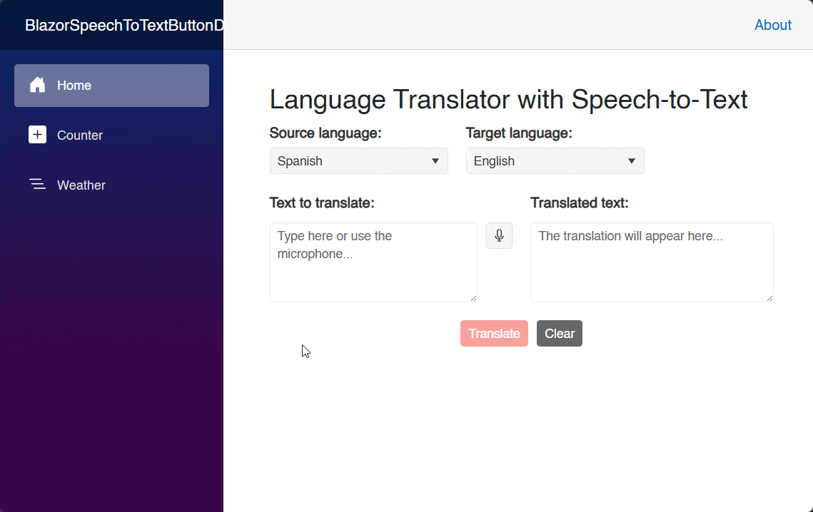
As you can see in the image above, the component itself has a professional appearance. And, when it’s pressed, it initiates the process of requesting access to the recording device. You can also appreciate a design management according to the recording state, including a nice animation.
Obtaining Text from Speech in Blazor
To obtain the transcription of a speech, we need to subscribe to the event OnResult, which is triggered when a speech is detected and a correct result is obtained. The event defines an argument of type SpeechToTextButtonResultEventArgs that contains recognized phrases, alternatives and confidence scores. Here is an example of its usage:
<TelerikSpeechToTextButton OnResult="OnSpeechResult" />

@code{
    private void OnSpeechResult(SpeechToTextButtonResultEventArgs args)
    {
        Debug.WriteLine($"Result: {args.Alternatives.FirstOrDefault().Transcript}");
        Debug.WriteLine($"IsFinal: {args.IsFinal}");
        Debug.WriteLine($"Confidence: {args.Alternatives.FirstOrDefault().Confidence}");
    }
    ...
}
In the previous code, we can see the use of the following properties:
Alternatives: A collection listing alternative transcriptions for the speech-to-text operationIsFinal: A boolean value indicating whether the result is final (true) or not (false). If true, then it is the last time the result will be returned; otherwise, the result may be updated later
The result of executing the previous code produces the following output in the Output window:
Result: How are you?
IsFinal: True
Confidence: 0
Binding the Speech-to-Text Result to a Text Component
To display the result in the graphical interface, we just need to have a text-type component bound to a property, with the purpose of assigning it the value of Transcript from an element of the Alternatives collection. In our example, we have a TelerikTextArea component bound to the SourceText property, so we can do something like the following:
private void OnSpeechResult(SpeechToTextButtonResultEventArgs args)
{
    SourceText = args.Alternatives.FirstOrDefault()?.Transcript ?? "";
}
The previous execution allows us to quickly enter text to be translated, as shown in the following image:
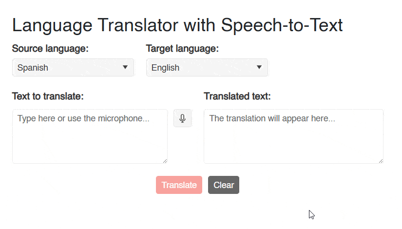
Undoubtedly, using the component makes a difference between dictating a phrase and having to write all the text, especially in situations where a quick introduction of the text is required or when the text is very long.
Modifying the Appearance of a SpeechToTextButton
There are several parameters of the SpeechToTextButton component that allow for quick customization if needed.
First, we can use the parameter Size to assign one of the following values:
ThemeConstants.Button.Size.SmallThemeConstants.Button.Size.MediumThemeConstants.Button.Size.Large
Similarly, it is possible to modify the padding of the component through the parameter FillMode and the use of one of the following values:
ThemeConstants.Button.FillMode.SolidThemeConstants.Button.FillMode.ClearThemeConstants.Button.FillMode.FlatThemeConstants.Button.FillMode.Outline
If you want to change the button color, you should use the parameter ThemeColor along with one of the following values:
ThemeConstants.Button.ThemeColor.BaseThemeConstants.Button.ThemeColor.PrimaryThemeConstants.Button.ThemeColor.SecondaryThemeConstants.Button.ThemeColor.TertiaryThemeConstants.Button.ThemeColor.InfoThemeConstants.Button.ThemeColor.SuccessThemeConstants.Button.ThemeColor.WarningThemeConstants.Button.ThemeColor.ErrorThemeConstants.Button.ThemeColor.DarkThemeConstants.Button.ThemeColor.LightThemeConstants.Button.ThemeColor.Inverse
Another configurable parameter is Rounded, which controls the rounding of the component, managed through the following values:
ThemeConstants.Button.Rounded.SmallThemeConstants.Button.Rounded.MediumThemeConstants.Button.Rounded.LargeThemeConstants.Button.Rounded.Full
It is also possible to change the icon using the parameter Icon, to which you can assign a Telerik icon or a custom one. Finally, you can also apply a custom style using the Class parameter, as in the following example:
<TelerikSpeechToTextButton Class="custom-speech-btn" Title="Custom Style" Lang="en-US" />

<style>
    .custom-speech-btn {
        font-size: 1rem;
        background-color: #28a745;
        color: #fff;
        border-radius: 6px;
        transition: background 0.2s;
    }

        .custom-speech-btn:hover {
            background-color: #218838;
        }

</style>
Other Events Available in the SpeechToTextButton Control
Previously, we discussed the OnResult event that allows us to retrieve the result of speech recognition. However, we also have these other events:
OnStartandOnEnd:OnStartis triggered when a recording starts, whileOnEndfires when a speech recognition ends. They could be useful for logging, measuring recording time, checking that a speech does not exceed X seconds, etc.OnError: This event is triggered if there is an error during speech recognition.OnClick: It fires when the user taps on the button.
Conclusion
Throughout this article, you have discovered the SpeechToTextButton component, which allows for easy integration of speech recognition into your Blazor-based applications. If you want to help users be more efficient by allowing them to dictate, this is definitely a component you should try.
Not yet using Telerik UI for Blazor components? The library comes with a free 30-day trial, so check it out:
Try Now
Héctor Pérez
Héctor Pérez is a Microsoft MVP with more than 10 years of experience in software development. He is an independent consultant, working with business and government clients to achieve their goals. Additionally, he is an author of books and an instructor at El Camino Dev and Devs School.
Related Posts
Comments
All articles
Topics
Web MobileMobile
Desktop
Design
Productivity
People
