Getting Started with Accessibility for React

Summarize with AI:
Many accessibility basics are the same across frameworks, but some things are framework-specific. Let’s look at what makes React accessibility unique.
A lot of the basics that you need to do in order to make an application accessible—things like adding alt text, checking your color contrast ratios, using labels, etc.—will remain the same no matter what framework you’re using. Alt text is alt text, whether you’re in React, Angular, Vue or just good old-fashioned HTML.
The thing we need to pay special attention to with regards to accessibility when working with React are the ways in which it modifies the DOM. That means, practically, we need to be thinking about:
- What changes between the JSX we write and the HTML that shows up in the browser
- How and when our components re-render
- The adjustments we need to make for single-page applications
In order to really understand how to accommodate these aspects of React, we’ll first need to take a brief look at two foundational pieces of knowledge: the accessibility tree and semantic HTML.
The Accessibility Tree
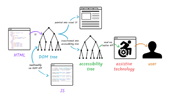
In addition to the DOM (Document Object Model) tree that represents the organization of our pages according to the HTML elements we’ve used, there’s also what’s called the accessibility tree. The accessibility tree contains the accessibility-related information for all of our HTML elements and it’s based on the DOM tree. It uses accessibility APIs to send assistive technologies the information they need about the name, description, role, state and interaction options of the elements on the page.
For example, this accessibility tree is what tells a screen reader that the element the user is currently focused on is a dropdown called “Sizes”—it contains three options (small, medium and large), it’s currently defaulted to the “medium” option, and it’s not disabled so the user can make a new selection from among those options. All of that information is sent over for every single element on the page, so that it’s possible for users of assistive technologies to get that full context and understanding that they need in order to navigate an application.
Semantic HTML
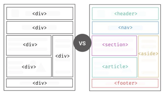
Image from https://medium.com/codex/what-is-semantic-markup-and-why-you-should-use-it-44777543c29c.
That’s why it’s so crucial for us to use semantic HTML when we’re coding. Semantic HTML elements are the ones which are created and named for specific uses—think: table, image, button, header, section, aside, ordered and unordered lists, etc.
There are over 100 different HTML elements, and they all have that information about the name, description, role, state and interaction options automatically associated with them. That sets them apart from the organizational elements, div and span, which have no information attached to them—they’re just empty boxes. Which is great for when we’re trying to set styles or handle layouts, but completely useless when it comes to communicating information and structuring the DOM—and, by extension, that makes them completely useless to the accessibility tree and to the user.
Suffice it to say, if we’re getting all that important information from the DOM … we need to be aware of how React is altering the DOM, so that we can accommodate for those changes and keep the experience as seamless as possible for our users.
With these basics in mind, let’s dive into some React specifics!
What Happens Between JSX and HTML?
JSX is the syntactic sugar that allows us to write our React components in a way that more closely matches the HTML structure that we’re all so used to. But, it’s actually kind of too good at its job, because it’s really
easy to forget that it’s not actually writing HTML—it’s compiling into React.createElement() functions.
<Greeting name="Taylor" />
// is the same as
createElement(Greeting, { name: 'Taylor' })
This example comes directly from the React docs—so you can see that even when we’re using specific HTML tags in our JSX, it’s still just
passing that as a string to that React.createElement(). That’s why we have to capitalize our own components, so that React can tell the difference between those built-in components that it will (eventually) translate
to the corresponding HTML elements, and the custom components that we’re creating and importing ourselves.
So, how can we preserve the semantic content and structure of our elements when we’re writing JSX, to ensure that by the time it’s all compiled and “translated” it’s still semantic in the DOM?
Use Semantic HTML
The first (and most obvious) thing we can do is to use as many actual semantic HTML elements as possible and avoid reinventing the wheel. That means using the actual button tag when we need a button, not jumping right into creating our own custom Button component that’s actually just three divs in a trenchcoat. Or, even when we need our own custom components, making sure that we’re still basing them on these semantic elements so that we can leverage all the accessibility goodness that’s built right into them.
Because it’s so easy for things to get lost in that JSX translation, we really want to take advantage of the elements that are already going to have everything built in from the get-go.
Abstract Components Using the ‘as’ Prop Pattern
One of the places where React developers (myself included) often struggle is when we’re abstracting components. Because, ideally, we want to make sure our code is as DRY as possible, we’re often trying to create a single component that can be reused in multiple ways and in multiple contexts. But when we’re working with multiple roles and multiple descriptions, we probably need to accommodate multiple HTML tags.
This is especially true for layout components—things like callout boxes or cards, whose role will change depending on how they’re being used. A callout box in the middle of a block of text might need to be a <blockquote>,
but if we use the same component again to draw attention to content in a sidebar, it should be an <aside>. Often, we just kind of lazily dodge this whole issue by making it a <div> and saying “good enough” … but, it’s not really good enough.
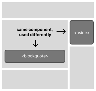
Thankfully, we have other options! One used by several UI component libraries is something known as the “as” prop pattern, which allows you to pass the semantic tag into a custom component and then render the wrapper as that.
import React from 'react';

export default function Callout(props) {
 const { as: Element, children } = props;
 return <Element className="callout">{children}</Element>
}

Callout.defaultProps = {
 as: 'p',
};
This works by destructuring the props, which then allows us to alias that “props.as” value as “Element” and pass it right into the component tag itself. We’ve also included a defaultProps safety net, here, so that the element will always be rendered with *something* as the tag.
That means that when we use this component, it will look like this in our JSX:
<Callout as="h1">Test</Callout>
… and then like this in the browser, when we inspect the element:

All things considered, it’s an easy thing to add to our components, and it makes a hell of a difference for preserving the semantic structure!
Don’t Forget Your Children!
Another challenge that comes with writing reusable components has to do with the accessibility information attached to the children inside those components. Things like icons, labels, alt text and more are all all variable content that can be easily overlooked when a component is being reused in different situations and contexts. You always want to make sure that you’re including unique and descriptive content for these elements, even if that makes the generalization of a given component slightly harder.
So, for example, let’s say you’re creating a product card component that’s going to include a photo of the product, a name, a price and a “Purchase” button. That product photo is going to different for every single one of those cards, so you need to make sure that you’ve accounted for variable alt text and you’re not just repeating “Product photo” as the alt text for every single card.
Use Fragments
One more thing we can do to make our apps as accessible as possible is to make use of fragments. Because fragments weren’t fully supported until React 16.2 (in 2017), some folks who established their coding habits in React before that point can kinda forget to make use of them. Which is a shame, because fragments are incredibly helpful for preserving that DOM structure!
Basically, when we want to add multiple elements to a React component, they need to have some kind of wrapper. As we know, this:
return (
    <h1>Hello World</h1>
    <p>Nice to meet you!</p>
  );
… is just going to end in an error. They need to be inside some kind of container element, and (pre-fragments) that was usually a <div>.
We can see the obvious downside of this: lots (and lots, and lots) of effectively meaningless and unnecessary divs cluttering up the DOM because we needed them in order to make React play nice. This is disruptive from an accessibility standpoint in a couple different ways:
- Assistive technologies make use of landmark elements to understand the structure of the page—tags like main, nav, section, article, footer and more. By using those elements at the highest levels, we allow them to understand the structure of the page and what’s in it. When this is cluttered with divs … it’s less useful.
- When HTML is expecting a specific order or structure with nested elements, throwing random
<div>s in there creates invalid HTML. That includes things like<table>s that expect<tr>s or<td>s or<ul>s that expect<li>s. Our browsers are usually adaptive enough to still render something, even when there’s a weird div in the middle breaking things … but (once again) this really throws a wrench in the works for screen readers and other assistive technologies.
Thankfully, fragments allow us to create empty wrappers that will satisfy the needs of the JSX, and then not actually render anything in the HTML. So we can write code like this:
return (
    <>
    <h1>Hello World</h1>
    <p>Nice to meet you!</p>
    </>
);
… to solve the problem and get the best of both worlds.
Use an Accessibility Linter
Especially if you’re just starting out with accessibility, it can be extremely helpful to have something to help check your code and remind you of guidelines that you might have forgotten about while you were working. For React and JSX, I recommend eslint-plugin-jsx-a11y—a plugin that will review your JSX for common accessibility issues. It will throw errors when you’ve neglected to write alt text or include captions for media, assesses the autocomplete validity of your forms, checks for associated labels, and so so much more!
Keep in mind, this is only checking your static code in the editor—not the actual, rendered DOM—so it’s not a replacement for proper accessibility testing in the browser. However, it’s still an immensely helpful tool that you can use to catch things early and help build the habit of coding accessibly.
Handling Component Re-Renders
Beyond the JSX, though, there are other things to consider—we also have to keep in mind the how a component re-render will impact the accessibility of our application. One of the ways this can be most disruptive is by throwing off the focus state.
The focus is how a browser shows which item is currently highlighted, when a user is navigating via keyboard or assistive technology. You’ve probably used it before to quickly navigate between form fields or options in a dropdown without reaching for your mouse … but you can (and should!) try it yourself—just hit tab after you load a page, and you should see the focus appear on the first selectable element. By repeatedly pressing tab, the user can cycle through interactive elements on the page without needing to point and click. The focus order is the order in which those elements are highlighted, and that default focus order is determined by (you guessed it)—the order of elements in the DOM.
The React Component Lifecycle
I’m going to assume you’re all at least vaguely familiar with the React component lifecycle, so I won’t spend much time here beyond just pointing out that the DOM gets updated not only when the application first loads, but then again each time a component re-renders—which, as we know, is primarily when new props are passed or state is updated, unless we’re manually forcing a re-render.
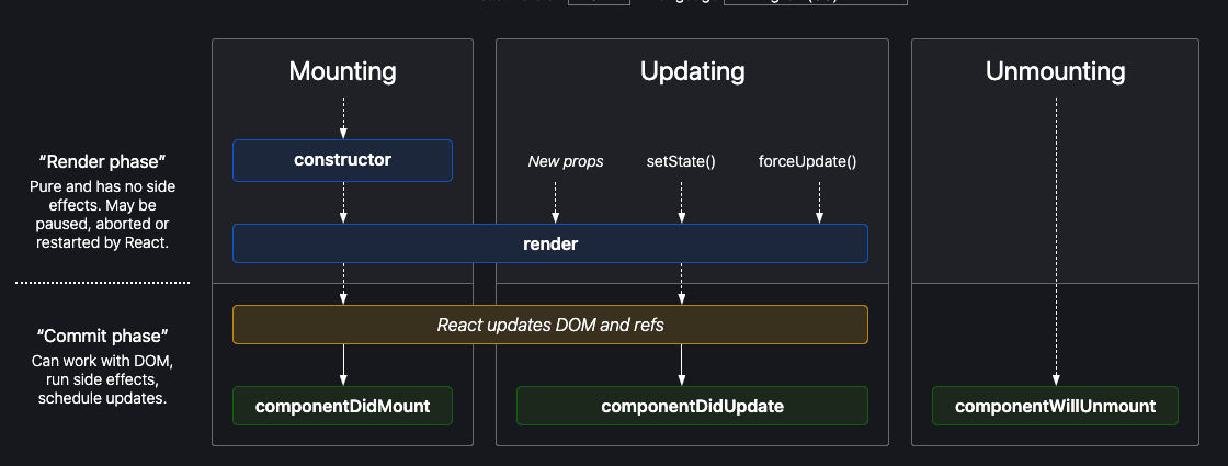
Image from https://projects.wojtekmaj.pl/react-lifecycle-methods-diagram/.
When you’re focusing on an element in a component that gets re-rendered, that focus is often either just lost or it gets bumped to another element—both of which are disorienting and frustrating for a user. That means that it’s our job as the developer to make sure we’ve got a plan in place for re-focusing when we know we’re going to trigger a component re-render that changes the structure of the DOM—things like confirmation or error text that appears, secondary or conditional form questions, pop-up modals that get triggered, etc.
⚠️ Before we dig into some technical approaches for manually managing focus, I want to start by saying that the focus is not something you should touch, unless you absolutely have to. Overriding the natural focus order should only be done to accommodate or fix disruptions we have made to the DOM. Generally, you really don’t want to mess with the focus order—the default order is going to be the most intuitive, so unless we’ve done something to mess that up, we don’t wanna put our hands in it. These approaches should ONLY be used in order to fix what we have broken by messing with the DOM. With great power comes great responsibility, and this is a tool to be used cautiously.
That said, there are a couple ways to do this, depending on what you’re trying to accomplish. The simplest way is to use the autoFocus prop.
AutoFocus
autoFocus will automatically shift the focus to the element it’s applied to, overriding the default focus order. Let’s take a look at an example.
<form>
  <label>
    Username
    <input name="user" type="user" />
  </label>
  <label>
    Password
    <input name="user" type="password" autoFocus />
  </label>
</form>
I’ve placed the autoFocus prop here on the Password input box, and even when we refresh the page, the focus jumps over everything else on the page and focuses in the Password box. We can see how this might be harmful when misused. If this was a full page and I were to remove autoFocus, the focus will naturally start somewhere much more logical—probably the navigation. This is not a real-world situation where I would override the focus, I’m only doing it here to demonstrate the approach because the situations in which you would want something like this tend to be more complex.

This is primarily useful to us when we’re using it in conditionally rendered components. One of the most common use cases here is a form question that triggers a followup question if the user selects “Yes.” If the user selects “No,” there’s no second question that appears. In that case, it makes total sense that we’d want the focus to automatically shift to that new input box as soon as it renders after the user has made the yes/no selection in the previous question.
Refs & UseEffect( )
Another way to accomplish the same goal with a more hands-on approach is using refs and hooking into the lifecycle of the component with useEffect(). In this case, we manually set the element we want to redirect the focus
to by creating a ref and adding it to the element, then calling focus() on that ref with the useEffect hook.
In this code sample, I’m just recreating what we did with autoFocus—forcing the focus to override the natural order and jump to the second input box—but using this method, instead.
Here, I’ve got the same super simple fake login component with those two input boxes. I’ve set up my ref—passwordinput—with useRef() and added it to the password
input box in the JSX. By using the
useEffect() hook, we’re telling React to do this thing immediately after component render—and in our case “this thing” is setting the element tagged with that passwordinput ref to be the current focus target.
export default function Login(props) {

 const pwinput = useRef(null);

 useEffect(() => {
   pwinput.current.focus();
 })

 return (
      <form>
        <label>
          Username
          <input name="user" type="user"  />
        </label>
        <br/>
        <label>
          Password
          <input name="user" type="password" ref={pwinput} />
        </label>
      </form>
  )
}
If you prefer classes instead of functional components, you can accomplish the same thing by using componentDidMount(). This approach is most useful when (for whatever reason) there’s a different action that you
want to trigger the focus change that’s not the component render—for example, closing a modal and re-focusing where the user left off. With this approach, you can call that same focus() function wherever
you need it. It just gives you a little more control than the autoFocus approach.
Single-Page Applications & Page Titles
Finally, let’s talk about page titles. The page title is the first element that gets announced by a screen reader when a user loads your page. They’re important for giving your user a gist of what’s on the page so they know what to expect, orienting them within the larger structure of your application, helping them tell tabs apart, and helping them set useful bookmarks. Ideally, your page title will include a short description of the page content, as well as your application or brand name.
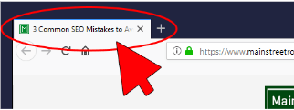
Image from https://www.mainstreetroi.com/where-are-the-webpage-titles-descriptions-and-headers/.
The issue, of course, is that the page title doesn’t automatically update as a user navigates through your React app because it’s a single-page application. So … we’re not actually changing any pages, and therefore not triggering page title updates. Obviously, from an accessibility standpoint, this is not ideal.
The easiest way to fix this, in my opinion, is to use a library called react-helmet, which helps manage changes to the document head. It is, seriously, one of the most dead-easy libraries I have ever used in my life. You just add it to your app, import it, and then anywhere in the component that you’re calling from your router, you can write:
<Helmet><title>My Page Title</title></Helmet>
You can put them anywhere in the component and it will work, but I like to keep them at the top—I think it makes the most organizational sense. Literally … it’s just that easy. Really nice, genuinely quick accessibility win!
More Resources
These are just a few of the most helpful things that you can do to get some quick accessibility wins in the books when you’re first starting out with accessibility in React—this is not intended to be a full and complete guide to making your app accessible. If you’re looking to dive a little deeper (and I hope you are!), then I highly recommend these resources:
- https://www.smashingmagazine.com/2022/11/guide-keyboard-accessibility-javascript-part2/
- https://www.youtube.com/watch?v=kz9e81oRs3Y
- https://reactjs.org/docs/accessibility.html
- https://developer.mozilla.org/en-US/docs/Learn/Tools_and_testing/Client-side_JavaScript_frameworks/React_accessibility
Avoid Analysis Paralysis
I’ve found accessible development to be one of the the places where it’s easiest to fall into analysis paralysis—there’s always something that you feel like you need to do more research on first, something that you heard someone else is doing, or just a vague feeling that you don’t really know enough yet to start tackling accessible coding yourself. Just one more blog, one more conference talk, one more video, and then you’ll be ready to start writing accessible code.
Meanwhile, our applications—and more importantly, our users—are stuck with the same old inaccessible code that we just keep writing. In my opinion, the best thing we can do is to start writing accessible code to the best of our ability, with the acknowledgement that we might make a mistake! Accessibility isn’t an on/off switch, it’s a sliding scale. We code accessible features as we’re able, based on what we know right now and the current accessibility-related guidance. It might not be perfect 100% of the time, but anything is better than ignoring accessibility entirely. And hey—code isn’t carved into stone, right? You can always go back and refactor something once you’ve learned how to do it better.
It can be easy to build up the idea of coding accessibly in our heads into something so large and intimidating that we can always find an excuse for putting it off. But in reality, as I hope that I’ve demonstrated here, accessible code is just a series of small to moderate adjustments to your development and testing process that are all absolutely doable by developers of all experience levels.
After all, learning new stuff is just part of our job. Frameworks, libraries, best practices, even languages themselves change and evolve over time. Once you start thinking of accessibility the same way and recognize that it’s not an optional upgrade, you can start to build accessible development into your existing processes and patterns at work.

Kathryn Grayson Nanz
Kathryn Grayson Nanz is a developer advocate at Progress with a passion for React, UI and design and sharing with the community. She started her career as a graphic designer and was told by her Creative Director to never let anyone find out she could code because she’d be stuck doing it forever. She ignored his warning and has never been happier. You can find her writing, blogging, streaming and tweeting about React, design, UI and more. You can find her at @kathryngrayson on Twitter.

